12 Architecture Web Design for a Timeless Look
Summer Nguyen | 08-05-2024
What exactly makes an architecture web design stand out in the digital world? Is it the seamless user experience, the captivating visuals, or perhaps the compelling way it tells a story? Join us today as we explore 12 exceptional examples of architecture web design that set new standards for beauty and functionality!
Key Elements Of An Architecture Web Design
It requires a keen eye for detail, a sense of artistry, and a focus on functionality to create a good architecture web design. Here are some key elements:
- High-Quality Imagery: The right visuals can turn a casual browser into an awestruck admirer, highlighting the intricate details and stunning beauty of each project.
- Seamless User Experience: It ensures visitors can find what they’re looking for without frustration, making their journey through your portfolio a delightful experience.
- Compelling Storytelling: Each project has a story to tell. By weaving narratives that detail the inspiration, challenges, and triumphs behind your designs, you create an emotional connection with your audience.
- Interactive Elements: Interactive elements like 3D tours and dynamic galleries can transform your website into an immersive experience.
- Fast Load Times: No one likes waiting around, especially online. A fast-loading site keeps visitors engaged and reduces bounce rates.
Top 12 Architecture Web Designs
Our showcase of the Top 12 Architecture Web Designs invites you to experience the stories behind each virtual marvel:
REON

REON’s website is a masterclass in minimalist design, embodying simplicity and sophistication. Upon landing on the homepage, visitors are greeted with a full-screen image slider that elegantly showcases REON’s portfolio.
Key features:
- Clean Aesthetic: The use of ample white space allows the projects to stand out.
- Smooth Navigation: A sticky header ensures easy access to various sections of the site.
- Interactive Elements: Hover effects on project images provide additional details without cluttering the design.
ABCD Architect

ABCD Architect’s website exudes a modern yet timeless appeal, reflecting the firm’s architectural philosophy. The homepage features a dynamic grid layout that presents their diverse portfolio in an organized and visually engaging manner.
Key features:
- Dynamic Grid Layout: Projects are arranged in a dynamic grid, allowing for an organized yet flexible presentation.
- Responsive Design: The website adapts beautifully across devices, maintaining functionality and aesthetics.
- Project Filters: Users can filter projects by type, location, and year, making navigation intuitive.
6a Architects

6a Architects’ website stands out for its elegant and timeless design. The combination of sophisticated typography and a monochromatic color scheme creates a visually pleasing and cohesive experience.
Key features:
- Elegant Typography: The choice of fonts enhances readability and adds a touch of elegance.
- Monochromatic Color Scheme: The restrained color palette ensures that the focus remains on the projects.
- In-Depth Project Pages: Each project page includes detailed descriptions, high-quality images, and project timelines.
Colab Company

Colab Company‘s website reflects their collaborative approach to architecture with a vibrant and engaging design. The use of bold colors and interactive elements creates a memorable and dynamic user experience.
Key features:
- Bold Color Palette: The vibrant colors reflect the energy and creativity of the firm.
- Interactive Elements: Features like project sliders and animated transitions enhance user engagement.
- Collaboration Stories: Case studies and collaboration stories provide insights into the firm’s working process.
Humbert & Poyet

When entering the Humbert & Poyet, you will be surprised by many collage images. It is designed to exude luxury and sophistication, mirroring the high-end nature of their architectural projects.
Key features:
- Fullscreen Video Background: Engaging videos provide a dynamic introduction to the firm’s work.
- Luxury Aesthetic: The design elements reflect the high-end nature of their projects.
- Client Testimonials: The inclusion of testimonials adds credibility and showcases client satisfaction.
Zikzak

Interactive elements in Zikzak such as animations and hover effects create a dynamic and engaging user experience. For those interested in innovative architectural work, the intuitive navigation and detailed project pages are a treasure trove of inspiration.
Key features:
- Playful Design: The vibrant colors and playful animations create an engaging user experience.
- Interactive Elements: Features like animated project previews and interactive project maps enhance usability.
- User-Centric Navigation: The intuitive navigation structure ensures a seamless user journey.
BIG

BIG’s website is a testament to innovation and creativity. Featuring a grid of dynamic project thumbnails on the homepage, it offers a quick and engaging overview of their diverse portfolio. Each project page is rich with multimedia content.
Key features:
- Dynamic Thumbnails: The interactive project thumbnails provide a quick overview of their diverse portfolio.
- Innovative Design Elements: The use of cutting-edge web technologies reflects the firm’s innovative spirit.
- Detailed Project Pages: Each project page includes extensive information, images, and videos.
Effekt

Effekt’s website is a model of minimalist design, focusing on simplicity and functionality. The clean layout, combined with ample white space and high-resolution images, directs attention to their architectural projects.
Key features:
- Minimalist Design: The clean layout and use of white space create a sophisticated look.
- Straightforward Navigation: The simple navigation structure ensures a seamless user experience.
- High-Quality Images: The use of high-resolution images allows visitors to appreciate the details of each project.
Bobak Studio

You will be welcomed by a big grid of Bobak Studio. The mix of static and dynamic content on the homepage keeps visitors engaged, while detailed project showcases highlight the firm’s creativity and expertise.
Key features:
- Artistic Design: The use of artistic elements reflects the creative nature of the firm.
- Mixed Content: The combination of static and dynamic content keeps the site engaging.
- Portfolio Showcase: The portfolio section highlights the firm’s diverse range of projects.
MMBB

MMBB’s website uses geometric shapes and bold colors to make a striking visual impression. Detailed project pages provide comprehensive information about their innovative architectural designs.
Key features:
- Geometric Design: The use of geometric shapes adds a modern touch to the site.
- Bold Colors: The bold color palette makes the site visually striking.
- Interactive Features: Interactive elements like hover effects and animated transitions enhance user engagement.
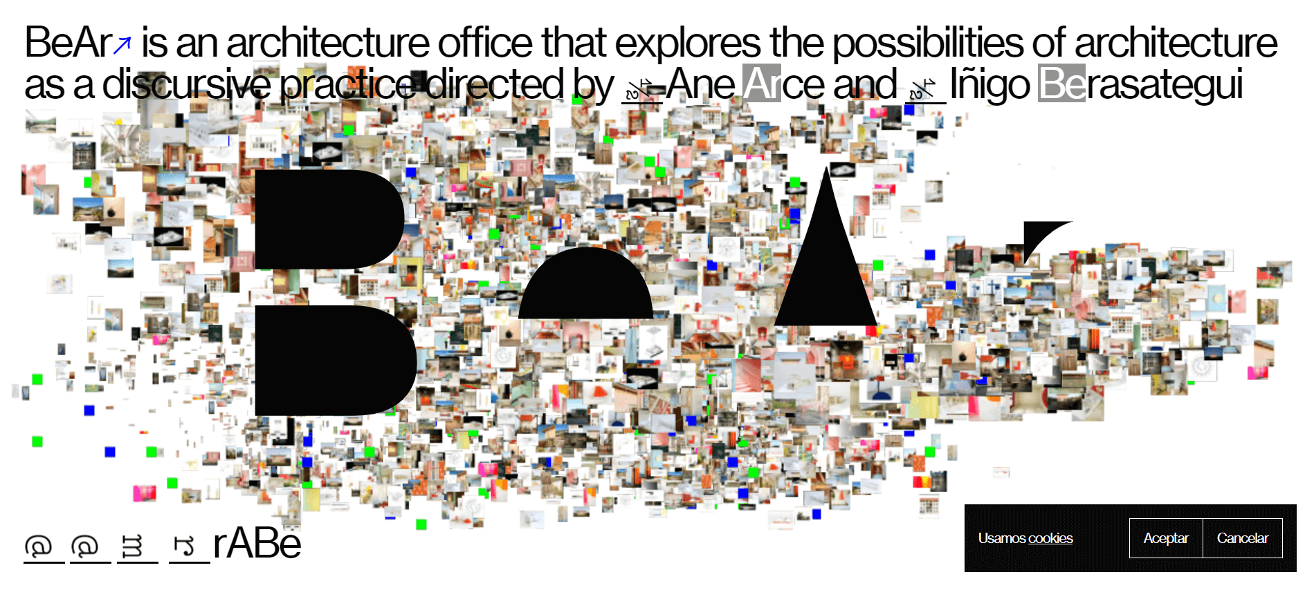
BeAr

BeAr is designed to tell a story through architecture. Using fullscreen images and engaging narratives, it draws visitors into the story behind each project. The immersive design and intuitive navigation make it easy to explore the firm’s creative process and architectural achievements.
Key features:
- Storytelling Design: The use of storytelling elements creates an engaging user experience.
- Fullscreen Images: The fullscreen images provide a captivating introduction to the firm’s work.
- Project Narratives: Each project page includes a narrative that explains the story behind the design.
Canatal

Canatal’s website features a sleek and modern design that immediately catches the eye. Clean lines, a minimalist aesthetic, and high-quality images create a sophisticated online presence. Detailed project pages and a fully responsive design ensure a seamless user experience across all devices.
Key features:
- Sleek Design: The clean lines and minimalist aesthetic create a sophisticated look.
- Intuitive Navigation: The simple navigation structure ensures a seamless user experience.
- Project Highlights: The project pages include high-quality images and detailed descriptions.
Tips For Creating An Architecture Website
Here are some tips to help you create a compelling architecture website:
- Showcase Your Portfolio: Your portfolio is the heart of your architecture website. Organize your portfolio in a way that is easy for visitors to navigate, such as by project type, style, or location.
- Tell Your Story: A compelling “About Us” page can help potential clients connect with you on a personal level and understand your unique approach to architecture.
- Keep It Clean and Simple: Simple navigation and a well-organized layout are key to a positive user experience.
- Include Client Testimonials: Positive reviews and stories of successful collaborations can reassure potential clients of your reliability and expertise.
Key Takeaway
In these 12 architecture web examples above, we’ve seen how architecture web design can be both timeless and innovative. Let’s have a quick review:
- REON’s website stands out due to its ability to present complex architectural projects in a clean, simple, and visually appealing manner.
- The dynamic grid layout of ABCD Architect’s website not only showcases the breadth of their work but also provides a cohesive visual experience.
- 6a Architects’ website wins by its elegant and timeless design.
- The use of interactive elements and engaging storytelling on Colab Company creates a unique and memorable user experience.
- Humbert & Poyet’s website stands out for its luxurious design.
- Zikzak’s playful design and interactive elements make the website memorable and fun to navigate.
- BIG’s website offers an in-depth look at their work.
- Effekt’s minimalist design approach makes their website both elegant and functional.
- The artistic design and mixed content make Bobak Studio’s website visually appealing and engaging.
- MMBB’s use of geometric shapes and bold colors sets their website apart.
- BeAr’s focus on storytelling through design makes their website unique.
- Canatal’s sleek and modern design makes their website visually appealing and easy to navigate.


