15 eCommerce Website Designs That Drive Sales (with Practical Tips)
Summer Nguyen | 08-26-2024
In the ever-evolving world of online shopping, a well-designed eCommerce website can make or break a brand’s success. From fashion to tech and home furnishings, each industry showcases unique website design elements that enhance user experience and drive sales.
In this article, we explore 15 standout eCommerce website design examples that excel in their respective categories. By examining fashion leaders like Everlane and Reformation, tech giants such as Apple and Razer, and home essentials retailers like IKEA and Wayfair, we uncover the design features that set these sites apart. This exploration will provide valuable insights into creating effective and engaging eCommerce platforms.
15 eCommerce website design examples
Fashion & Apparel
1. Everlane
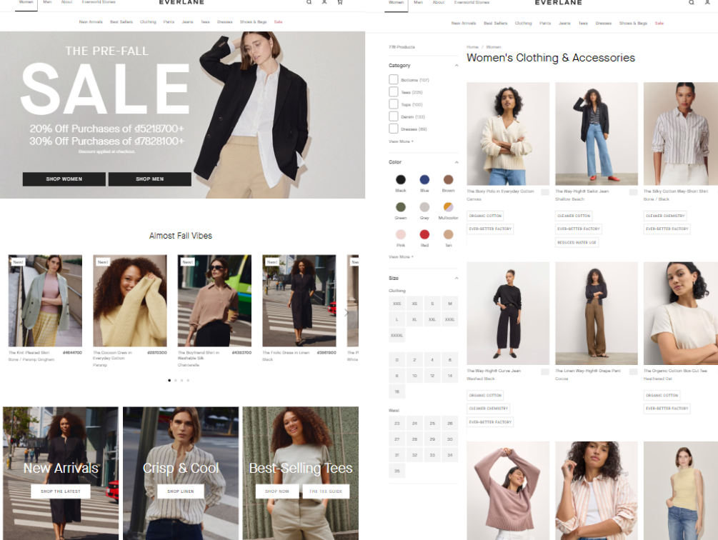
Everlane, an American clothing brand founded in 2010, has become renowned for its “Radical Transparency” philosophy. This approach involves being exceptionally open about production costs and pricing, aiming to provide high-quality, timeless products to customers.
The brand’s website reflects this ethos through a minimalist design that utilizes a clean sans-serif font, generous white space, and high-resolution product images. The neutral color palette, collaborating shades of white, gray, and black, exudes sophistication and places the focus squarely on the clothing.
Each item’s page provides detailed information about the materials used, the conditions of the factories where the items are made, and a comprehensive pricing breakdown, reinforcing Everlane’s commitment to transparency.
Standout e-commerce features on the Everlane website include:
- Diverse filters & sorting options: Allows users to sort by fabric, color, size, fit, waistband, and more.
- Related product recommendations: An engaging CTA, “Add To Your Forever Wardrobe,” suggests complementary items.
- Save your info: Enables faster checkout for returning customers.
2. Reformation
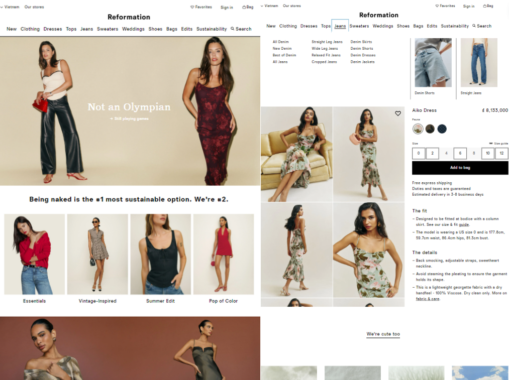
Reformation has carved out a niche for itself with its sustainable and stylish clothing, characterized by eco-friendly fabrics and vintage-inspired designs.
The Reformation website mirrors this aesthetic, featuring a chic and feminine look with a touch of nostalgia. Soft color palettes, such as dusty pinks and earthy tones, and delicate fonts perfectly complement the vintage-inspired clothing. High-quality photographs highlight the intricate details and textures of the garments, enhancing the overall shopping experience.
Standout e-commerce features on the Reformation website include:
- Localized pricing: The site automatically adjusts currency based on the user’s country selection.
- Wish list: Allows users to save their favorite items.
- Buyer account: Facilitates easy tracking of orders and preferences.
- Multi-language support: The checkout page can be displayed in various languages.
3. ASOS
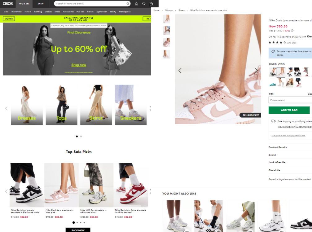
ASOS is a global fashion destination for young adults that offers an extensive selection of clothing, accessories, and beauty products.
ASOA website is designed to be visually stimulating, with large product images, bold typography, and a vibrant mix of colors. ASOS frequently incorporates user-generated content, showcasing real customers wearing their products, which adds authenticity and relatability. The dynamic layout, which changes frequently, keeps the site fresh and aligns with the fast-paced nature of fashion trends.
Standout e-commerce features on the ASOS website include:
- Wishlist: Helps users save items for later.
- Personalized recommendations: The “You might also like” feature suggests related products.
- Checkout suggestions: Additional products are recommended during the checkout process.
- Localized shopping: Users can choose their shopping location and the appropriate currency.
Electronics & Tech
4. Apple
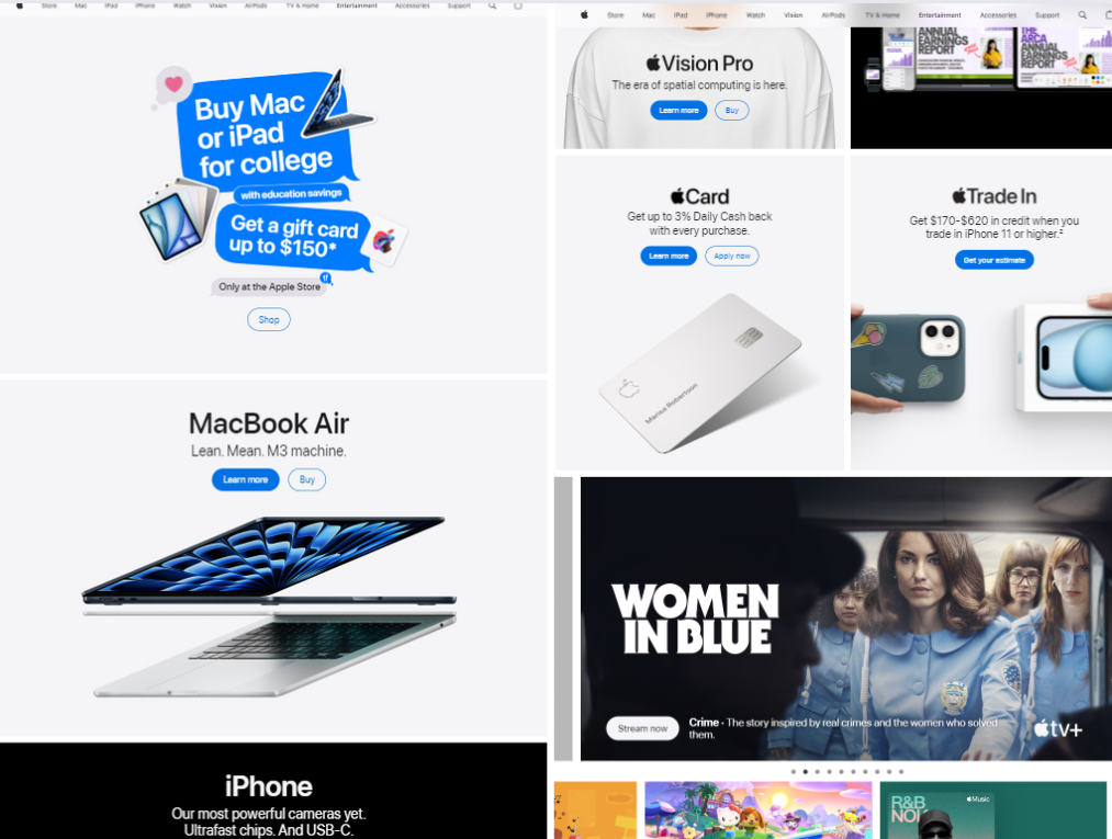
Apple, a technology firm known for its innovative items, needs no introduction.
The company’s website embodies its iconic design language with ample white space, high-resolution product images, and sleek typography. Subtle animations and parallax scrolling effects enhance the user experience, making it both intuitive and visually appealing. Each product page is meticulously crafted, highlighting key features and benefits through interactive demos and detailed specifications.
Standout e-commerce features on the Apple website include:
- Country or region selection: Tailors the shopping experience to the user’s location.
- Product comparison tool: Allows users to compare features and specifications of different products.
- Personalized recommendations: Based on user preferences as well as previous purchases.
- Seamless ecosystem integration: Ensures a cohesive experience across all Apple devices and services.
- Business accounts: Offers tailored solutions and benefits for business customers.
5. Razer
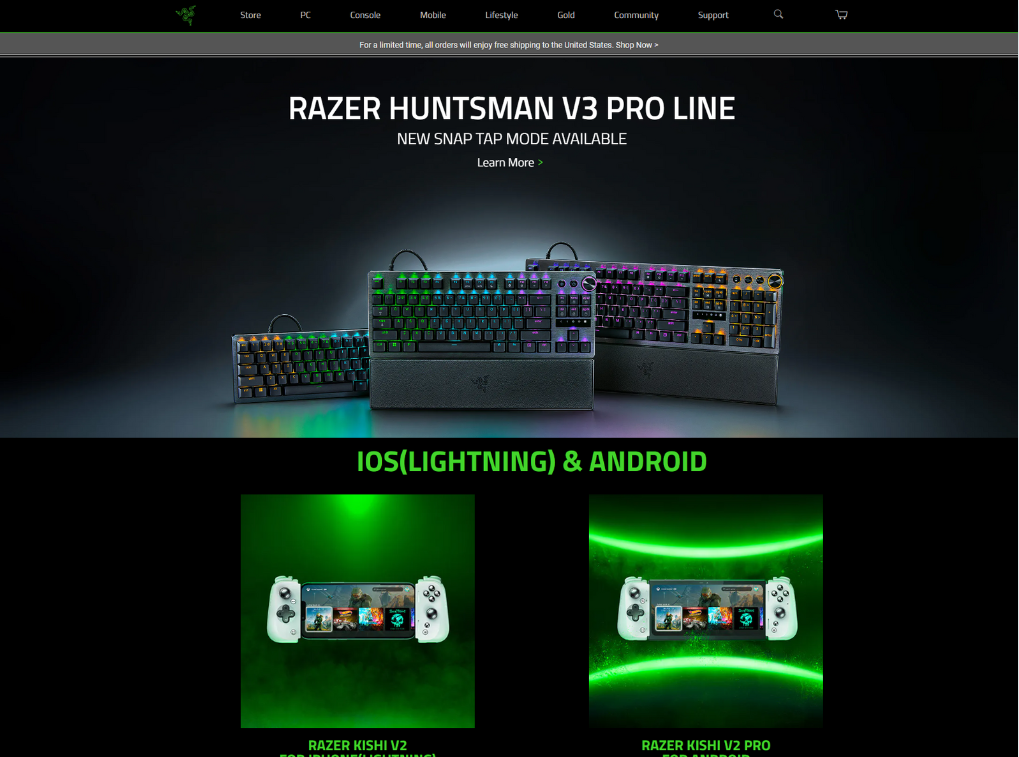
Razer caters to the gaming community and offers high-performance hardware and peripherals.
Its website immerses users in a dark, futuristic environment with neon green accents and glowing elements. Bold, angular fonts and dynamic animations create a sense of energy as well as excitement, perfectly aligning with the brand’s image. Moreover, Razer’s product pages are detailed, showcasing specs and customization options that appeal to the discerning gamer.
Standout e-commerce features on the Razer website include:
- Customization options: Available for select products to tailor specifications.
- Virtual try-on: Allows users to try accessories virtually.
- Razer Gold and Silver is a virtual currency program that rewards customers for purchases, gameplay, and social engagement.
- Mobile XDK: An all-in-one payment processor that integrates various payment methods on websites, enhancing user convenience
6. B&H Photo Video
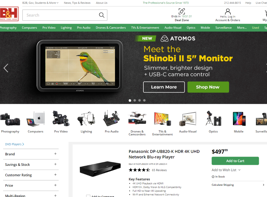
B&H Photo Video is a trusted retailer specializing in photography, videography, and audio equipment.
Its website prioritizes functionality and information, featuring a clean layout, clear navigation, and detailed product descriptions. It caters to both professionals and enthusiasts, providing expert reviews, tutorials, and buying guides as valuable resources.
Standout e-commerce features on the B&H Photo Video website include:
- Extensive product catalog: Covers a huge range of categories and brands.
- Deal zone: Highlights current discounts, promotions, and clearance items, helping customers save on their purchases.
Home & Furniture
7. IKEA
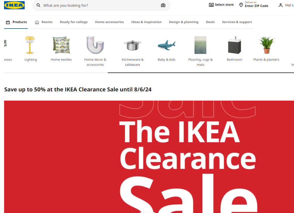
IKEA, a global furniture retailer, is known for its affordable, functional designs and flat-pack concept.
The IKEA website is playful and interactive, featuring bright colors, playful icons, and fun animations. Room planners and 3D product visualizations help customers envision how furniture would look in their homes. Moreover, the website’s layout is easy to navigate, with clear product categories and filtering options.
Standout e-commerce features on the IKEA website include:
- Augmented reality (AR) furniture placement: Allows users to see how items would look in their space.
- Click-and-collect options: Convenient for customers who prefer to pick up their orders.
- Inspiration and ideas: Provides curated collections, room sets, and articles on home decor trends.
8. Article furniture
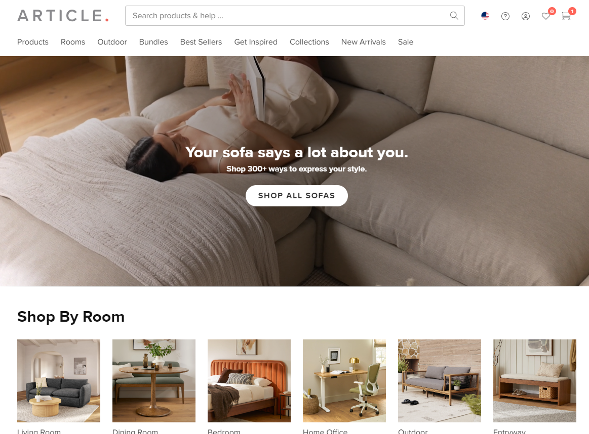
Article company offers modern furniture and home decor with a focus on quality, design, as well as affordability.
Its website features a sleek, minimalist aesthetic with curated product collections. Furthermore, high-resolution lifestyle photography showcases furniture in real-life settings, inspiring customers with design ideas.
Standout e-commerce features on the Article Furniture website include:
- 3D room view: Available for select products, helping users visualize items in their space.
- Shop by room: Simplifies finding coordinated pieces.
- Shop bundles: Offers sets of complementary items.
- Inspiration section: Provides design ideas and trends.
- B2B portal: Tailored solutions for business customers.
9. Wayfair
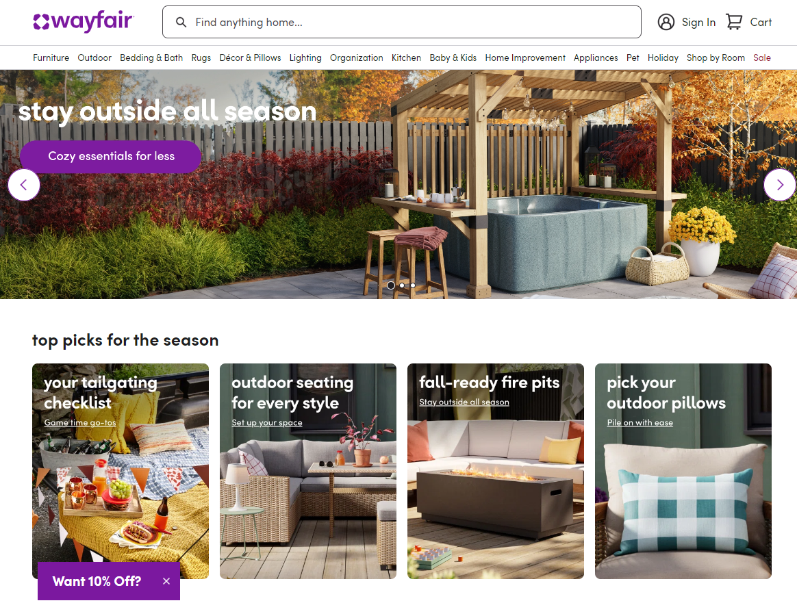
Wayfair is a massive online retailer offering a wide variety of furniture, home decor, and appliances.
Wayfair’s website is clean and user-friendly. Its vast product catalog is organized into clear categories. A powerful search bar and filtering options help customers quickly find what they’re looking for. The “Shop the Look” feature allows users to visualize products together in curated collections.
Standout e-commerce features on the Wayfair website include:
- Idea boards: Users can create virtual collections of products they like.
- View in the room: A feature that helps visualize products in a user’s space.
- 3D room planner tool: Assists in designing and planning rooms.
- Shop by room: Facilitates finding coordinated pieces for specific spaces.
Beauty & Personal Care
10. Glossier
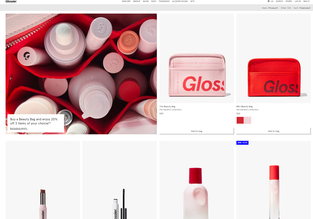
Glossier is a beauty brand that champions a natural, “skin first” approach and focuses on community and inclusivity.
The brand’s website radiates a youthful, playful vibe with pastel colors, handwritten fonts, and candid imagery. Product pages feature real people, not models, showcasing diverse skin tones and types, enhancing the brand’s appeal.
Standout e-commerce features on the Glossier website include:
- Community-driven reviews and recommendations: Enhances trust and engagement.
- Bundled sets and kits: Offers complementary products together.
- Curated selection: Showcases best-selling and most-loved products.
11. Sephora
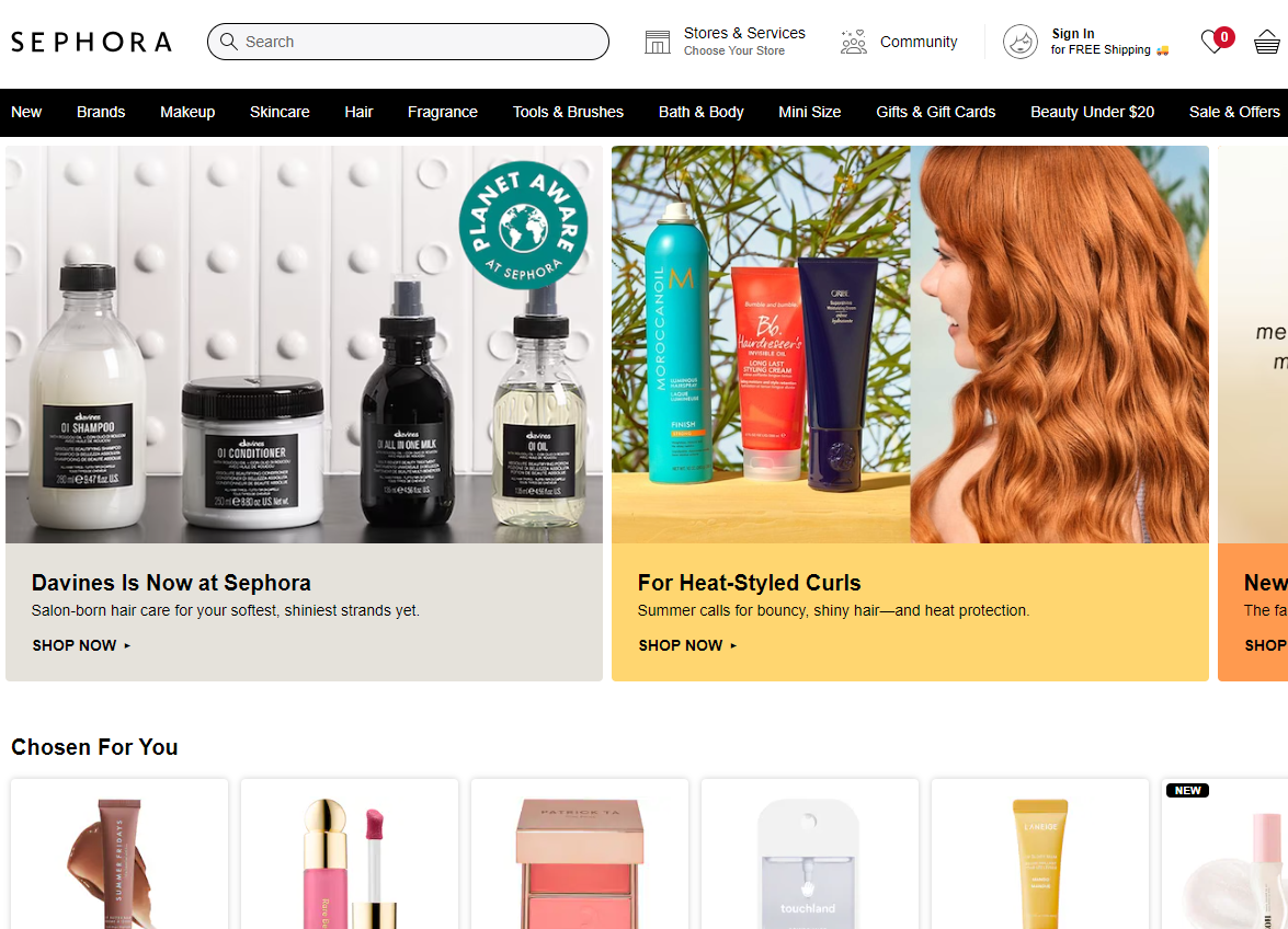
Sephora, a leading beauty retailer, offers a vast selection of makeup, skincare, haircare, and fragrance products.
Sephora’s website is visually vibrant and energetic, with a kaleidoscope of product images, brand logos, and promotional banners. The navigation is intuitive, allowing users to filter by brand, category, or concern.
Standout e-commerce features on the Sephora website include:
- Virtual artist: Allows for makeup try-ons.
- Auto-replenishment: Customers can sign up for regular deliveries of select products.
- Beauty quiz: Helps customers find products that match their preferences and needs.
12. The Ordinary
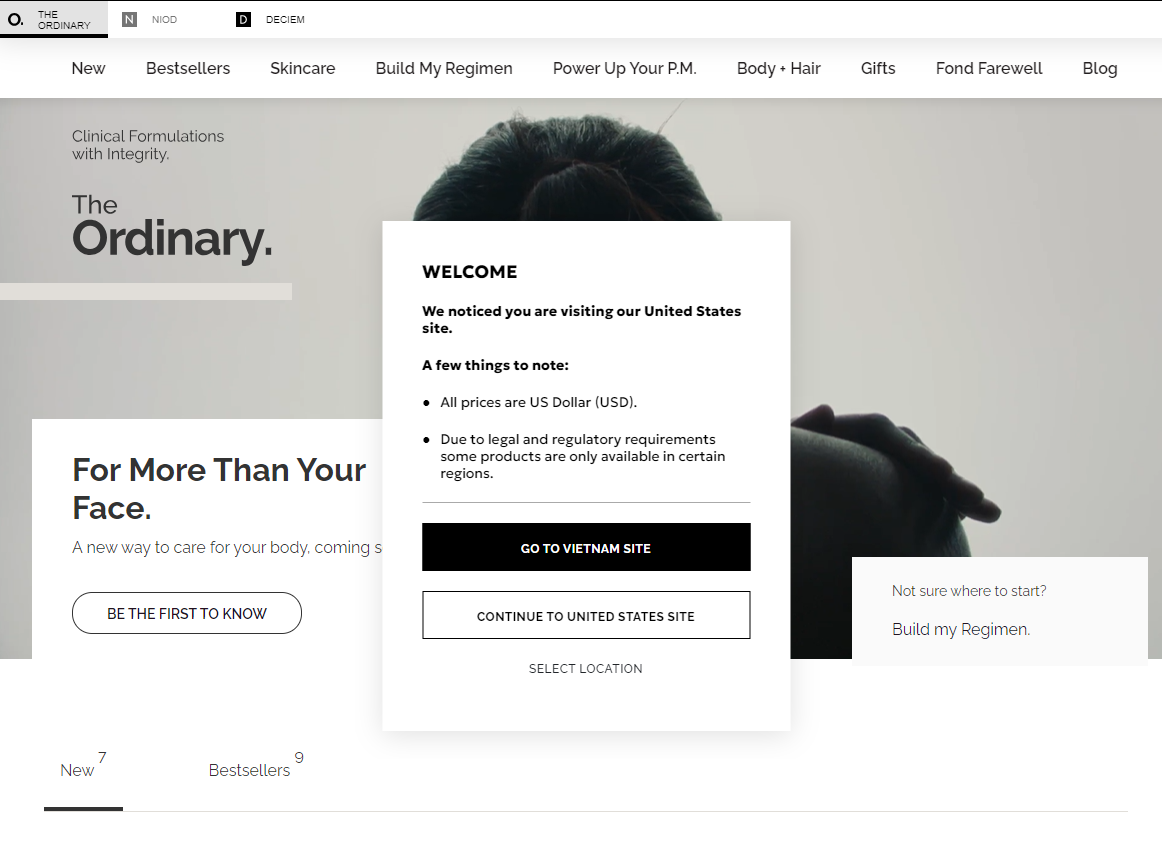
The Ordinary is known for its simple, effective skincare formulations and transparent ingredient lists.
The brand’s website reflects its no-nonsense approach. It features a clean, clinical aesthetic featuring white backgrounds, sans-serif fonts, and minimal graphics. Product pages prioritize scientific information, listing ingredients and their concentrations clearly. This straightforward design allows users to focus on the products themselves.
Standout e-commerce features on The Ordinary website include:
- Personalized regimen guides: Based on customers’ skin concerns and goals.
- Localized sites: Users can switch to specific country sites.
- Intensive review section: Features detailed reviews with images.
Food & Grocery
13. Thrive market
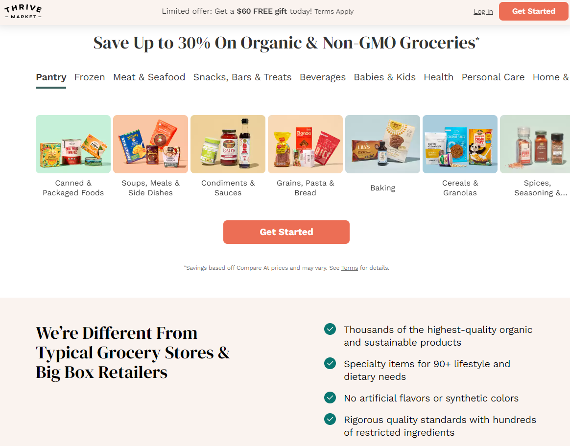
Thrive Market is a membership-based online marketplace for natural and organic food, home goods, and personal care products.
The website evokes a sense of health and wellness with earthy tones, natural textures, and wholesome imagery. Product pages highlight organic certifications and sustainability practices. The overall design is clean and inviting, encouraging users to explore the wide range of healthy options available.
Standout e-commerce features on the Thrive Market website include:
- Filtering options for dietary restrictions: Users can easily look for items that meet their specific dietary needs.
- Buyer account: Allows for personalized shopping experiences and order tracking.
- Personalized recommendations: Based on dietary preferences and previous purchases.
14. FreshDirect
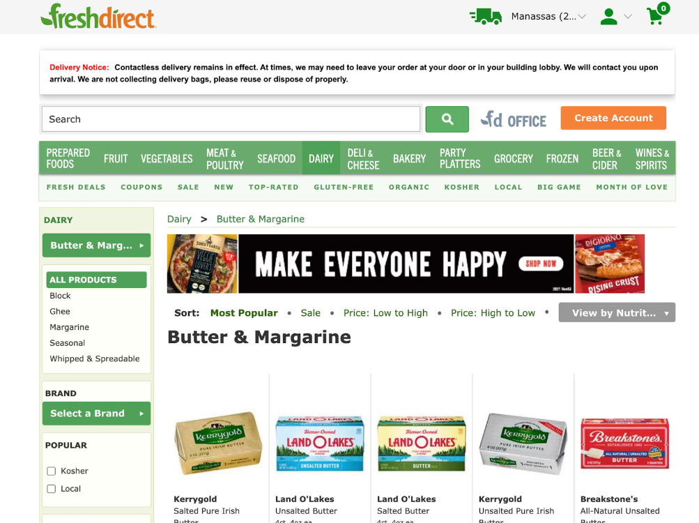
FreshDirect refers to an online grocery delivery service that offers fresh produce, prepared meals, and pantry staples.
The website FreshDirect is an online grocery delivery service that offers fresh produce, prepared meals, and pantry staples. The website prioritizes user-friendliness and convenience, featuring a clear and organized layout with intuitive navigation. This makes it easy to browse and add items to the cart. Product pages are detailed with high-quality images, nutritional information, and recipe suggestions, making the shopping experience both informative and enjoyable. The streamlined checkout process ensures quick and efficient ordering.
Standout e-commerce features on the FreshDirect website include:
- Delivery pass subscription service: Provides unlimited free delivery for a monthly or annual fee.
- Recipe suggestions and meal planning tools: Help customers plan their meals and discover new recipes.
- Variety of meal kits: Offers pre-portioned ingredients and easy-to-follow recipes for convenient meal preparation.
prioritizes user-friendliness and convenience, featuring a clear and organized layout with
15. Farmdrop
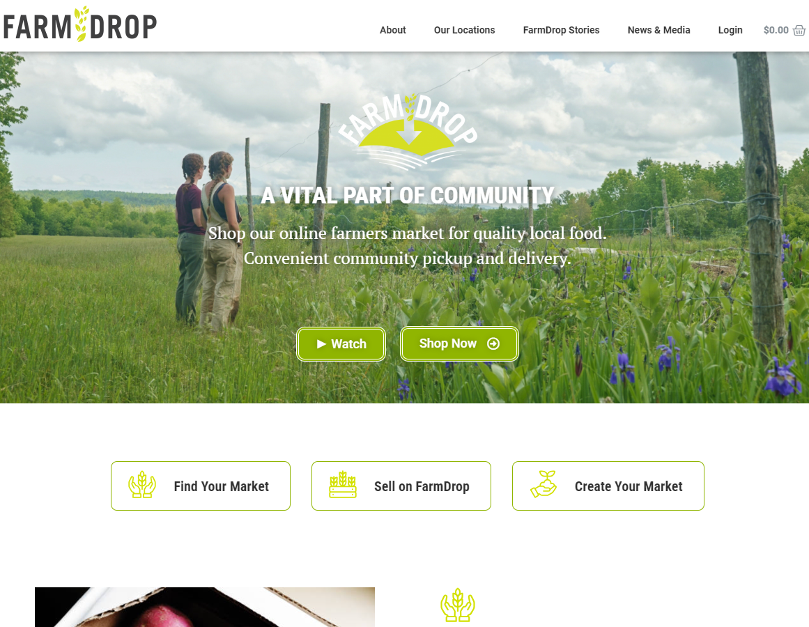
Farmdrop connects consumers directly with local farmers and producers, offering a wide range of fresh, seasonal produce and artisanal goods.
The website has a rustic, farm-to-table aesthetic with warm colors, hand-drawn illustrations, and photos of farmers and their fields. Product descriptions are rich with stories about the producers and their sustainable practices, creating a sense of connection to the source of the food and promoting transparency and trust.
Standout e-commerce features on the Farmdrop website include:
- Local sourcing: Allows customers to browse and order a wide range of products directly from local farmers and food producers.
- Sustainability information: Provides details about the sustainable practices of the farmers and producers.
Key Takeaway from the 15 Greatest eCommerce Website Design Examples
After examining the top eCommerce website designs, we’ve identified several key insights that can guide you in creating an outstanding eCommerce site design, including:
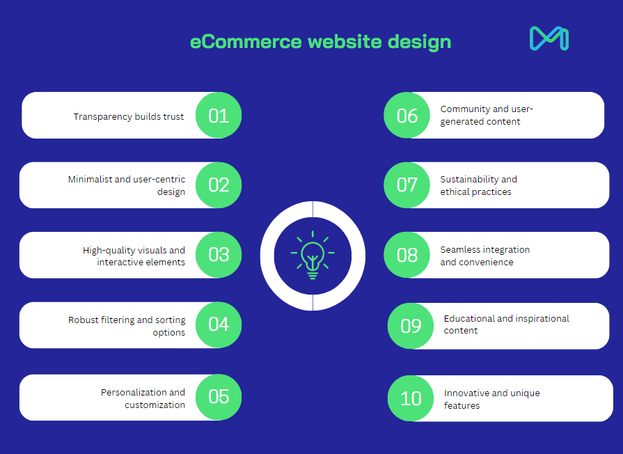
1. Transparency builds trust
A common theme among the most successful e-commerce websites is transparency. Whether it’s Everlane’s detailed production costs and factory conditions or The Ordinary’s clear ingredient lists, providing customers with transparent information fosters trust and loyalty. Transparency about pricing, materials, and production processes can significantly enhance the customer experience and differentiate a brand in a crowded market.
2. Minimalist and user-centric design
A minimalist design approach, as seen in Everlane, Apple, and Article Furniture, helps keep the focus on the products. Clean layouts, ample white space, and neutral color palettes create a sophisticated and user-friendly shopping experience. This design philosophy reduces distractions and makes it easier for customers to navigate the site as well as find what they’re looking for.
3. High-quality visuals and interactive elements
High-resolution product images and interactive elements are essential for an engaging e-commerce experience. Websites like Apple and IKEA utilize interactive demos, augmented reality (AR), and 3D visualizations to enhance product understanding and customer engagement. These features allow customers to interact with items virtually. This led to the online shopping experience being more immersive and informative.
4. Robust filtering and sorting options
Effective filtering and sorting options are crucial for improving user experience, especially on websites with extensive product catalogs like ASOS and Wayfair. Allowing customers to filter by various attributes such as size, color, price, and material helps them quickly find items that meet their needs. This improves the overall shopping experience and increases conversion rates.
5. Personalization and customization
Personalized shopping experiences, such as those offered by Razer and Thrive Market, cater to individual customer preferences and needs. Features like personalized recommendations, customization options for products, and personalized regimen guides make customers feel valued and understood. As a result, this fosters a stronger connection with the brand.
6. Community and user-generated content
Incorporating community and user-generated content can significantly enhance engagement and authenticity. ASOS and Glossier effectively use real customer photos and reviews to create community and trust. Encouraging customers to share their experiences and showcase products in real-life scenarios adds credibility and relatability to the brand.
7. Sustainability and ethical practices
Highlighting sustainable and ethical practices resonates with environmentally conscious consumers. Brands like Reformation and Farmdrop emphasize their eco-friendly materials, local sourcing, and sustainable production methods. Showcasing these values not only attracts like-minded customers but also strengthens the brand’s reputation and appeal.
8. Seamless integration and convenience
Seamless integration of various functionalities, such as payment methods, delivery options, and checkout processes, enhances convenience for customers. Websites like FreshDirect and Apple excel in providing streamlined and efficient shopping experiences. Features like one-click checkout, delivery subscription services, and business accounts simplify the purchasing process and encourage repeat business.
9. Educational and inspirational content
Providing educational and inspirational content can position a brand as an authority and inspire customers. B&H Photo Video and IKEA offer tutorials, buying guides, and curated collections to educate and inspire customers. By using this approach, customers gain clarity in their decisions and enjoy a more satisfying shopping experience
10. Innovative and unique features
Incorporating innovative features that stand out from the competition can significantly enhance the user experience. Features like Razer’s virtual try-on for accessories, Wayfair’s “View in Room” tool, and Sephora’s virtual artist for makeup try-ons provide unique value and differentiate these brands in the market. These innovative tools not only engage customers but also help them make better purchasing decisions.
Further Tips to Design an Effective E-commerce Website
Alongside the key takeaways from the best 15 e-commerce website designs, here are more practical suggestions to enhance your e-commerce site’s appeal and conversion rates:
1. Prioritize Mobile-First Design
With mobile commerce (m-commerce) expected to hit $710.4 billion by 2025, designing for mobile users is no longer optional. A mobile-first approach ensures your website is optimized for smaller screens, touch interactions, and slower connection speeds. This enhances user experience, decreases bounce rates, and rises conversions.
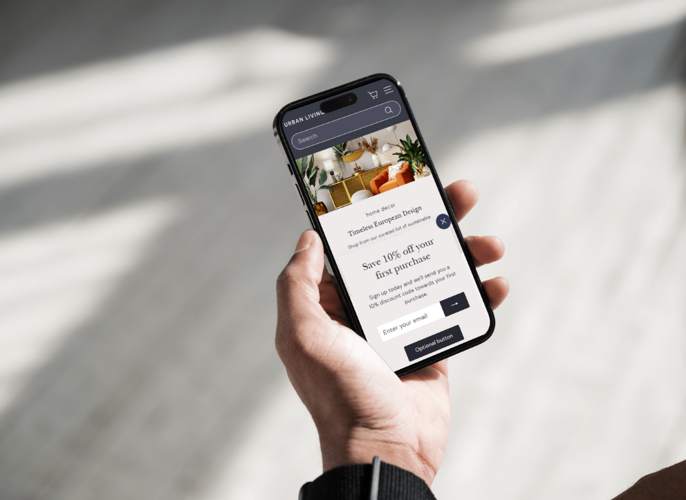
For mobile-first purposes, we suggest you:
- Use responsive web design techniques to guarantee your e-commerce website adapts to different screen sizes. Tools like Bootstrap can help create a flexible grid system.
- Streamline your menu and navigation to make it easy for users to find what they need on smaller screens.
- Design buttons to be easily tappable on touchscreens by maintaining a minimum size of 44×44 pixels
- Regularly test your site on multiple mobile devices as well as browsers to ensure a consistent and smooth user experience.
Related topic: Mobile Web Development: A Comprehensive Guide for 2024 and Beyond
2. Consistent branding
Consistent branding is key for building trust and recognition. A solid visual and verbal identity across all platforms, including e-commerce sites, strengthens your brand image and encourages customer loyalty. Moreover, presenting a brand consistently across all platforms can increase revenue by up to 23%.
To achieve consistent branding on your e-commerce website design, you need to:
- Develop and adhere to brand guidelines that define your color scheme, typography, logo usage, and overall style.
- Ensure that your website’s design elements align with your brand’s visual identity, including consistent use of colors, fonts, and imagery.
3. Fast Loading Times
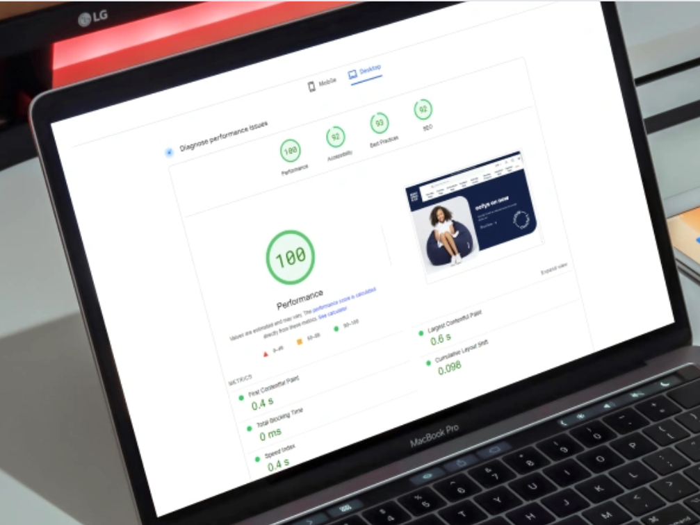
Fast loading times are crucial for retaining visitors and improving search engine rankings. A 1-second delay in page response may lead to a 7% reduction in conversions. Therefore, to enhance conversions for your e-commerce website, it is crucial to:
- Reduce the number of elements on your pages, such as scripts, images, and CSS files, to decrease load times.
- Compress images using tools like TinyPNG or JPEG-Optimizer without compromising quality.
- Use a CDN like Cloudflare or Akamai to distribute your content across various servers worldwide, reducing latency and load times.
Related topic: Website Speed Optimization: 7 Best Tools To Improve
4. Data-Driven Optimization
Using data to drive decisions allows for continuous improvement of your e-commerce site. As per McKinsey‘s findings, companies that use data effectively are 23 times more adept at gaining new customers, six times better at keeping them, and 19 times more likely to see profits.
Apply these data-informed tips to elevate the design of your e-commerce website:
- Conduct A/B tests regularly to compare different versions of web pages or elements to know which performs better. Tools like Optimizely or VWO can facilitate this process.
- Collect and analyze customer feedback through reviews, surveys, as well as direct communication to identify areas for improvement.
- Use heatmaps and session recordings, using tools like Hotjar or Crazy Egg, to understand how users interact with your site and identify any friction points.
- Leverage data to personalize the shopping experience, such as showing relevant product recommendations based on browsing history or previous purchases.
Ready to Elevate Your E-Commerce Website Design?
If you’re looking to elevate your eCommerce site with professional design expertise, look no further than Mageplaza! We offer unmatched e-commerce website design services that boost your brand and supercharge your sales.
Our team of experts combines cutting-edge technology with creative flair to craft e-commerce platforms that truly engage and convert. More than that, we work closely with you to understand your brand’s unique identity, target audience, and business objectives. This enables us to create a personalized website that reflects your brand’s essence and resonates with your customers.
Our services cover every aspect of e-commerce website design, from sleek, modern aesthetics to user-friendly interfaces and seamless integrations. Mageplaza confirms that your commerce website not only looks stunning but also has an exceptional user experience that keeps customers coming back for more.
Partner with Mageplaza and unlock the full potential of your e-commerce website. Contact us today for a personalized consultation, and let us transform your e-commerce vision into a reality.

