


1 min read
|
03-30-2026
Top 10 Fitness Websites for Design Inspiration
Summer Nguyen | 08-08-2024
As we step into 2024, the significance of website design in the fitness industry has never been more pronounced. Beyond being functional platforms, fitness websites serve as powerful tools for attracting, engaging, and converting visitors into dedicated clients. This year has witnessed a remarkable evolution in the design aesthetics and user experience strategies employed by fitness brands. From immersive visuals to intuitive interfaces, these elements are pivotal in defining the digital presence of top fitness websites. Let’s delve into the standout examples that exemplify these trends and redefine the standards of fitness website design in 2024.
Key Elements of A Fitness Website Design
In the realm of fitness websites, captivating design elements are instrumental in not only attracting visitors but also conveying the unique essence of a brand. From dynamic visual effects to personalized training programs, each element plays a vital role in shaping a compelling online presence.
- Dynamic Visual Effects: Incorporating popup image effects like those on Martin Cris’s Day One Fitness website can enhance visual appeal and create a 3D-like experience.
- Personalized Training Programs: Highlighting trainer Sharail’s personalized training programs, which focus on building self-love through customized diet and exercise plans.
- Trainer’s Persona: Using imagery to portray Sharail as approachable and friendly, appealing to potential clients seeking a supportive fitness environment.
- Message of Transformation: These elements not only enhance visual appeal but also effectively communicate a message of personal transformation and individualized care, crucial for attracting and retaining clients in the competitive fitness industry.
By integrating these elements into their website design, fitness professionals can not only captivate visitors with visually engaging content but also foster a sense of trust and connection that encourages long-term client relationships.
10+ Best Fitness Website Design Examples
Day One Fitness
Martin Cris’s Day One Fitness website demonstrates how popup image effects can add dynamism and give it a 3D appearance. Trainer Sharail from Day One Fitness offers personalized training programs that focus on building self-love through changing dietary habits and exercise routines, supported by imagery that portrays Sharail as approachable and friendly.
Popup effects are a great addition to fitness websites as they create a sense of powerful movement — much like how customers transform on these websites.
Key Highlights:
- Enhanced Visual Appeal: Popup image effects add dynamism and a 3D look to the website.
- Personalized Training Programs: Sharail emphasizes self-love through tailored diet and exercise routines.
- Customer Transformation: Mirrors the transformative experience customers have on these websites.
Blue Blairy Fitness
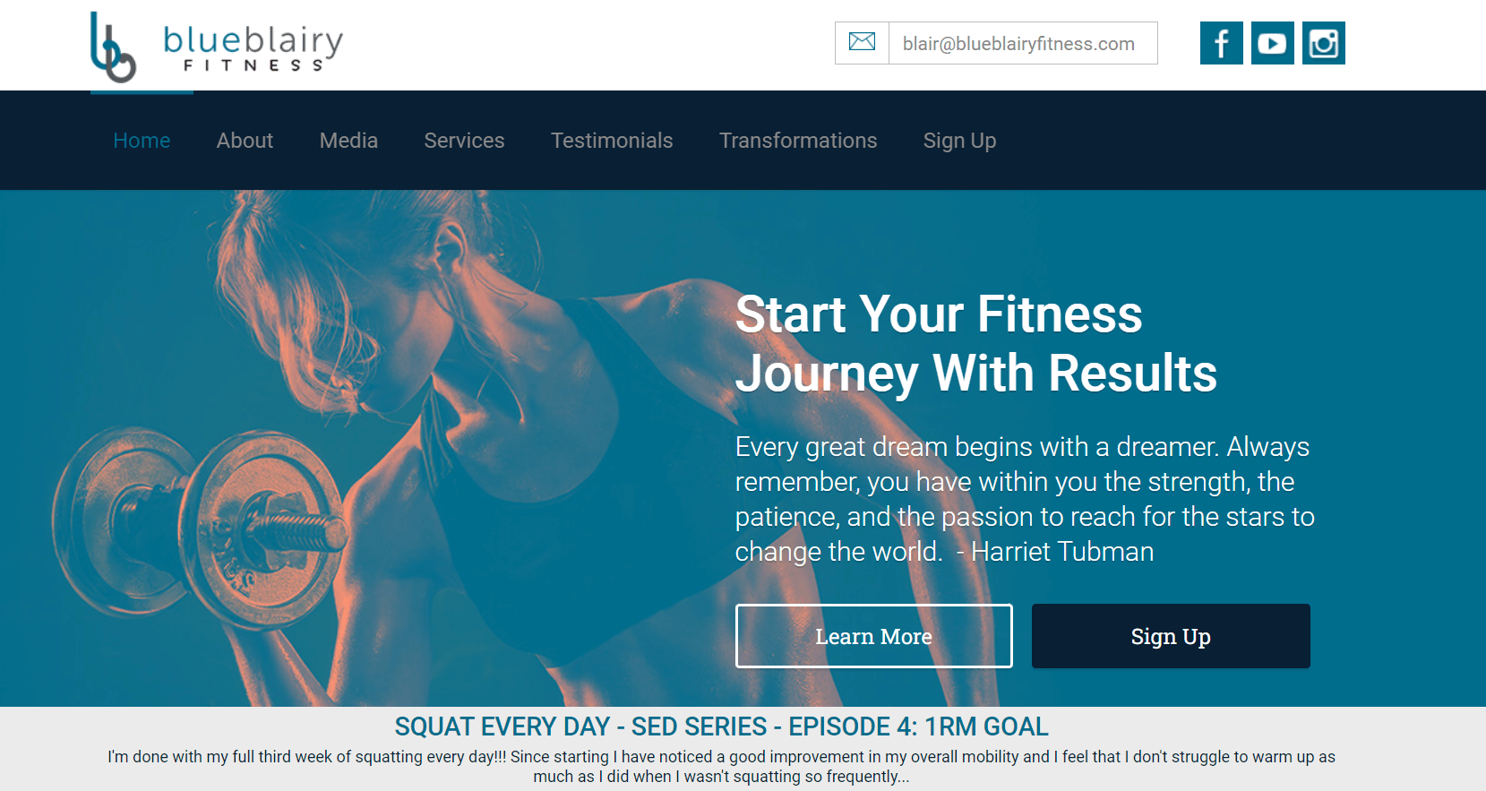
The contact form design on Blair Wyatt’s Blue Blairy Fitness website, crafted by Raul Flores, features a transparent overlay with a background image of weights, giving it a distinctive and appealing look that encourages visitors to get in touch. The subtle opacity softens the intensity of the metal plates and loaded weights, creating a welcoming atmosphere — much like Blair’s contact form, prompting visitors to reach out to find what best suits their needs.
Key Highlights:
- Distinctive Visual Appeal: Transparent overlay with weight-themed background enhances aesthetic appeal.
- Encourages Engagement: Softened design elements invite visitors to initiate contact.
- User-Focused Design: Prompts visitors to seek personalized solutions through contact.
Rebel Fitness
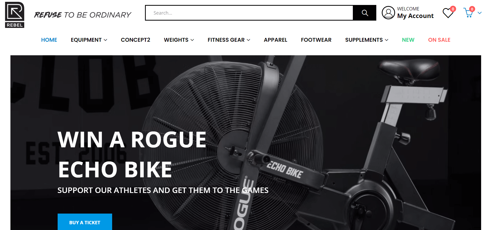
Some fitness customers integrate an e-commerce store as a revenue source, selling goods, supplements, or equipment online. On Rebel Fitness’ website, designed by Red Shark Digital, visitors access the gym’s online store from the menu at the top right corner. Upon selecting an item, clicking “Add to Cart” directs you to the product page where you can choose the desired size.
The cart appears as a popup window each time a product is added, inviting customers to proceed with checkout — a method effective for smaller stores where people typically purchase one or two items.
Key Highlights:
- Efficient E-commerce Integration: Seamlessly integrates an online store into the gym’s website layout.
- User-Friendly Shopping Experience: Simple navigation and quick checkout process enhance customer satisfaction.
- Responsive Cart Feature: Instantly updates and prompts customers to complete their purchases, optimizing conversion rates.
Koreball
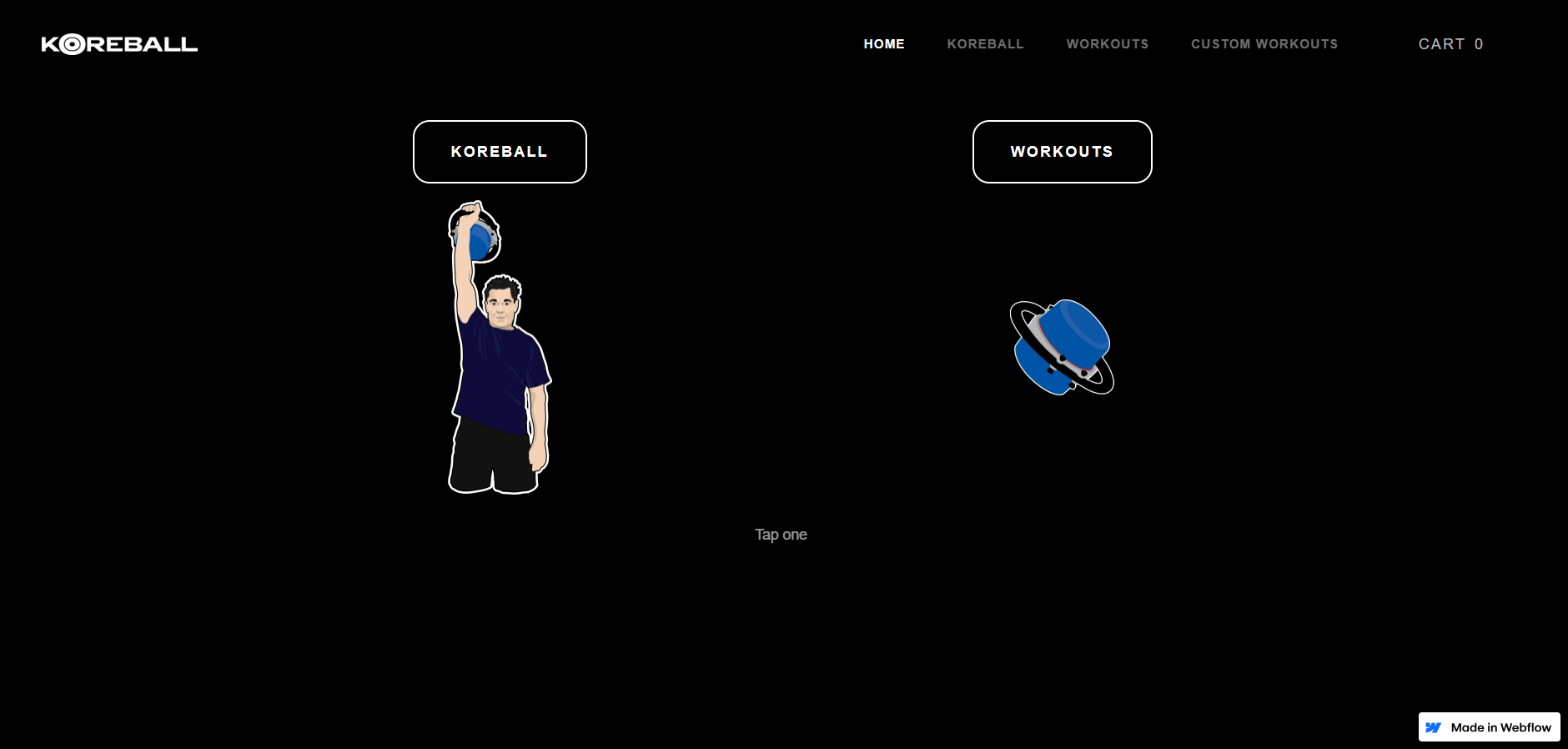
Koreball’s unique landing page design captures visitors’ attention and invites them to interact with the website right from the start.
Clicking on “Koreball” directs visitors to a page where they can purchase the Koreball fitness device, learn how it works, and read its invention story. Clicking on “exercises” guides visitors through a series where they can choose the intensity and duration of workouts they want to do with their Koreball, followed by accessing relevant workout schedules. This web design ensures that both new and experienced Koreball users can quickly find the information they need on the website.
Key Highlights:
- Interactive Design: Engages visitors by offering easy access to purchase options, instructional content, and workout plans.
- User-Friendly Navigation: Facilitates seamless exploration for both beginners and experienced users.
- Empowering Information Layout: Enables users to confidently understand and utilize Koreball, fostering trust and driving sales.
Sean Alexander
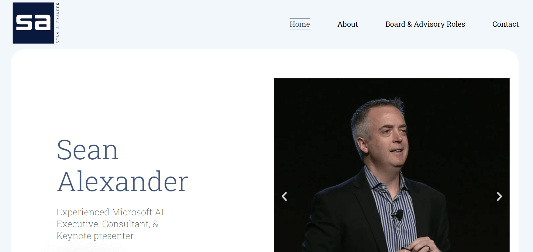
Created by Eikon Labs, this fitness instruction website clearly communicates Sean Alexander’s training method, focusing on overcoming both physical and mental weaknesses. The site uses inspiring copy such as “rise up,” “become the person you want to be,” and “reinforce mindset and rebuild habits” to reflect Sean’s philosophy that muscle building occurs at both physical and mental levels.
Key Highlights:
- Inspiring Messaging: Empowering phrases motivate users to overcome challenges and transform.
- Holistic Approach: Addresses both physical and mental fitness for comprehensive improvement.
- Value Proposition: Clearly demonstrates how fitness training can enhance overall quality of life.
KG Fitness
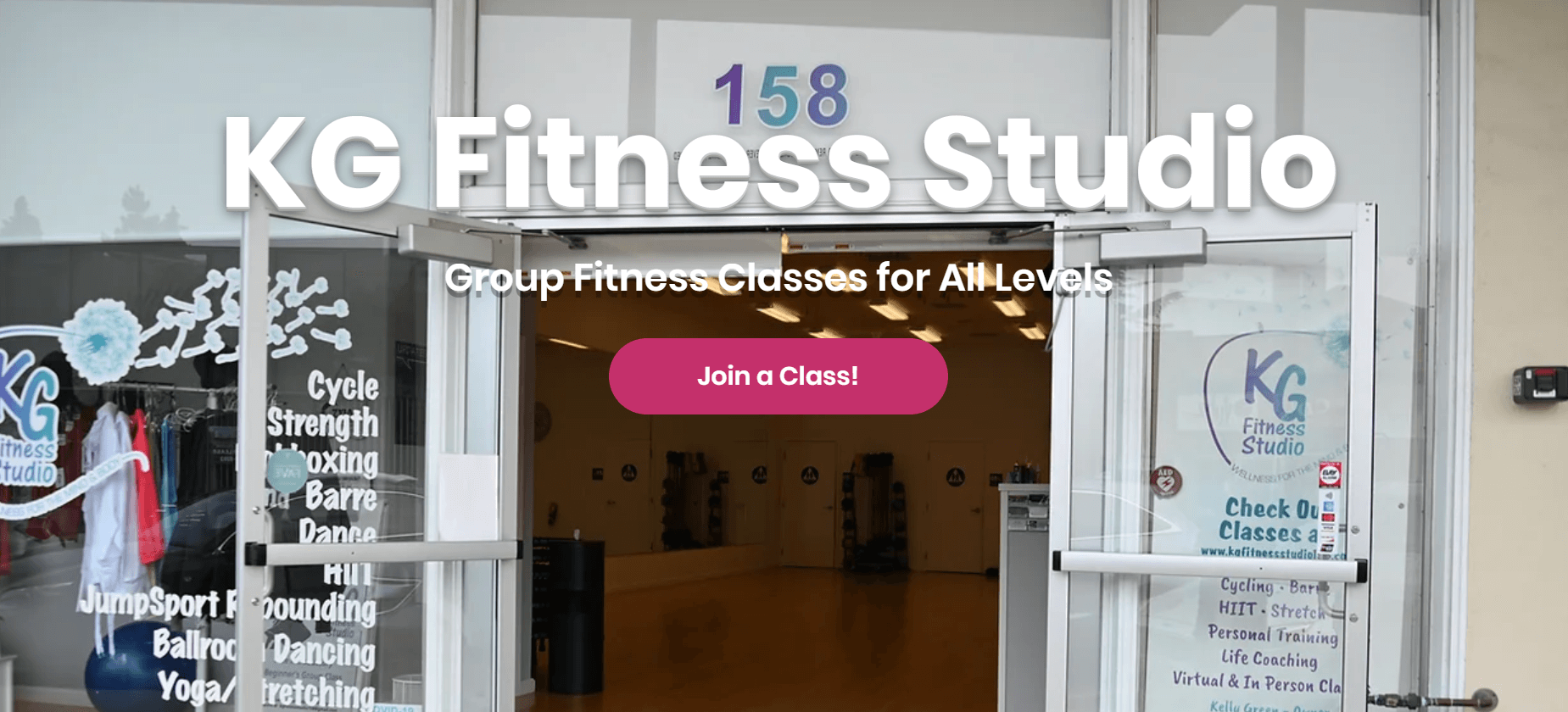
KG Fitness website, designed by Phunk Creative, departs from the typical high-contrast black-and-white intensity often seen on fitness websites, opting instead for a gentle pink-orange color scheme. This modern feminine hue perfectly communicates personal trainer Katie Gawthorp’s empowerment goals through a scientifically grounded approach to health and fitness. The deliberate color choice distinguishes KG Fitness from other fitness websites, helping potential clients clearly understand the brand and encouraging them to engage.
Key Highlights:
- Distinctive Color Palette: Gentle pink-orange tones set KG Fitness apart, conveying modern femininity and empowerment.
- Scientific Approach: Emphasizes a sustainable, evidence-based method for health and fitness.
- Brand Differentiation: Clear color choice helps KG Fitness stand out in the fitness industry, prompting potential clients to make contact.
Ali About Fitness
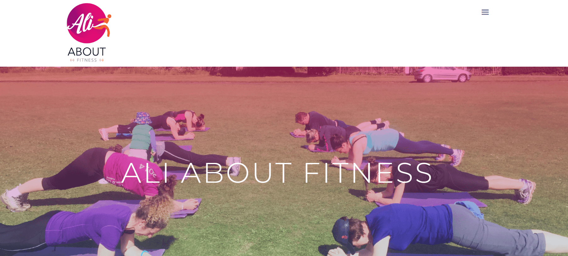
Scrolling down Ali About Fitness’s homepage, designed by Wesley Lyne, you’ll find clickable buttons for each type of class offered. Below each button, images dynamically change based on the class selected, displaying ongoing sessions along with schedules and pricing. For instance, a training event image shows three muddy yet cheerful customers celebrating outdoors, hinting to potential clients that they can experience this by signing up for a class.
Key Highlights:
- Interactive Class Selection: User-friendly buttons for easy access to different class types.
- Dynamic Image Display: Images change to match selected classes, showcasing active sessions.
- Engaging Visual Content: Evocative images encourage potential clients to visualize participating in similar experiences.
Gramz Fitness

Gramz Fitness’s landing page features a background video composed of clips showing a man in a hoodie (the gym owner, Adam McBride, although first-time visitors may not know this) walking along the street and entering the facility. Adam then guides classes and trains clients, giving virtual tours of the gym, making them feel familiar even before stepping inside. Introducing workout videos, trainers, and gym space helps interested customers know what to expect at Gramz Fitness, building trust in the brand and business.
Key Highlights:
- Interactive Background Video: Engages visitors with a virtual tour led by Adam McBride.
- Transparent Introduction: Showcases workouts, training sessions, and gym atmosphere to set clear expectations.
- Brand Trust: Builds confidence by familiarizing potential customers with the gym environment and services.
Sweat FXBG
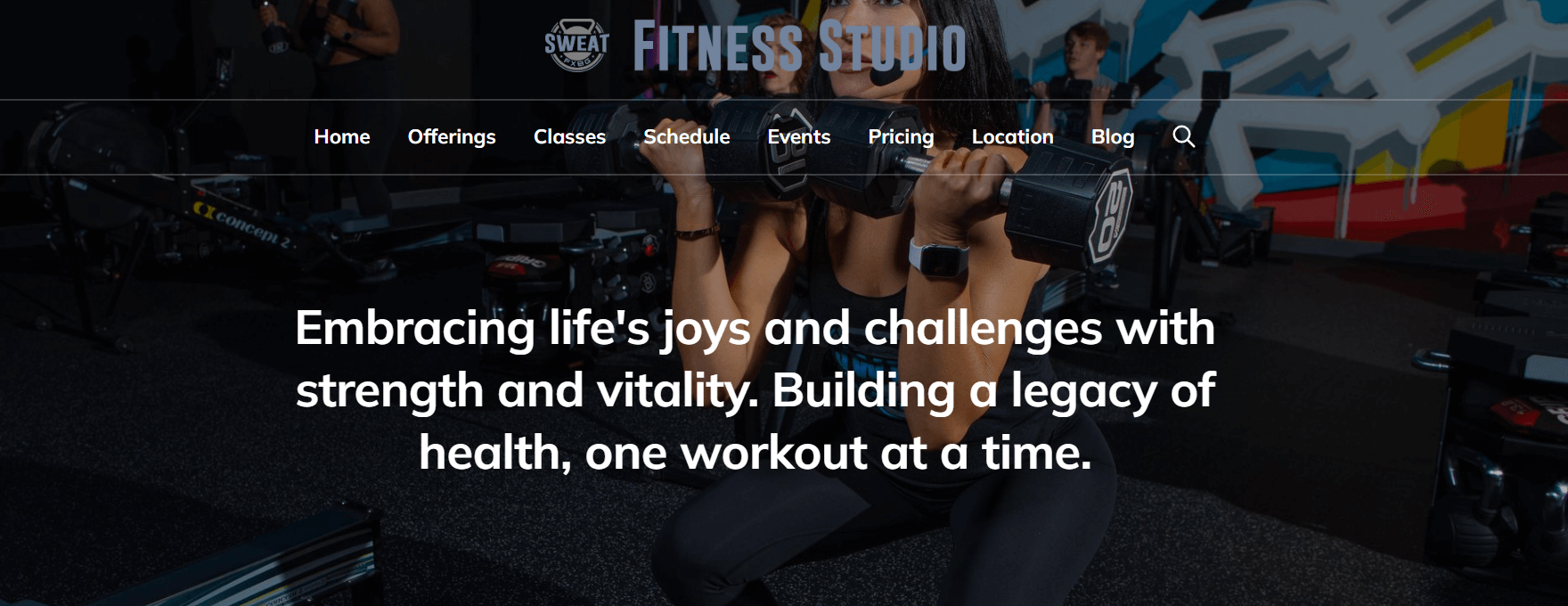
First-time visitors to the Sweat FXBG website immediately understand what the fitness club offers and what their next steps should be. The unmissable value proposition “4 Rooms, 5 Workouts. Welcome to the only gym you need” appears prominently in large white uppercase letters against a solid black background. Sweat FXBG caters to all fitness needs without requiring gym membership or other fitness class prerequisites.
Key Highlights:
- Clear Value Proposition: Highlighted in bold, contrasting colors to immediately communicate benefits.
- Accessible Fitness Options: No membership or class requirements, accommodating all fitness needs.
- Compelling visuals and calls-to-action (CTAs): Presented in high resolution, enrich user interaction.
Planet Fitness
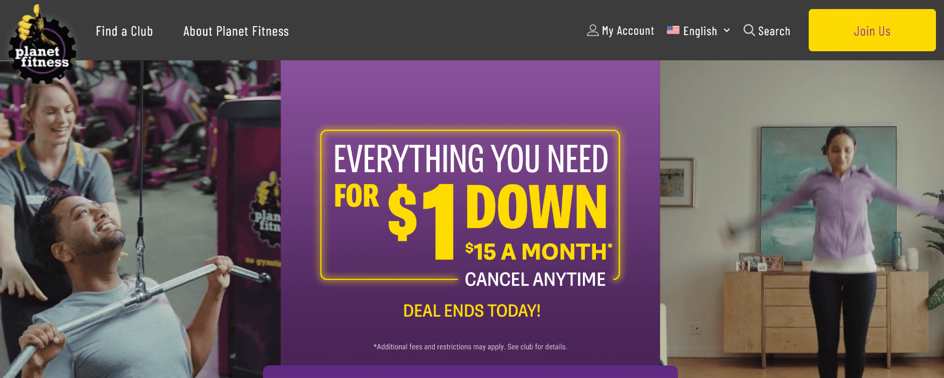
Planet Fitness’s prominent yellow “Join Us” button on the homepage and navigation menu directly links to the location finder, allowing visitors to input their location and find the nearest Planet Fitness gym. This location finder marks the initial stage in a five-step process — displayed through a progress bar — enabling potential customers to explore available Planet Fitness packages, input their personal information, and sign up for membership on the spot.
Key Highlights:
- Direct Location Access: Easily find nearby Planet Fitness gyms by entering your location.
- Conversion Focus: Encourage potential customers to convert by showing them the proximity of your business to their location.
- Progressive Signup Process: Step-by-step progress bar guides users through package selection, personal information input, and immediate membership registration.
Municorn Fasting App
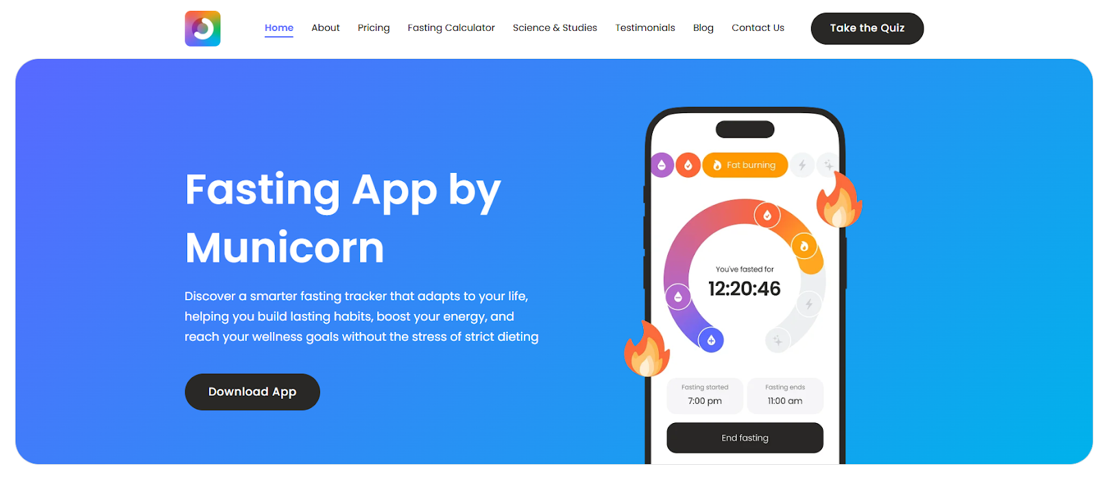
Municorn’s Fasting App site is a great example of a fitness/wellness brand that wins with clarity over clutter. The homepage leads with a simple promise (make intermittent fasting sustainable), then pushes users straight into an action step (like a quiz) rather than burying them in paragraphs. It’s designed like a conversion-focused landing page: clean navigation, confidence-building pages (Testimonials / Studies & Research), and supportive tools (like a fasting calculator) that keep visitors engaged instead of bouncing.
Key Highlights:
- Strong “start here” CTA: The site funnels visitors into a quiz-style onboarding flow, which reduces decision fatigue.
- Utility-led content: Helpful resources like a fasting calculator and educational articles add real value and increase time-on-site.
- Trust + credibility pages: Clear sections for testimonials and studies/research help reassure skeptical users and support conversions.
- Simple, app-first structure: Navigation is minimal (Home, Pricing, Testimonials, Blog, etc.), keeping the user journey straightforward.
Explore more:
- 20 Gym Website Design Examples For Inspiration
- Top 15 Shopify Fitness Stores in 2025 And Why They Succeed
Best Practices To Create A Fitness Website Design
The first step in producing a website for a gym, personal trainer, or other fitness company is to decide the type of website you need to build. For example, a website for a solo intimate trainer might look more like a personal website, whereas a local fitness center would require a small businessfriendly site.
At a minimum, fitness websites should include:
- An engaging landing page with compelling Calls-to-Action (CTAs)
- Details about available services and their pricing
- A page like “About Us”, “Our Story”, or “Why Train with Us?” to provide a clear value proposition
- A contact page
These are the basics, but top fitness websites go beyond. Here are five tips to take your website further:
Prioritize User Experience (UX)
Web users aren’t always patient. If your website is hard to navigate, you’ll lose potential customers. Since most people browse on mobile devices, ensure your website has excellent mobile functionality and clear navigation to enhance user flow.
Capture the workout experience at the gym or with fitness experts
Include images or videos of happy customers achieving their goals, along with testimonials where visitors can hear from satisfied clients. Consider adding a workout video to provide a preview of classes. Anything that helps visitors understand what the business offers — whether it’s personalized coaching or a vibrant class atmosphere — should be highlighted.
Find subtle ways to showcase brand identity
By following a structured design process, start by discussing goals, audience, competitors, and products with clients. To create a unique website design based on that information, carefully consider color schemes, typography, and layout.
Use physical and psychological effects of different colors to your advantage
For example, red and yellow increase heart rates (and wearing red uniforms can even give athletes an edge in close competitions), while cool colors may increase purchasing intent. Decide which colors best convey what customers are selling.
Carefully consider the structure of the website
The website structure highlights the most important content. Including online class schedules and scheduling consultations or training sessions is a good idea. These features encourage potential customers to think about organizing classes into their schedule – or actually scheduling a class. Setting up these features through Webflow’s calendar and scheduling integration is very easy.
Experiment with creative image presentation
Use high-quality images and experiment with other design elements to introduce active exercises and make visitors want to watch. Image effects, color transition filters, mouse-over effects on images, or changes in transparency can give your website a unique visual experience that attracts visitors.
Summary
In conclusion, the landscape of fitness website design in 2024 reflects a blend of creativity, functionality, and user-centricity. The showcased examples highlight how effective design can elevate user experience through compelling visuals, personalized content, and seamless navigation. By adopting these innovative approaches, fitness brands not only attract prospective clients but also foster enduring relationships based on trust and value. Looking ahead, staying abreast of evolving design trends will be essential for fitness websites aiming to maintain their competitive edge and meet the dynamic expectations of today’s digital-savvy fitness community.
Table of content

Summer is the CMO and Digital Commerce Solution Expert with 10+ years of experience. She specializes in Magento, Shopify, ERP, CRM, AI, and Blockchain, delivering strategic solutions that transform businesses. With a deep understanding of digital commerce, she helps brands scale and stay ahead in a competitive market.
Related Post


Magento 2.4.9 Beta Release: What's New?
Magento 2.4.9 beta is here. Stay up to date with every release milestone with this regularly updated guide.
11 mins read
|
03-17-2026

Google Analytics Website Traffic: The A–Z Guide for Magento 2 Store Owners
Learn how to analyze website traffic in Google Analytics 4, identify high-quality traffic sources, and grow your Magento 2 store with data-driven insights.
18 mins read
|
03-17-2026

The Complete Guide to UTM Parameters & Google Analytics for Magento website
Master UTM parameters and Google Analytics for Magento. Track traffic sources, measure campaign performance, and practical tips to use it for better business decisions.
9 mins read
|
10-05-2025

How to implement Cookie Consent for GTM & Google Analytics in Magento Under GDPR?
Implement cookie consent for GTM & GA4 in Magento under GDPR. Step-by-step guide using Google Consent Mode v2 to avoid fines and maintain analytics.
15 mins read
|
02-27-2026

Speed vs. Sales: Comparing Hyvä Checkout and Mageplaza One Step Checkout
Learn how Hyvä Checkout and Mageplaza One Step Checkout impact order completion rates and revenue growth.
8 mins read
|
02-25-2026
1 min read
|
03-30-2026
Magento 2.4.9 Beta Release: What's New?
Magento 2.4.9 beta is here. Stay up to date with every release milestone with this regularly updated guide.
11 mins read
|
03-17-2026
Google Analytics Website Traffic: The A–Z Guide for Magento 2 Store Owners
Learn how to analyze website traffic in Google Analytics 4, identify high-quality traffic sources, and grow your Magento 2 store with data-driven insights.
18 mins read
|
03-17-2026
The Complete Guide to UTM Parameters & Google Analytics for Magento website
Master UTM parameters and Google Analytics for Magento. Track traffic sources, measure campaign performance, and practical tips to use it for better business decisions.
9 mins read
|
10-05-2025
How to implement Cookie Consent for GTM & Google Analytics in Magento Under GDPR?
Implement cookie consent for GTM & GA4 in Magento under GDPR. Step-by-step guide using Google Consent Mode v2 to avoid fines and maintain analytics.
15 mins read
|
02-27-2026
Speed vs. Sales: Comparing Hyvä Checkout and Mageplaza One Step Checkout
Learn how Hyvä Checkout and Mageplaza One Step Checkout impact order completion rates and revenue growth.
8 mins read
|
02-25-2026