Best Florist Web Design of 2024: 20 Inspiring Examples
Summer Nguyen | 08-15-2024
Finding the right florist web design can make a big difference in attracting and keeping customers. As we look at the best designs of 2024, we see a variety of styles that make florist websites both beautiful and functional. From clean, modern looks to interactive features, these websites show how a great design can highlight your flowers and improve the shopping experience. In this guide, we’ll explore 20 standout florist websites that offer fresh ideas and inspiration for creating an eye-catching and effective online presence.
15+ Best Florist Web Design Examples
Esscents of Flowers
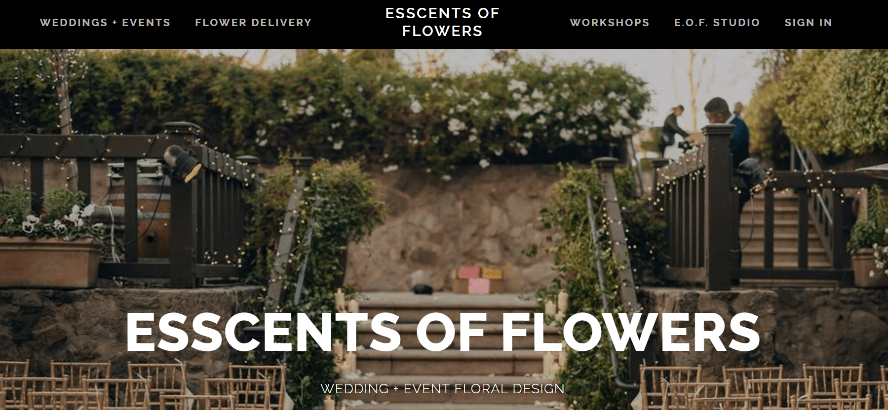
Esscents of Flowers in Oakland stands out as an exemplary flower shop website that captures attention and boosts conversions. Upon entering the homepage, I was instantly captivated by its layout and classic style.
Elegant, clean, and splendid. A warm color palette and a full-width hero image showcasing wedding designs instill confidence in this studio and encourage visitors to explore further. The headings clearly outline the available services, enhancing the user experience.
Esscents of Flowers also features a first-person story from the owner, who shares her vision and approach to floral design. This builds an emotional connection that can attract more potential customers.
What we love: The website greets you with a popup offering a 10% discount on your first purchase. This effectively attracts potential customers.
Starbright Floral Design
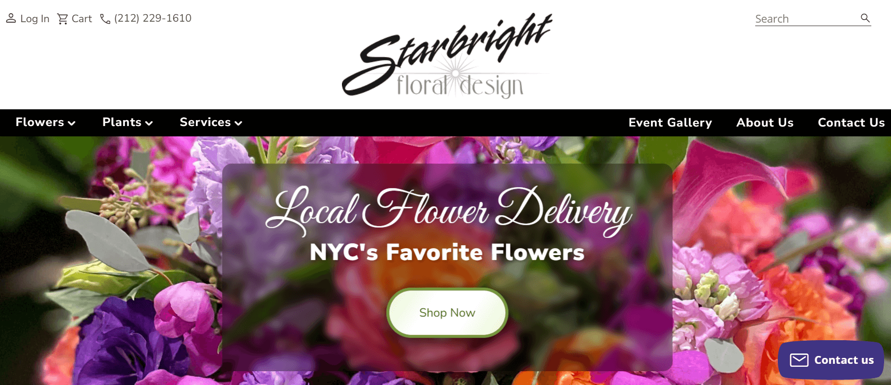
Starbright Floral Design offers a unique blend of smart calls-to-action and personal branding.
The homepage is divided into two sections. On the left, there is a slideshow showcasing new products and awards for the best-selling items in NYC. On the right, you can read a brief story about the shop’s owner, recognized as one of NYC’s top florists. This feature enhances credibility and builds trust with visitors.
What we like: The flower menu below includes an engaging option—flowers based on your zodiac sign. It provides a personalized shopping experience.
Scotts Flowers
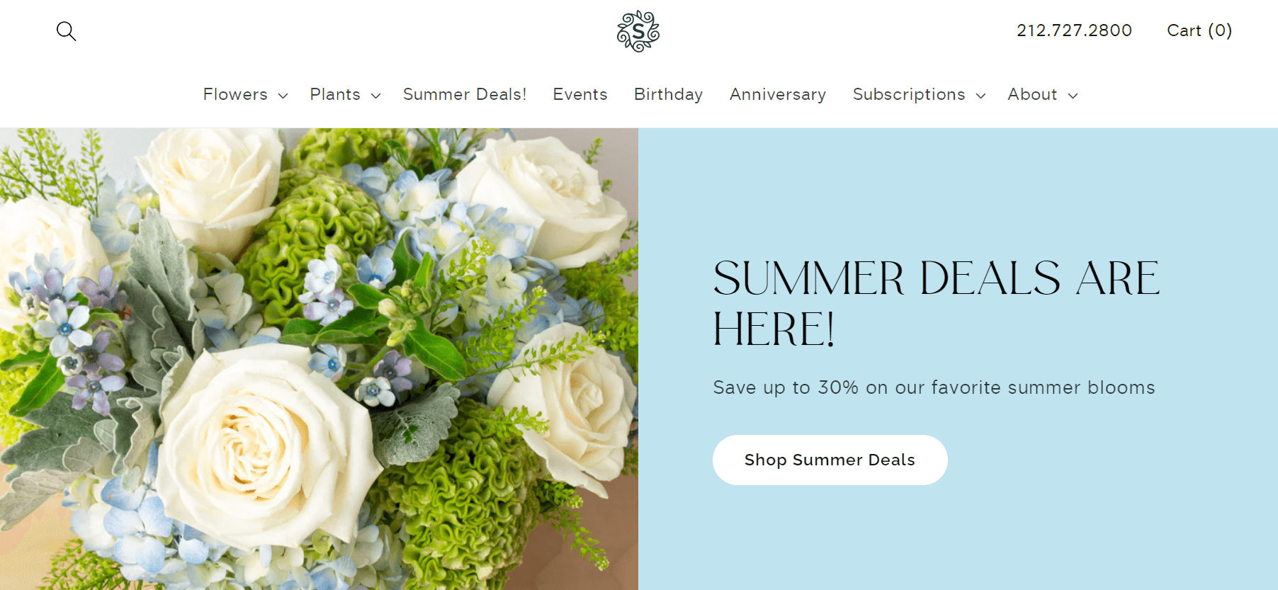
Scotts Flowers enables shoppers to purchase flowers for any occasion with ease. The menu bar directs you to the relevant flower categories and allows you to select a delivery date.
On the homepage, you’ll find current deals, a chatbot for quick contact with the seller, and a daily flower-picking schedule.
What we appreciate: Scrolling down reveals an integrated Instagram feed that adds vibrancy to the website and showcases the people behind the flower shop.
Elan Flowers
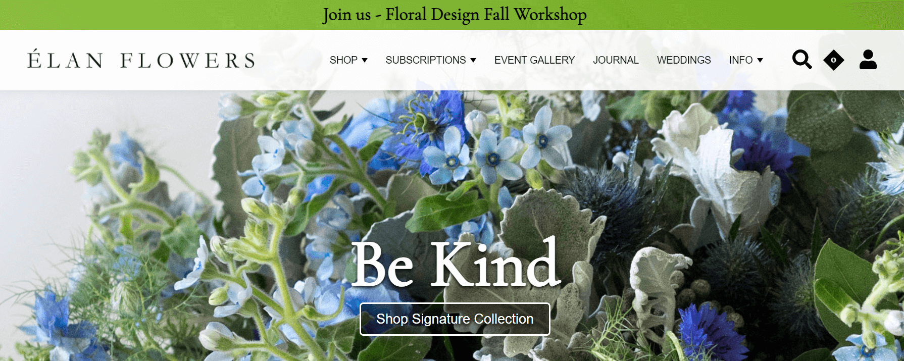
Visiting Elan Flowers feels like stepping into a verdant showroom. The stunning full-screen hero images of vibrant greenery will draw you in, encouraging you to explore their range of plants and perhaps take home a new green friend or a bouquet.
What we like: The “Flower Subscription” option allows users to sign up for weekly or monthly flower deliveries, making it convenient for those who need fresh blooms regularly.
Arena Flowers
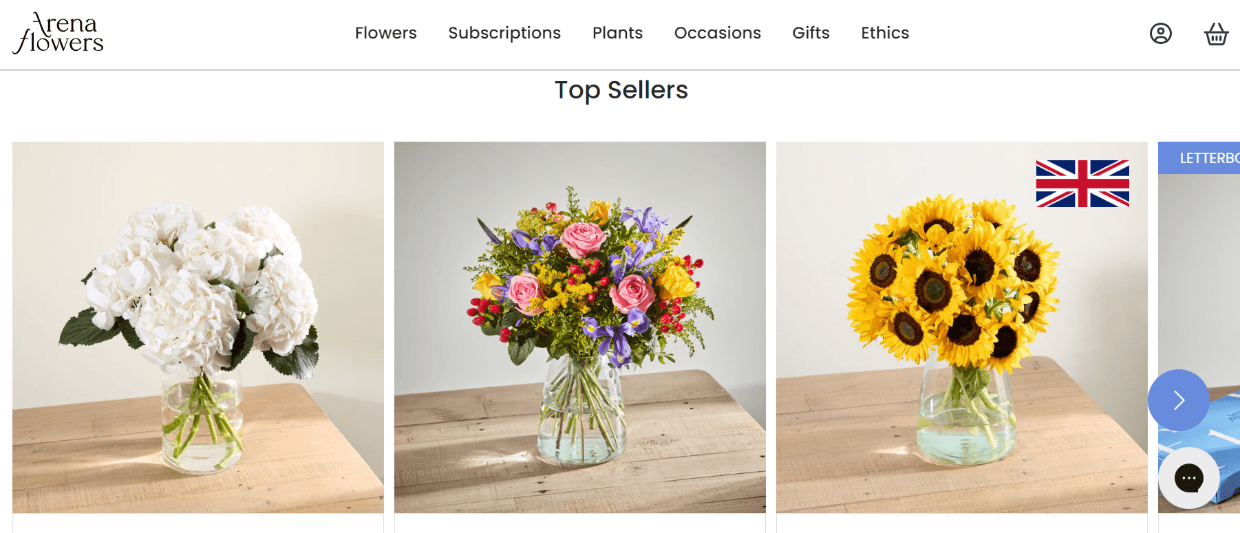
When you visit the Arena Flowers website, you’ll experience a vibrant and cheerful atmosphere with a beautiful mix of pink, purple, and green. The modern graphics and user-friendly layout make navigation easy.
Attractive promotions are prominently featured on the homepage, along with useful information about delivery options and flower care tips.
Arena Flowers is also one of the few flower shops that encourages customer reviews and media coverage. Consider incorporating these elements into your website to build trust with visitors from the start.
What we like: The grid layout displaying the bouquet menu offers a perfect balance between large images and ample white space.
FloraQueen
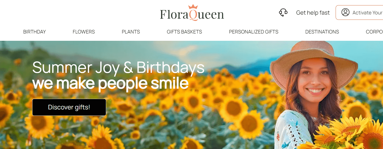
FloraQueen is an exemplary online flower shop with robust e-commerce features. Let’s dive in.
FloraQueen offers real-time order tracking, which adds reassurance for customers. The website also includes a convenient search menu where you can select the delivery date, city, occasion, and flower type. This allows visitors to quickly find available products and saves time on their search.
What we like: FloraQueen encourages visitors to log in to access discounts and special offers. In the top-right corner, you’ll notice a small pop-up window for these promotions.
Plantshed
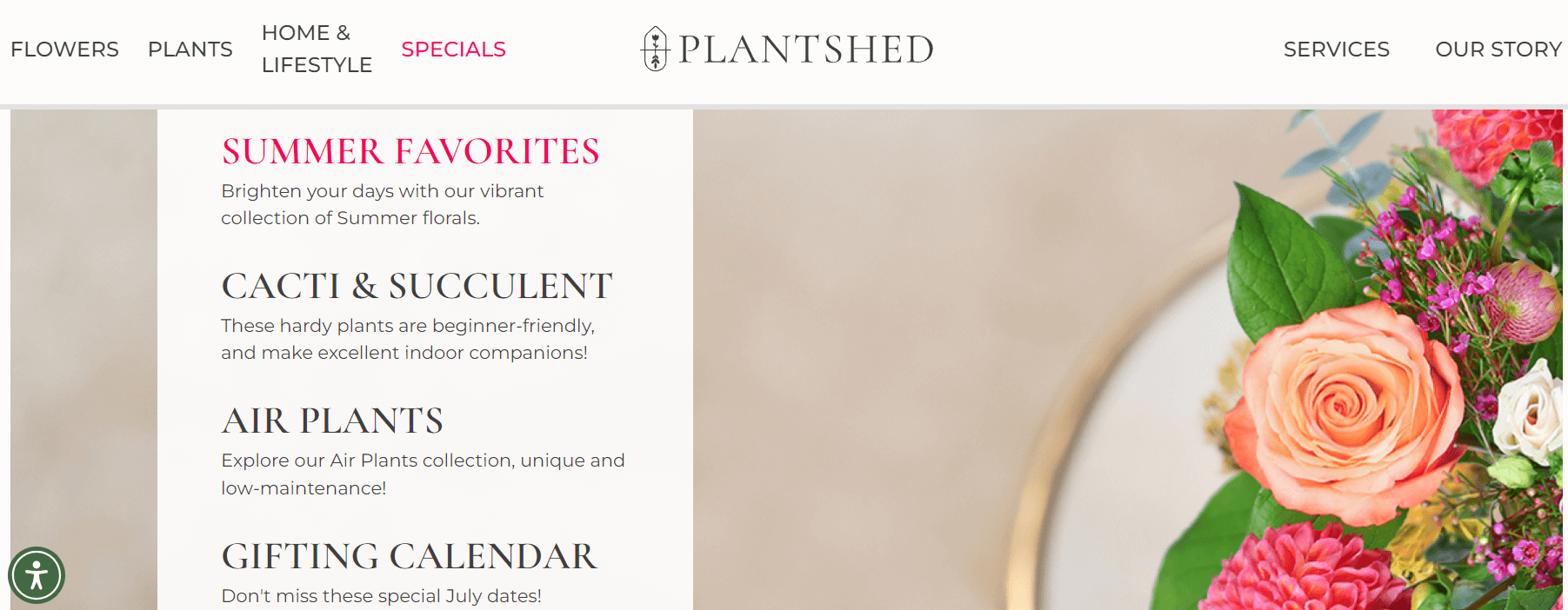
Welcome to one of the most elegant and inviting flower shop websites. The homepage offers valuable information about various services, including online shopping, event flowers, and in-store café options. You’ll also find details on current deals and updates about new plant arrivals.
Plantshed’s website features a section where you can read customer reviews. Seeing social proof is particularly useful before purchasing plants.
Plantshed also invites visitors to check out their blog for plant care tips and floral styling advice. Adding a blog to your website can offer similar advantages.
What we like: The white tones create a serene atmosphere that blends beautifully with the vibrant illustrative images throughout the site.
PETAL AND POST
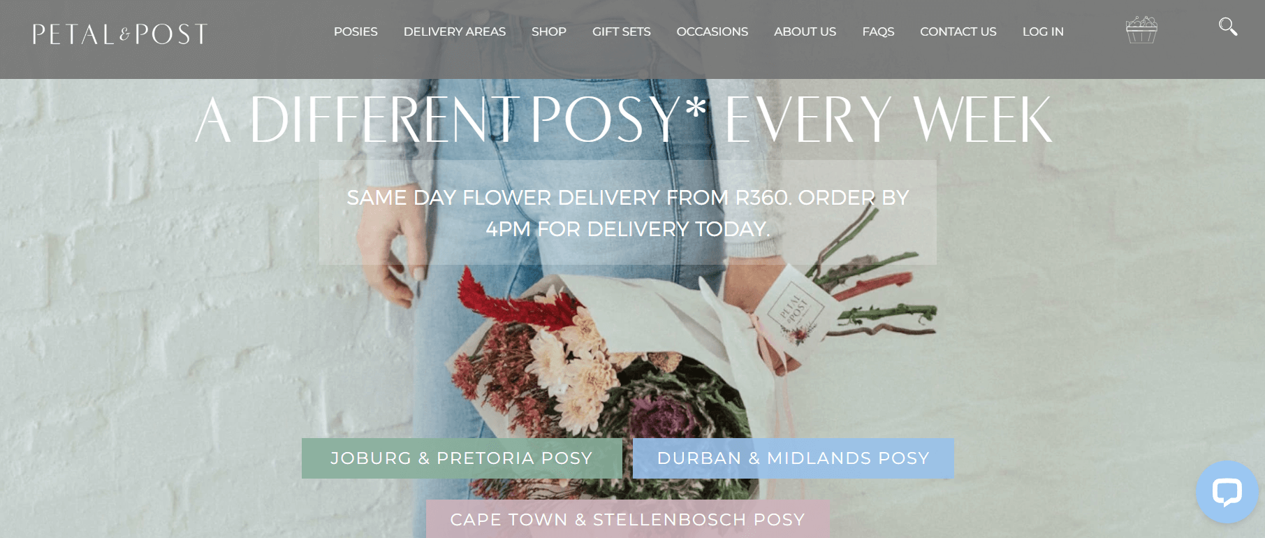
Petal and Post is unique in that it does not feature a flower menu on its homepage. Instead of showcasing any flowers, the site tells the story of a daily bouquet crafted from the freshest seasonal blooms directly sourced from the farm.
What sets this florist apart is that they update their posy selection every day at 7 a.m. If you wish, you can add a bouquet to your cart, choose the size, and expect same-day delivery.
What we like: The website includes a customer review section, options for pre-ordering, and a subscription service for weekly or monthly flower deliveries.
Julia Testa
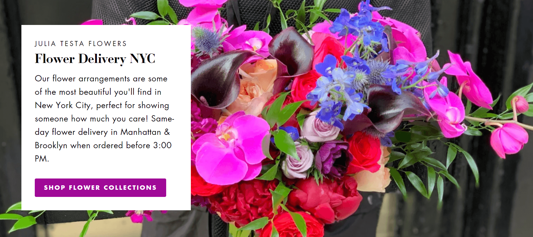
Julia Testa’s website features a refined color palette that exudes sophistication. Want your site to achieve a similar effect? Consider using a dark background with vibrant red and green accents in full-width bouquet images. This balanced mix guarantees a pleasant viewing experience for visitors.
Throughout the site, you’ll also find neatly organized flower collections and Testa’s work displayed in a grid format.
What we like: Overall, Julia Testa’s website is a great example of a minimalist flower shop site that you can replicate using a WordPress theme.
Flowers For Everyone
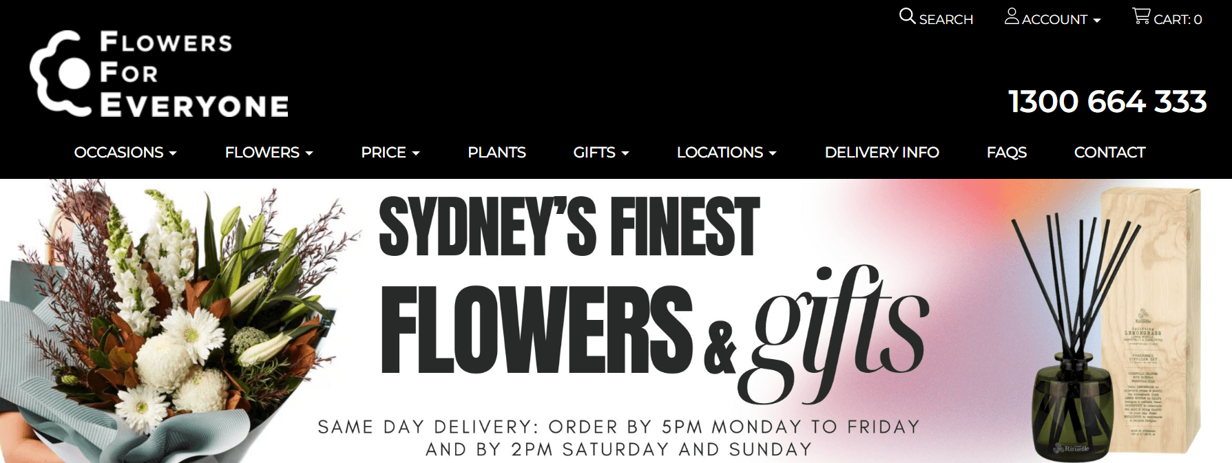
Flowers for Everyone features a classic e-commerce design that includes all the essential elements to attract visitors to your marketing channel. Right from the start, the website creates a warm welcome with deals displayed on static hero images and in the header. Below this, you’ll find the flower menu.
A standout aspect is how the site is optimized for SEO. Each landing page includes descriptive text at the bottom and a Frequently Asked Questions section. Additionally, every product page features a detailed product description.
According to Semrush, this strategy has helped Flowers for Everyone achieve 1,530 positions in the People Also Ask section of search engine results.
What we like: The website competes in the top 10 for high-volume search keywords like “flower delivery in Sydney.”
Flowers by Jordan Marie
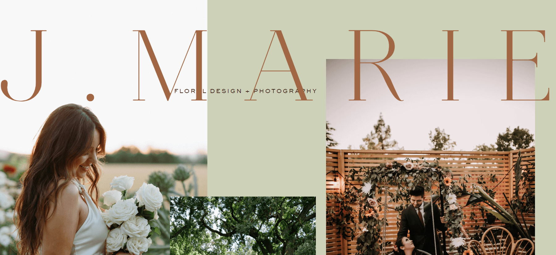
Flowers by Jordan Marie features a stunning website with a sophisticated contemporary style. The ivory and beige color scheme exudes elegance and creates a charming atmosphere. Additionally, the site utilizes classic typography and full-width images to enhance its visual appeal.
What we like: You can explore Jordan Marie’s flower catalog and immerse yourself in the beautiful grid layout that highlights every intricate detail of her exquisite bouquets.
Flower Lane & Co
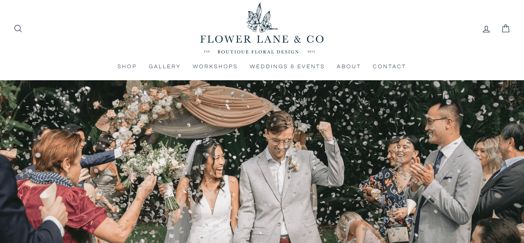
Flower Lane & Co really knows how to showcase their flowers! As soon as you visit their website, you’re greeted by stunning full-width images highlighting their services — from floral workshops to wedding decorations and their shop.
As you scroll down, they outline all the reasons why you should choose them. The highlight is their flower collection, displayed with large, striking images against a gray background.
What we like: The beautiful imagery on NetFlorist draws visitors into the website.
Rooted Floral
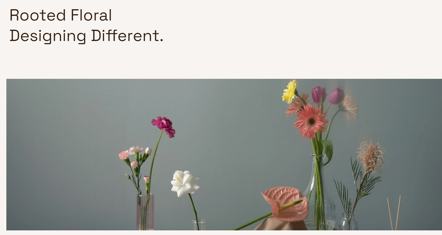
Rooted Floral takes video and color to the next level! Instead of using dull image galleries and full-width photos, Rooted Floral fills the site with short video clips. This adds an extra layer of interactivity and user trust. Vertical videos are also a trendy design choice for 2023.
Pro tip: Incorporate videos throughout your website. Customers are more likely to place orders on modern, engaging sites rather than those with static galleries reminiscent of the early 2000s.
La Vie en Rose Florist
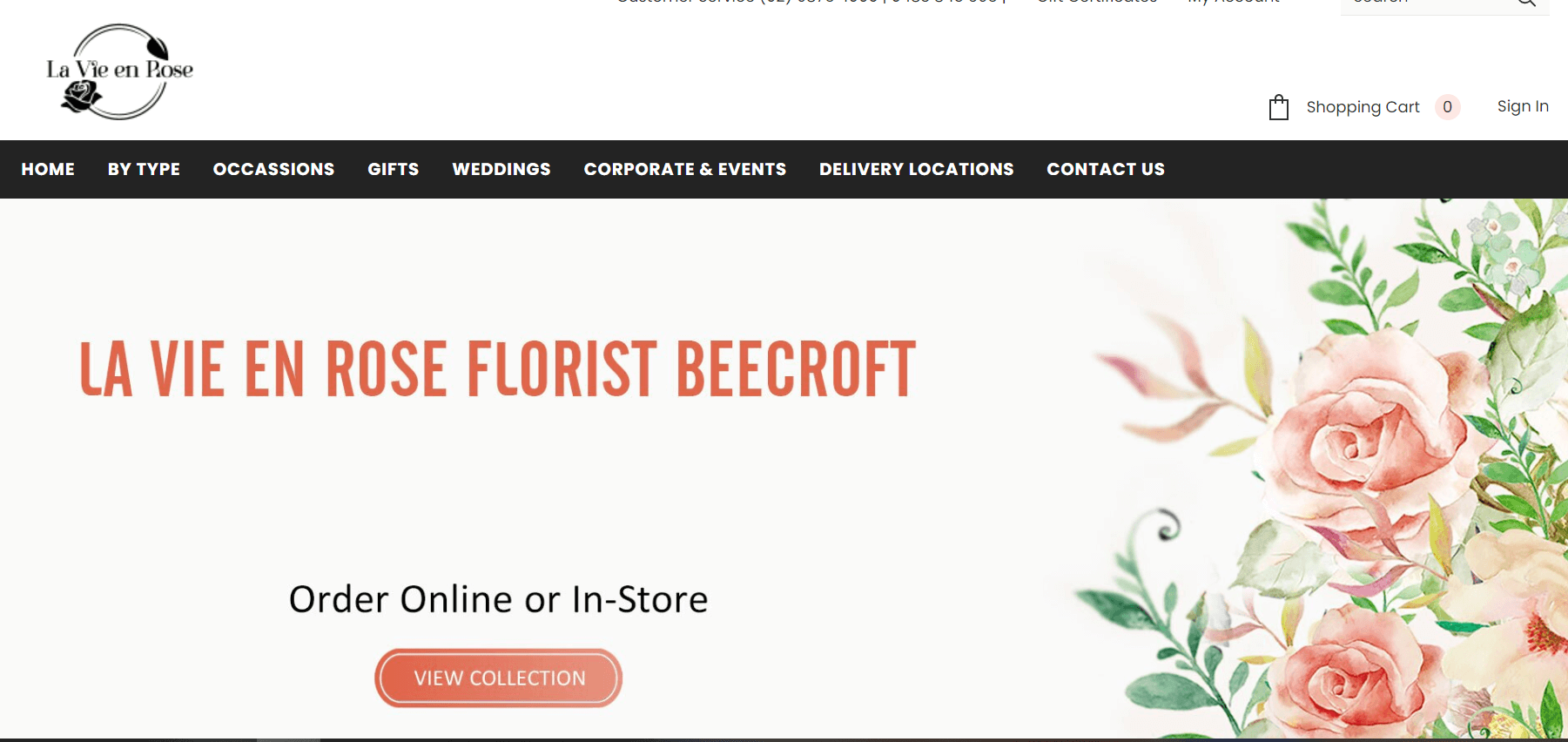
La Vie en Rose Florist features a minimalist and elegant website that highlights its core services. The homepage invites you to explore the range of flowers available for delivery.
As you continue to scroll, you will come across a section showcasing La Vie en Rose’s beautiful floral arrangements for weddings and events. Further down, you can enjoy discovering their latest products, trends, and featured items.
What we like: The layout of the homepage modules tells a story. La Vie en Rose effectively shares the story of their business and what they offer right on the main page, drawing visitors in.
Flower Chimp

FlowerChimps’ homepage exudes charm with its vibrant color scheme featuring soft pinks and greens that create a celebratory mood and invite exploration of the flower menu.
The site also includes an integrated search box for floral arrangements, allowing you to specify your theme and budget. This feature is highly convenient for visitors, as they can easily find what they’re looking for without endless browsing, even if they aren’t knowledgeable about flowers.
Pro tip: Create specialized categories, such as mood or theme, to make searching easier.
French Florist
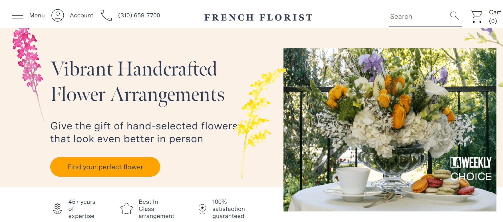
FrenchFlorist offers an elegant and visually appealing flower shop website with a soft color palette. The homepage is striking, featuring four slides showcasing various floral arrangements and bouquets. Customers can passively explore the services without needing to scroll.
The well-organized dropdown menu provides quick access to categories such as pet-friendly plants and flowers for specific occasions. The site also integrates an Instagram feed and a testimonials section, including endorsements from notable clients like Dior.
The FrenchFlorist homepage forms a warm and inviting atmosphere, encouraging visitors to explore a wide range of flowers and gift baskets.
Pro tip: Implement a pop-up for first-time visitors offering a $10 discount in exchange for their email address.
Ballard Blossom
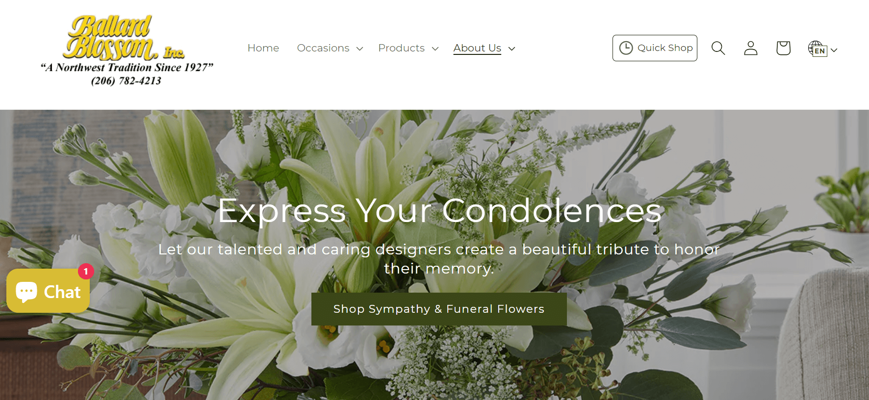
Ballard Blossom is another great example of a simple website design that beginners can easily implement. While it doesn’t feature advanced technology or stunning animations, the site makes smart use of space.
It combines full-width images with calls to action (CTAs) and a grid layout for flower selections, creating a smooth shopping and browsing experience.
What we like: The website collects customer reviews from verified buyers.
Tips To Design A Florist Web Design
Get Inspired
Before preparing your flower shop website, you should begin by exploring other flower shop websites to gather inspiration. You need to observe which elements, such as color schemes and layouts, plead to you the most. To comprehend the user experience better, try putting an order or scheduling an appointment on these websites.
Additionally, remember that inspiration can come from a variety of sources. Therefore, you should explore different types of websites to discover new ideas.
Choose Your Colors
You need to select a color palette that reflects your personal preferences and complements the flowers you plan to feature on your website. Choose colors that enhance the visual appeal of the flowers and create the desired atmosphere. For example, if you want to convey a calming and inviting feeling, you should consider using soft pinks, greens, or beiges. These pastel and earthy tones are popular in contemporary web design.
Pick a CMS or Website Builder
After assembling stimulation and choosing your color scheme, you should select a Content Management System (CMS) such as WordPress, Drupal, HubSpot, or Joomla to build and manage your website. Ensure that the CMS you choose supports e-commerce functionality for selling flowers online. It should also be responsive, meaning it looks appealing on both desktop and mobile devices. The CMS should be user-friendly and not require advanced coding skills. It must accommodate the growth of your business without needing significant changes.
Select a Theme
You should choose a pre-designed theme that allows you to customize the appearance of your site without needing to write code. The theme should feature a responsive design to ensure your site looks good on all devices. It should integrate with social media platforms for easy sharing and promotion. The theme must offer customization options for colors and fonts to align with your branding.
Furthermore, you might consider features like a gift option that enables customers to send flowers to others, a custom bouquet feature allowing customers to design their own arrangements, and an order tracking feature to keep customers informed about their buys.
Choose Your Images
When picking images for your website, you should use quality photos to make your site visually appealing. Ensure that your images are well-lit and have clean, simple backgrounds. Quality images will help display your flowers effectively and attract possible customers to your site.
Summary
As we wrap up our look at the top florist web designs of 2024, it’s clear that a great website is essential for standing out and engaging customers. The examples we’ve covered show a range of styles and features that can enhance your own site. By using these ideas and focusing on design, navigation, and personalization, you can create a website that attracts visitors and keeps them coming back. Take these insights to improve your florist website and make it shine in the online floral market.

