15+ Best Jewelry Website Designs to Explore
Summer Nguyen | 08-14-2024
In today’s digital age, having an ergonomic website is compulsory for any business, especially in the jewelry industry, where visual appeal and user experience play key roles in attracting customers. A spectacular and functional website can significantly boost a brand’s online presence, engage possible customers, and drive sales. This blog post will explore 15+ of the best jewelry web design examples in 2024, showcasing a variety of styles and features that can inspire your own website.
Explore Top 15+ Jewelry Web Design Examples
Greenwhich Jewelers

Built with: Wix
Key Features:
- Stunning visuals
- Clean design
- Excellent chat functionality
Greenwich St. Jewelers is a small, family-owned business run by New York locals. If you appreciate websites with beautiful images, a clean design, and great chat features, this is the site to visit! Greenwich offers a well-organized layout that showcases jewelry pieces sure to meet your needs.
Aurora
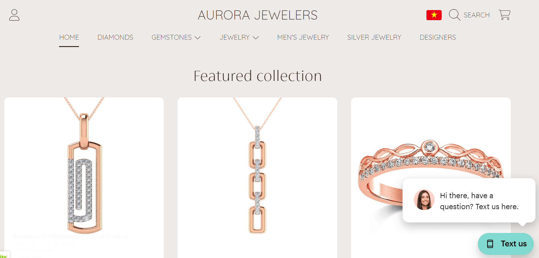
Built with: Drag & Drop Website Builder
Key Features:
- Quick jewelry website setup
- No coding or design experience required
- Includes domain and hosting
Ready to launch a stunning jewelry website in no time? With Aurora, you can achieve this effortlessly.
No need for coding or design expertise! Plus, Aurora takes care of both the domain and hosting for you—talk about convenience!
Pre-designed templates and features allow for seamless customization. You can even start selling jewelry online, begin blogging, and showcase your store’s location on Google Maps.
ISLYNYC
Built with: Wix
Key Features:
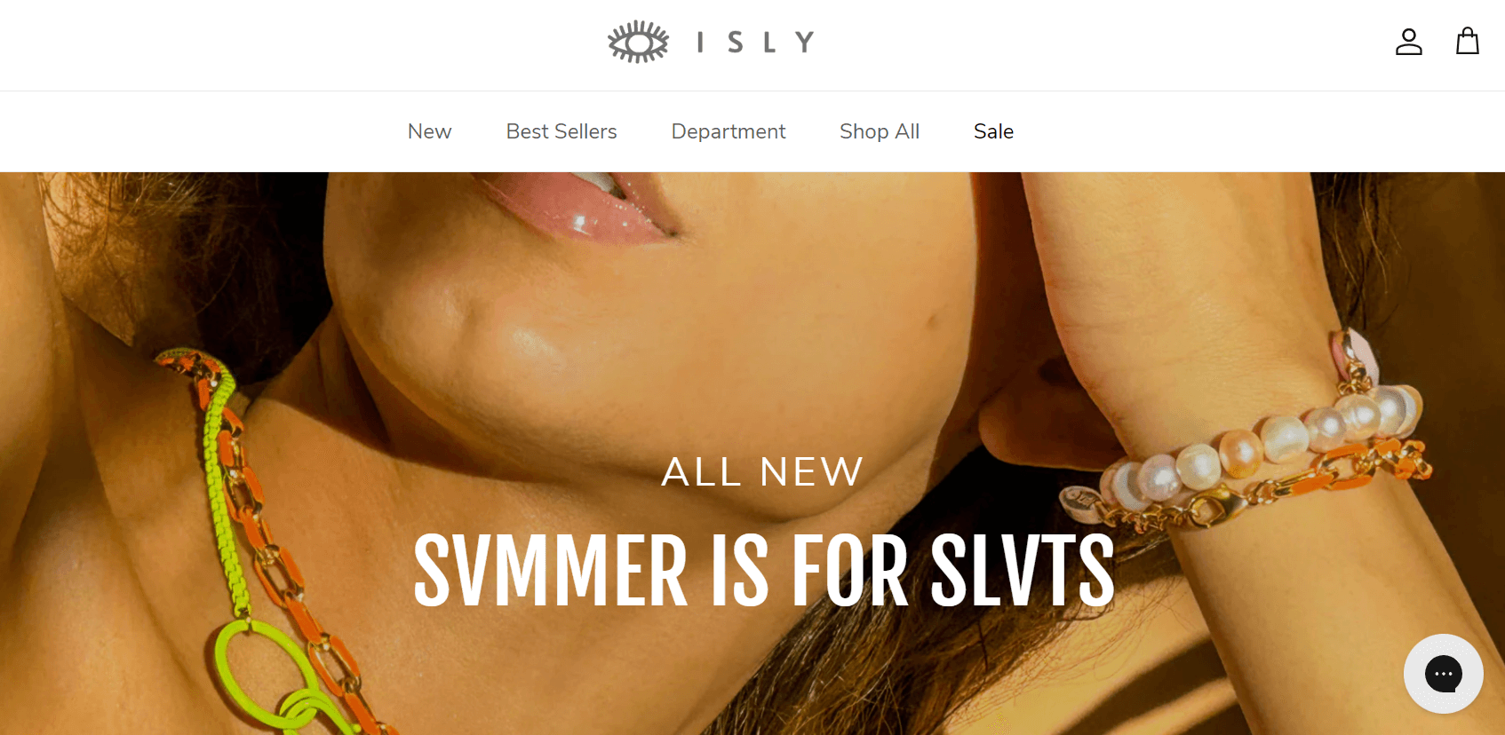
- Unique web design
- Bold colors and shapes
- Vibrant website feel
ISLYNYC is a brand of laser-cut acrylic jewelry and accessories founded by Carrie Morrissey in Brooklyn, New York. Their small team of professional artisans is passionate about art and unique ideas. You’ll love how this website’s logo artistically blends with stylish fonts!
Charriol

Created with: Shopify
Key Features:
- Brand-focused web presence
- High-quality imagery
- Elegant design elements
Expand your business by establishing a strong web presence to market your brand. Many brands have recognized the power and potential of websites in promoting their products and services. Charriol exemplifies this with its sleek jewelry website design, which can inspire other entrepreneurs.
As a Swiss luxury watch and high-end jewelry manufacturer, Charriol’s site features stunning background images on its main header, showcasing the brand name and an off-screen menu. When creating your own website, ensure essential tools like high-quality images, fonts, and color schemes are in place to effectively represent your brand, layout, and necessary components.
The Diamond Store
Built with: Wix
Key Features:
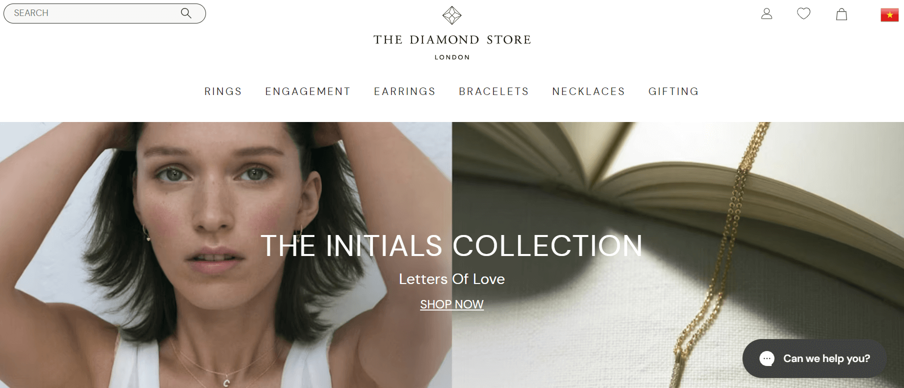
- Clean web design
- Ample white space
- Great layout
Diamond Store has created its website to help you, the consumer, find the best jewelry within your budget and make your special event memorable. This is achieved through a clear and simple design, sophisticated software, and excellent customer service.
Mejuri
Built with: Shopify
Key Features:
- Beautiful, trust-enhancing design
- High-quality, everyday jewelry
- Sleek and minimalist e-commerce site
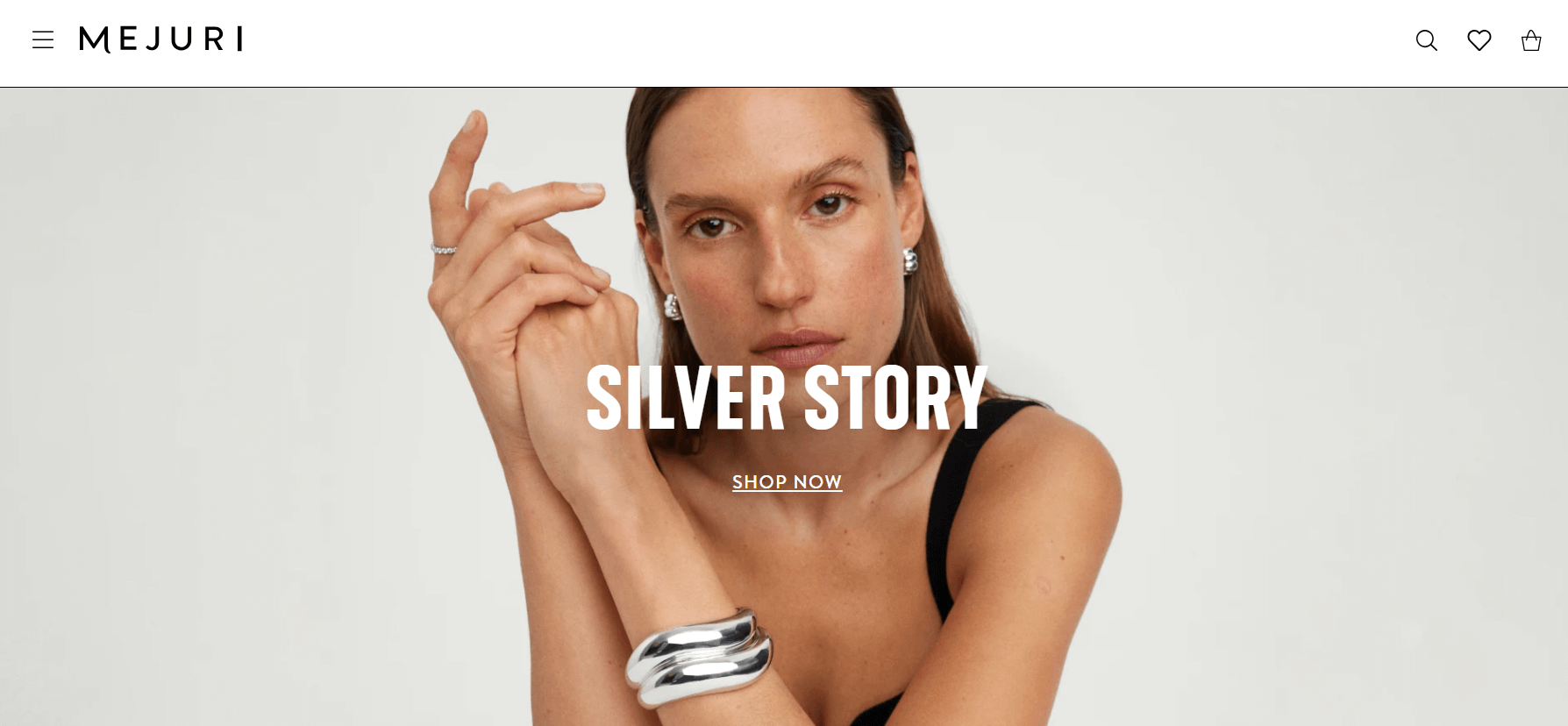
Display your brand online with a stunning website to boost your credibility. If you’re in search of a luxurious jewelry website design, Mejuri might catch your eye. This brand, understood for its “High quality jewelry for daily life” slogan, offers handmade, affordable, and luxurious pieces for daily wear.
To reach a broader audience with its genuine products, Mejuri’s website is both impressive and professional, featuring a sleek, minimalist design. It greets visitors with a smooth slider showcasing beautiful jewelry images. The e-commerce site utilizes visual hierarchy and stylish typography to make content engaging and well-organized.
Harry Winston
Created with: Wix
Key Features:
- Sophisticated color palette
- Excellent menu design
- Great product examples
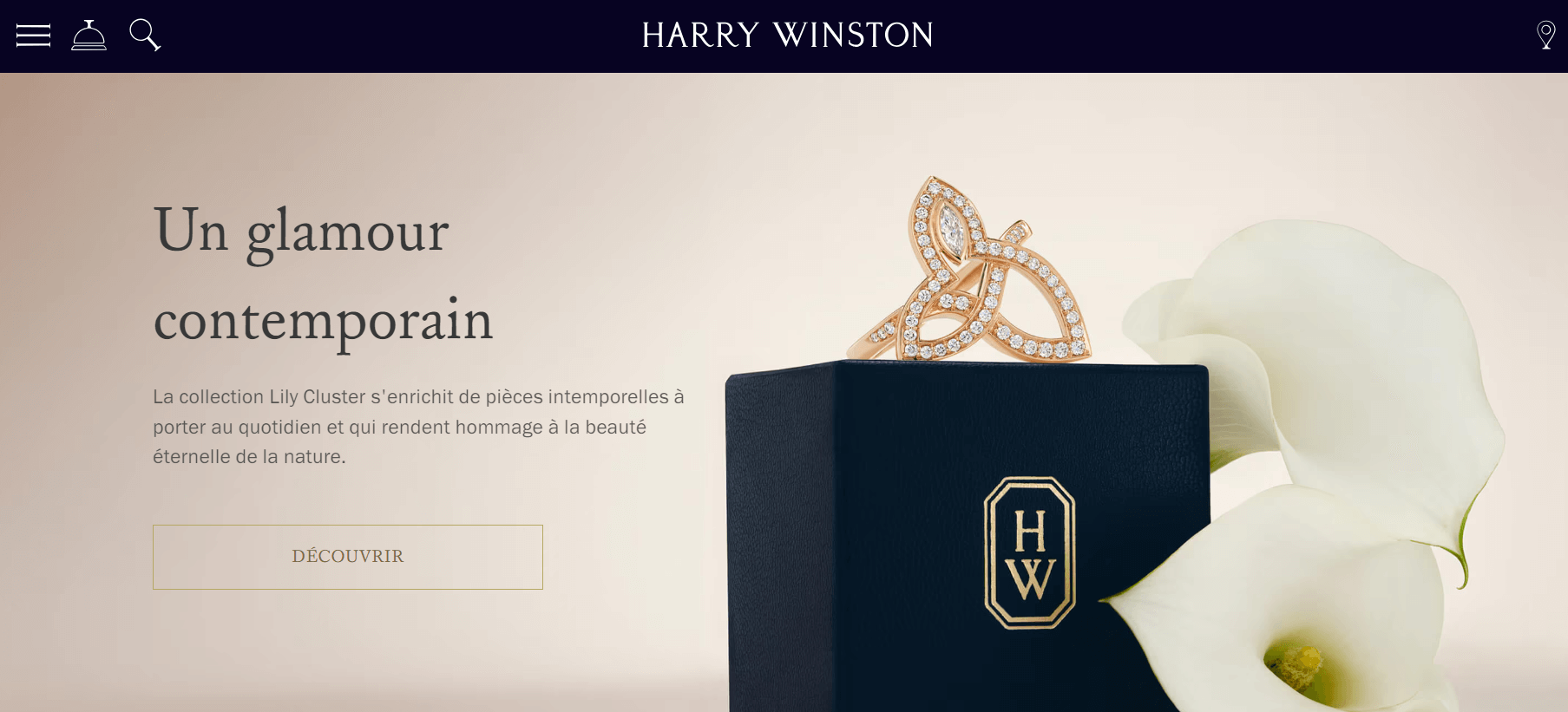
The Harry Winston website looks luxurious and professional. If you want to browse jewelry presented with a refined color scheme, outstanding menu design, and detailed examples, we highly recommend checking out this site without hesitation!
Mable Jewelry
Built with: Shopify
Key Features:
- Stunning visual presentation
- Affordable, unique silver jewelry
- Engaging, user-friendly design
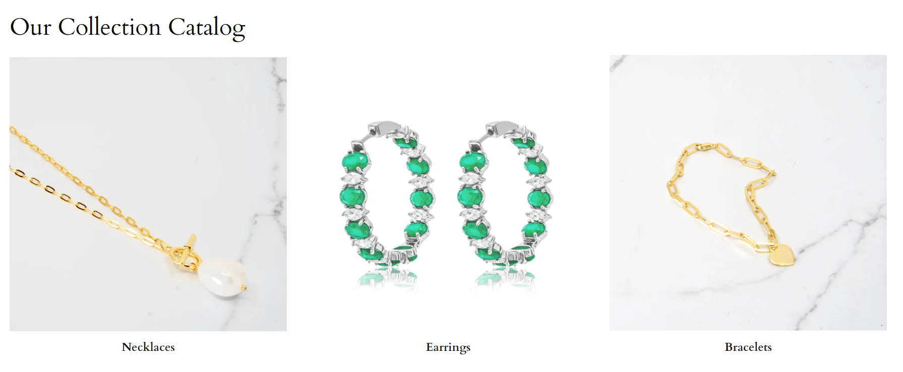
Encourage your prospective customers to browse and explore your jewelry collection with an elegantly designed website that presents your pieces in an appealing manner. This collection of jewelry website designs aligns perfectly with that goal. Mable Jewelry features a range of distinctive and reasonably priced silver jewelry.
The site features a slider on the main header to display images and uses square boxes to showcase various categories. Additionally, it highlights a standout product with social sharing options. To build brand trust, it includes testimonials presented in a clean layout. Other useful features are social media links, an Instagram feed, and a newsletter sign-up.
Pandora

Built with: Shopify
Key Features:
- Elegant, minimalist design
- International jewelry brand
- User-friendly e-commerce features
A special affair calls for extraordinary jewelry to enhance one’s look. As a result, numerous jewelry brands have arisen to provide exceptional products. Every jewelry brand should consider establishing an online presence to stay ahead of the competition.
One minimalist and elegant jewelry website design to believe is Pandora’s. Founded in 1982, Pandora is a famous Danish jewelry works and vendor known for its customizable magic bracelets, designer rings, necklaces, and watches. Their e-commerce site is equipped with useful features for showcasing products effectively.
Aurate New York
Built with: Shopify
Key Features:
- Impressive, inspirational design
- Emphasis on readability and brand presentation
- User-friendly navigation and highlights
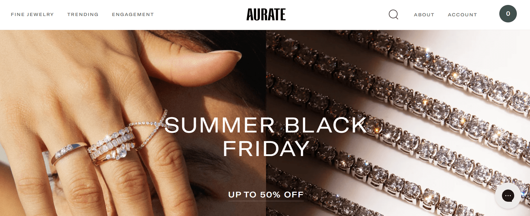
Be sure to take the opportunity to explore these outstanding jewelry websites, which feature impressive and high-quality designs for inspiration. One such example is Aurate New York, a brand dedicated to offering high-quality jewelry for every woman. Recognizing the importance of a strong website for business growth, they’ve created a site that effectively showcases their brand globally.
Their website employs ample white space to enhance readability and comprehension. The homepage features essential elements like clear CTAs, high-quality images, integrated videos, and sliders. With a fixed header, accessing the store, blog, and account is incredibly swift.
ID Jewelry
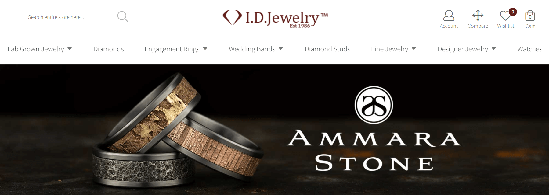
Built with: Shopify
Key Features:
- Elegant and minimalistic design
- Focus on engagement rings and custom jewelry
- Smooth, clear visuals and CTAs
Finding stunning jewelry has never been easier thanks to the digital improvements embraced by countless jewelry brands. Take ID Jewelry, for instance, a retailer specializing in stunning engagement rings and various diamond jewelry, including custom pieces.
Their website is both refined and impressive, featuring a sleek, minimalist design. The main area showcases images with clear CTAs and headlines, all presented through a smooth slider.
Read more: Top 20+ Shopify Themes for Your Jewelry Business (FREE AND PREMIUM)
Gemfields
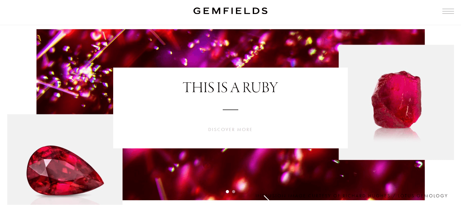
Created with: WordPress and hosted on Amazon AWS
Key Features:
- Professional and creative design
- Engaging video integration
- Effective use of white space and fixed header
Whether you’re a web creator or a jewelry manufacturer, this jewelry website design is essential. Gemfields, a global leader in responsibly sourced colored gemstones, exemplifies an ideal design for showcasing such precious materials.
Their website, created with WordPress and hosted on Amazon AWS, features a professional and innovative design that can inspire industry players. It incorporates engaging and informative videos to capture visitors’ attention on the hero section. The site utilizes white space effectively across the homepage to present web elements clearly.
Carlo Barberis

Created with: Aruba Cloud hosting services in Italy
Key Features:
- Fully custom design
- Elegant Italian-inspired aesthetics
- Dynamic visuals and smooth navigation
Jewelry is a powerful symbol of social or personal status. It can signify marital bonds or membership in certain clubs or groups, and generally, it enhances a woman’s appearance. With numerous competitive jewelry brands in the market, finding inspiration for a similar project is essential.
Carlo Barberis Jewelry offers a striking website design that captures Italian elegance and a deep passion for nature, beauty, and jewelry. The homepage features a full-screen design with the brand name, navigation, and social media icons prominently displayed. It uses a slider for seamless transitions between pages and incorporates lively GSAP animations for a captivating experience.
Hortense Jewelry
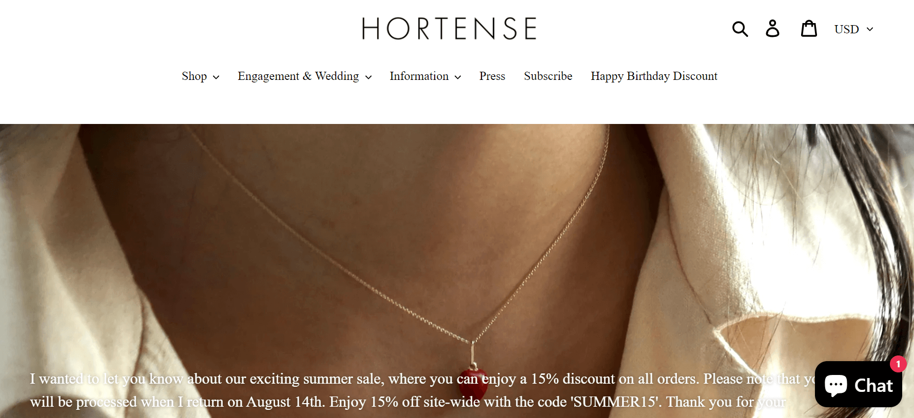
Built with: Wix
Key Features:
- Beautiful images
- Ample white space
- Attractive CTA buttons
Hortense Jewelry is crafted using high-quality gold and both semi-precious and precious stones. This web design concept focuses on delightful surprises that can captivate consumers. The web designer consistently delivers exceptional results through stunning visuals, generous white space, and appealing CTA buttons.
Aviva

Created with: WordPress and WooCommerce and hosted on Expim Cloud
Key Features:
- Sleek, clean design
- Unique materials and vibrant products
- Modern look with dynamic animations
If you offer premium jewelry pieces, it’s essential to have an exceptional website to display them effectively. This inspiration is especially valuable if you’re planning to build a jewelry website soon.
Aviva boasts an impressively minimalist and elegant design for its jewelry website. Created with WordPress and WooCommerce and hosted on Expim Cloud, this e-commerce site is ready to shine in the market. The products, made from unique materials like beadwork, colorful embroidery, and distinctive fabrics, are highlighted against a clean backdrop that contrasts beautifully with the vibrant jewelry. The modern design is enhanced with GSAP animations and includes a fixed header for easy navigation.
Danielle Draper

Created with: Magento (Adobe Commerce), Hosted with Cloduflare
Key Features:
- Convenient online shopping
- Award-winning British designer
- Elegant and user-friendly design
Online shopping offers unpaired convenience and a wider range of choices compared to physical stores, which is why many brands are embracing this strategy. The jewelry industry is no exception, leveraging effective online strategies to reach customers.
If you’re seeking stimulation for a jewelry website design, this collection is worth a look. Danielle Draper, a renowned British jewelry designer, crafts exquisite pieces from recycled gold and silver, ensuring they are both timeless and durable. Her e-commerce site is luxurious to cater to global shoppers.
Alkemistry

Built with: Wix
Key Features:
- Excellent typography
- Beautiful sliders
- Elegant color palette
Alkemistry transforms the purchase of fine jewelry into an exhilarating and uplifting experience. This is the place for women who adore luxury to find exquisite, unique, and wearable pieces. You’ll enjoy browsing through their items, which are well-organized and detailed.
4 Best Practices For Jewelery Web Design
Now that you understand the importance of web design, here are some best practices your website should follow. If your goal is to design the best possible jeweler’s website, follow these tips to ensure that your customers have a positive connection with your brand, making them more likely to visit you for their next high-end jewelry purchase.
1. Clean, Simple Layout Focused on Jewelry
For jewelry websites, distractions are a bad idea. With hundreds or thousands of dollars at stake, even the smallest distraction can divert potential customers and halt the purchase process.
To achieve more online purchases or attract more qualified customers to your store, ensure your website has a simple, clean layout focused on the merchandise. This means a clean background color like white or light gray, very simple navigation options, clear text in basic fonts, and a clutter-free browsing experience without excessive pop-ups, banner ads, sidebars, or links.
2. Inspirational Images, Motivating Messages, and Strong CTAs
Your website should do more than just showcase images of your jewelry. It needs strong calls to action to change shoppers’ mindset from “looks nice” to “I should buy that.”
One of the best ways to turn a browser into a serious shopper is with a motivational image. Many sites do this with large banner ads or striking images on their home or landing pages. This might feature a happy couple with engagement or wedding rings, a partner receiving a gift, or a model showcasing a stunning piece.
Calls to action should also be used on product pages, in the shopping cart, or in other key locations, like the contact page. Instead of sticking to bland phrases like “contact us” or “buy now,” try inspiring action – why not “find the perfect ring today” or “call us to schedule a personal consultation”?
3. Responsive Website Design
As you may know, more and more people are using mobile devices to shop online, look up information about local businesses, and just browse the internet. This also applies to jewelry shopping: believe it or not, many consumers are researching future big purchases on their phones (especially if they’re planning a surprise!).
Given this increasing trend, designing your jewelry website to be compatible with screens of all shapes and sizes is becoming essential. If your website requires pinching to zoom, excessive scrolling, or special plugins to display correctly on mobile, you might find fewer consumers spending time on it.
The best way to increase the number of visitors using your site from a mobile device is something called responsive design. Responsive design involves automatically adjusting the scale of a website’s content – not a separate website for desktop and mobile – to fit any screen size.
4. Streamlined Organization and Navigation Options
Lastly, your website needs to have a structure and organization that makes sense to visitors. Whether you run a jewelry e-commerce site or just use your website to represent your physical location, your menu and navigation options must be clear and easy to follow. If they’re confusing, scattered, or hard to find, you may drive potential customers away.
The best jewelry websites have very simple navigation, with pages organized into “groups.” For example, you can create a landing page for rings linked from the home page, then have ring options beneath – like engagement, wedding, gemstones, etc. Instead of placing all these links on the home page, they can be sub-items that appear as a dropdown list or after someone clicks on “rings” for the first time.
Summary
In conclusion, the jewelry industry thrives on visual appeal and customer experience, making web design an integral part of its success. The 15+ examples we’ve explored in this blog post demonstrate the diverse approaches and innovative features that can make a jewelry website stand out. Whether you’re a small artisan or a luxury brand, implementing clean layouts, high-quality imagery, strong CTAs, and mobile-friendly designs can elevate your online presence and enhance customer engagement.


