15 Lawyer Website Design Ideas to Enhance Client Engagement
Summer Nguyen | 08-05-2024
In the highly competitive field of law, standing out is crucial. But how do you make your law firm shine in a sea of sameness?
The answer lies in a compelling, user-friendly website design. This article will reveal 15 best lawyer website design examples that are tailored to make a lasting impression on potential clients. Let’s dive in to find out how a well-designed website can bring to your legal practice!
How to Connect Payoneer to Shopify
Key Elements of Lawyer Website Design
Your law firm’s website is often the first impression potential clients have of your practice. Below are some key elements that will transform your online presence:
- Professional Aesthetics: Your website should convey professionalism and trustworthiness. Use a clean, modern design with a cohesive color scheme that reflects your brand.
- Engaging Content: This can include blog posts, case studies, FAQs, and detailed service pages. Well-written content that showcases your expertise can help build trust and credibility.
- Client Testimonials and Reviews: Featuring testimonials and reviews from satisfied clients can significantly enhance your trust.
- Contact Information: A well website needs to include multiple contact options such as phone numbers, email addresses, and a contact form.
- Live Chat Support: This can improve user experience and increase the likelihood of converting visitors into clients.
- Attorney Profiles: Highlight the attorneys’ experience, qualifications, and areas of expertise. Professional headshots and well-written bios are essential. Consider adding
15 Best Lawyer Website Design Examples In 2024
As we step into 2024, the standards for web design have evolved, emphasizing not just aesthetics but also functionality and user experience. Let’s explore 15 of the best lawyer website design examples and understand innovative features and creative approaches that set these sites apart:
William Kiang
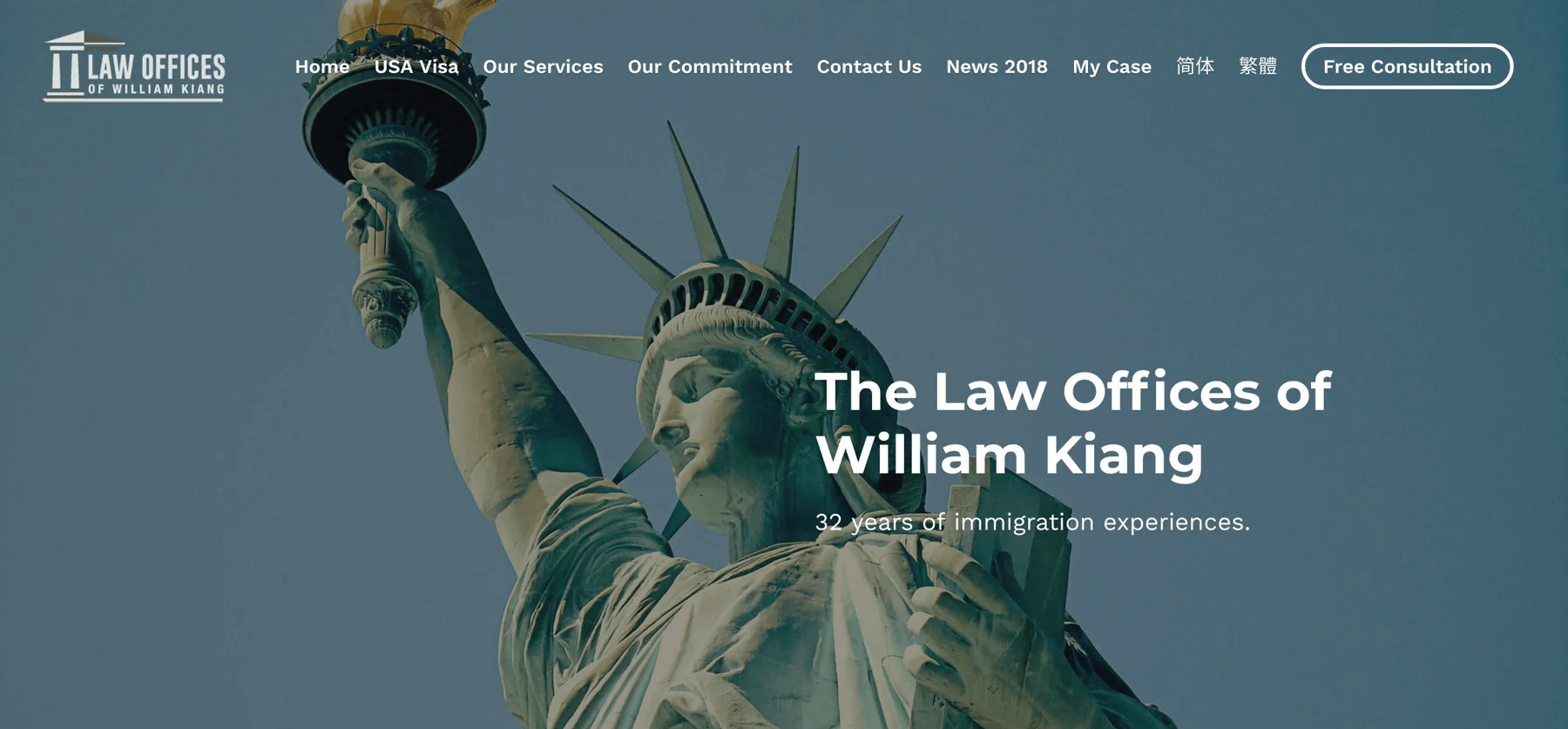
William Kiang‘s website is a masterclass in sophisticated simplicity. From the moment you land on the homepage, you are greeted with a sleek, minimalist design that speaks volumes about his professional ethos.
Kiang’s site perfectly balances aesthetics with functionality, offering a seamless user experience.
Build with: Strikingly
Key features:
- User-friendly interface with intuitive navigation
- High-quality images enhancing visual appeal
- Strategically placed call-to-action buttons for better engagement
- Detailed attorney biography and service descriptions
Sean O’Brien

O’Brien’s commitment to client-focused service is evident in every aspect of the site, from the personalized welcome message to the easy-to-navigate service pages.
The website’s design is both contemporary and approachable, featuring a mix of bold colors and clear typography that makes information easy to digest.
Build with: Squarespace
Key features:
- Modern design with vibrant visuals
- Clear and bold typography for easy readability
- Comprehensive service pages detailing areas of expertise
- Interactive elements for better user engagement
Dana Weber
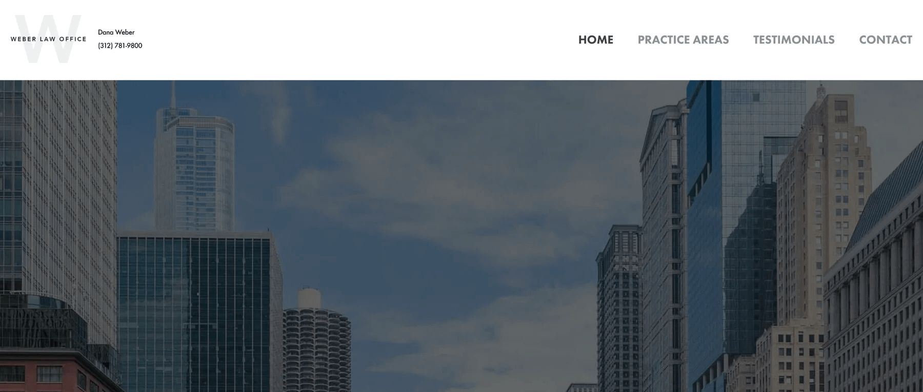
The next example is Dana Weber. It is a beacon of elegance and expertise. Weber’s commitment to excellence is mirrored in the website’s polished layout, which offers a comprehensive view of her legal services and areas of specialization.
Build with: Squarespace
Key features:
- Seamless functionality with well-structured content
- High-resolution images enhancing the visual experience
- Detailed attorney profile and legal service descriptions
- Thoughtful use of white space for better readability
Westrick Law
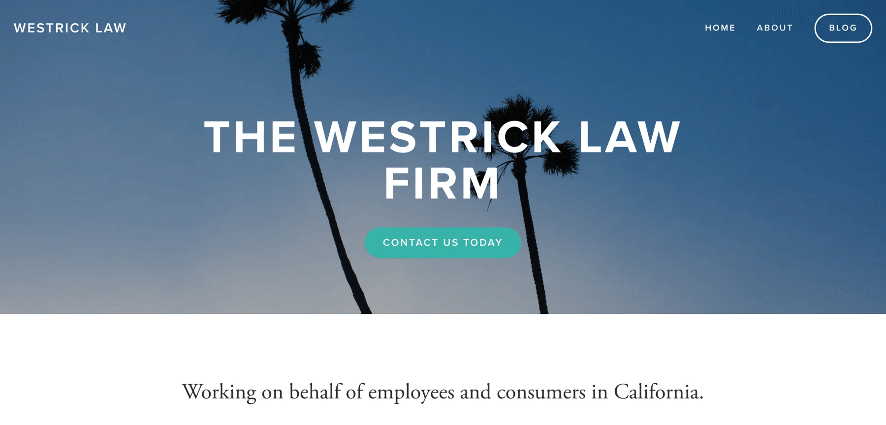
Westrick Law’s homepage welcomes visitors with a clean, modern look that conveys reliability and expertise.Each section of the site is carefully curated to provide valuable insights into the firm’s legal services and areas of practice.
Build with: Squarespace
Key features:
- Clean and modern homepage design
- Straightforward navigation with well-organized content
- Professional color palette enhancing trustworthiness
- High-quality imagery creating an inviting atmosphere
- Detailed descriptions of legal services and areas of practice
Perliss Law
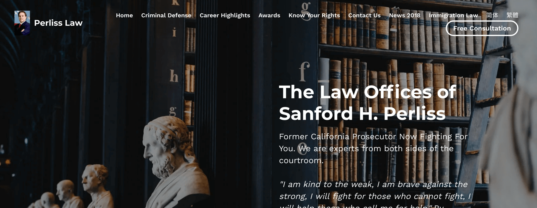
Perliss Law’s website is a striking example of contemporary design meeting practical functionality. The homepage is visually captivating, with a bold color scheme and dynamic layout that immediately grabs attention.
Build with: Strikingly
Key features:
- Dynamic layout enhancing user engagement
- High-quality visuals and multimedia elements
- Clear sections for practice areas, attorney profiles, and testimonials
- Comprehensive and easily accessible content
Cubillos Reed Law
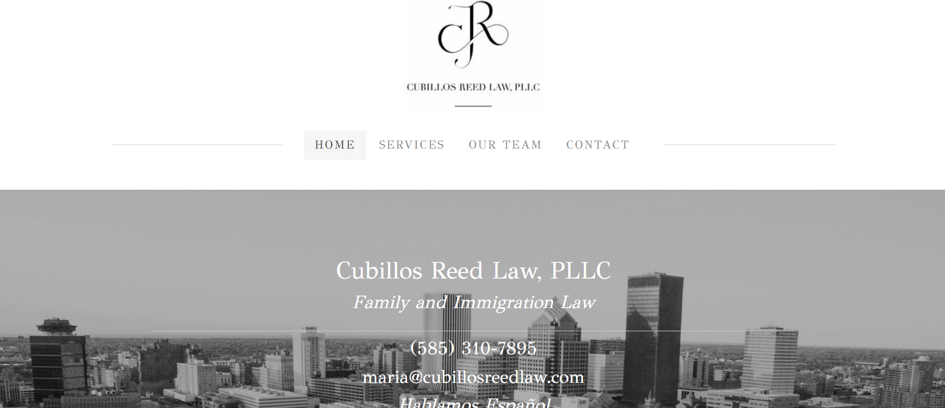
Its sleek aesthetics and user-friendly features in Cubillos Reed Law make it one of the top lawyer websites of 2024. The site’s intuitive navigation and well-organized content make it easy for visitors to explore the firm’s services and expertise.
Build with: Weebly
Key features:
- Sophisticated design with calming color palette
- Intuitive navigation and well-organized content
- Emphasis on clarity and accessibility
- High-quality images enhancing user experience
Brian O’Dwyer

Brian O’Dwyer’s website features a refined aesthetic, with high-quality images and thoughtful use of color enhancing the overall user experience. It excels in combining traditional elegance with modern functionality.
Build with: Squarespace
Key features:
- Warm, professional design reflecting extensive legal experience
- Clear navigation and comprehensive content
- Refined aesthetic with high-quality images
- Thoughtful use of color enhancing user experience
DKM Law Group
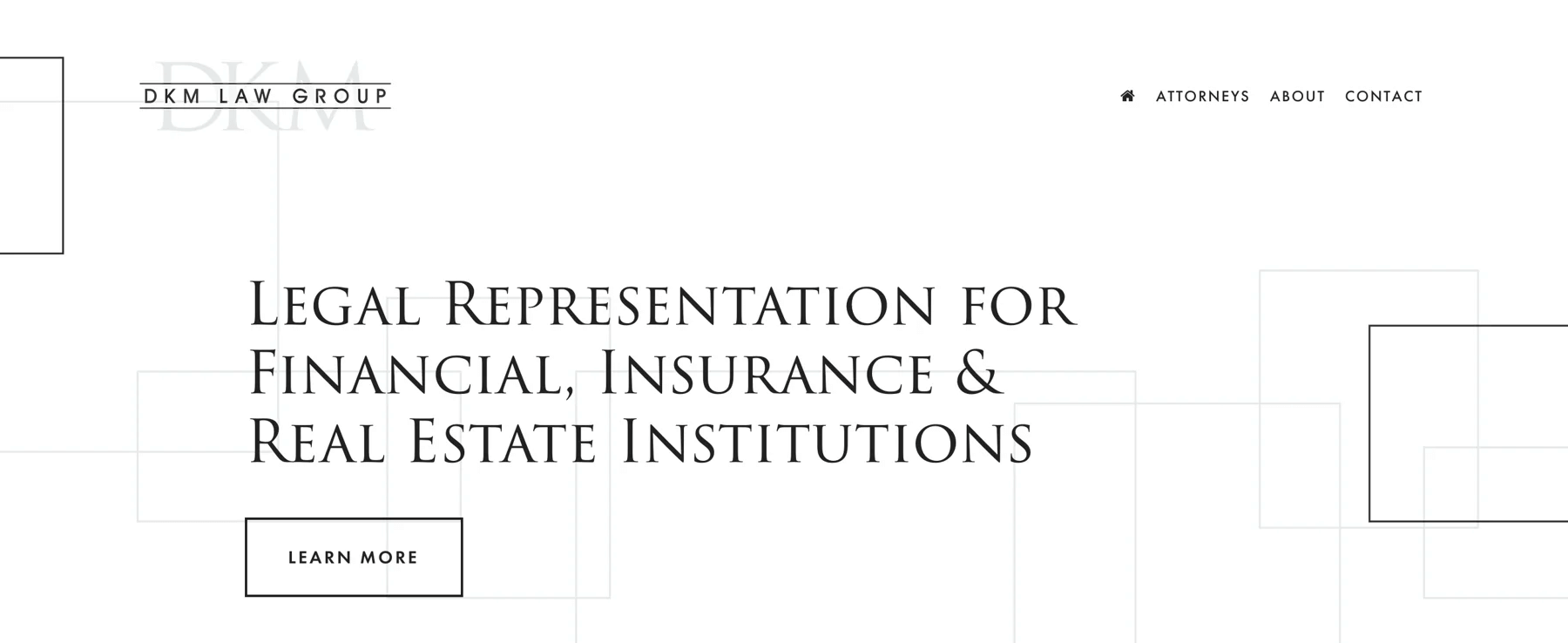
Color scheme and typography are two outstanding design elements in DKM Law Group. They are designed to create a professional and trustworthy atmosphere, making it easy for visitors to engage with the content.
Build with: Squarespace
Key features:
- Sleek, minimalist layout emphasizing clarity
- Easy-to-navigate design
- Professional color scheme and typography
- Comprehensive service descriptions
- Detailed attorney profiles
Allan Rouben
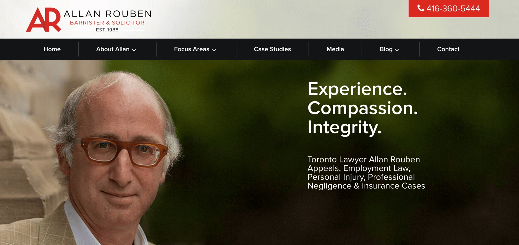
The homepage greets visitors with a sophisticated design that reflects Rouben’s high standards and dedication to his clients. The site’s intuitive navigation and well-structured content make it easy for potential clients to explore his legal services.
Build with: WordPress
Key features:
- Sophisticated design with refined color palette
- Intuitive navigation and well-structured content
- High-quality imagery enhancing professionalism
- Detailed service descriptions and client testimonials
- Comprehensive insights into legal expertise
Page Law
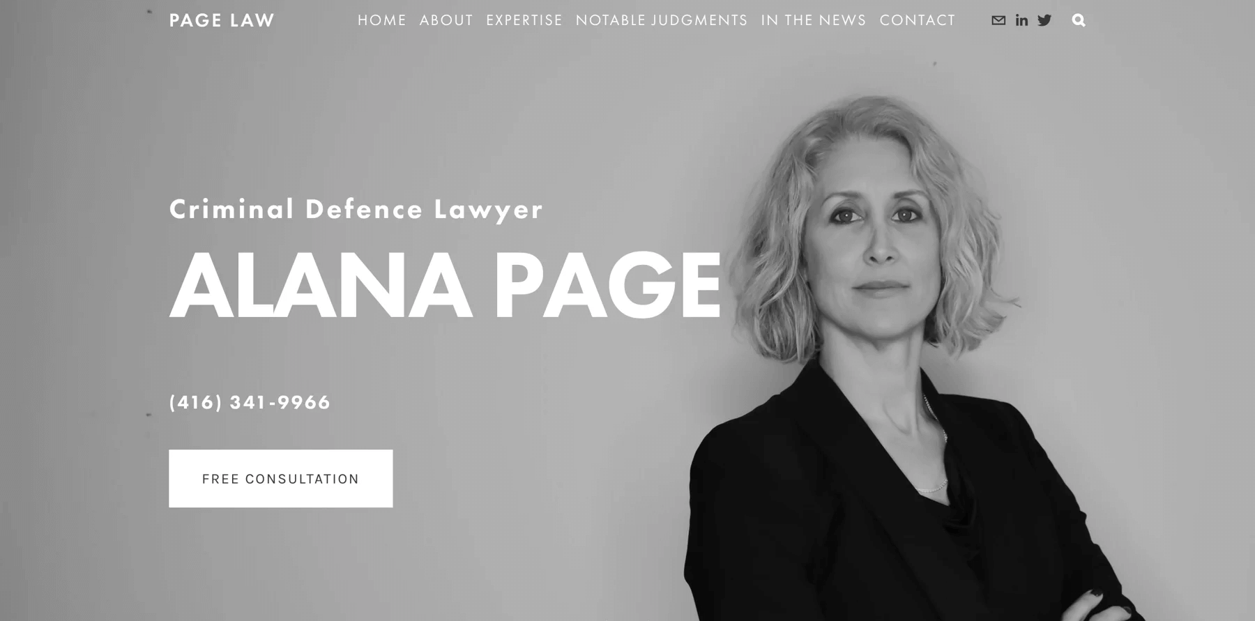
Page Law is one of the most famous lawyer websites in 2024. It is a vibrant and engaging digital space that captures the essence of their legal practice. The website emphasizes user engagement.
Build with: Squarespace
Key features:
- Dynamic design with bold colors and compelling visuals
- Clear navigation and well-organized content
- Emphasis on user engagement with interactive elements
- High-quality images and videos
- Detailed service descriptions
Caryma Sa’d
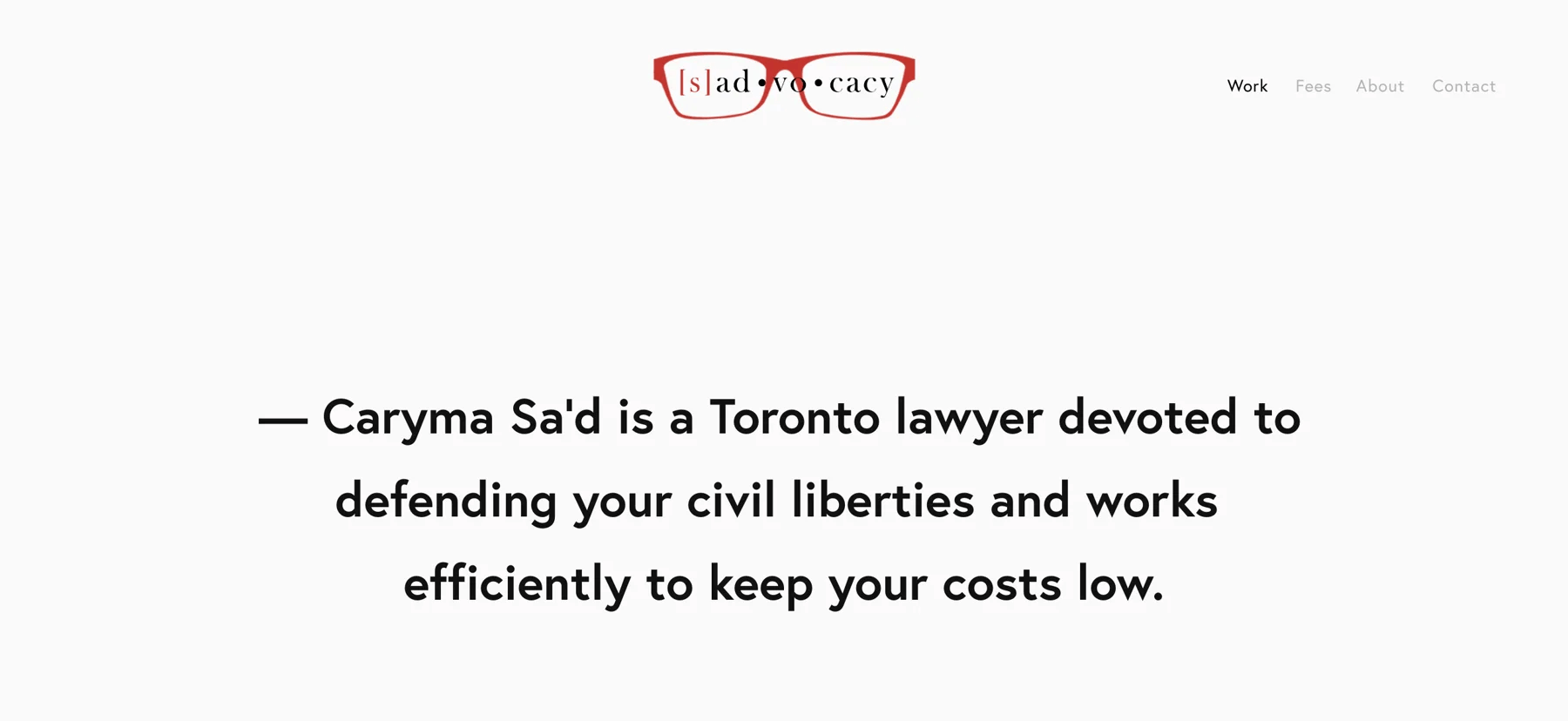
Caryma Sa‘d’s website is a unique blend of creativity and professionalism. Its design elements are complemented by high-quality images. Moreover, detailed service descriptions and client testimonials provide valuable insights into Sa’d’s legal approach.
Build with: Squarespace
Key features:
- Distinctive design with bold visuals
- Engaging content reflecting innovative approach
- Intuitive navigation and comprehensive content
- High-quality images and interactive elements
Matrona Law
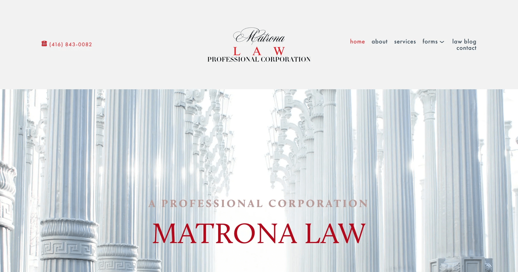
Matrona Law’s website is a prime example of how professional design can enhance user experience. The site’s design reflects the firm’s commitment to providing high-quality legal services, with each element carefully crafted.
Build with: Squarespace
Key features:
- Clean, modern layout emphasizing clarity
- Easy-to-navigate design
- Professional color scheme and typography
- Comprehensive service descriptions
John Leader
If you’re seeking a website model to build trust and credibility, John Leader is number one. The website features a refined aesthetic that reflects Leader’s extensive legal experience and dedication to his clients.
Build with: WordPress
Key features:
- Clear navigation and well-structured content
- Refined aesthetic with high-quality images
- Thoughtful use of color enhancing user experience
- Detailed insights into legal expertise and services
Gecic Law

Navigating through Gecic Law’s website feels like embarking on a journey of legal enlightenment. Each section is meticulously highlighted, offering a wealth of information about the firm’s specialized legal services and industry insights.
Build with: WordPress
Key features:
- Sophisticated design with calming color palette
- Intuitive navigation and well-organized content
- Emphasis on clarity and accessibility
Horea Crisan

Horea Crisan’s website is a bold declaration of modern legal practice fused with personalized client care. It’s designed to empower visitors with easy access to comprehensive legal services and insights into Crisan’s approach to advocacy.
Build with: Squarespace
Key features:
- Vibrant visuals and engaging content
- Personalized welcome message
- Easy-to-navigate service pages
- Bold colors and clear typography
Tips For Creating A Lawyer Website
Designing a lawyer website that stands out in 2024 requires a blend of creativity and a deep understanding of your target audience. Here are some fresh and innovative tips to help you create a site:
- Embrace Minimalist Design: Less is more. A clean, uncluttered design can help convey professionalism and focus visitors’ attention on what matters most—your expertise and services.
- Interactive Elements: These tools can engage visitors, provide valuable information, and guide them through the decision-making process. For example, a quiz on “What Type of Lawyer Do You Need?” can be both informative and engaging.
- Strong Branding: Consistent use of colors, fonts, and imagery helps build recognition and trust. Your site should instantly communicate who you are and what sets you apart from the competition.
- Client-Centric Approach: Design your website with your clients in mind. Use simple language, avoid legal jargon, and clearly explain your services and processes. In addition to a well-designed and optimized website, lawyers may need specialized law software to enhance their marketing activities. For example, bankruptcy attorneys can use a bankruptcy law solution to streamline marketing efforts and keep all client details organized.
Conclusion
These 15 lawyer website design ideas are your toolkit for boosting client engagement and standing out in a competitive market. From sleek visuals to interactive elements, each idea can transform your site into a powerful client magnet. Ready to make your law firm’s website unforgettable? Start implementing these tips today and watch your online presence thrive!


