Discover 15+ Museum Web Design Examples in 2024
Summer Nguyen | 08-14-2024
Discovering amazing museum web designs in 2024 offers insights into how institutions enhance online engagement and showcase their cultural treasures. An exquisite museum website not only reflects the institution’s identity but also captivates visitors with riveting experiences. This article explores over 15 museum websites that excel in design, functionality, and user engagement, providing valuable lessons for creating compelling digital spaces in the cultural sector.
Key Elements of Museum Web Design
Creating an effective museum website involves several key elements to engage visitors and showcase collections seamlessly. Here are some essential factors:
- Visual Appeal: The website should visually delight visitors with appealing designs that reflect the museum’s character and highlight its artworks or exhibits.
- Easy to use Experience: Ensure easy piloting and a clear layout so guests can find information quickly and enjoyably. Responsive design is meaningful for accessibility on distinct gadgets.
- Value driven content: Present content in an effective way, using superior images, videos, and interactive elements to enhance visitor interaction and learning.
- Handiness: Make the website available to all users, including those with disabilities, by providing text alternatives for images and ensuring readable fonts.
- Fast Performance: Optimize loading times to keep visitors engaged without delays, ensuring a smooth browsing experience.
- Interactive Features: Comprise features like virtual tours, educational resources, and social media links to encourage exploration and interaction.
- Consistent Branding: Preserve consistency in colors, fonts, and design elements to reinforce the museum’s brand identity throughout the website.
- Security: Enforce robust security measures to defend visitor data and provide a safe online background.
- Adaptive design: Create the website to be responsive on mobile devices, regarding the increasing the count of individuals accessing the internet through smartphones and tablets.
- Evaluation and Improvement: Get feedback from visitors and use analytics to continually improve the website’s content and practicality, ensuring it meets visitor expectations.
Examples of Museum Web Design
1. Modern Museum
Museum of Modern Art (MoMA)
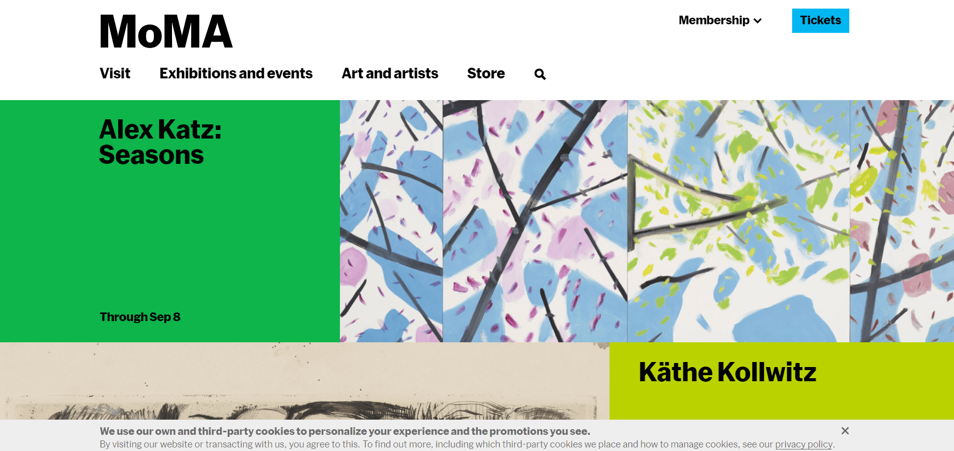
The MoMA website is a striking example of effective museum web design in 2024. Its visual appeal is immediately evident, boasting a vibrant color palette that enhances its overall attractiveness. As you delve into the site, you’re welcomed by a meticulously curated collection of artworks that captivate from every angle. Whether you’re browsing through iconic modernist pieces or discovering contemporary installations, the MoMA website ensures a seamless and enjoyable experience.
What you can learn from this outstanding website design:
- Vibrant color palette
- High-quality images
- Excellent web browsing experience
Museum of Modern Art in Warsaw
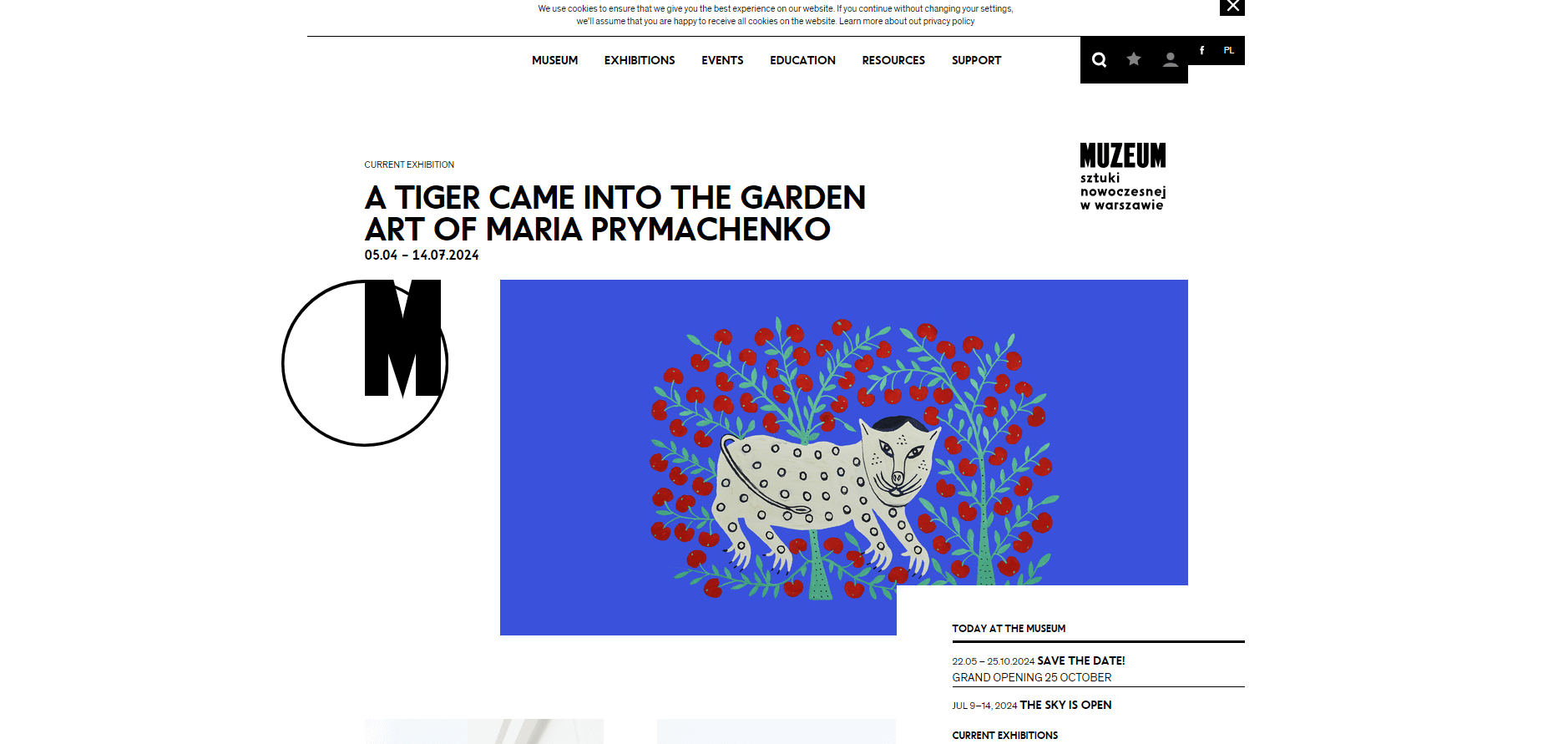
The Warsaw Museum of Modern Art serves as an online hub for minimalist and contemporary artworks. There’s plenty of white space on the page, and the visitor’s journey is logically laid out, starting right at the fold. Additionally, they feature captivating images! It’s really impressive.
From the moment you land on the homepage, the layout is thoughtfully organized, starting with essential information positioned strategically at the top fold. This logical arrangement guides visitors seamlessly through the site, allowing them to navigate exhibitions, collections, and educational resources with ease. The intuitive design ensures that visitors can find what they’re looking for quickly, whether exploring new acquisitions or revisiting favorite pieces.
What you can learn from this excellent website design:
- Appealing design concept
- Easy navigation
- Colorful layout
The Met
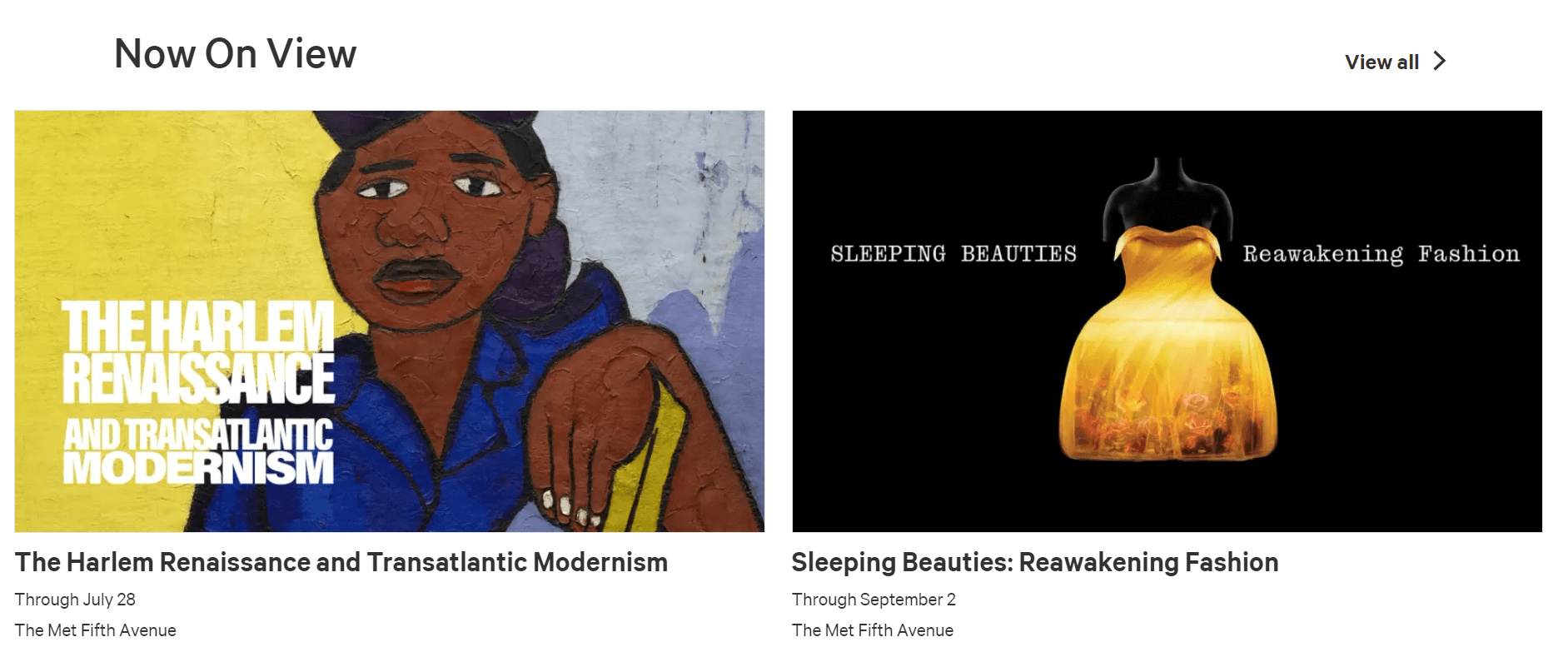
The Met’s website is skillfully designed, sleek, and visually attractive. As you scroll down the homepage, you immediately see how well-known they are. The elements are carefully arranged by the designer to ensure you have an engaging experience.
What you can learn from this excellent website design:
- Impressively clean and well-designed interface
- Thoughtfully arranged elements
- Fast loading
National Museum of African American History and Culture
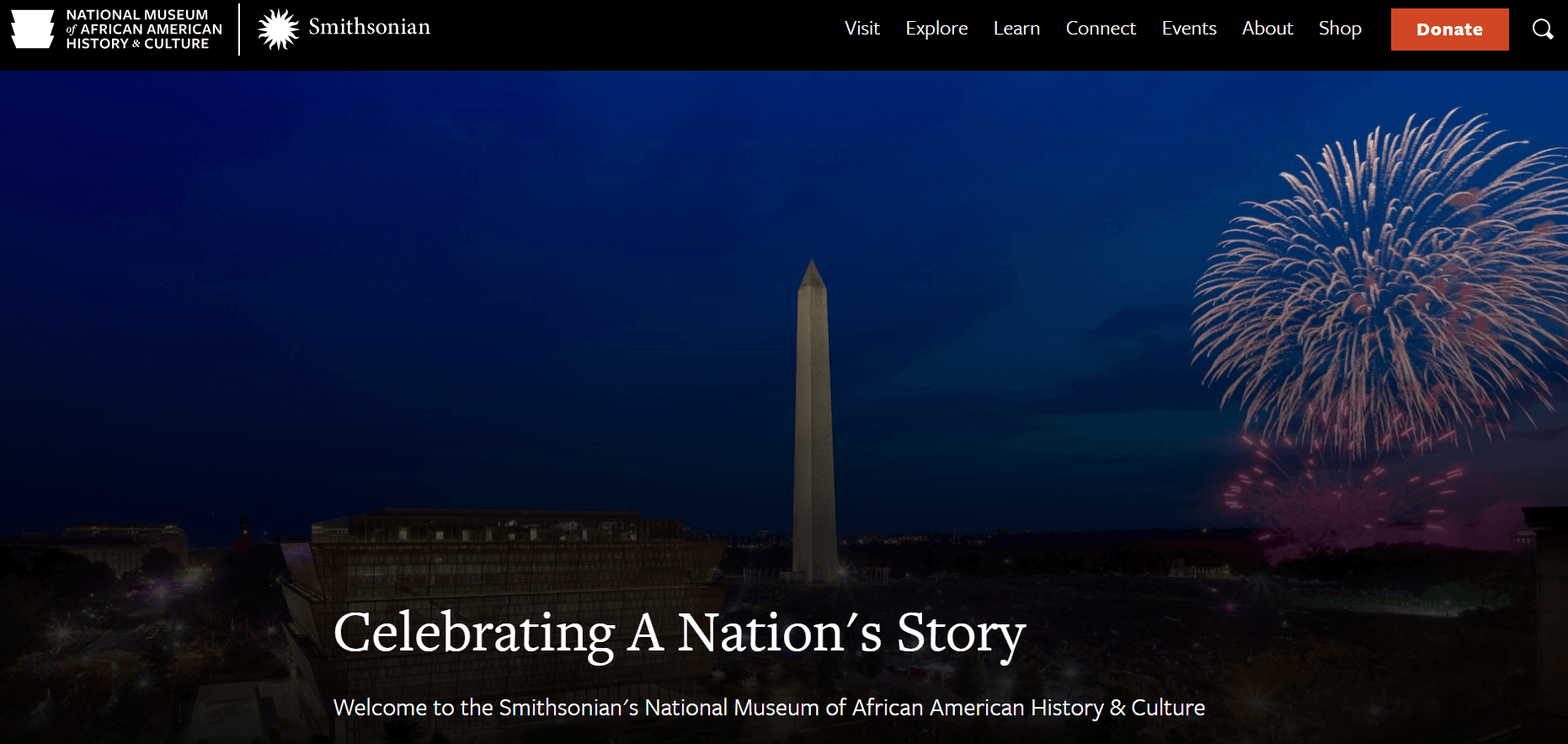
It’s fascinating to see so much open space on the website of the National Museum of African American History and Culture. Each image is impressive without being overly prominent. The images are displayed in sliders, giving a sense of minimalist beauty to the design and creating an engaging visual experience. It’s wonderful!
What you can learn from this excellent website design:
- Beautiful images
- Simple and clean layout
- Ample white space
M+
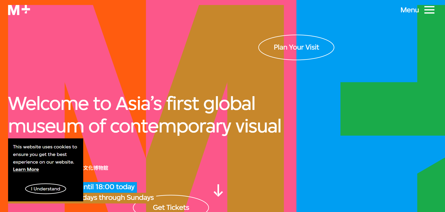
If you’re looking for a vibrant museum website, M+ is a standout choice. Upon arrival, you’re immediately immersed in a visual feast of lively colors and captivating images. Unlike traditional minimalist layouts, M+ opts for a bold and creative approach that challenges norms and invites exploration.
M+ embraces its role as a digital innovator in the museum world. It uses dynamic colors and striking visuals to engage visitors in an unconventional yet compelling way. Every webpage on the site is carefully designed to offer an immersive experience that embodies the museum’s dedication to contemporary art and design. Whether you’re navigating exhibitions, discovering new artists, or interacting with multimedia content, M+ offers a journey that is as exciting as it is informative.
What you can learn from this fantastic website design:
- Innovative web design concept
- Beautiful color palette strategy
- Unique web layout
Lumen Museum
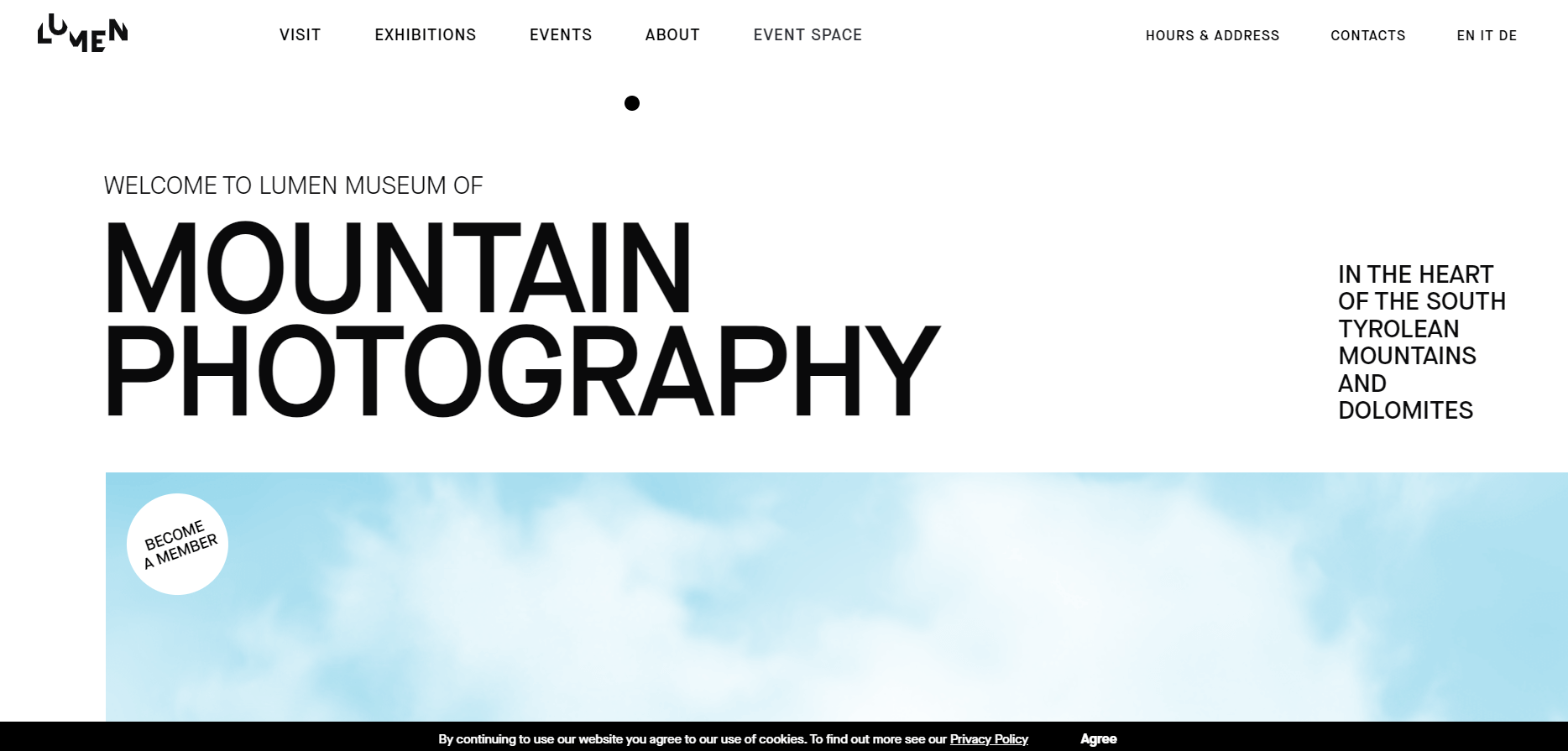
Lumen Museum acknowledges the significance of a user-friendly website to ensure a positive visitor experience. You’re sure to have a great experience here, as every corner is adorned with beautiful illustrations that will capture your attention!
What you can learn from this excellent website design:
- Soft color palette
- Simple and tidy design
- Easy navigation
Canterbury Museum
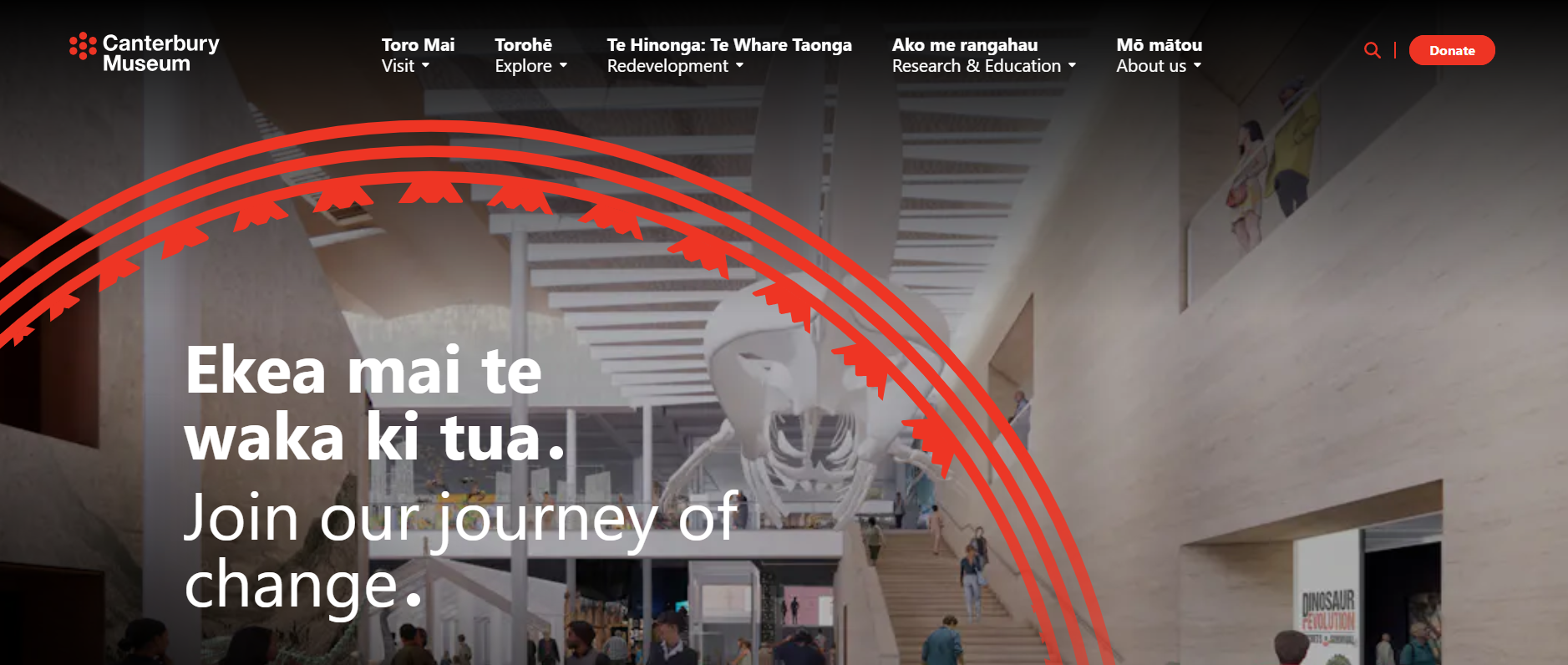
The Canterbury Museum boasts a contemporary and attractive website. A visually striking color palette is achieved by strategically placing bright colors against a white background. This is the best choice for you if you prefer clean and tidy websites. Excellent content awaits you at the link.
What you can learn from this excellent website design:
- Clean, white background
- Vibrant color scheme
- Neat layout
2. Classical and Fine Museum
Louvre Museum
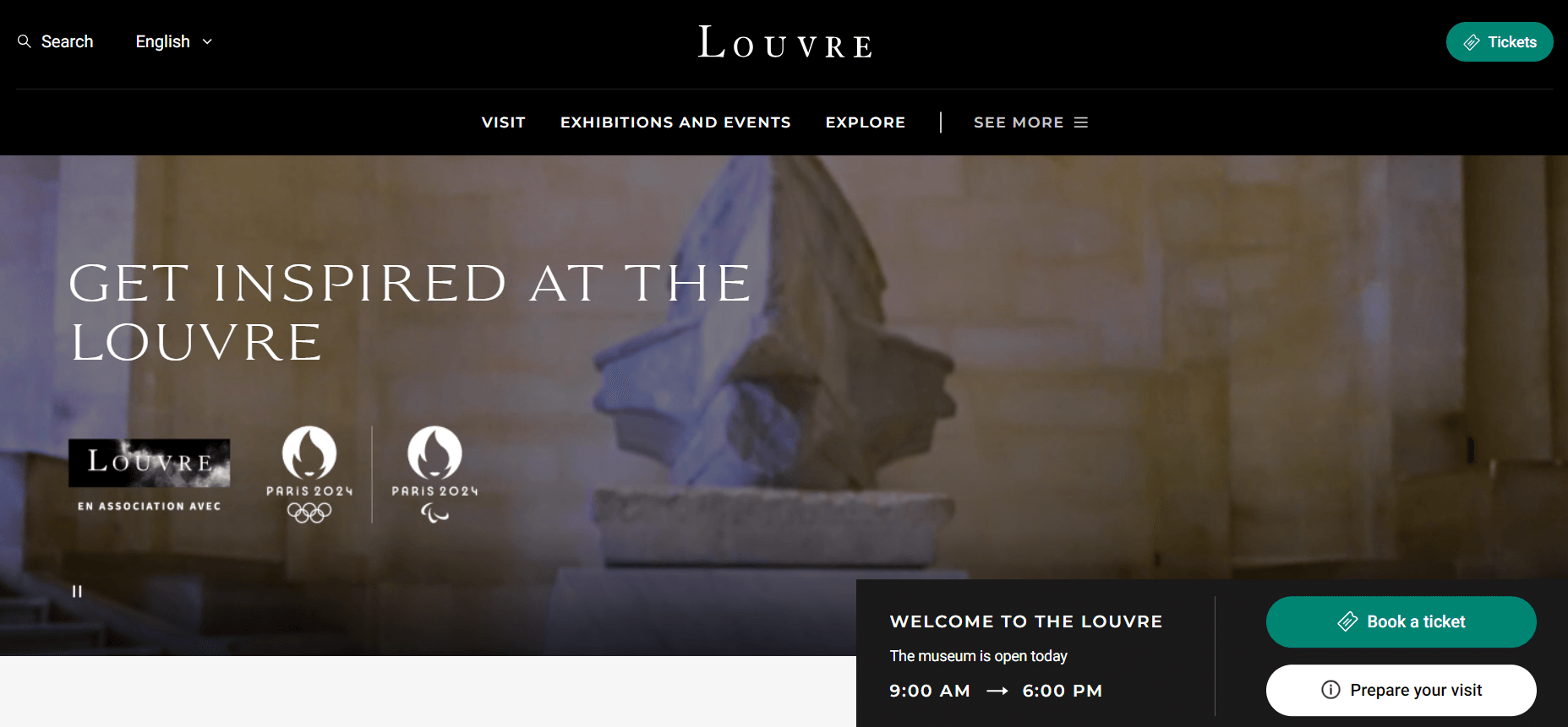
The website designer made a wise choice by using high contrast between light and dark backgrounds. It helps establish credibility and fosters a professional atmosphere. Additionally, it enhances the aesthetic value of the website by giving it a cleaner and more coherent appearance. Don’t hesitate to check out the Louvre!
What you can learn from this excellent website design:
- High-contrast light-dark background
- Professional layout
- Clean and coherent interface
British Museum
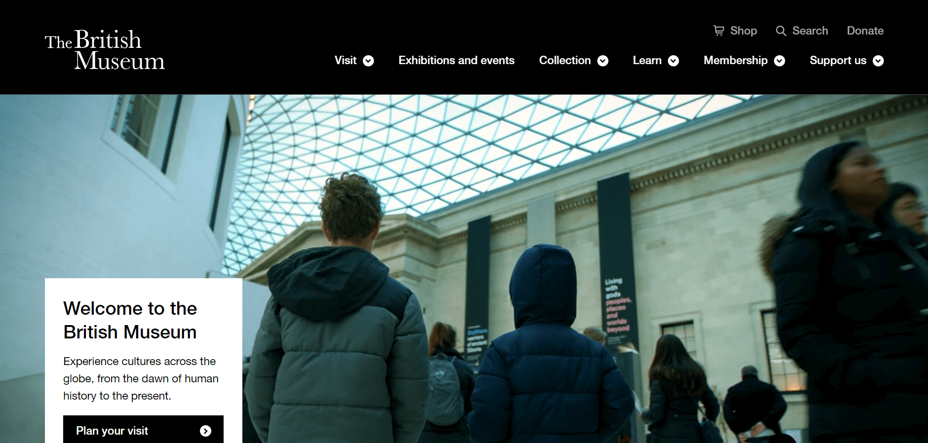
The web designers at the British Museum have done a remarkable job with the aesthetic of their site! We sincerely appreciate the sophistication and professionalism that the websites exhibit. Additionally, the dynamic images are genuinely intriguing from start to finish! There won’t be a dull moment here!
What you can learn from this outstanding website design:
- Sense of elegance
- Informative website
- Clean and simple layout
Tokyo National Museum
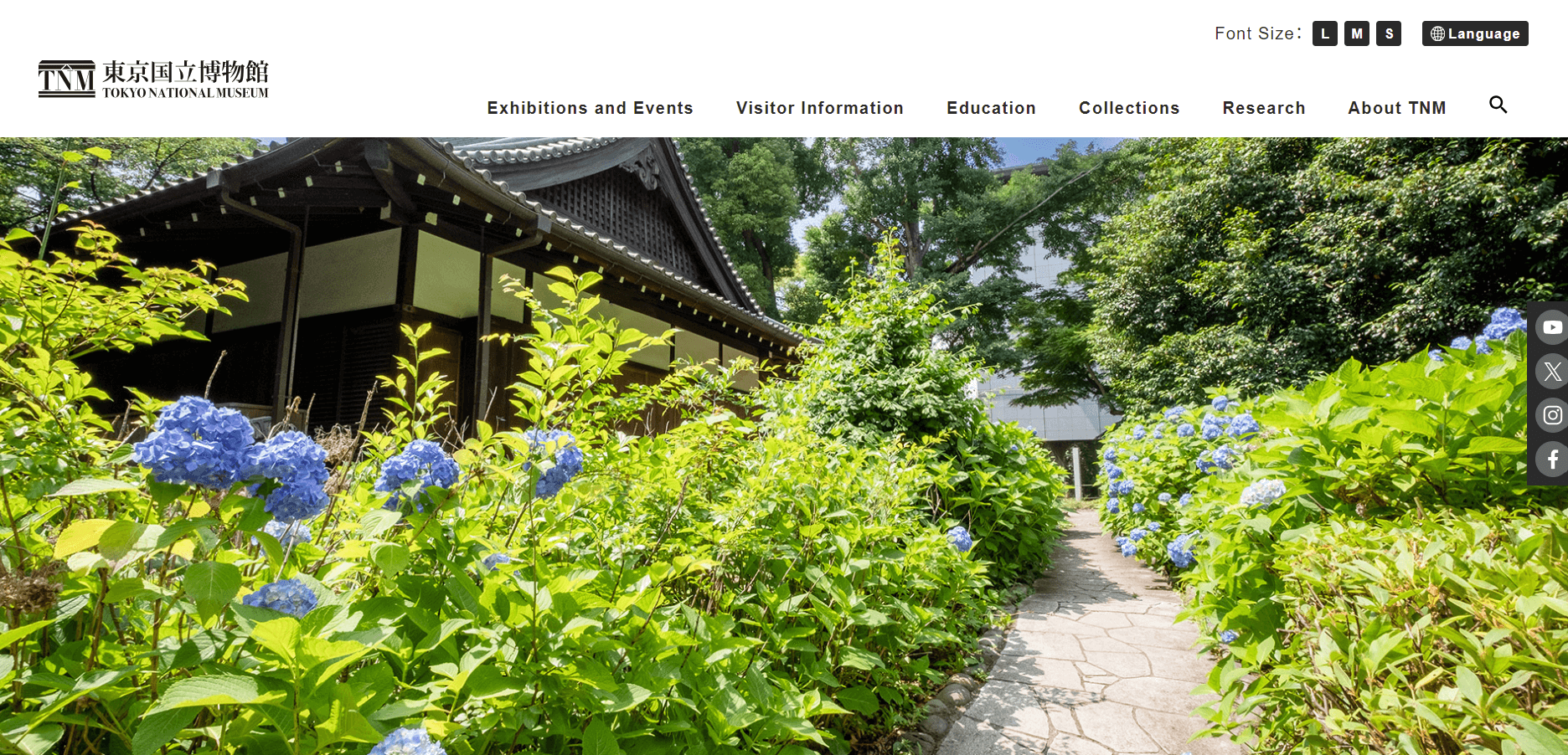
Despite its serious nature, the website of the Tokyo National Museum is vibrant and engaging. You’ll definitely appreciate the background of this site as it remains visible even as you scroll down, creating an enjoyable experience. Additionally, the site features engaging images that draw you in to explore further.
What you can gain from this excellent website design:
- Premium images
- An enjoyable scrolling experience
- A vibrant atmosphere
Art Institute of Chicago
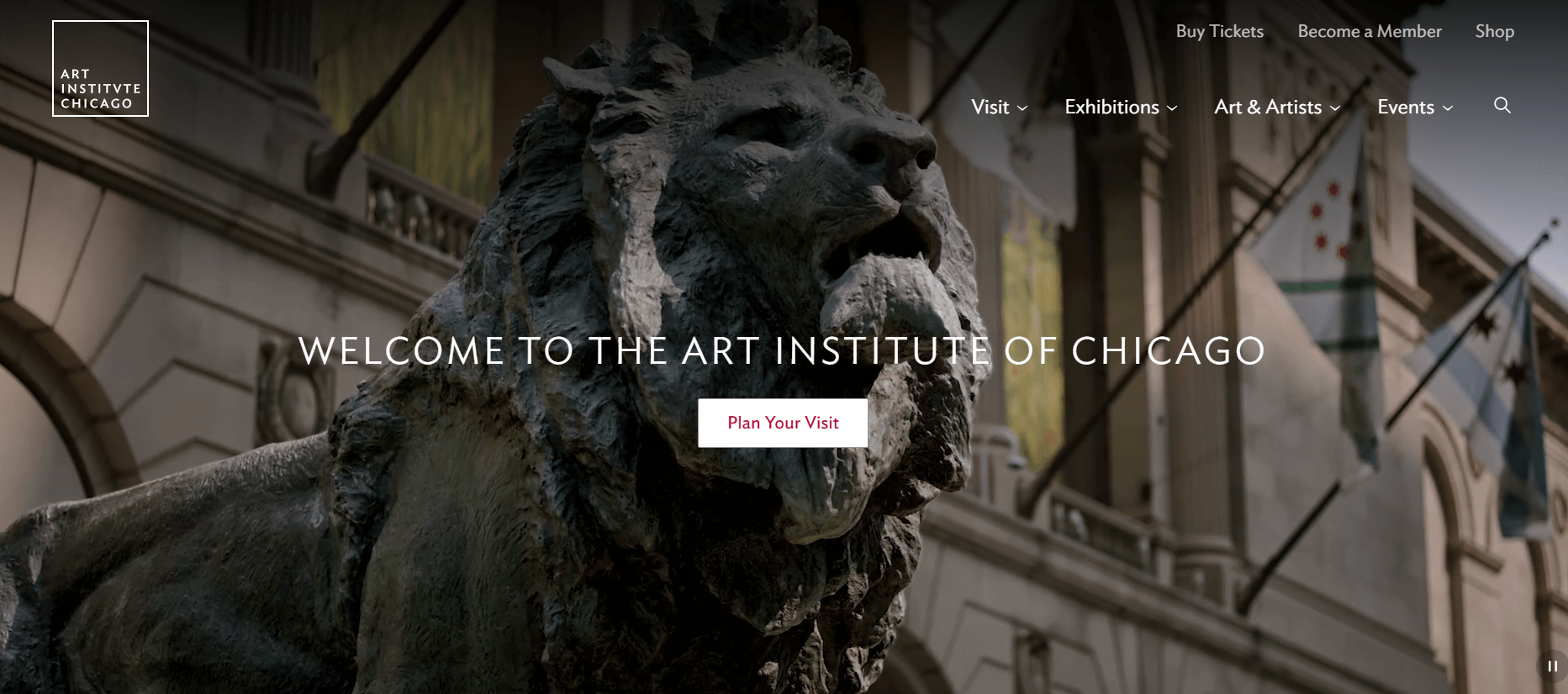
The Art Institute of Chicago’s website is marked by generous white space, contributing to its overall aesthetic appeal. This configuration will ensure that scrolling through the site is effortless and enjoyable, without any clutter to distract from the content. Additionally, the inclusion of smooth scrolling spirits and strategically placed CTA buttons enhances the website’s usability, simplifying the navigation and exploration for visitors.
Take a moment to visit the Art Institute of Chicago’s website and experience firsthand how these design elements come together to create a seamless and engaging browsing incident.
Key takeaways from this excellent website design:
- Ample white space
- Smooth scrolling animations
- Effective call-to-action buttons
R’JKS Museum
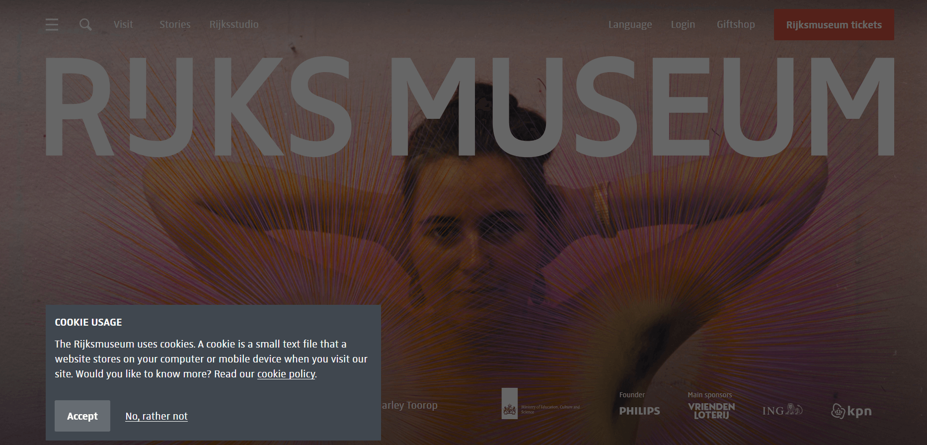
The website design prioritizes user experience by offering a clean, simple interface. It’s truly a valuable resource! Everything is organized in a way that makes it easy for you to quickly view and find the artwork you need. Additionally, the designers are continuously striving to enhance the experience for visitors.
What you can learn from this excellent website design:
- Excellent user experience
- Simple interface
- Clean design
3. Specific Artists Museum
Van Gogh Museum
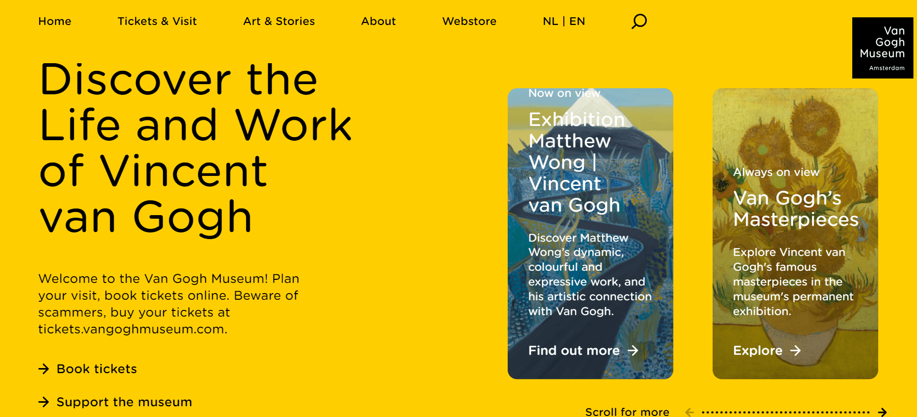
The Van Gogh Museum website stands out with its impressive, clean, and visually appealing design. When you first land on the homepage, you’re immediately struck by its prominence and aesthetic appeal. The elements on the site are meticulously arranged, providing a smooth and interactive experience for users as they browse through the collection and details offered.
What you can learn from this excellent website design:
- Impressively clean and well-designed interface
- Thoughtfully arranged elements
- Fast loading
Frans Hals Museum
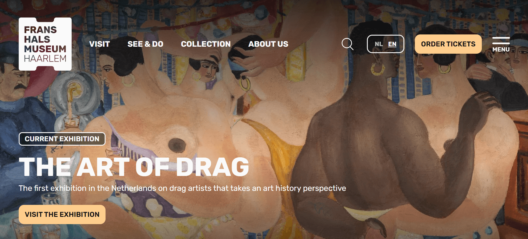
The Frans Hals Museum website is a testament to sleek and visually captivating design. From the very first moment you land on its homepage, the museum’s protrusion is palpable. The layout is meticulously curated, offering visitors an immersive and engaging experience that seamlessly integrates navigation with discovery.
Each element is preemptively placed to showcase the museum’s rich collection of artworks and historical significance. The mix of aesthetic appeal and operative design ensures that every visit to the website is not only informative but also visually stimulating, capturing the essence of the museum’s offerings with sophistication and clarity.
What you can appreciate from this exceptional website design:
- Sleek and visually captivating design
- Thoughtfully curated layout
- Fast and efficient user experience
Barnbrook
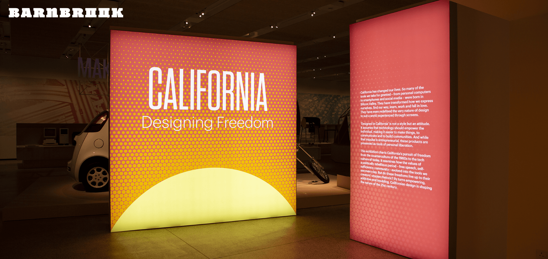
Barnbrook provides the opportunity for you to fully appreciate each artwork as you scroll down. Honestly, this is a perfect way to showcase your creativity. The website features an elegant and polished design, free from any extraneous elements that might deter visitors. Well done!
What you can learn from this excellent graphic design website example:
- Emphasis on usability over technicality
- Absence of unnecessary distractions
- Updated with dynamic content
4. Contemporary Museum
Phoenix Art Museum
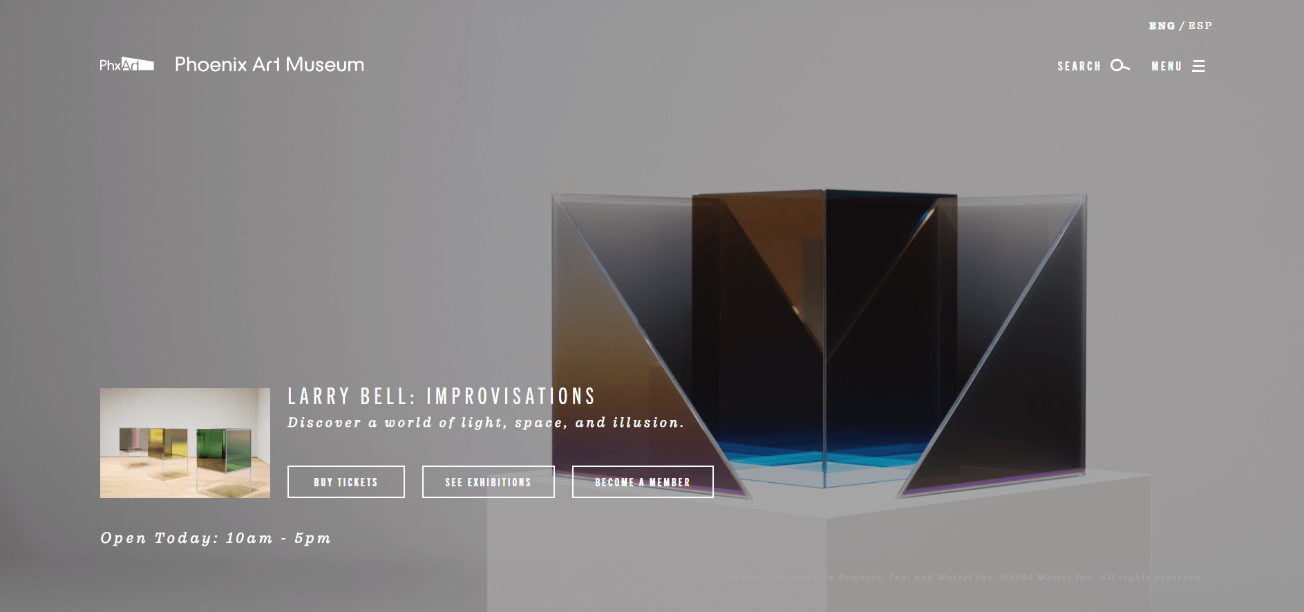
Prepare to elevate your spirits the moment you visit the Phoenix Art Museum’s website! Its breathtaking design is a visual treat that will both inspire and exhilarate you. The designers have excelled in their special skills of choosing a visually appealing color palette and producing graphic illustrations that are both visually striking but also highly understandable!
What you can learn from this fantastic website design:
- Beautiful header imagery
- Beautiful color palette
- Engaging typography
Apartheid Museum
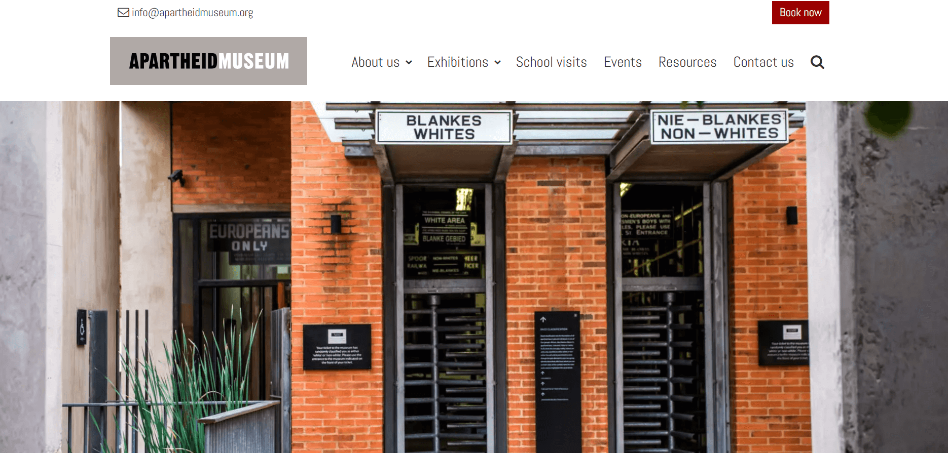
The Apartheid Museum website is both intelligible and aesthetically pleasing. The contrast between vibrant colors and the sophisticated black-and-white background is astonishing. Moreover, the dynamic images are impressive, and the information is presented in a logical manner. It’s truly remarkable!
What you can learn from this excellent website design:
- Ease of use
- Beautiful aesthetics
- Stunning background colors
Auckland Museum
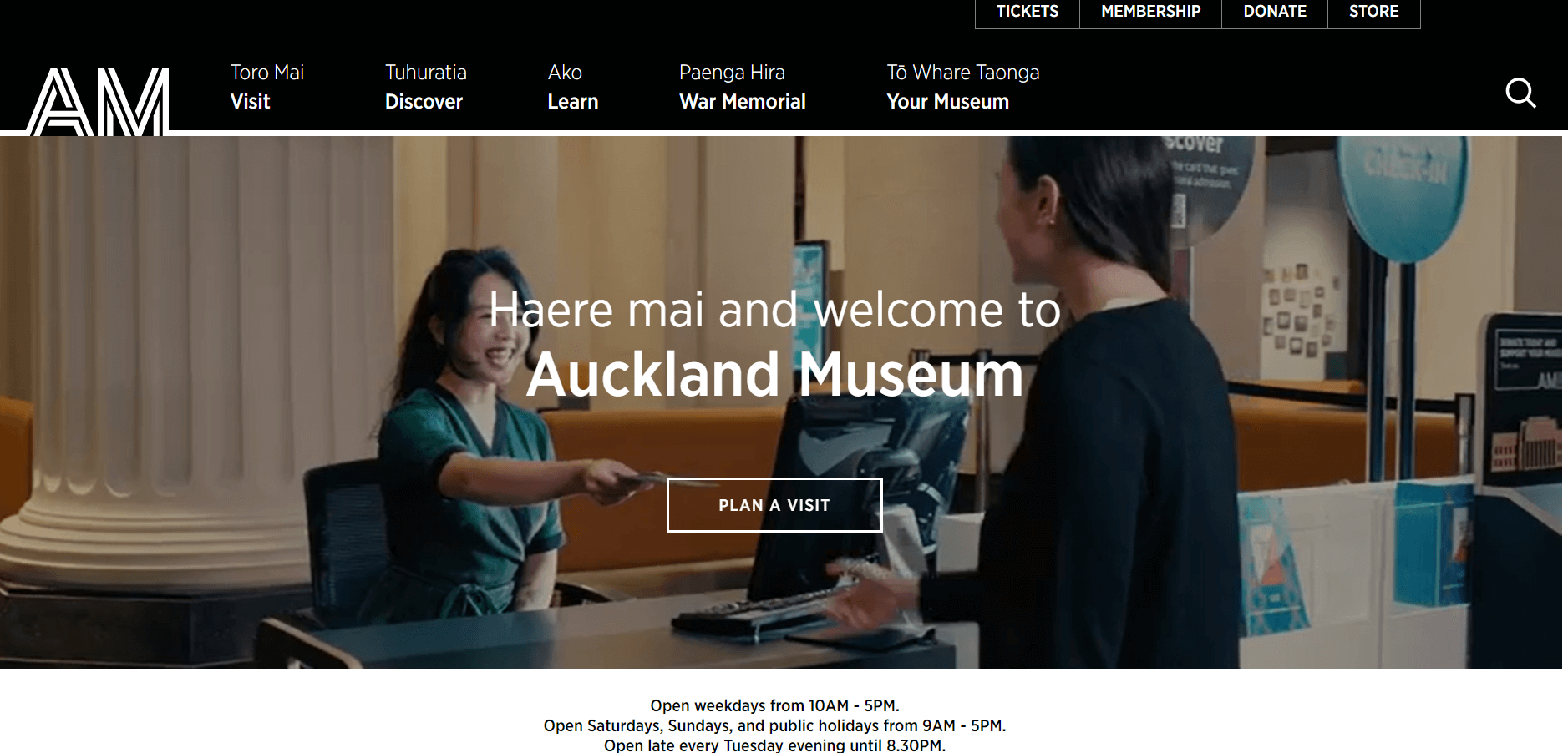
The Auckland Museum website is visually striking with vibrant and engaging background images. It’s evident that the web designers had a passion for creating this site, as there’s no dull moment and each element reflects a distinct artistic style. This website is both whimsical and enjoyable!
What you can learn from this excellent website design:
- Colorful web design
- Engaging background visuals
- Playful and creatively designed layout
5. Historical and Cultural Museum
National Museum of National History
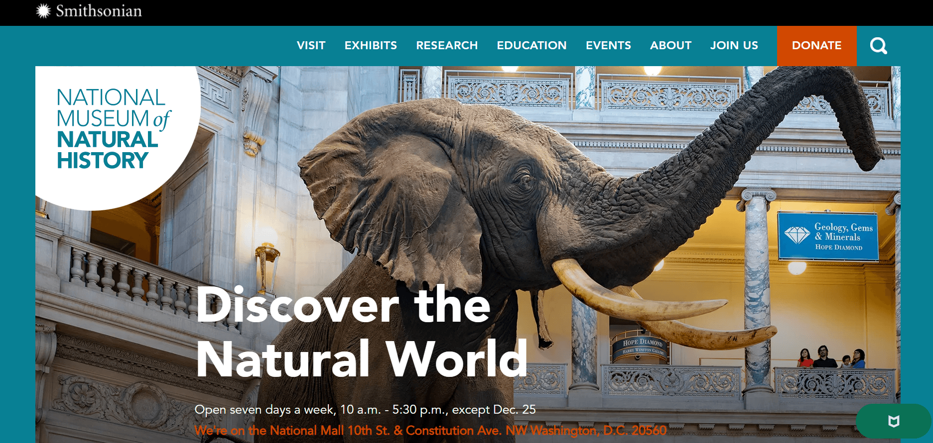
The National Museum of Natural History features an impressive website filled with captivating images. The homepage stands out for its blend of visual appeal and practical functionality, reflecting the designer’s skill. If you appreciate a consistently excellent design, this is the site to visit.
For anyone who values consistently high-quality design and a user-friendly experience, the National Museum of Natural History’s website sets a benchmark. It exemplifies how effective web design can elevate the online presence of a museum, creating an engaging platform that educates, inspires, and captivates audiences worldwide.
What you can learn from this excellent website design:
- Beautiful photos
- High-quality design
- Engaging homepage
The Uffizi Galleries
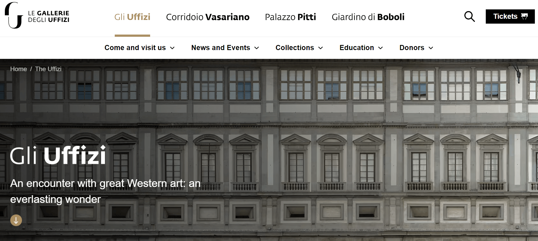
The web designer responsible for the Uffizi Gallery clearly values the importance of simplicity. We appreciate how they use minimal design elements to create a sophisticated and user-friendly website. The pages are elevated by outstanding typography and large, striking images.
For aspiring web designers and museums alike, the Uffizi Gallery’s website serves as a testament to the power of simplicity in creating compelling online experiences. It exemplifies how minimalism can be leveraged to convey sophistication, functionality, and aesthetic appeal, setting a benchmark for museums striving to engage and inspire global audiences through their digital presence.
Key takeaways from this excellent website design:
- Simple design
- Professional viewing experience
- Excellent typography
Hermitage Museum
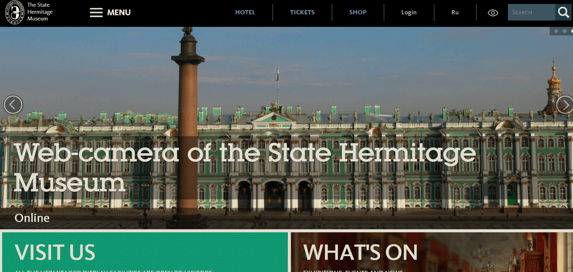
The Hermitage Museum greets visitors with engaging visuals and detailed information. As you navigate through the site, you quickly uncover the exhibits and what they have to offer. Despite the many activities happening, the designers have been meticulous in ensuring each page is lively, aiming to keep you engaged throughout your visit.
What you can learn from this excellent website design:
- Engaging illustrations
- Professional layout
- Informative text
Summary
In conclusion, exploring the diverse museum web designs of 2024 reveals a commitment to creativity, accessibility, and user-centricity. Each showcased museum exemplifies how thoughtful design choices—from visual aesthetics to interactive features—enhance the visitor experience and extend cultural reach online. By incorporating these insights and continuous improvements based on visitor feedback, museums can further enrich their digital presence and foster deeper connections with global audiences.


