10 Best News Web Design Examples of 2024
Summer Nguyen | 08-15-2024
In the continuously changing landscape of digital news consumption, the design of news websites plays a vital role in enchanting audiences and providing information effectively. An elaborate news website not only informs but also amuses users through reflexive navigation, convincing visuals, and interactive features. This article explores key elements of thriving news web design, spotlighting examples that display effective implementation in 2024.
Key Elements of News Web Design
When crafting a news website, certain elements play decisive roles in creating a compelling user experience. Here are essential factors to consider:
- Clear Navigation: Ensure easy access to various sections like news categories, opinion pieces, and multimedia content. A well-organized menu and intuitive search function simplify user exploration.
- Engaging Visuals: Utilize impactful images, videos, and graphics to captivate visitors and enhance storytelling. Visuals should complement headlines and articles to draw attention effectively.
- Responsive Design: Advance the website for all devices, from desktops to smartphones, ensuring seamless browsing experiences. Responsive design improves how easily users can access the website and enhances their overall satisfaction.
- Content Readability: Use legible typography and appropriate spacing to facilitate effortless reading. Headlines and summaries should be concise yet informative, guiding readers through content effortlessly.
- Interactive Features: Merge elements like polls, quizzes, and comment sections to encourage user interaction and feedback. These features foster community engagement and deepen user involvement.
Through focusing on these key factors, news websites can effectively deliver timely information while enhancing user engagement and satisfaction.
Explore more:
- Web Design and Web Development: Key Differences and How They Work Together
- What is Website Traffic? Tips to Boost Website Traffic
Examples of News Web Design
The New York Times
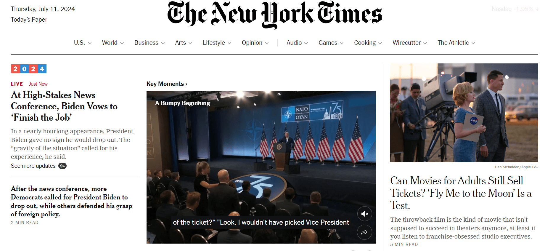
The homepage of the New York Times website qualities engaging images with captivating headlines that grab readers’ attention. The format is easy to use, with a flat bar that includes categories like News, Opinion, Business, and more. The strategic use of white space and a restrained color palette contributes to creating a sophisticated and professional style on the website. Further, the typography is rigorously chosen, utilizing clean and readable fonts throughout.
What you can learn from this excellent website design:
- Engaging images with captivating headlines
- User-friendly layout
- Elegant use of white space and color
- Carefully chosen, readable typography
NBC News
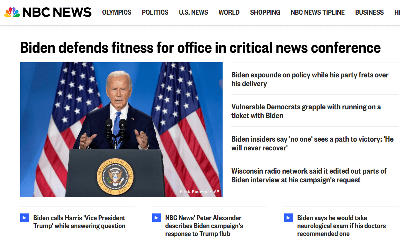
NBC News boasts a visually appealing and accessible website design. The homepage qualities a large image slider showcasing the latest news, accompanied by bold titles. The layout is induced and easy to navigate, with sections such as Top Stories, U.S. News, World News, and more. The color scheme is minimalist yet effective, with red accents highlighting important elements. The typography is clear and legible, ensuring that readers can engage with the content effortlessly. NBC News’ website design effectively balances visual appeal with practical functionality.
What you can learn from this excellent website design:
- Large image slider with bold headlines
- Streamlined, easy-to-navigate layout
- Clear, readable typography
A.P. News
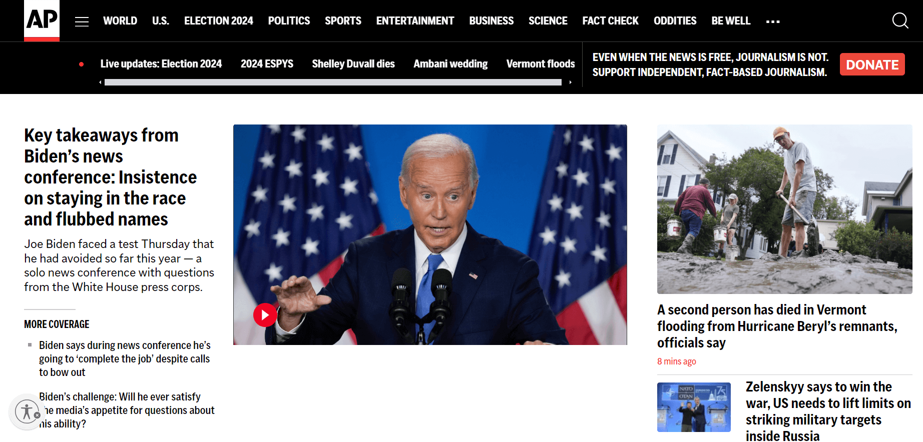
The AP News website emphasizes simplicity and ease of use. The homepage features a clean and minimalistic layout. Ample white space and a limited color palette create a neat and visually pleasing interface. The typography is clear and easy to read, with headlines that draw in readers. The AP News website design rank furnishing news in a specific and handy manner.
What you can learn from this excellent website design:
- Clean and minimalistic layout
- Effective use of white space and limited colors
- Direct and accessible news delivery
BBC
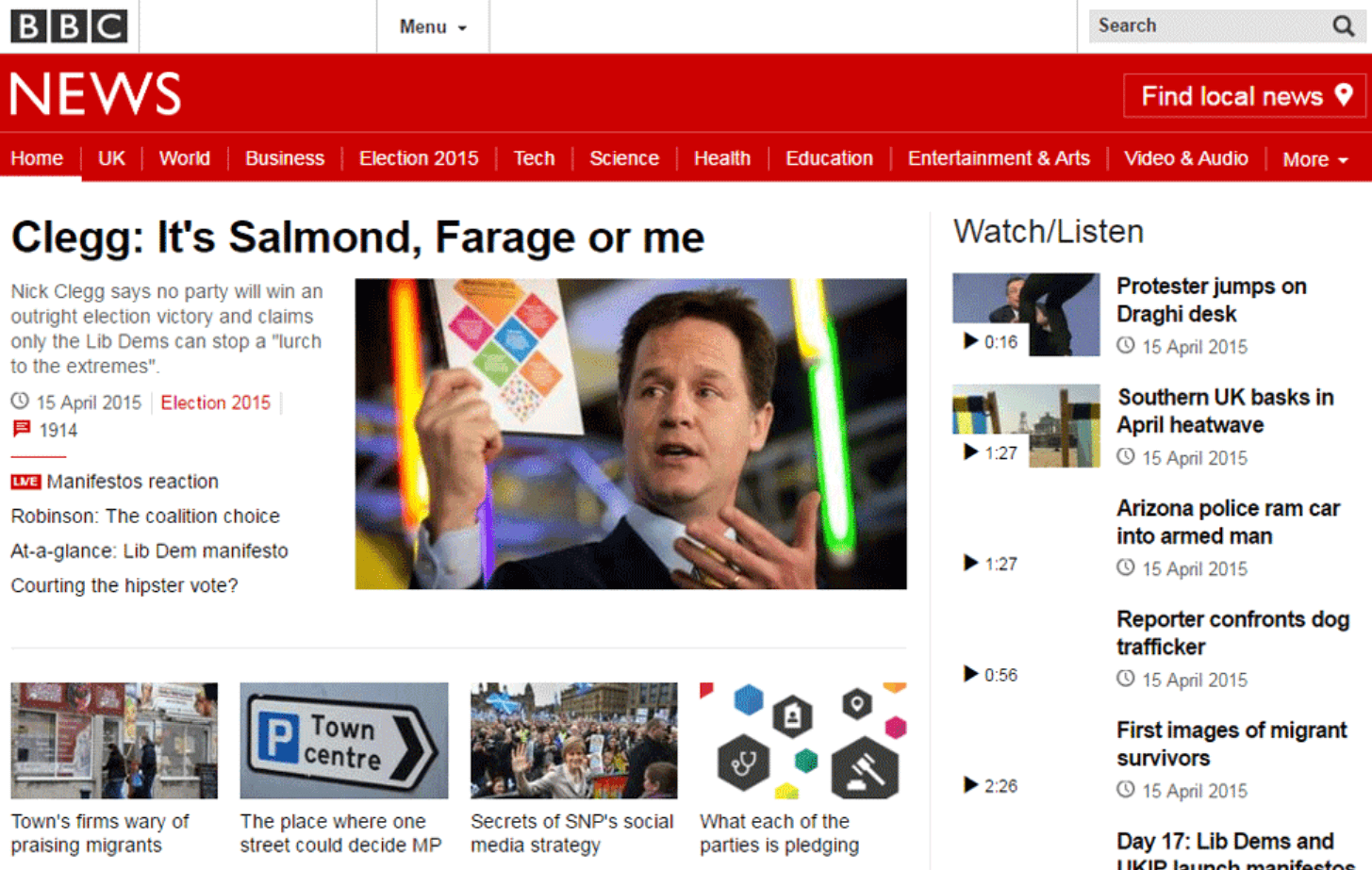
The BBC’s website design is renowned for its clean and organized layout. The homepage properties a grid format with visually appealing images and headlines that capture readers’ attention. Ample white space and a limited color palette create a cool, modern feel. The web design incorporates readable typography, enabling visitors to easily navigate the site. Readers can quickly move through the BBC’s web pages, making it both attractive and user-friendly for finding relevant news items.
What you can learn from this excellent website design:
- Clean and organized grid layout
- Visually appealing images and headlines
- Attractive and user-friendly design
Los Angeles Times
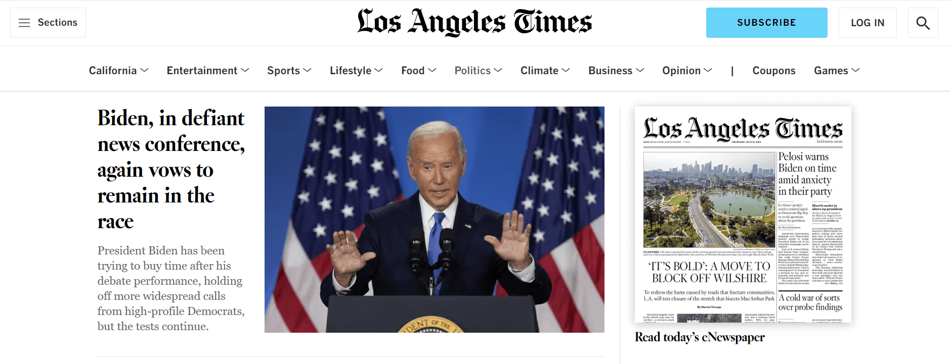
The Los Angeles Times website design is sleek and modern, emphasizing visual storytelling. It features a polished interface with a strong focus on visual narratives. The homepage boasts an oversized image slider displaying current headlines and representative images of the latest stories. The easy accessible layout simplifies navigation, making sections like News, Sports, and Entertainment easily accessible to users. Minimal yet effective use of color, with vibrant blue and orange accents, highlights specific elements. The typography is clear with well-spaced lines, ensuring intelligibility. The Los Angeles Times website design smoothly blends aesthetics with functionality.
What you can learn from this excellent website design:
- Sleek and modern interface
- Emphasis on visual storytelling
- Oversized image slider with current headlines
- Clear and easy-to-navigate layout
- Minimal yet effective use of color
- Readable typography with well-spaced lines
- Seamless blend of aesthetics and functionality
Time
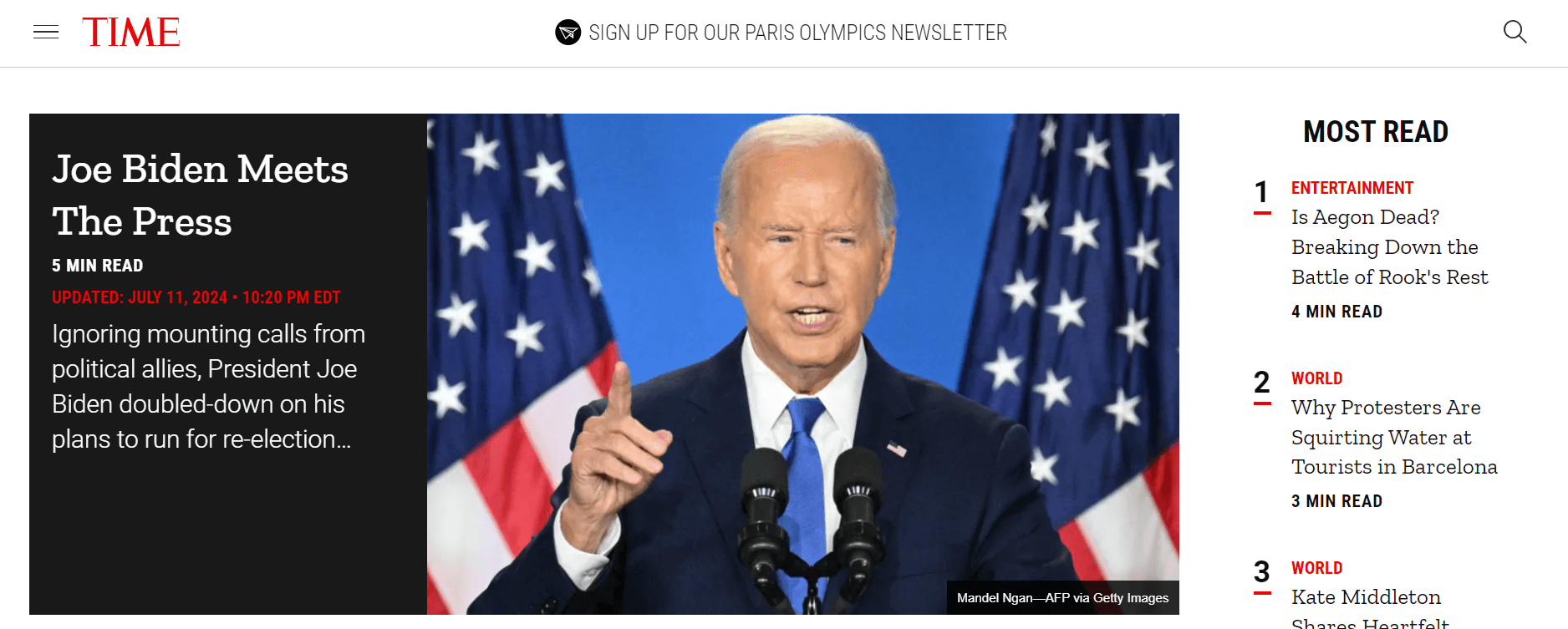
Time has developed a visually attractive and intelligible website. The clean, streamlined design of the homepage makes it easy to navigate through various sections. The addition of dauntless typography and vibrant images enhances the overall look of the site. Moreover, Time incorporates features like videos and animations to boost online user engagement.
What you can learn from this excellent website design:
- Visually appealing and user-friendly design
- Clean and streamlined layout
- Bold typography and vibrant images
- Interactive features like videos and animations
TheNextWeb
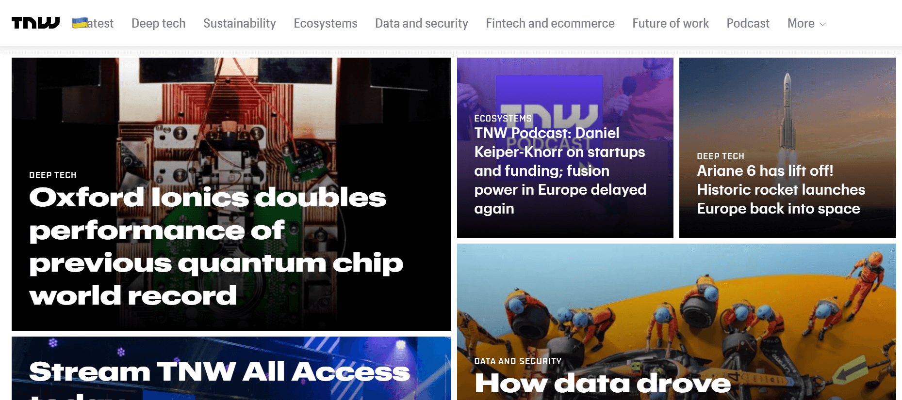
One standout feature of The Next Web’s website is its design. The site assumes a minimalist approach, focusing on Technology and Business News within a sleek layout. The use of white space and simple typography gives it an elegant, sophisticated look. Similar to The Next Web, the engaging animations and interactive elements make it an enjoyable platform.
What you can learn from this excellent website design:
- Minimalist design focusing on Technology and Business News
- Elegant use of white space and simple typography
- Engaging animations and interactive elements
- Sleek and sophisticated layout
Bloomberg
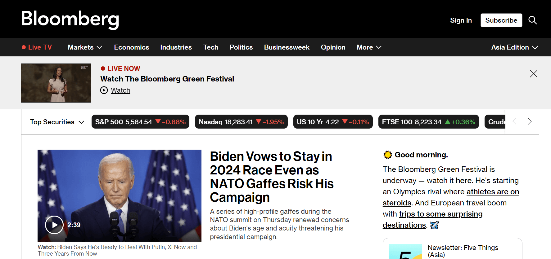
Bloomberg’s website design exudes professionalism and credibility. The site uses a classic and timeless layout, combining bold headlines with clean typography. The use of subtle color palettes heightens the website’s refined aesthetic. Bloomberg also combines involved charts and diagrams to present financial data in visually alluring and comprehensible ways, making it an excellent source for financial news and analysis.
What you can learn from this excellent website design:
- Professional and credible design
- Classic and timeless layout
- Clean typography and bold headlines
- Sophisticated use of neutral color palettes
Fox News
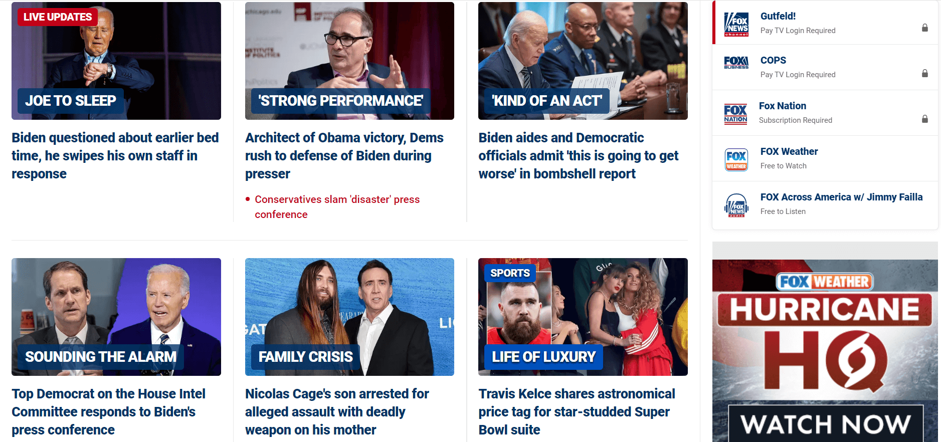
Fox News’ website design is characterized by a bold and dynamic layout. The website combines vibrant colors and compelling graphics to instantly attract visitors’ attention. Large headlines and superior images create a sense of urgency and excitement. Fox News also integrates interactive components such as ballots and quizzes, allowing users to actively engage with the content.
What you can learn from this engaging website design:
- Bold and dynamic layout
- Vibrant colors and eye catching graphics
- Large headlines and prominent images
- Interactive elements like polls and quizzes
ABC News
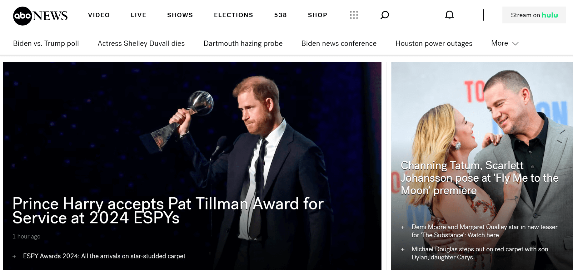
ABC News prioritizes a simple and handy website design. Their site is clean and has an easily understandable layout, making it straightforward for visitors to find what they’re looking for without hassle. This can enhance your overall news experience through various multimedia files. Consistent use of color palettes and typography enhances the overall cohesion of the website.
What you can learn from this engaging website design:
- Prioritize simplicity and ease of navigation.
- Maintain a clean and straightforward layout.
- Integrate multimedia effectively.
- Ensure consistency in design elements.
Summary
Effective news web design goes beyond aesthetics; it’s about creating a seamless user journey that prioritizes accessibility, engagement, and usefulness. By comprising clear navigation, enchanting visuals, responsive design, readable content, and interactive attributes, news websites can not only attract but also retain audiences in an increasingly competitive digital landscape. These examples highlight successful implementations that blend functionality with visual appeal, ultimately enhancing the overall user experience and satisfaction.

