What Makes a Good Web Design: 10 Principles to Follow
Vinh Jacker | 07-18-2023

In the digital age, websites have become the forefront of any organization’s online presence. However, with the vast number of websites available today, standing out from the crowd and captivating users has become increasingly challenging. A good website design is not just visually appealing; it encompasses a harmonious blend of aesthetics, functionality, and user experience.
This article will explore the key features and principles contributing to a good website design. We will delve into the elements that make a website visually engaging, the importance of usability and intuitive navigation, and the significance of responsive design in today’s mobile-dominated world.
Moreover, we will shed light on content’s crucial role in website design, emphasizing the need for well-structured, compelling, and accessible information.
What Makes a Good Web Design?
Website design creates a visually appealing, practical, and user-friendly structure and appearance for a website. It involves:
- Considering elements such as colors, fonts, images, and graphical components that align with the brand identity and message.
- Organizing the content.
- Designing interactive elements.
- Creating clear navigation menus.
- Ensuring responsiveness compatibility with different devices
- Optimizing speed and performance.
A good website design requires a deep understanding of the target audience, their needs, and browsing habits. Designers must:
- Prioritize user experience.
- Make sure the website is easy to use.
- Offer valuable content.
- Create straightforward navigation.

10 principles to make a good website design
With our 8 following principles, you can create a good website design that not only attracts and engages visitors but also provides a positive user experience and supports your overall objectives:
1. Show website purpose
A good website’s first and foremost principle is clarity in conveying its purpose. Visitors should immediately understand what the website is about and what value it offers. Whether it’s an e-commerce platform, a blog, or a portfolio, the homepage should provide a clear and concise overview.
Here are effective ways to communicate your website’s purpose clearly:
- Provide a clear and concise overview of your company, its mission, and values
- Craft a concise statement that articulates the specific benefits or solutions your website provides to its target audience. Make it easy for visitors to understand what’s in it for them.
- Utilize a visually striking image or video that reinforces your website’s purpose and resonates with your target audience.
2. Strive for simplicity
Simplicity is the key to a good website design. A simple design not only enhances the visual appeal but also ensures faster loading times, contributing to a positive user experience. Also, a clean and minimalist aesthetic can build trust and professionalism. You should:
- Avoid cluttered layouts and excessive design elements that may overwhelm visitors.
- Focus on essential elements that guide users through the content.
- Prioritize concise text and ample white space. This gives your content room to breathe and allows users to focus on what truly matters.
3. Appreciate the importance of navigation
Navigation plays a pivotal role in ensuring a good website design. A well-organized and intuitive navigation menu allows visitors to find what they want easily.
A good navigation system feels natural and intuitive. Users shouldn’t have to decipher cryptic menus or hunt for hidden links. You should employ clear labels, consistent hierarchy, and logical groupings to organize your content.
Also, it is important to minimize the number of clicks required to reach key pages and avoid burying important information behind layers of menus. Every click should be a purposeful step towards their goal, not a frustrating detour.
Furthermore, you should take advantage of breadcrumbs. Breadcrumb trails display the current page’s location within the website’s hierarchy. It provides context and allows users to navigate back to previous sections easily.

4. Test early, test often
Testing your website’s functionality and usability is vital to ensure a good website design. Conducting usability tests with diverse individuals can uncover any issues or obstacles that may hinder user engagement. Testing early in development allows you to make necessary adjustments, resulting in a more refined and user-friendly website.
When implementing the principle of testing early, test often; here are some key points to remember:
- Testing one user is better than testing none, and testing early in the project is better than testing near the end.
- Errors are common during requirements and design activities and become more expensive to fix later.
- Usability testing is an iterative process. You design, test, fix, and test again.
- Usability tests always produce beneficial results, whether they identify problems or confirm the absence of significant design flaws.
- Developers and designers are not the best testers for their work. They have a biased perspective and know exactly how the site is built and works.
5. Levarge F- based pattern
Have you ever wondered how people scan web pages? Eye-tracking studies reveal a fascinating truth: most users follow a predictable pattern, known as the F-shaped pattern when reading online content. This insight holds immense power for web designers, allowing us to tailor our layouts to optimize user attention and engagement. To leverage an F-shaped pattern for a good website design, follow these key points:
- Place your most important headline or message in the top left corner of the page, where it captures immediate attention.
- Position your primary navigation menu along the top horizontal section.
- Prioritize your most important content along the left side of the page, where users’ eyes naturally linger.
- Utilize high-quality images and videos within the F-pattern’s focus areas.
6. Follow the graphic hierarchy
Graphic hierarchy is the strategic arrangement of visual elements on a page to communicate their relative importance. It’s like organizing a symphony, where each instrument plays its part in harmony, contributing to a unified experience. By creating a distinct visual hierarchy, you can direct users’ attention and help them comprehend the relative importance of the various website parts. Use size, color, contrast, and space to separate headings, subheadings, body text, and calls to action. You may increase user engagement and enhance the overall user experience by stressing important components and establishing a feeling of order.
To create an excellent visual hierarchy in website design, consider the following points:
- Order of importance: Arrange graphic elements based on their importance to guide users’ attention. Emphasize essential content by making it more prominent and visually appealing.
- Size: You should use varying sizes to indicate the importance of different elements. More prominent elements attract more attention, while smaller ones are perceived as less critical.
- Color: Using color to create contrast and highlight essential elements is important. Bright or contrasting colors can draw attention, while muted or harmonious colors can create a sense of harmony and balance.
- Contrast: Contrast helps differentiate elements and create visual interest. Use contrasting colors, shapes, or sizes to make essential elements stand out.
- Typography: Use typography to establish a hierarchy of information. Vary font sizes, weights, and styles to differentiate headings, subheadings, and body text. Also, you need to ensure legibility and readability across different devices.
- Alignment: Align elements consistently to create a sense of order and structure. Use alignment to group related elements and guide the viewer’s eye through the design.
7. Reliable on mobile
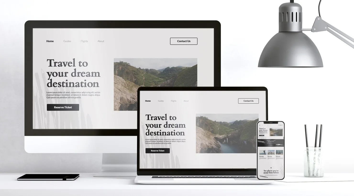
Making a good website design that is mobile-responsive is essential due to the growing use of mobile devices. Ensure your website adjusts and runs well across various screen sizes and gadgets.
Thanks to responsive design, your website’s visual appeal, usability, and functionality are all maintained across desktops, tablets, and smartphones. No matter what device a consumer uses, it offers a consistent experience.

8. Have a fast loading time
A quick loading time is necessary for an enjoyable user experience. Users are likelier to stay on your website when it loads quickly and are less likely to leave because of slow loading times.
To ensure that your website loads quickly, you should:
- Optimize image size and format: Resize images to the appropriate dimensions using external picture editor tools like Photoshop. Also, you need to compress images further using image optimization tools like JPEG & PNG Stripper Smush.it, Online Image Optimizer, or SuperGIF.
- Minify CSS, JavaScript, and HTML: Minifying your CSS, JavaScript, and HTML files involves removing unnecessary characters, such as white spaces and comments, to reduce file size. This can help improve the loading time of your website.
- Use a Content Delivery Network (CDN): A CDN is a network of servers distributed geographically that helps deliver website content to users more efficiently. By caching content closer to the user, a CDN can reduce your website’s loading time.
- Reduce the number of redirects: Redirects can add round trips between the user’s browser and your website, increasing the loading time.
Related post: Top 10 Ways to Maximize Magento Website Speed
9. Content optimization
Optimized content is essential for attracting and keeping a good website design. You should:

- Stick to a specific writing style: Consistency helps maintain a cohesive and clear voice throughout the website’s content.
- Use shorter sentences and paragraphs: Breaking down content into shorter sentences and paragraphs makes it easier for readers to scan and comprehend the information.
- Utilize headings and subheadings: Organizing content with headings and subheadings helps readers navigate the information more easily.
- Incorporate bullet points and lists: Using bullet points and lists helps present information concisely and scannably. This makes it easier for readers to quickly grasp key points and main ideas.
- Optimize legibility: Ensure that the text is legible by using a font color that contrasts nicely with the background color and choosing an appropriate font size that is easy to read.
- Test readability: Use online editing tools like the Hemingway Editor or readability tools like Readable from WebFX to assess the readability of the content.
10. Easy to communicate
By offering straightforward and easy-to-find contact information, you may make it simple for users to contact you. Include an email address or contact form on a separate “Contact Us” page.
To offer in-the-moment assistance, think about implementing live chat functionality. Respond immediately to questions, comments, and feedback to build trust with your visitors.
Wrap up
Now that you’ve perused the principles for a good website design, it’s time to start enhancing your site. If you follow the above principles, you will have a more professional and eye-catching website!


