


1 min read
|
03-30-2026
20 Gym Website Design Examples For Inspiration In 2024
Summer Nguyen | 08-08-2024
Are you interested in designing an exceptional gym website for 2024? Look at these 20 examples that will inspire you. These websites display top-notch fitness web design, featuring modern features and creative ideas. This will enhance your gym’s online visibility and draw in new members.
Key Elements of Gym Website Design
To create an engaging, functional, and effective gym website, remember to include these key elements during the design process.
- Class Schedule and Description: It is crucial to have a current class schedule visibly posted with detailed descriptions. Provide thorough explanations of each class, instructor backgrounds, and class levels. This assists prospective members in selecting the most suitable classes for their fitness objectives.
- Membership Options & Pricing: Outline the various membership options available. Provide them with corresponding prices, and the benefits that come with each plan. Simplify the process for potential members to compare different plans and select the most suitable one.
- Online Booking and Payment System: Enable members to schedule classes, book personal training sessions, and complete payments through the internet. This convenience can enhance member contentment and automate gym functions.
- Contact Information & Location: Provide visitors with clear contact details and the whereabouts of your gym. These include address, phone number, email, and business hours. Think about including a map to make it simple to find directions.
- Before and after pictures: Display a collection of transformation photos showcasing your members. This is an effective method to showcase the outcomes individuals can meet with the help of your gym.
20 Gym Website Design Examples For Inspiration
Rumble
The Rumble Boxing website showcases a lively layout with a captivating video loop on the front page. The user-friendly navigation makes it simple to find and browse class schedules and offerings. Strong black and white colors increase the website’s energetic design. The brand’s distinctive identity is effectively portrayed through the design.
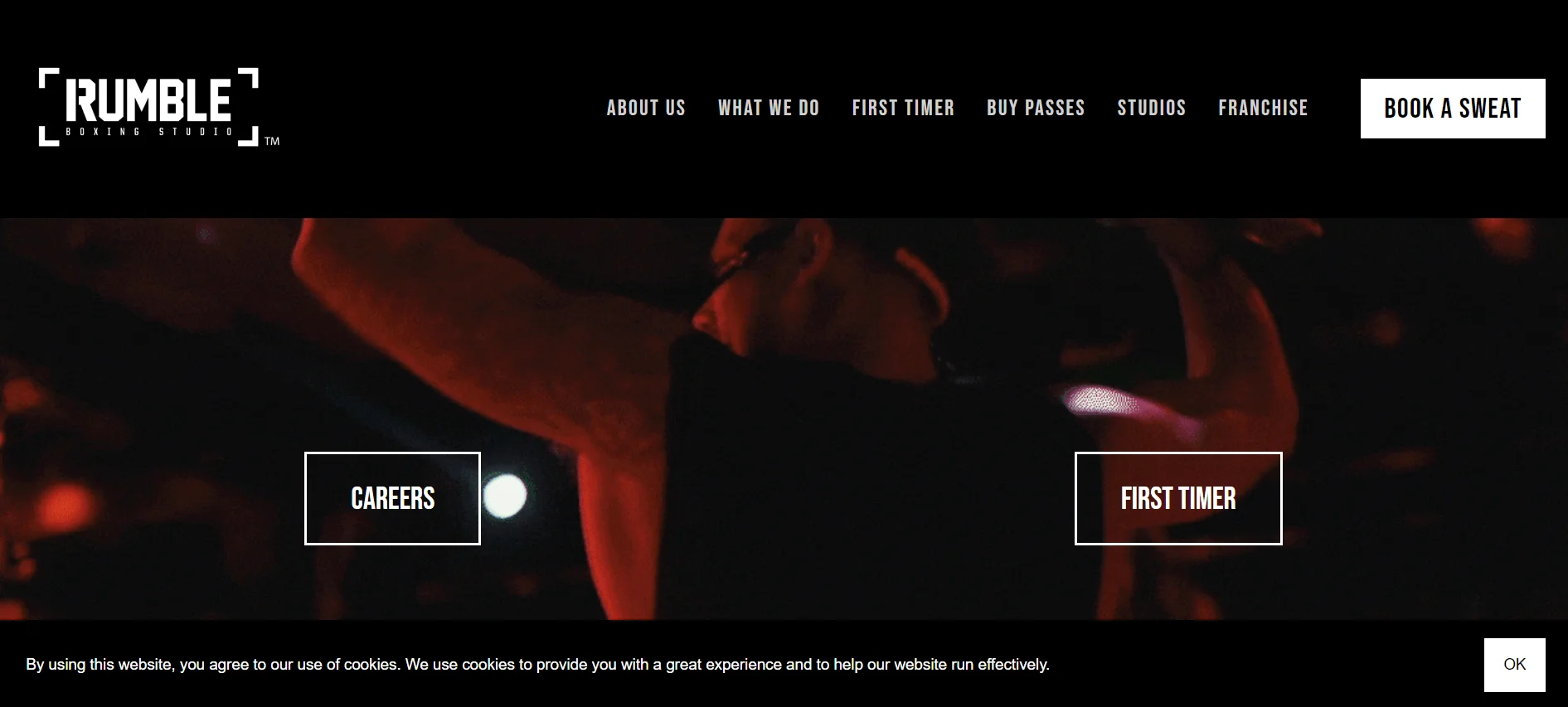
Key Takeaways:
- Dynamic creation
- Captivating video sequence
- Simple to move around
- Vivid color palette
- Powerful brand recognition
CrossFit
The CrossFit website efficiently communicates details about its worldwide brand and workout approach. The layout is straightforward, neat, and user-friendly. The site showcases easily identifiable branding and simple navigation for users. Visitors can easily find affiliate gyms all over the world and access details on how to become a CrossFit coach.
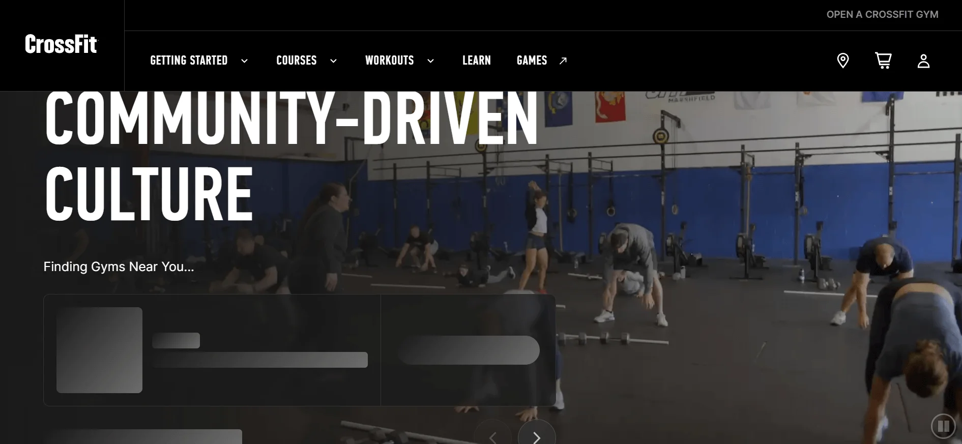
Key Takeaways:
- Uncomplicated, minimalist layout
- Simple to navigate
- Unambiguous branding
- Worldwide gym finder
- Details for individuals interested in becoming coaches
CorePower Yoga
CorePower Yoga‘s website is stylish and contemporary. It features vibrant branding that expresses happiness and satisfaction. High-resolution images and videos are employed to feature studios, virtual classes, and their mobile application. Guests can buy branded merchandise and enroll in teacher training programs.
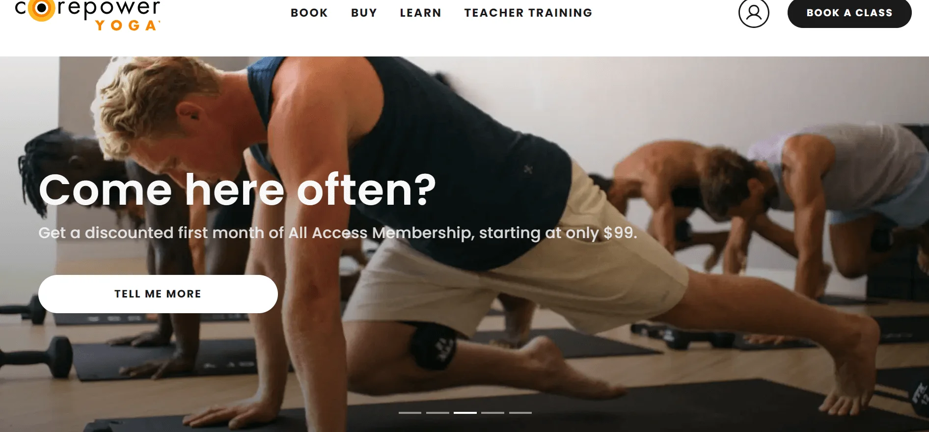
Key Takeaways:
- Stylish, contemporary appearance
- Lively, happy branding
- Top-notch graphics
- Features studio space and virtual lessons
- Choices for buying equipment and learning opportunities.
Pure Barre
The Pure Barre website demonstrates the brand’s elegance and strength through a sophisticated layout. Soft pastels, white space, and elegant typography are employed to achieve a refined appearance.
Finding class schedules, studio locations, and workout attire is simple. This is due to the user-friendly navigation. The user-friendly design effectively communicates the brand’s fitness message.
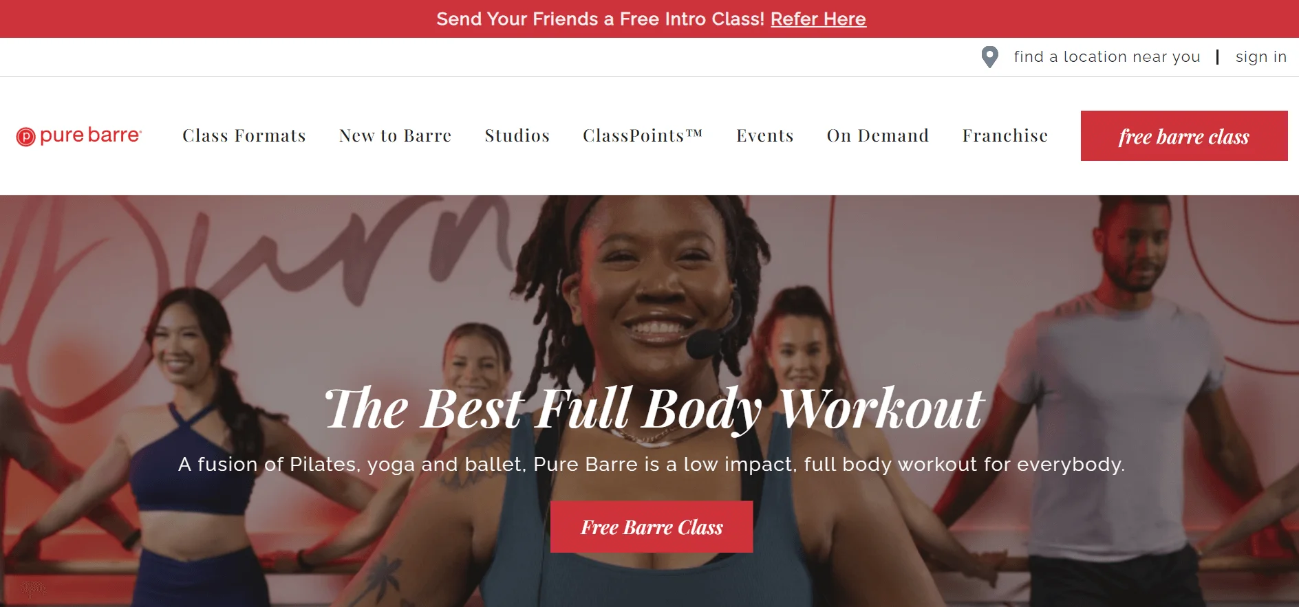
Key Takeaways:
- Sophisticated appearance
- Soothing soft hues
- Vivid workout visuals
- Simple to browse through.
- Successful brand communication
F45 Training
The F45 Training website showcases a sleek, contemporary layout with a captivating video prominently displayed on the front page. The dark blue and red hues elevate its energetic appearance. Finding workout programs, resources, and studio locations is simple due to the clear navigation. The design aptly reflects the brand’s energetic fitness program.
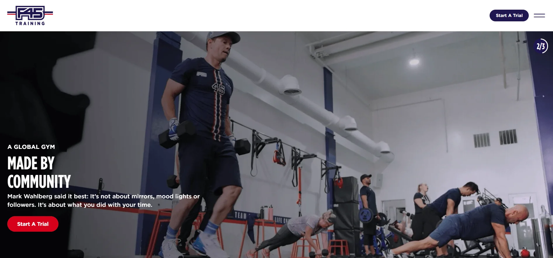
Key Takeaways:
- Sleek and contemporary style
- Impressive video on the main page
- Shades of deep blue and crimson hues
- Simple browsing
- Symbolizes an evolving workout journey.
Armoury Coaching Studio
The website of Armoury Coaching Studio is visually striking and has a professional appearance. The brand’s quality is emphasized through powerful visuals and cohesive design features. The drop-down menus for classes, coaches, and pricing make navigation easy to understand. The website efficiently markets its tailored coaching services and streamlines the booking process.
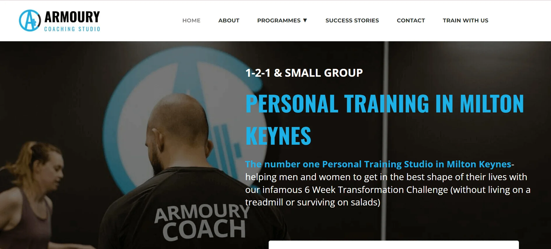
Key Takeaways:
- Aesthetically stunning
- Uniform design
- Easy to navigate
- Convenient availability of services
- Booking made easier.
The Mercedes Club
The website of The Mercedes Club showcases an elegant and polished design. The front page displays luxurious facilities with beautiful images. Navigation is simple, with separate pages for classes, personal training, and wellness. The blog also contains informative articles.
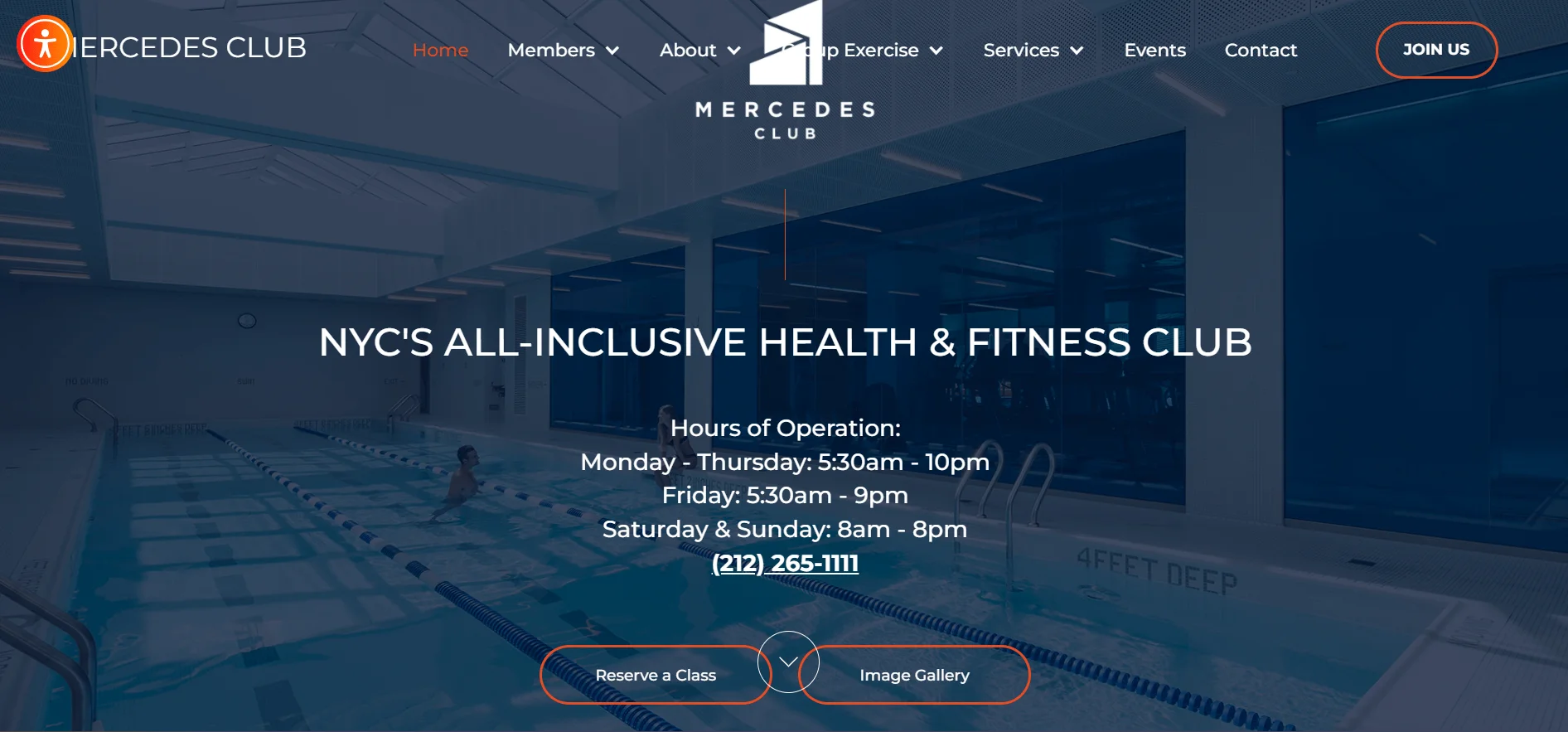
Key Takeaways:
- Fashionable appearance
- Top-notch photography
- Simple to move around
- Services available on blank pages.
- Blog filled with valuable information
Equinox
The Equinox website exudes a high-end vibe with its sleek and polished design. The main page features top-notch gym images, giving off a premium atmosphere. Getting around is easy, thanks to the convenient links to courses, training, and membership options.
The fitness programs and services are explained clearly on the website. The minimalistic design and use of white space enhance readability. The website of Equinox features a luxury brand dedicated to innovation and excellent customer service.
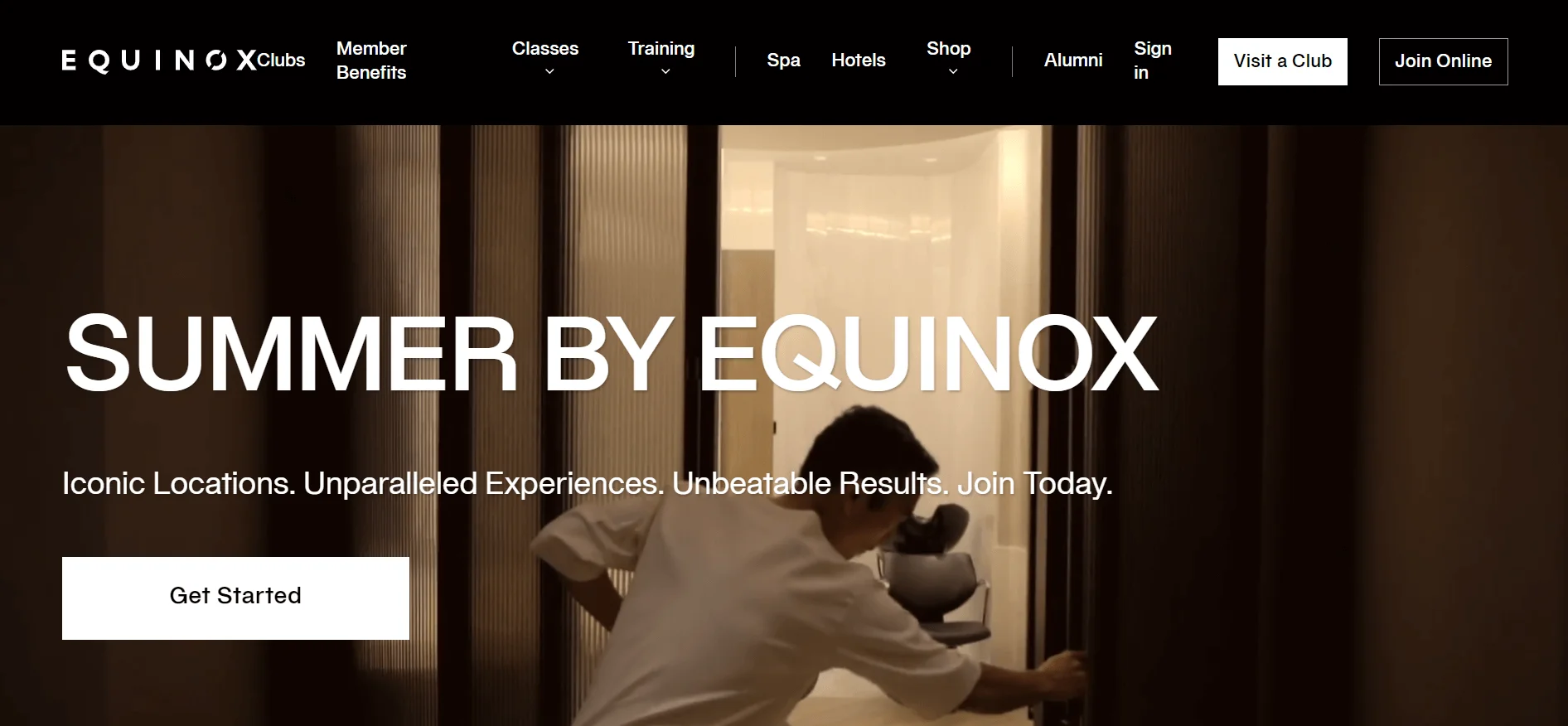
Key Takeaways:
- Smooth, refined appearance
- Images of excellent quality
- Easy to use directions
- Concise service explanations
- Neat, easy-to-read design
- Attention on luxury brand
Gymbox
Gymbox‘s website features bold, vibrant designs and lively animations for a high-energy look. Finding your way around is simple, as there are concise links to courses, places, and subscription options.
The website contains health articles and a fun blog. It has great reactivity, loading videos and images quickly. The website of Gymbox mirrors the brand’s entertaining, high-energy exercise sessions.
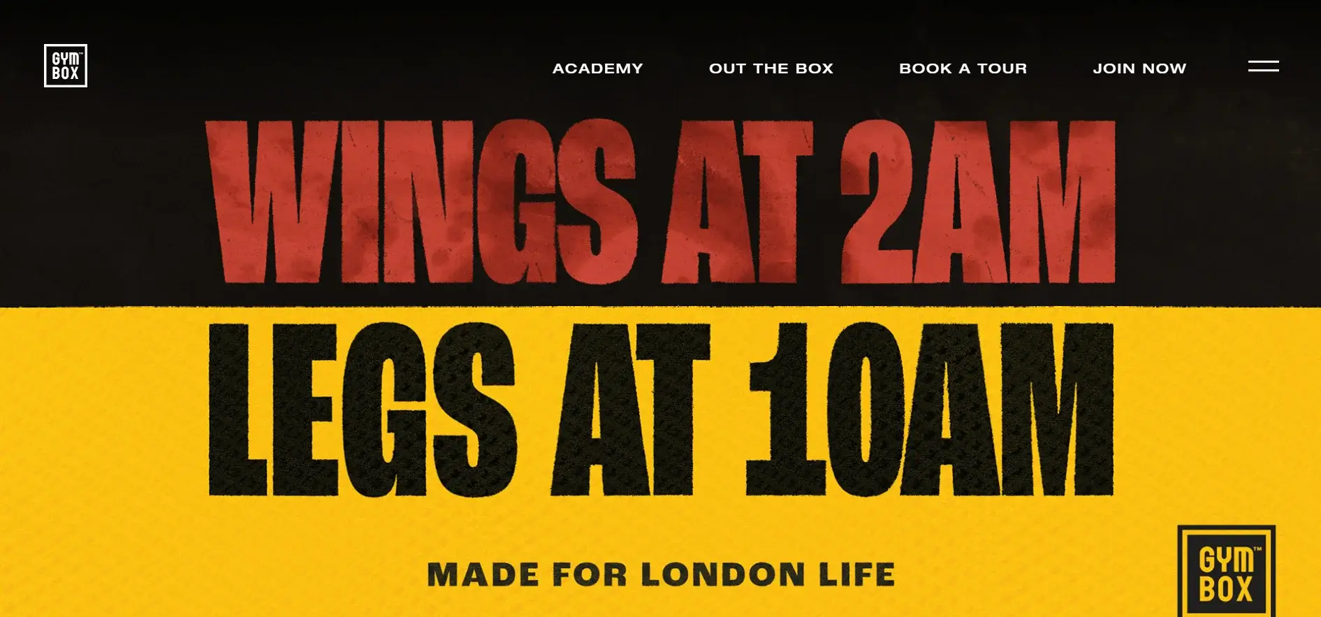
Key Takeaways:
- Design that is eye-catching and lively.
- Intense visual designs
- Simple maneuvering
- Articles and blog posts that provide useful information.
- Quickly loading content.
- Shows a lively exercise experience
Barry’s
Barry‘s website has a modern and tidy design. It includes top-notch workout images and straightforward prompts to book classes and buy merchandise. The use of bold typography simplifies the navigation process.
Videos display the rigorous exercise sessions provided by Barry’s. The brand is well represented on the website, creating a distinctive presence in the fitness industry.
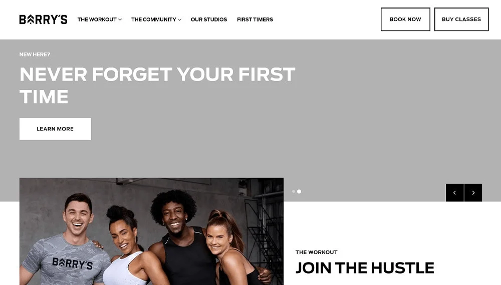
Key Takeaways:
- Sleek and contemporary aesthetic
- Images of superior quality
- Precise instructions to act
- Bold font style in printing and design.
- Optimal use of video
- Effective brand portrayal
GoodLife Fitness
The GoodLife Fitness website is modern and easy to navigate. The gym’s facilities are showcased in a rotating banner that displays high-quality images and videos.
The structure is arranged with distinct prompts for joining, scheduling classes, and membership choices. The font is clear and readable, while the color palette complements the brand. Additionally, there is a blog on the website sharing advice on staying fit.
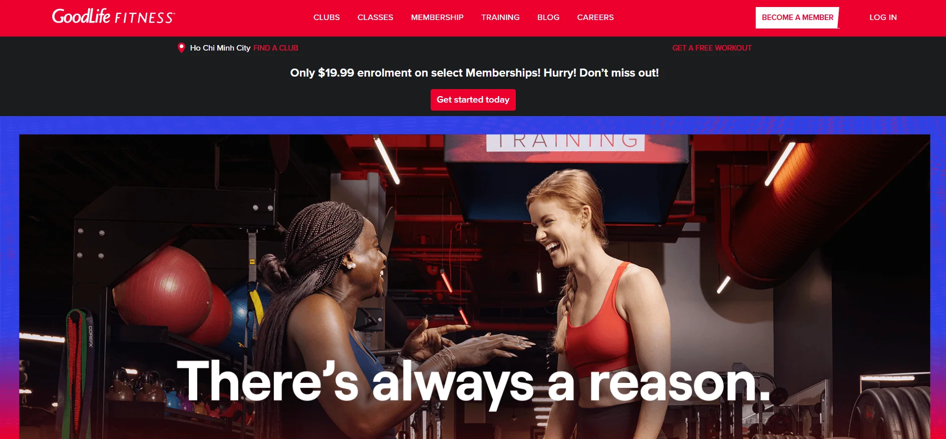
Key Takeaways:
- Modern and easy-to-use layout
- Top-notch pictures and videos
- Precise calls for action
- Simple typography that is easy to read.
- Color combination that enhances the brand’s image.
- Blog providing advice on physical health and wellness.
Planet Fitness
The website of Planet Fitness showcases a playful and attractive layout with vibrant graphics and entertaining titles. It is simple to locate the Join Now button and the various membership options. The website also includes a Find a Club function to help users find nearby gyms and see what facilities they offer. It effectively conveys the gym’s welcoming, non-judgmental atmosphere.
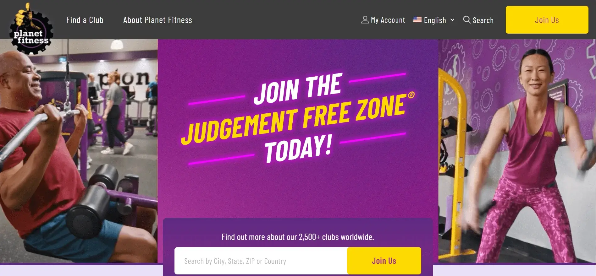
Key Takeaways:
- Enjoyable, interactive layout
- Colorful drawings
- Simple to locate Join Now button
- Locate a Club function
- Conveys approachable principles
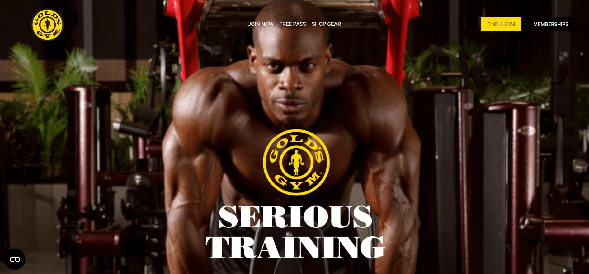
Gold’s Gym
The website of Gold’s Gym features a contemporary layout showcasing big, top-notch workout pictures. It includes straightforward prompts to sign up and reserve spots in classes. The design is well-structured with simple access to areas, membership choices, and activities.
The bright color palette and uncomplicated font style strengthen the intense exercise session. The website features video testimonials from its members as well. It accurately reflects the brand and its principles.
Key Takeaways:
- Contemporary style
- Top-notch pictures
- Precise prompts for action
- Efficiently arranged design
- Vivid color palette
- Testimonials in video format
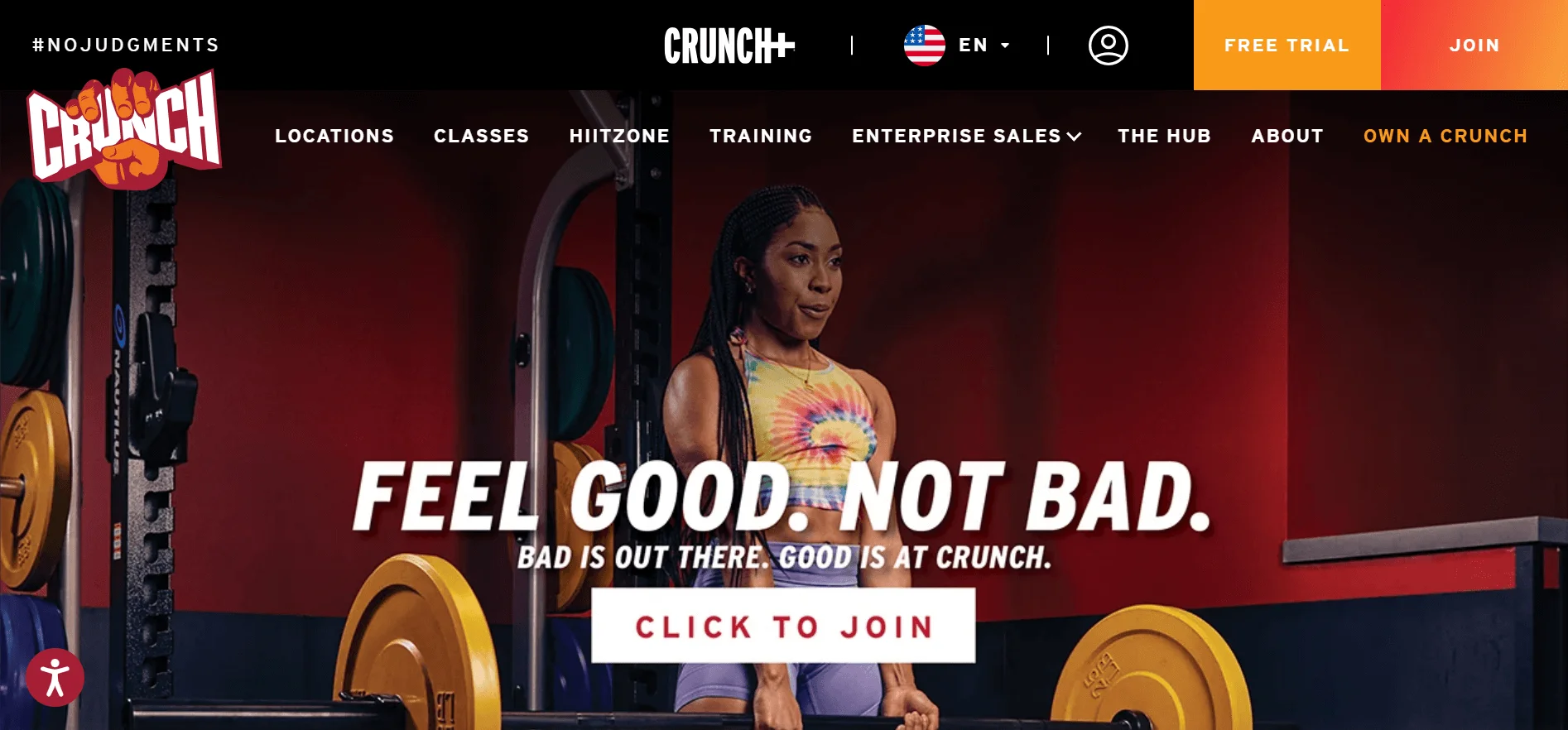
Crunch Fitness
The website for Crunch Fitness has a stylish and contemporary layout. The front page showcases top-notch pictures and distinct prompts for signing up, reserving sessions, and checking out membership choices. The structure is efficiently arranged with convenient links to places and course timetables.
The brand’s lively personality is showcased through bold typography and a playful color palette. Videos efficiently showcase the gym’s distinct exercise atmosphere.
Key Takeaways:
- Stylish, contemporary appearance
- Images of superior quality.
- Concise directives for action
- Efficiently structured design
- Typography in bold style
- Exciting color combination
- Optimal use of video
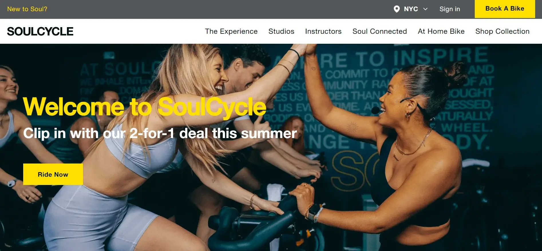
SoulCycle
The website for SoulCycle showcases a contemporary and minimalist layout. Finding classes, instructors, and pricing is made easy by the straightforward navigation. The website is designed to adapt to any device, ensuring it looks great no matter what. The arrangement and prompts simplify the process of signing up for classes or reaching out to the studio.
Key Takeaways:
- Contemporary style
- Straightforward way to find your way.
- Responsive to mobile devices
- Convenient options for registration and communication are available
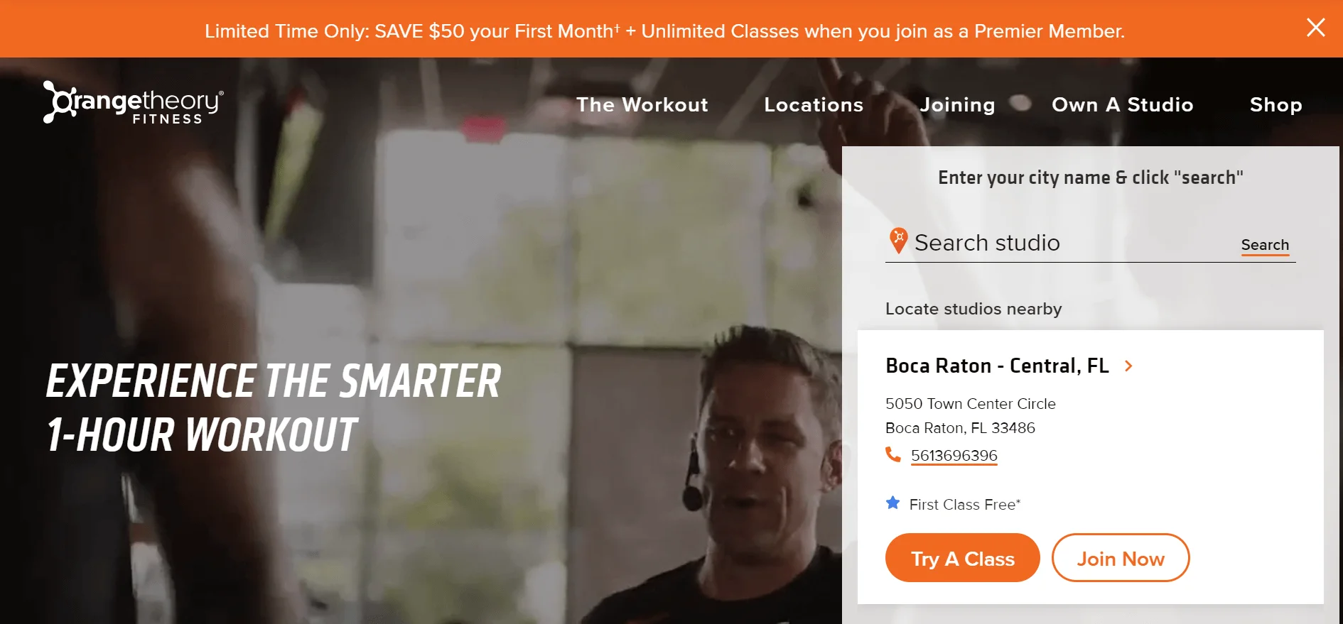
OrangeTheory Fitness
The website for Orange Theory Fitness showcases a vibrant and bold design that emphasizes its high-energy brand. Navigation is simple and user-friendly. This makes it easy for users to quickly locate classes, venues, and membership options.
The website is responsive to mobile devices and adjusts smoothly to any screen size. Having clear calls-to-action simplifies the process of booking classes and accessing event information.
Key Takeaways:
- Vivid and striking appearance
- Simple way to find your way around.
- Responsive to mobile devices
- Basic reservation of classes
- Concise details about the event
The Bar Method
The website for The Bar Method is sophisticated and uncomplicated. It features a minimalist design and a soothing color palette. The studio is showcased with a stunning background image on the homepage. The “Try a Class” button provides easy navigation to a booking form. The website also has a blog featuring articles on health and fitness. The design mirrors the brand’s calm principles.
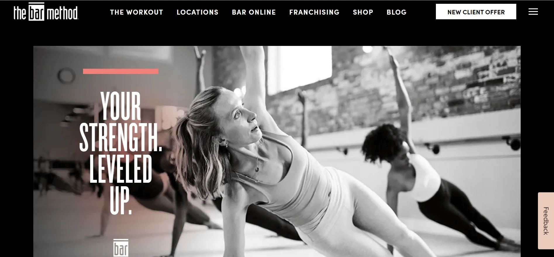
Key Takeaways:
- Sleek, simple design
- Soothing hues
- Easy-to-understand wayfinding
- Booking a class that is easy and straightforward
- Website containing articles about physical fitness
FIT4MOM
The Fit4Mom website is interactive and captivating. It showcases vibrant hues and powerful pictures of energetic mothers with their infants. The front page showcases the different types of exercises offered. Navigation is easy, with obvious prompts to explore programs. Mothers who focus on health and wellness are attracted to the contemporary design.
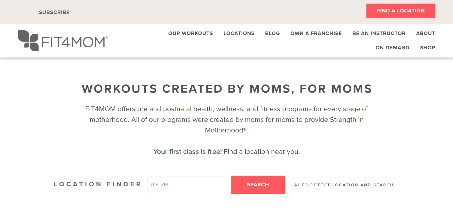
Key Takeaways:
- Design that is constantly changing or evolving.
- Vivid hues and pictures.
- Simple to move around
- Various workout features
- Attracts mothers who focus on health.
Anytime Fitness
Anytime Fitness‘ website has a sleek and contemporary design. It Incorporates shades of blue, purple, and white to communicate a sense of inclusiveness. The main page showcases the gym’s sense of community. Finding a gym, exploring memberships, or inquiring about personal training is easy with a clear CTA for navigation. The website prioritizes ease of use and user-friendly design.
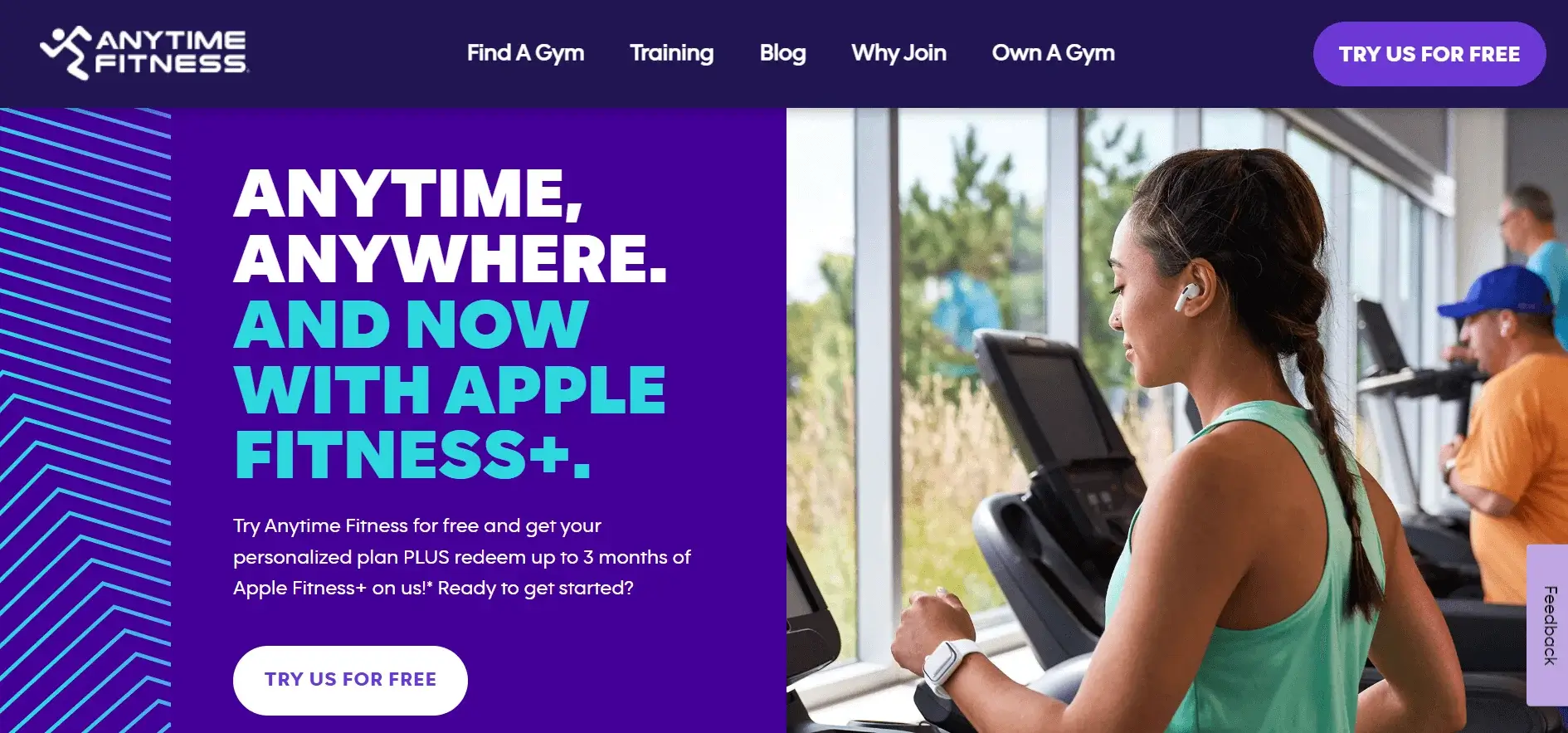
Key Takeaways:
- Sleek, contemporary aesthetic
- Basic color palette
- Simple to navigate
- Emphasize on ease of use and practicality
The Barre Code
The clean and minimalistic design of The Barre Code website highlights fitness and grace. The design makes it simple for users to explore and locate information efficiently. High-resolution photos display exercise fashions, while the peaceful, elegant color palette elevates the appearance. The gym’s brand and services are effectively and elegantly promoted on the website.
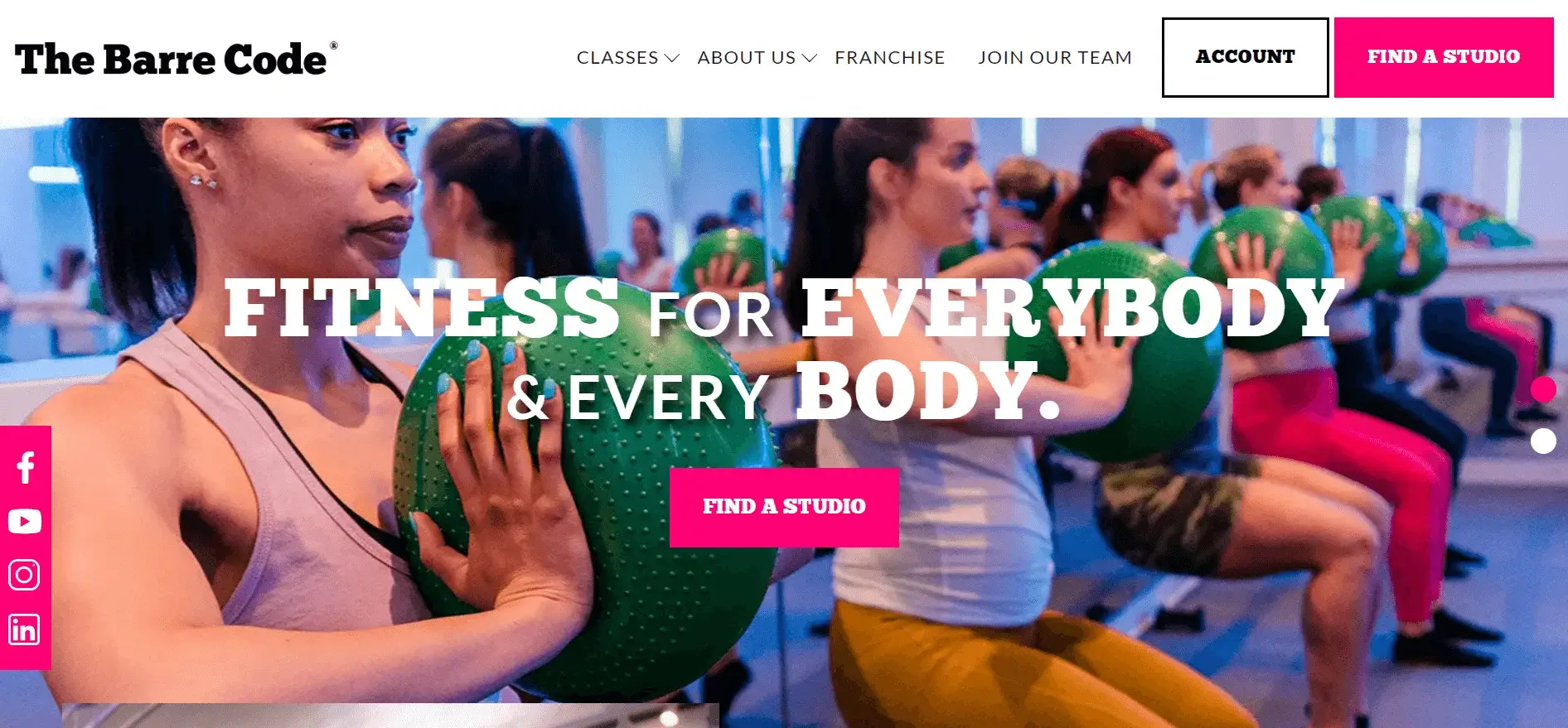
Key Takeaways:
- Sleek and simple design
- Simple to get around
- Images of superior quality
- Tranquil, elegant color combination
- Successful promotion of a brand.
Read more:
- Top 10 Fitness Websites for Design Inspiration
- Top 15 Shopify Fitness Stores in 2025 And Why They Succeed
Tips for Designing an EffectiveGym Website
To create a gym website, keep in mind these important suggestions:
- Engaging Home Page: Ensure your website’s main page leaves a lasting impact. You can do this by featuring top-notch pictures showcasing your gym, classes, and active members. Use brief, engaging videos to display the vitality and enthusiasm of your gym. An important call-to-action button (such as “Sign Up Now” or “Free Trial”) will motivate visitors to proceed.
- A transparent and user-friendly class schedule: Devote a specific page or a notable section on your main website to show a thorough class schedule. Enable guests to easily sort through options based on class type, date, time, or instructor. Incorporate online booking features to ensure a smooth user experience.
- Emphasize the advantages: Prove what sets your gym apart. Discuss your top-of-the-line gear, diverse range of courses, and welcoming environment. Use testimonials and concise explanations to highlight these advantages.
- Simplicity: Ensure that the design is simple and easy for users to navigate. Make sure that it is easy to find information and the website is simple to navigate. Avoid complicated features that might confuse users.
- Use high-quality visuals: Install professional images and videos to highlight your gym. Top-notch images of your gym and classes can provide visitors with an honest representation of your facilities and make a lasting impression.
- Mobile-friendly: Ensure your website is mobile-friendly. You should includ compatibility with smartphones and tablets. Enabling a layout that works well on mobile devices enables users to access and interact with your website easily. This is the case regardless of the device they are on.
Get Your Shopify Store Designed!

Wrap Up
To sum up, these 20 examples of gym website design can give plenty of ideas for building a strong online identity in 2024. By implementing these top design and functionality practices, you can draw in new members and ensure current ones stay interested. Whether you are beginning anew or updating a current website, these examples showcase the most recent trends to make your gym unique on the internet.
Table of content

Summer is the CMO and Digital Commerce Solution Expert with 10+ years of experience. She specializes in Magento, Shopify, ERP, CRM, AI, and Blockchain, delivering strategic solutions that transform businesses. With a deep understanding of digital commerce, she helps brands scale and stay ahead in a competitive market.
Related Post


Magento 2.4.9 Beta Release: What's New?
Magento 2.4.9 beta is here. Stay up to date with every release milestone with this regularly updated guide.
11 mins read
|
03-17-2026

Google Analytics Website Traffic: The A–Z Guide for Magento 2 Store Owners
Learn how to analyze website traffic in Google Analytics 4, identify high-quality traffic sources, and grow your Magento 2 store with data-driven insights.
18 mins read
|
03-17-2026

The Complete Guide to UTM Parameters & Google Analytics for Magento website
Master UTM parameters and Google Analytics for Magento. Track traffic sources, measure campaign performance, and practical tips to use it for better business decisions.
9 mins read
|
10-05-2025

How to implement Cookie Consent for GTM & Google Analytics in Magento Under GDPR?
Implement cookie consent for GTM & GA4 in Magento under GDPR. Step-by-step guide using Google Consent Mode v2 to avoid fines and maintain analytics.
15 mins read
|
02-27-2026

Speed vs. Sales: Comparing Hyvä Checkout and Mageplaza One Step Checkout
Learn how Hyvä Checkout and Mageplaza One Step Checkout impact order completion rates and revenue growth.
8 mins read
|
02-25-2026
1 min read
|
03-30-2026
Magento 2.4.9 Beta Release: What's New?
Magento 2.4.9 beta is here. Stay up to date with every release milestone with this regularly updated guide.
11 mins read
|
03-17-2026
Google Analytics Website Traffic: The A–Z Guide for Magento 2 Store Owners
Learn how to analyze website traffic in Google Analytics 4, identify high-quality traffic sources, and grow your Magento 2 store with data-driven insights.
18 mins read
|
03-17-2026
The Complete Guide to UTM Parameters & Google Analytics for Magento website
Master UTM parameters and Google Analytics for Magento. Track traffic sources, measure campaign performance, and practical tips to use it for better business decisions.
9 mins read
|
10-05-2025
How to implement Cookie Consent for GTM & Google Analytics in Magento Under GDPR?
Implement cookie consent for GTM & GA4 in Magento under GDPR. Step-by-step guide using Google Consent Mode v2 to avoid fines and maintain analytics.
15 mins read
|
02-27-2026
Speed vs. Sales: Comparing Hyvä Checkout and Mageplaza One Step Checkout
Learn how Hyvä Checkout and Mageplaza One Step Checkout impact order completion rates and revenue growth.
8 mins read
|
02-25-2026