
1 min read
|
03-30-2026
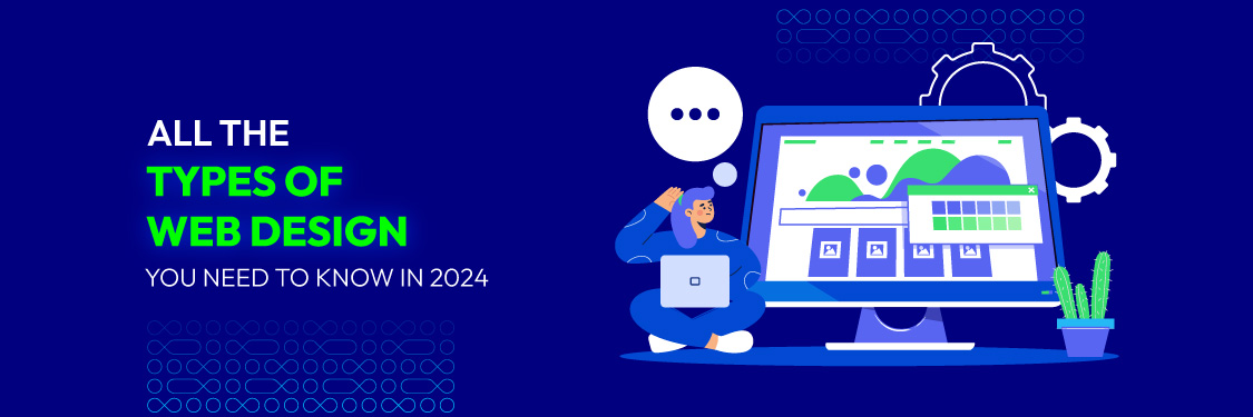
6 Types of Web Design You Need to Know in 2024
Summer Nguyen | 09-16-2024
Ever thought about how websites are categorized? Some websites are commercial, like efficient online stores, while others are informational, like blogs with relevant insights. Awareness about various types of websites enables us to build our own web identity.
So, what are the different types of websites, and how do they shape our online experiences? Let’s discover now!
6 Type of Web Design Based on Layout and Adaptability
We have six types of web design that differ in how they handle layout and screen size changes.
1. Static Website
Static page design is one of the oldest types of web design that is still in use today. Its name refers to the idea that the content and structure of these pages do not change with the size of the device or screen used to view them.
Static pages do not allow dynamic adaptation based on the device being used. The technique dates back to the birth of the Internet and is aimed at displaying pages on a computer screen.
Advantages:
- Simplicity: Static pages are quite easy to manage and, hence, cost-friendly, making it easier for one to develop simple websites.
- Predictable performance: The layout has remained unchanged, so all devices’ performance is equal, making it easier for users to sync.
Disadvantages:
- Lack of flexibility: They display poorly on a mobile device, making it a bad user experience.
- Outdated user experience: In today’s mobile-first world, a non-responsive website perhaps leads to higher bounce rates.
Use cases: The static pages should be used to create elementary websites, informational pages that don’t require frequent updates, landing pages for a particular campaign, or simple personal portfolios.
2. Dynamic Website Layout
A dynamic website has content or layout that changes based on different factors, like user interactions, the time of day, personal preferences, or data from a database. Unlike static websites, which show the same information to everyone, dynamic websites provide a more personalized and interactive experience for each visitor.
Advantages:
- Real-time adaptation: Dynamic layouts adjust automatically to changes in screen size, providing a consistent user experience across devices.
- Smooth user experience: The change in the screen size is well adopted, improving the user’s interaction and experience.
Disadvantages:
- Development complexity: A lot of coding is involved, and considerable testing is done to ensure the arrangement’s flow is correct on all devices.
- Performance variability: When not effectively engineered, websites with dynamic layouts are likely to have a slow-loading screen and a poor user experience.
Use cases: Dynamic layouts are great for e-commerce websites, news websites, or any site that needs real-time data.
3. Liquid Design
Liquid design, or fluid design, is an improvement over fixed layouts. In liquid design, the entire webpage adjusts to fit the browser window’s size. This means that elements on the page will stretch or shrink based on how wide or narrow the window is, making it easier and more comfortable for users to view the content.
Advantages:
- Flexibility: Liquid designs are superior to static design, as the result shows, particularly for devices with non-standard dimensions.
- Improved user experience: By eliminating the need for horizontal scrolling or excessive zooming, liquid design enhances navigation and usability. Users can easily find the information they need without frustration.
Disadvantages:
- Design challenges: Creating high-quality layouts compatible with large and small screens may be difficult because elements will elongate or reduce in size unexpectedly.
- Performance issues: The design breakdown may cause performance problems when working with extreme screen sizes.
Use cases: Liquid website design is mainly used for sites with big pictures or movies that need to zoom correctly. It also works well for galleries of visual pieces or sites where absolute control over elements’ positions is not crucial.
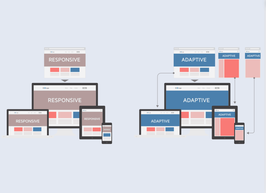
4. Adaptive Website
Adaptive website design changes its layout based on the screen size, like a desktop, tablet, or mobile phone. It uses specific points to switch between these layouts, ensuring that users get a version that looks good on their device. This aims to create a smoother and more effective experience for them.
Advantages:
- Optimized layouts: Each is created for a particular position size, providing the user with a custom experience.
- Improved performance: Adaptive designs may be quicker and more efficient than fluid designs, as they only load the layout needed for the device being used.
Disadvantages:
- Complexity: Designing multiple layouts for different devices requires more time and effort, increasing development costs.
- Maintenance: It may be cumbersome to keep track as well as manage several layouts.
Use Cases: Adaptive design works best for websites with a lot of information and complex layouts, like online stores with product grids or sites where the design needs to change based on screen size. It’s also helpful for businesses that want a consistent look across different devices and user situations.
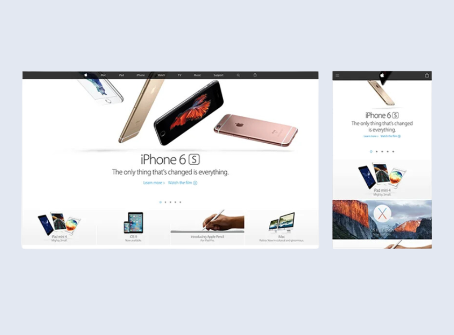
5. Responsive Design Layout
Responsive design layout is among the most favored types of web design at present. It is also responsive, meaning it can be accessed and viewed from any device, large and small, thus making it easy to use from any device.
That sounds like an adaptive website, right? Actually, an adaptive website has several pre-designed layouts for different screen sizes (e.g., one for desktops, one for tablets, one for smartphones). The server identifies the user’s device and delivers the appropriate layout. Meanwhile, responsive design employs a fluid grid, flexible images, and media queries to create a layout that adapts dynamically to the user’s device.
Advantages:
- Universal compatibility: Responsive design guarantees that a website will display properly on all devices, from smartphones to large desktop displays.
- Future-proofing: With new devices and screen sizes continually developed, responsive design allows fewer redesigns.
Disadvantages:
- Complexity in design: Designing for the web that actually adapts to different contexts can be an endeavor. It needs careful planning and execution.
- Performance concerns: Responsive designs may require optimization to maintain fast load times, especially on mobile devices.
Use cases: Responsive design is the go-to approach to addressing the needs of modern websites, especially those that prioritize mobile users. It’s ideal for online stores, blogs, and corporate sites that require a consistent experience on all devices.
6. Single Page Layout
A single-page layout is a design technique in which all the website’s materials are on one single page, using scrolling and menus to take the visitor to or show the different parts of the site.

Advantages:
- User-friendly: Single-page designs are particularly captivating since a single page replicates the entire site. In this way, users do not have to jump from one page to another.
- Faster loading: Limiting the number of pages can make a website faster than a website with many web pages, hence altering user experience.
Disadvantages:
- Limited content: Single-page layouts need to be more neatly applicable to websites containing much information and intricate organization.
- SEO challenges: There may be less content and fewer opportunities to target specific keywords.
Use cases: Single-page layouts are very applicable to product landing pages, portfolios with little content to display, event web services, and storytelling websites because of their simple and straightforward approach.
5 Types of Web Design Based on Visual Style and Aesthetics
The appearance and layout have a massive influence on the audience’s experience. Let us consider five types of web design that are best recognized by their appearance features.
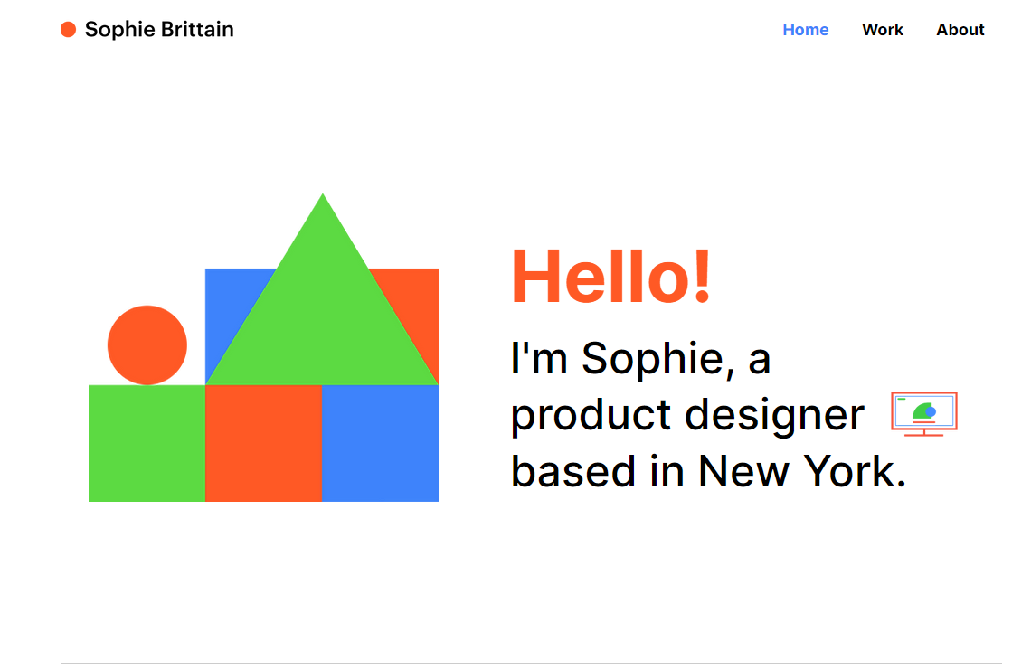
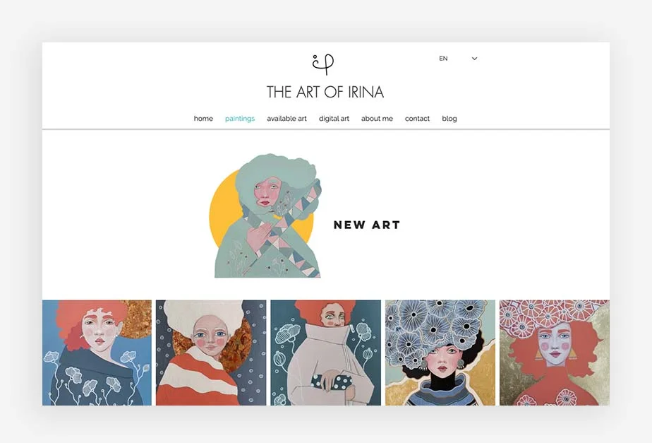
1. Minimalist web design
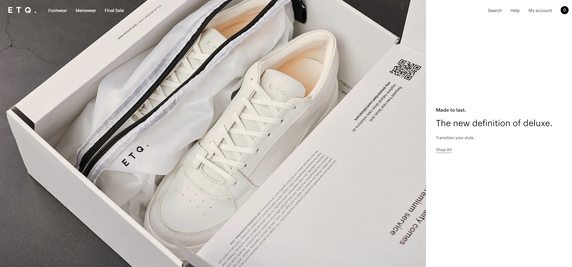
Minimalist design focuses on simplicity and clarity. It uses clean lines, plenty of space, and a small number of colors. This approach highlights the most critical elements, reduces clutter, and makes reading easier.
Advantages:
- Clarity: Minimalist designs are easy to navigate and understand, making them user-friendly.
- Aesthetic Appeal: Minimalist designs’ clean, modern look is visually appealing and can convey a sense of sophistication.
Disadvantages:
- Limited Detail: Simplicity can take a bow at the cost of depth and character.
- Over-Simplicity: When not well done, simplicity results in plain, boring
Use cases: Minimalist design works well for websites that don’t need flashy designs and instead prioritize explicit content. This includes sites for creative professionals, tech companies, and brands that offer high-end services or products that suggest a premium image.
2. Flat website design
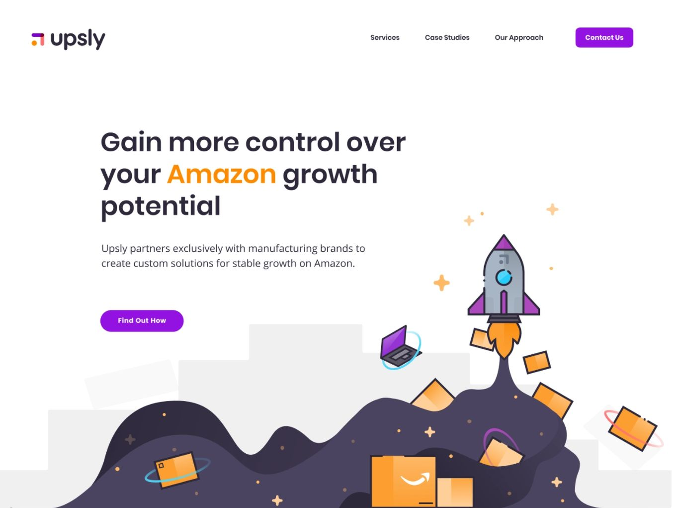
A flat-design website includes solid colors, basic shapes, and very few gradients. This style is influenced by modern user interfaces. It emphasizes functionality and simplicity. There are no gradients, and there is little emphasis on 3D elements.
Advantages:
- Simplicity: The flat design is relatively straightforward and does not require much effort to create or modify, making it cheaper.
- Fast loading: Reduced use of graphics means less congestion and, hence, better performance.
Disadvantages:
- Lack of depth: Flat designs may look uninteresting, more like unadorned and plain designs than complicated designs.
- Visual interest: It may need to be designed in a unique way to avoid appearing too simple.
Use cases: Flat design is often used for websites aimed at younger audiences and for informational sites that focus on being easy to use and accessible.
3. Material website design
Google created a material design website. It blends flat design principles with gentle depth and motion effects. It uses bright colors and smooth animations and emphasizes user interaction with the interface.
Advantages:
- Modern look: Material design is colorful and increases user interaction because of the design features.
- Consistency: This design style provides a cohesive user experience across platforms, especially within Google’s ecosystem.
Disadvantages:
- Complex implementation: Adhering to Google’s aesthetics, provided by Google’s material design, can be strenuous and time-consuming.
- Performance impact: Some of these effects, such as animations and shadows, may impact the time it takes to load the web page based on the capacity of the devices.
Use cases: Material design is the best selection for websites related to Google’s ecosystem.
4. Skeuomorphic design
The skeuomorphic design mimics real-life objects and surfaces for easy identification and to give the users an almost real product experience. This style makes it easier for the users to understand how to use the interface. This is due to the make-believe or makeshift items that appear as if they are physically realizable, such as the press buttons.
Advantages:
- Familiarity: Skeuomorphic design adds value by familiarizing users with interfaces and relating them to the physical objects to which users usually relate.
- Rich detail: The combination of realistic settings and props can also help present an exciting and artistic outlook.
Disadvantages:
- Outdated look: Skeuomorphic design is somewhat dated as compared to designing clean and simple lines of modern trends.
- Overuse of details: Having too many details can make an interface look messy or complicated, which can hurt the user experience
Use Cases: Skeuomorphic design is commonly found in online stores selling physical products, educational apps that benefit from realistic looks, games, and websites that want to create a familiar and easy-to-use user experience.
5. Retro website design
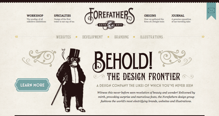
The retro design uses patterns popular in past decades and is focused on nostalgic motifs. It commonly employs outmoded fonts, colors, and graphics, and its chief strength is its ability to establish an effective brand image.
Advantages:
- Nostalgic appeal: Retro design can stimulate users who are interested in designing processes, like unique design, or think about the days of old.
- Unique branding: Retroelements can help build a distinctive and memorable brand identity, making the website stand out from competitors.
Disadvantages:
- Niche appeal: Retro design might appeal only to some of the users in the market, such as customers who are used to modern or minimalistic design.
- Design Challenges: Combining retro elements with modern features can be challenging. It needs comprehensive planning and execution.
Use Cases: Retro design is perfect for websites that focus on vintage products or fashion, music bands with a retro look, creative agencies that want to show off a unique style, and online games that aim for a nostalgic feel.
6 Emerging Trends in Web Design 2024
In addition to being about the different types of website design, many website owners and businesses want their sites to stay relevant in the coming year. To help with that, we’re highlighting some new trends in website design.
Here are seven trends that are likely to shape the world in 2024 and beyond:
-
The dark mode
In present-day web design, switching from the traditional light-colored background with dark text to the dark background with light text, known as dark mode, is no longer an option; it is a must. Not only does it help reduce eye strain, but it also helps save battery life on OLED screens, which is quite beneficial for users.
Android, iOS, and Windows are among the latest and most popular interfaces with options to implement dark mode. A 2023 survey by Android Authority found that an impressive 81.9% of respondents said they always use dark mode on their devices.
This feature has gained immense popularity. Apple can be found on multiple platforms, including Twitter, YouTube, and Instagratrend, which also offer dark mode settings.
While implementing dark mode for a website, you should always provide a UI control—a toggle or a button—so that users can switch between the modes. Consumers appreciate this flexibility, especially because the designs adapt to their unique needs and wants.
Explore more: 13 Dark Mode Websites with Unique Designs
2. Custom Illustrations
While most content creators resort to using generic stock images, custom illustrations are the weapon of choice for making others understand who you are and what you are about. These hand-drawn or digitally created visuals not only make your site unique and interesting but also enhance engagement.
In fact, websites that incorporate custom illustrations have been recorded as increasing their conversion rates by a factor of seven.
This is postmodern in its use of custom illustrations to create a unique brand identity that is familiar but not quite commonplace, much like some examples: Mailchimp, Dropbox, Duolingo, and Headspace.
To implement custom illustrations on your site, you need help from an illustrator who can create perfect illustrations according to your brand’s message. On the other hand, there are ready-made illustrations in Undraw or Open Doodles for more vector-based illustrations. If the problem is the lack of funds, simple illustration software like Procreate or Adobe Illustrator can be used to make simple yet informative visuals.
3. Parallax scrolling

The trend of parallax scrolling provides an illusion of depth where the background images scroll slower than the foreground images continue to engage the users. This technique provides extra dimension and aesthetic appeal and wins out in making websites less boring.
Famous brands such as Apple, Nike, and Spotify are great examples of companies that successfully use parallax scrolling on their websites.
Nonetheless, all these aspects have to be optimized when using parallax scrolling to ensure smooth, fast loading. Cross-verification across devices is also important to avoid jarring the user out of the experience. It should keep on flowing, not jerking.
4. Organic Shapes

Organic shapes, which are irregular and flowing like natural elements, are becoming more common on the web. While geometric shapes look structured and formal, organic shapes create a warmer and more inviting image, connecting with creativity and a user-friendly brand. They are especially effective for creating an attractive design that also evokes positive emotions.
Organic shapes are also used in websites such as Figma, The Octopus, Pitch, and Stripe.
It’s best to use SVG (Scalable Vector Graphics) to effectively use organic shapes in your web design. This ensures that the shapes remain sharp and clear, no matter the screen’s resolution. Additionally, background images with natural shapes and designs will make your site rich in some textures.
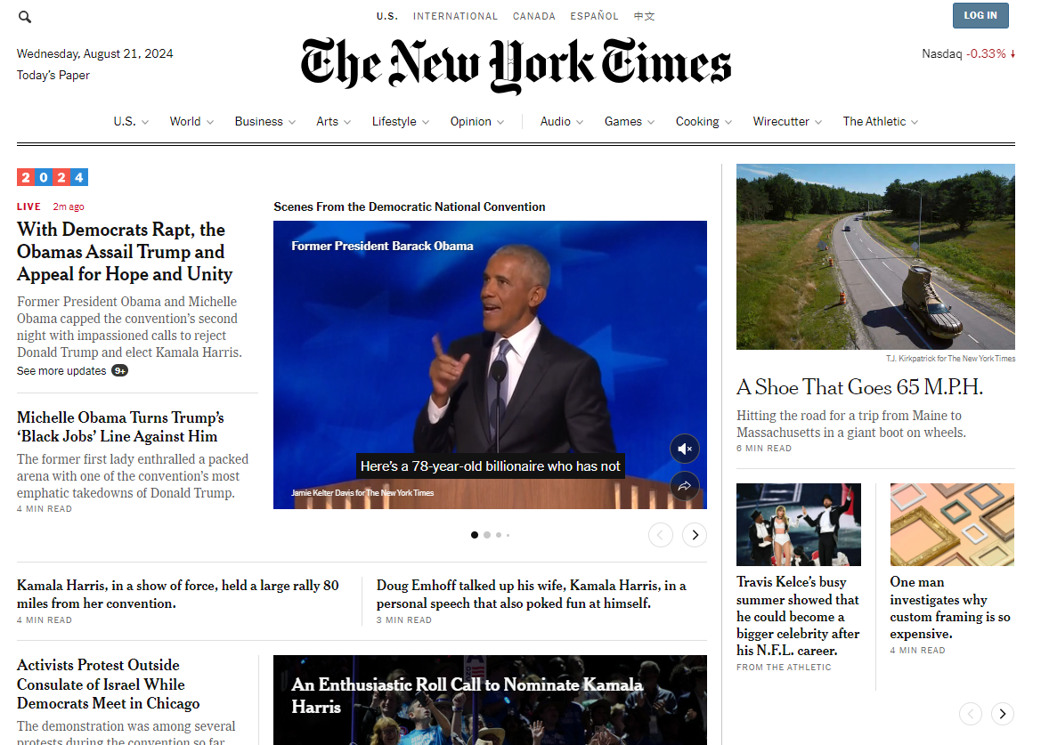
5. Full-Page Header
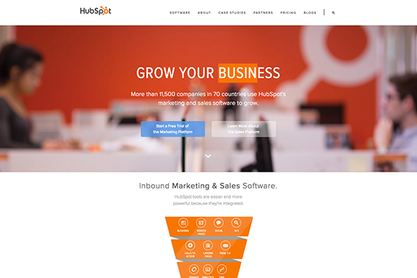
Full-page headers or large hero sections that stretch the width and height of the browser window above the fold aim to create a powerful first impression. These headers usually contain beautiful images or moving backgrounds—the first thing the visitor sees.
Prominent examples of full-page headers are the Airbnb, Tesla, Squarespace, and The New York Times websites.
When using full-page headers, make sure they adjust well to different screen sizes and devices. Moreover, using media queries can help you create a smooth experience on various platforms, so your message is communicated clearly, no matter what device is being used.
6. Micro-Interactions
Micro-interactions are the mall and discrete animations or messages in response to a specific user action such as clicking a butt n or submitting a form. They are critical in improving the user experience because they give the users an instant response and make them active.
Business organizations such as Dropbox and Slack have successfully applied micro-interactions to provide feedback that enhances general user interaction.
To effectively use micro-interactions, you need to focus on their timing and length. Too quick or slow animations can upset the user experience and lead to frustration. It’s also important that these interactions are relevant to what the user is doing and the other elements on the screen, as this helps create a more cohesive design
Related topic:
- Designing the Future: A Look at the Top 15 Modern Websites
- 50+ Latest Website Design Statistics in 2024
Choosing the Right Web Design Type
To ensure your type of website not only fulfills its potential but also leaves a lasting impression, consider these essential factors:
- The purpose is the first step that has to be executed. What are your goals and objectives for having the website? Whether you are using your site to showcase a portfolio, promote users, or disseminate information, this main function should be reflected in the design of your site. A portfolio might require a slick, image-heavy layout, while a business site requires clear navigation that guides customers from browsing to purchasing.
- Your website’s pulse and life are its audience. Their choices in the devices and screen resolution they favor will help you select a variant that also looks great and is optimal. The single-page layout might be ideal for some websites, while in other instances, a complex layout might be necessary to accommodate various user experiences.
- Your budget will be instrumental in determining the sort and complexity of your web design. While some may be cheaper than others, it is important to consider these models in terms of long-term returns.
Related topic: What Makes a Good Web Design: 10 Principles to Follow
Need a Guiding Hand? Mageplaza’s Website Design Service is Your Solution
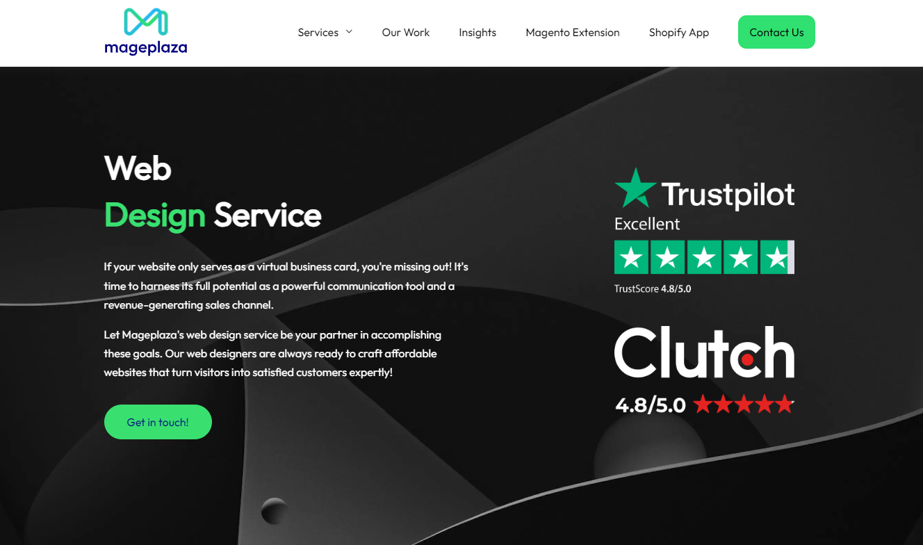
If you still need to navigate the complexities of choosing and implementing the perfect website design, look no further than Mageplaza. We’ll partner with you to uncover the ideal design type that meets your immediate needs and sets the stage for continued growth and success.
Whether you’re starting a new website or improving an existing one, Mageplaza’s website design service ensures that your online presence truly represents your brand and connects well with your audience.
Recap
In 2024, web design will be more vibrant and varied than ever. With diverse types of web design, like static, responsive, and dynamic pages, alongside eye-catching styles like minimalist and retro designs, each choice serves a unique purpose. We hope that our articles can help you create a stunning site that offers an exceptional user experience!
Table of content

Summer is the CMO and Digital Commerce Solution Expert with 10+ years of experience. She specializes in Magento, Shopify, ERP, CRM, AI, and Blockchain, delivering strategic solutions that transform businesses. With a deep understanding of digital commerce, she helps brands scale and stay ahead in a competitive market.
Related Post
Magento 2.4.9 Beta Release: What's New?
Magento 2.4.9 beta is here. Stay up to date with every release milestone with this regularly updated guide.
11 mins read
|
03-17-2026
Google Analytics Website Traffic: The A–Z Guide for Magento 2 Store Owners
Learn how to analyze website traffic in Google Analytics 4, identify high-quality traffic sources, and grow your Magento 2 store with data-driven insights.
18 mins read
|
03-17-2026

The Complete Guide to UTM Parameters & Google Analytics for Magento website
Master UTM parameters and Google Analytics for Magento. Track traffic sources, measure campaign performance, and practical tips to use it for better business decisions.
9 mins read
|
10-05-2025
How to implement Cookie Consent for GTM & Google Analytics in Magento Under GDPR?
Implement cookie consent for GTM & GA4 in Magento under GDPR. Step-by-step guide using Google Consent Mode v2 to avoid fines and maintain analytics.
15 mins read
|
02-27-2026

Speed vs. Sales: Comparing Hyvä Checkout and Mageplaza One Step Checkout
Learn how Hyvä Checkout and Mageplaza One Step Checkout impact order completion rates and revenue growth.
8 mins read
|
02-25-2026
1 min read
|
03-30-2026
Magento 2.4.9 Beta Release: What's New?
Magento 2.4.9 beta is here. Stay up to date with every release milestone with this regularly updated guide.
11 mins read
|
03-17-2026
Google Analytics Website Traffic: The A–Z Guide for Magento 2 Store Owners
Learn how to analyze website traffic in Google Analytics 4, identify high-quality traffic sources, and grow your Magento 2 store with data-driven insights.
18 mins read
|
03-17-2026
The Complete Guide to UTM Parameters & Google Analytics for Magento website
Master UTM parameters and Google Analytics for Magento. Track traffic sources, measure campaign performance, and practical tips to use it for better business decisions.
9 mins read
|
10-05-2025
How to implement Cookie Consent for GTM & Google Analytics in Magento Under GDPR?
Implement cookie consent for GTM & GA4 in Magento under GDPR. Step-by-step guide using Google Consent Mode v2 to avoid fines and maintain analytics.
15 mins read
|
02-27-2026
Speed vs. Sales: Comparing Hyvä Checkout and Mageplaza One Step Checkout
Learn how Hyvä Checkout and Mageplaza One Step Checkout impact order completion rates and revenue growth.
8 mins read
|
02-25-2026