22 Tactics to create the best E-commerce Shopping Experience

The meteoric bloom in e-commerce is undeniably shifting the market’s consuming habit tendency. People are having the propensity to buy goods and services from online sites rather than brick-and-mortar stores to take the utmost advantage of e-commerce convenience. Many businesses have been allured to put a step into this digital platform, but not all of them are lucky enough to achieve a sense of accomplishment.
The most simple explanation for this status lies in the contrast between applying online and offline strategies. While physical shops can attract more buyers with a proper location and in-store display planning, e-commerce stores can only prove their verified quality through the offered products or services and most virtually, user experience. In other words, it is the customer’s shopping satisfaction that determines an eCommerce business’s failure or success.
Therefore, prudent investment in enhancing user shopping experience is a must if businesses want to gain built-in loyalty and boost sales instantly.
An overview of the e-commerce shopping experience
What is an e-commerce user experience?
E-commerce user experience (UX), is about the impression a user has after interacting with a company and its products which adds up to the user’s overall perceptions. These perceptions embrace all the factors that determine if users are satisfied with their received encounter including how they feel when interacting with the site, how well they understand the described guidelines and whether the experience has met their expectations.
A verified UX may require:
- Users’ demand satisfaction: Meeting users’ needs without any complaints or fuss.
- Product simplicity and usability: The offered products should come “handy” with minimized executing steps and easy-to-use to deliver comfort while using.
- Optimal branding and promotion: Apart from just giving customers what they want, user experience can also be assessed through the efficiency of a merge in promotional strategies such as marketing, graphics and visuals designing or engineering.

Distinguishing UX from UI
It’s normal that folks have mistaken these two terms and used them incorrectly. User interface (UI) could be anything user interacts with to get access to digital goods and services. These elements may include the touchscreens, keyboards, sounds, and many other technical components. UX, on the other hand, focuses on what a site should display to optimize the user’s interaction. In other words, UX emphasizes on the process of resolving arising issues, while UI emphasizes the function and visual aspect of a product’s surfaces.
The importance of UX
User experience undoubtedly has a huge impact on the e-commerce business’ overall performance and position elevation in the market. The user-centric aspects of understanding users’ demands and expectations will ultimately provide support in improving the quality of the interaction users have with the product.
Attract commitment
When users are aware that the engaged company understands their behaviors to instantly advance their experience of navigation, they will be willing to stay and claim their loyalty. Supporting users to ensure their quickest way of reaching their goals prospectively provokes a long-term trade commitment for a stable sales boost.
Gain customer referrals
Customers’ recommendations appear to be one of the most competent marketing mechanisms. However, it’s a challenge for businesses to get a hold of this idea as the only available way to grasp customers’ expectations is to advance user experience in goods and service provision. Hence, with proper UX planning, companies can get their satisfied customers to recommend the products or services to their friends or leave positive online feedback that can target a group of potential customers.
UX design
UX design is the process where design teams create products that provide relevant experiences to users. This involves the design of the entire process of acquiring the product, including branding, design, usability, and function. In other words, UX design is user-centric as a whole.
A UX designer, in order to create the most optimal UX design, has to put himself under users’ perception and observe his own design as a guest to examine the entire experience generated. Hence, UX designers do not just focus on creating a usable web page but they take the elements of website efficiency and users’ pleasure into consideration as well.
Since UX designs encompass the customer journey as a whole, UX designers must come from various backgrounds such as programming, visual and interactive design, or even psychology to understand users’ preferences. A UX designer’s tasks are not always the same, but they all surround users’ needs and compulse designers to present as a users’ partner in every of their design.
22 ways for an optimal e-Commerce shopping experience
These days, it is not solely the business’s engaging marketing strategies and advertising campaigns that exemplify business position but customers’ reacting behaviors matter as well. The role of customers in the market trade is living promoters for stores to widely spread their goods and services. Hence, a proper understanding and updating of customers’ needs and expectations give businesses a prospective vision to deliver the best experience.
#1 Make sure the website is instantly updated with accurate information

Users tend to have a positive first impression of sites with precise information. The specificity presented in the instructions smoothens customers’ process of getting to know the products offered. A broad and general product information will get customers frustrated when not finding enough “evidence” to consider their own decisions “wise”.
For an updated website, administrators should take these pointers into account:
-
Provide precise and detailed information about product prices, order status, additional fees, pickup time, arrival dates, contact information, etc. to let customers keep track of their demanded product or service
- Always keep website content fresh with a grasp of recent trends not to stay behind time
- Display clear terms and conditions
#2 Devote effort on the product description
In an online store, a product description comes out as a concrete and supportive guideline to encourage and strengthen users’ willingness to buy. Customers who already had their selected items in mind will not mind reading a long description guaranteed that it is presented in clear formatting.
Besides engaged customers, there are users who browse through the store just to get references and make comparisons among stores. In this case, it’s the website content writer’s duty to provide them with a coherent summary noting out prominent product features answering the “what”, “who”, “why” questions while making the benefit elements stand out.
Users also have the tendency to visit the Frequently Asked Questions (FAQs) section to look for more useful tips. A strong FAQ page can solve their uncertainties while gaining stores more positive impressions from their perception. Content writers should execute their FAQs page under users’ point of view to get the closest idea of how users are experiencing the sites.
#3 Display quality product videos and images

The biggest disadvantage of online shopping is that buyers cannot physically verify the products. They have no other ways but to totally depend on the pictures and intro videos to virtually visualize the items.
Hence, high-quality images and videos allow visitors to have a more proper product’s visual presentation in order to enhance their willingness to purchase. Many businesses hesitate to invest in product videos for fear of perceiving high costs but in fact, videos play a significant role in boosting website visits and SEO too.
#4 Allow reviews, reminders, and ratings

A recent study has shown that 90% of consumers take a look at the reviews before making transactional decisions, while 88% of them trust online reviews as much as real-life recommendations. It can be indicated that customers tend to be attracted to online reviews as these sections are an easily-accessible source with real credible experience.
An increase in the added reviews can contribute to an improvement in the overall customer journey. Therefore, an investment in product viewing tools is a must to enhance the user experience. Products Reviews on Magento 2 could be a suggestion for customers to leave interactive reviews while store administrators can easily keep track of these feedbacks. The extension offers various extra features, such as reviews summary or buyers badge, guaranteeing a smooth experience in customers’ product analysis process.
Better Product Reviews Extension for Magento 2
Better reviews & ratings which convince your shoppers to buy Learn moreThe e-commerce driven market has witnessed a more powerful way of gaining reviews - Review Reminder through email. The method has been proven efficient for after-sales customer care where stores can send automatic emails to ask customers to leave kind comments on their purchased items.
Unfortunately, it’s easier said than done: getting customers to leave reviews is not a piece of cake. Customers would not be willing to do another extra work that can take up from 5 to 10 minutes to finish if the conduct doesn’t bring any values. Only when they have an extremely strong impression with the purchase or when they sincerely want to share their personal shopping experience with the prospective visitors will users take out their precious time source to write reviews.
In this case, show star ratings. The act of rating with stars only takes seconds to conduct but still holds the same influence as manual reviews do. The more stars are scaled, the better the product quality might be.
#5 Improve shopping cart quality
Shopping cart has become an indispensable element in the general e-commerce market and specific customer shopping journey.
Nowadays, customers have higher expectations in shopping cart functions, not just adding the purchase-demanded items for the final checkout. They would like to have a glance at multiple products at once to make a quick comparison and tend to expect to customize the product attributes directly in their cart. While customers are adding items to cart, they will feel frustrated when being navigated to another site, and the annoyance doubles with an encounter of a slow page load. It’s high time businesses designed an optimal “add to cart” button to ensure certainty in an excellent customers’ shopping experience.
These days, more and more online stores have chosen to utilize AJAX technology to assure the best UX. AJAX cart & Quick view extension guarantees to help users instantly select products to the cart on Product Listing Page, Home Page, and more conveniently, on a supported Quick View Popup, not to mention the Add to wishlist/compare features allowing buyers to view details of their wishlist and compare items instantly.
Quick View & AJAX Cart Extension for Magento 2
Improves shopping experience and enhances conversion rates Learn more#6 Provide a decent sizing system

When it comes to selling clothing apparel, e-commerce businesses are commonly outweighed by brick-and-mortar stores by physical verification. Many online stores have instinctively applied an unregulated sizing system based on physical measurements or relative numberings (eg. scaling size from 1 to 5). Customers tend to hesitate to spend effort in these stores for fear of not fitting the desired items.
Businesses can consider ensuring customers’ purchasing certainty by offering a standardized Size Chart. Customers will definitely feel more confident in their own decisions, resulting in a much smoother user experience.
#7 Accelerate page load time
An investment in a quality website content will be regretfully ignored and skipped when the page takes forever to load.
A study has revealed that half of the internet users expect a website to load within 2 seconds, and 40% of them would leave pages that start running after 3 seconds. Any longer than that, they are prepared to click out and direct to other competitors with better page loading performance. Slow page load time is the key reason for the increase in page exit rates.
Web designers can try applying some specialized tools, but the easiest suggestion to optimize loading speed is to keep graphics and image sizes as minimal as possible. Magento website audit can help you identify other factors that may affect page loading speed and provide suggestions to improve it.
Webp Image Optimizer Extension for Magento 2
Speed up page loading & enhance user experience for your store Learn more#8 Ensure simple navigation
Web designers have a common inclination to creating visually attractive home pages, but unintentionally forget to apply the fundamental website marketing principles to practically support user experience.
When searching for the demanded items, users would be pleased to be offered shortcuts that speedily guide them to the right product page. In this case, navigation performance is the core determinant to keep users continue their engagement.
Strong site navigation can optimize search engine feature to provide better information tracking of consumers’ preferences whereas a poorly-performing one would challenge visitors’ patience in locating desired information. An inventory investment in improving site navigation will guarantee an enduring user experience rate increase.
Stores can consider equipping advanced layered navigation integrated with many advanced features, such as multiple filters, price slider or shop by brand, and supported by AJAX technology to enhance customers’ product search satisfaction.
#9 Optimize search box

The search bar is the fastest shortcut connecting users to their desired items. Users expect to be navigated to the right product page without putting too much effort into typing keywords. An effective search box function ought to be equipped with features that optimize the search process with minimal keywords insertion.
Drop-down suggestion list
A drop-down suggestion list (also known as a drop-down menu) is a search feature allowing a list of search results to display after one letter of the keywords is typed only. This suggestion list is compiled from search history data gathered from other popular previous searches, which attempt to give users the closet keywords predictions. Users can also have a glance at the related product categories suggested in the list as well.
Autocomplete
Autocomplete operates in the same way as the suggestion drop-down list does, with a typical difference.
When inserting a query into the search box, the drop-down list suggestions are based on data from search history, while autocomplete suggestions are online assorted categories offered by the brand. This feature can help narrow customers’ category search down while motivating more product observations, auto-correcting misspellings and providing alternatives for unidentified items.
#10 Avoid page reload

When entering a specific page, users expect to be possibly conducting clicking acts without being redirected or re-navigated. While users are filtering product attributes and categories, they can be irritated to experience a page reload at every mouse click and might leave for other sites with a much more united page function.
Businesses should consider taking AJAX loading products as a solution. With AJAX technology, the webpage will only reload what has changed rather than the whole page. When the unnecessary reloads are cut down, buyers can keep the unfinished process when data is transmitted since the web application is now more frequently available for shoppers.
#11 Offer incentives
Buying incentives have become an indispensable element in the e-commerce market where businesses enter an explicit competition to draw the most users’ attention to stores. Offering incentives is an approach to value customers for using your products and services, from free shipping to coupon codes or structured eCommerce loyalty programs with tiered rewards
Businesses can keep in mind the following two most typical types of purchase incentives that are always in high demand.
Free delivery
More than half of e-Commerce merchants offer free shipping. The delivery fee is one of the most important factors when it comes to making a purchase, with the high delivery cost being the number one reason for cart abandonment.
“Free” is a basic psychological trick that attracts more assumptions of “benefits”, and free shipping is commonly seen as an essence in digital trades these days. Hence, a business without a free shipping policy is likely to lose its customers to other competitors. The most simple way to keep resources intact is to reasonably increase prices to cover the shipping cost.
To make the most use of the policy, businesses can consider equipping a free shipping extension
Limited-time coupon codes
Customers are always pleased to hear if their purchases are qualified for a coupon code at the final checkout. An immensely demanded coupon code should require a definite condition to acquire and avail at a certain period of time only. Secret coupon codes indicate the benefits of multiple purchases, with the urgency element encouraging customers to quickly pay the bills.
For an optimal user experience with minimal effort, coupon codes should be automated and made into use with the support of such tools as emails or private links. The Coupon Code Extension can be a great choice with the instant codes which could be generated quickly, or sent codes through emails or via private coupon links offered site
Tip: When customers have been willing to spend their time and effort with the store, they tend to expect to be viewed as “special” and demand some specific offers that are customized just for them.
Having an understanding of this psychological tendency, businesses should present exclusiveness in the incentives given to this group of customers. Every personalized incentive offered is an opportunity to achieve a long-time trade partnering relationship along with an increase in user experience rate.
#12 Create a sorting list
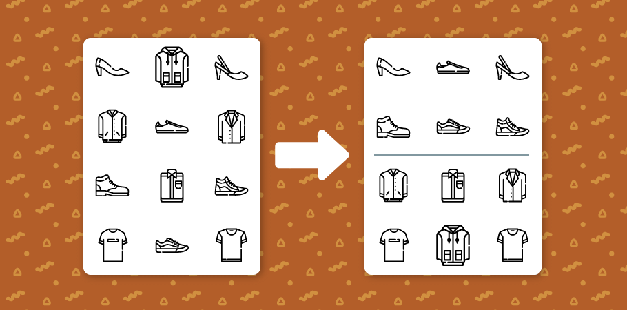
It may hinder users to be scrolling through the whole web store and not manage to find the right items. The time wasted should be spent on other valuable activities rather than reaching the dead end and getting frustrated.
The in-store time value can be elevated immensely with proper product sorting based on most-concerned criteria. An application of Better Sorting extension, with 12 outstanding sorting criteria on both search page and category page, can be ideal to stores that demand enhancement in user shopping experience.
#13 Optimize price sliders

In the awareness phase of a typical customer journey, users may have a set goal price level in mind for a specific product line. However, when encountering a store website displaying thousands of merchandise, customers are still likely to get confused in finding products at the planned price level.
The design of a price search box was created to hopefully offer support to customers, but the tool has faced a limitation of inefficient price ranging when in reality, customers may demand more than one price options, not to mention that the act of manual typing could frustrate users to the extent of a page exit.
Nowadays, the creation of price sliders has been proven to be more optimized in smoothing users’ shopping experience in the e-commerce market. Customers can now limit their desired price range by simply sliding the price bar, which will make product filtering much more easier.
#14 Minimize checkout steps
26% of US shoppers gave up at the checkout because they found the process too complex, according to a 2018 study. The increasing user demand for a simplified checkout process stirs up the urgency for an optimal solution.
These are some basic criteria to measure a checkout process efficiency that stores can have a quick glance at:
-
One-step checkout: Displaying all checkout information on one page helps reduce mouse clicks while sending customers a better category navigating experience. Also, a one-step checkout form will enhance page loading speed which will elevate better user experience compared to a multiple-checkout-pages process.
-
Let customers check out as guests: When customers use guest checkout, they are not required to create a store account, which helps reduce friction in the purchase process.
-
Auto-fill relating information: This act aims to minimize the number of unnecessary form fields. For example, when customers have already provided their country data, the country postcode should be mechanically filled in after without requesting customers to manually type it in.
-
Save customers’ information for next purchases: An optimized checkout page should archive shoppers’ personal data submitted during the final checkout step and auto-fill this information for next purchases to provide shoppers with the utmost convenience.
-
Secure payment badge: Checkout page is one of the most ideal places to put a trust mark that has a huge impact on customers’ buying determination. A security badge located under the “Place Order” button and featured with possible paying methods will guarantee credibility and trust.
On Magento 2, the One-step checkout works pretty smoothly with every checkout information demonstrated in one final page only. Customers can take advantage of this extension to enjoy a more speedy and satisfying checkout experience.
One Step Checkout for Magento 2
Cut down 80% of checkout time & increase 30% of conversion rates Learn more#15 Allow easy social login

While visiting an online store, users are normally irritated when being forced to register to save temporary data. The frustration doubles as they are required to fill in an unnecessary information form to create an account. Every user would demand an optimal login technique that minimizes the time and effort made to spend.
One user-friendly registration method that is being commonly used these days is social login. By allowing users to log in with their personal social accounts, not only can businesses access customers’ public information but they can also learn their customers’ behaviors through the social media platform.
#16 Present an easy return policy
A free return policy implicitly reflects businesses’ enduring consideration towards customers. Such policies can appear as a guarantee to customers who initially hesitated to make final orders. Strict return rules increase the risk of losing loyal customers to other competitors with easier return policies.
A rational return policy should be urgently established to build up a better user experience. With the help of the Return Merchandise Authorization (RMA) extension, businesses can manage exchanges and returns more easily while customers can enjoy a more open and convenient policy supported by many outstanding digital features.
#17 Enable store credit system
One way to improve customer loyalty is to set up a store credit system presented through rewarding. The credit amount will be automatically added to their account balance that works as a second account of users to motivate more credits accumulation. And in order to enlarge the credit account, users will have to make frequent visits to the store, which generates an enduring commitment.
User commitment is not just strengthened through rewards on purchases but also through the compensation of poor shopping experience. Mistakes are unavoidable, but how businesses deal with them to make up for users’ losses is what matters. To express apology and sincerity, companies can deliver customers a sum of credit as a guarantee aiming to eliminate poor shopping experience and regain trust.
💡 If you’re looking to implement this kind of system in Magento, Mageplaza’s Reward Points extension is a solid choice. It allows you to award points for various actions (like purchases or reviews), offer flexible redemption rules, and even use points as compensation — all of which help turn everyday interactions into long-term loyalty
#18 Allow users to quickly order in large quantity
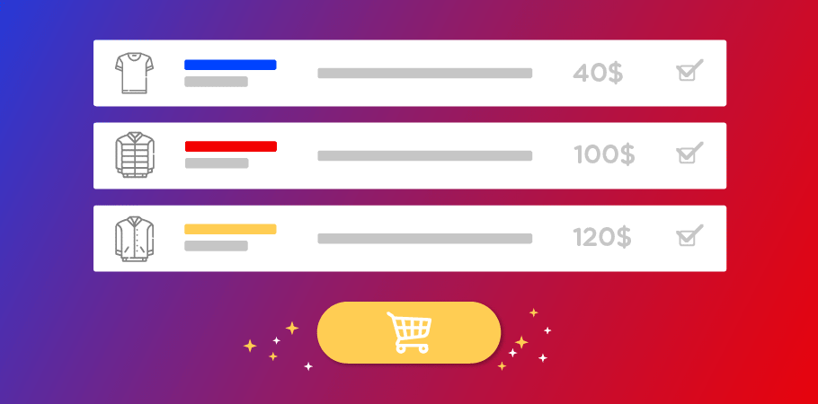
Wholesales customers are perceived as important clients in online stores, especially in a B2B business where digital commercial acts are actively conducted daily. Compared to brick-and-mortar stores where wholesalers can directly choose and pick up their desired items in a large quantity, the execution is challenging on the e-commerce platform since manual searching, selecting and adding a bulk purchase to cart would be time-consuming and frustrating as well.
The most simple yet efficient way is to optimize the number of mouse clicks to precisely deal with bulk orders. On Magento 2, the Quick Order extension is a comprehensive solution allowing customers to add products to cart with 3 simple clicks only. A large number of products can be looked up by multiple SKUs or uploading a CSV file, with product attributes being easily selected on one page guaranteeing an optimal user experience.
#19 Attach product recommendations

Users would like to seek better opportunities for quality products by visiting the product recommendations section recommended from their last browsing. Product recommendations in online websites have the same position as sales assistants in brick-and-mortar stores to enhance customers’ e-commerce activities experience.
Many stores have noticed this importance and started applying in this marketing tool to push their cross-sell and up-sell activities. Common recommendation extensions such as Who bought this also bought, Who viewed this also viewed, Automatic related product or Frequently bought together are the most exemplary-verified tools that utilize personalization to match the suggested products with users’ preferences, which will excite users to later drive them in stores again with great satisfaction.
#20 Update product availability to users
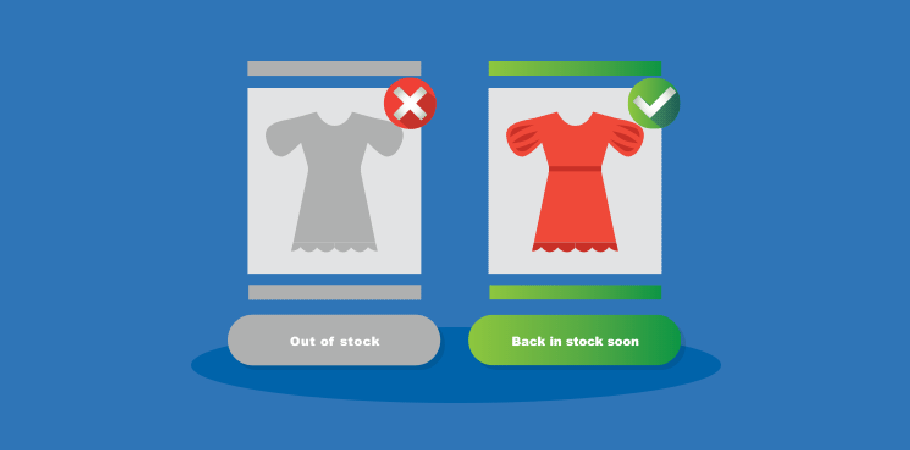
It baffles customers to see the long-time desired items to be out of stock right when they are in high demand. In this case, letting customers know about the arrival notice of their preferred items through an Out-of-Stock Notification extension for Magento 2 is a brilliant way to calm down customers’ disappointment.
The idea of a product alert has facilitated customers to be notified about a product’s validity status and any price changes made. The extension offers ultimate convenience by enabling the notification subscription to many types of users including the non-login ones. This is an ideal way to keep in touch with the customers and impress them with an excellent customer care system.
Besides, customers can also get a hold of premieres availability with the Custom Stock Status. Apart from the traditional “in stock” and “out of stock” notifications, stores can now customize more friendly stock statements for pre-release products such as “Coming soon” and “Available next week”, or “Hurry up! Last items!” for products that will soon run out of.
Comprehensive Sale Boosters Pack for Magento 2
Equip helpful functions to level up your sales in only one package Learn more#21 Provide a privacy policy

Users tend to suspect a store’s credibility and authenticity when asked to fill in the information form mostly for the fear of personal data leaks. They would demand an assurance that they are engaged with an authentic store that is approved as market-secure. An officially verified privacy policy should be every business’ top priority to reassure users.
There have been hundreds of extensions invented to help stores gain better trust from customers with guaranteed security, one of which is the user-friendly General Data Protection Regulation (GDPR). The most outstanding feature this extension offers is data protection through trade compliance. To efficiently utilize this tool, businesses ought to execute a proper info assortment based on necessity levels to select the right information to ask, then state clear reasons why users should fill in their personal information.
#22 Build a thank you page

Businesses’ responsibility with the customer journey does not finish even when the customers have converted. After-sale customer care is also an essential element in gaining positive perceptions of user experience.
Many stores nowadays have an additional page designed to notify order success to customers. The creation of thank you page is a more user-friendly tactic to glamorize the notice page for a better attractive look and more added details. Stores equipped with this tool can enjoy a diversity of extra features, such as a self-customizing page or cross-selling, while customers can look forward to detailed order success information with auto-generated coupon codes for the next purchase.
5 user experience practices
Many brands have successfully drawn their users’ interest using the UX tricks mentioned above. Let’s take a look at how these following brands have cleverly designed their UX-friendly websites to encourage more purchases.
Amazon
Amazon is no doubt the biggest e-commerce site in the world, by both numbers and recognition. The position Amazon has been earning is perfectly persuasive since every feature on this website could be an example of a good UX design.
Take a look at some prominent features this amazing platform has offered.
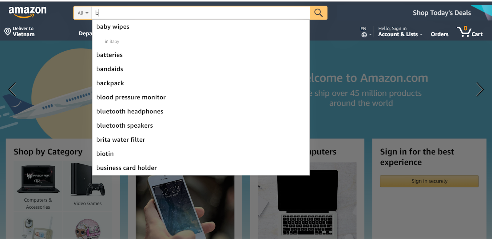
Amazon has equipped an ultimate search box where users can get a drop-down suggestion menu just by typing the first letter.
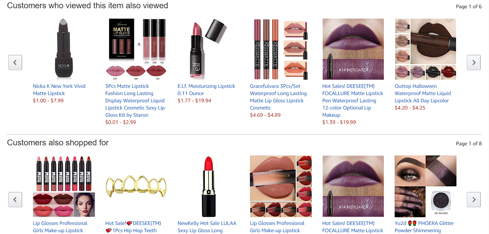
Through the data gathered from users’ browsing history, Amazon has attached some automatic product recommendation extensions such as ‘who viewed this item also viewed’ or “who also shopped for” to give users more suggestions of the same product line.
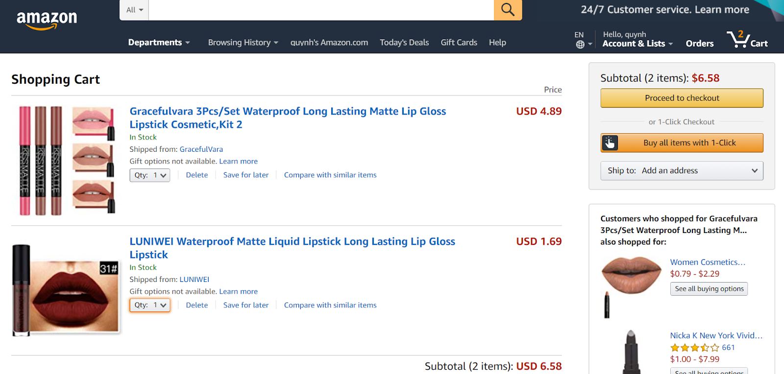
Of all these clever bundles and product recommendations, the 1-click checkout button has proven most of Amazon’s efficiency in anticipating users’ needs. Users can get frustrated during the checkout process, and an optimal number of steps will surely guarantee a smooth shopping experience that every buyer demands.
Apple
Besides the trademark designs of technological innovation, Apple has never failed to impress its store visitors with a high-quality UX design. The website enhances minimalism and sophistication while delivering excellent HD product visuals in many forms and dimensions.
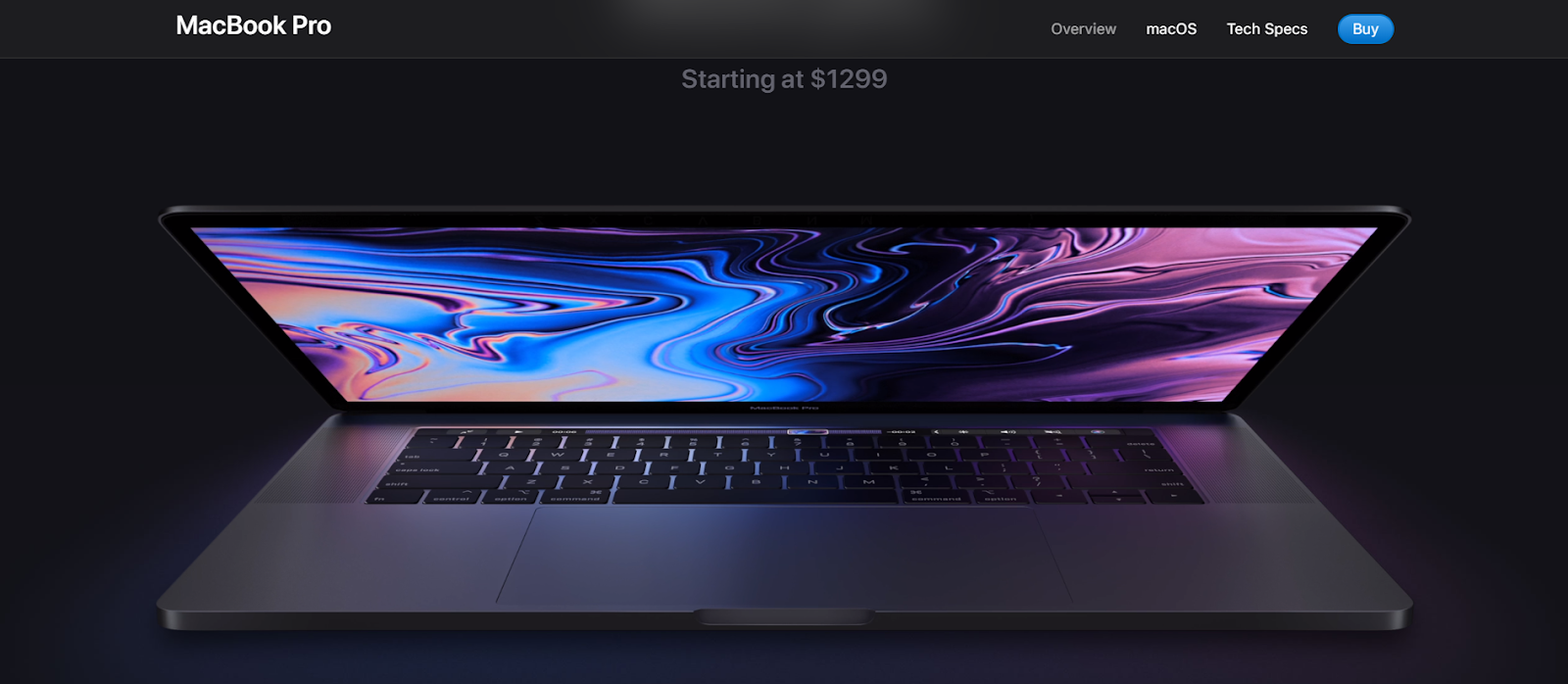
In a specific product page, parallax scrolling is used to provide dynamic images with texts being neatly captioned, and more visuals are revealed as users scroll down the page.
Additionally, the clever 3D animations show how the product looks at different angles and what basic features it will offer. Unlike some other sites where users have to drag around to fully view the animation, with Apple, the only thing they need to do is to click on the product preview and let the video automatically play. This idea is brilliant to minimize users’ efforts made on such unnecessary technical steps.
Top Shop
Top Shop is one of the leading brands in women’s clothing. The reason behind the brand’s success is partly contributed by the amazing verified shopping experience it offers users. With a large quantity of SKUs with slight differences in details, it’s harder for the brand to design an optimal UX website that will not get users baffled on their way of product search.
Top Shop has favorably managed this issue by equipping a category filter dial floating on the products page. With this tool, users can easily change the product attributes to match the favor. An attachment of a price slider is also a wise choice to help users find the items at the desired price level more quickly.
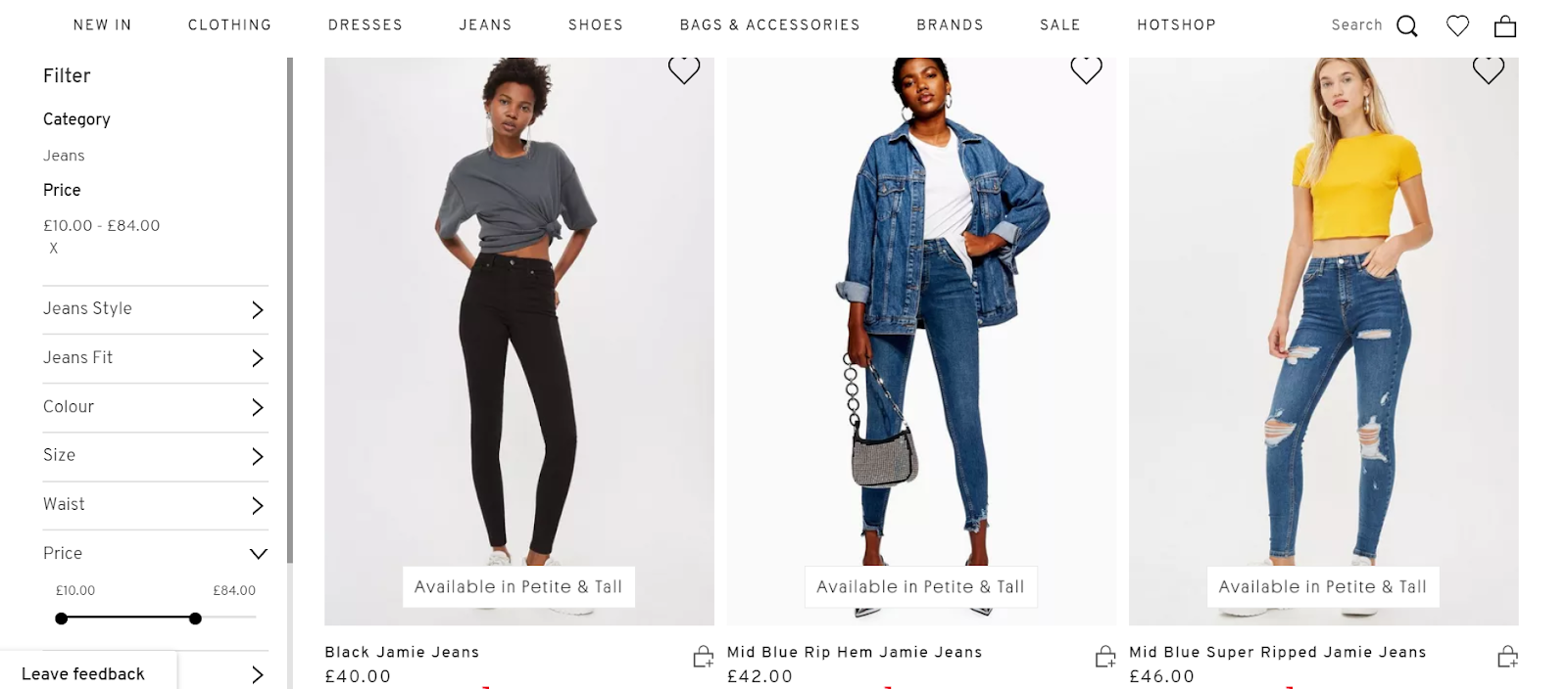
Moreover, when users move their mouse to the product images, it will switch to a picture of a model wearing 36the sample and vice versa, giving customers a closer look at the items.
Graze
Graze seems to leave a positive first impression in every one of its visitors for the healthy and environment-friendly vibe, and also the sleek and visually engaging page designs. And most importantly, the brand has made a clear statement of how it will operate to clarify some points for customers.
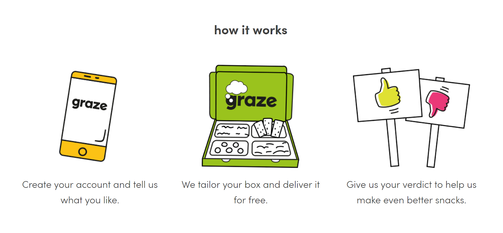
(A short explanation of how the system works, with prominent images attached)
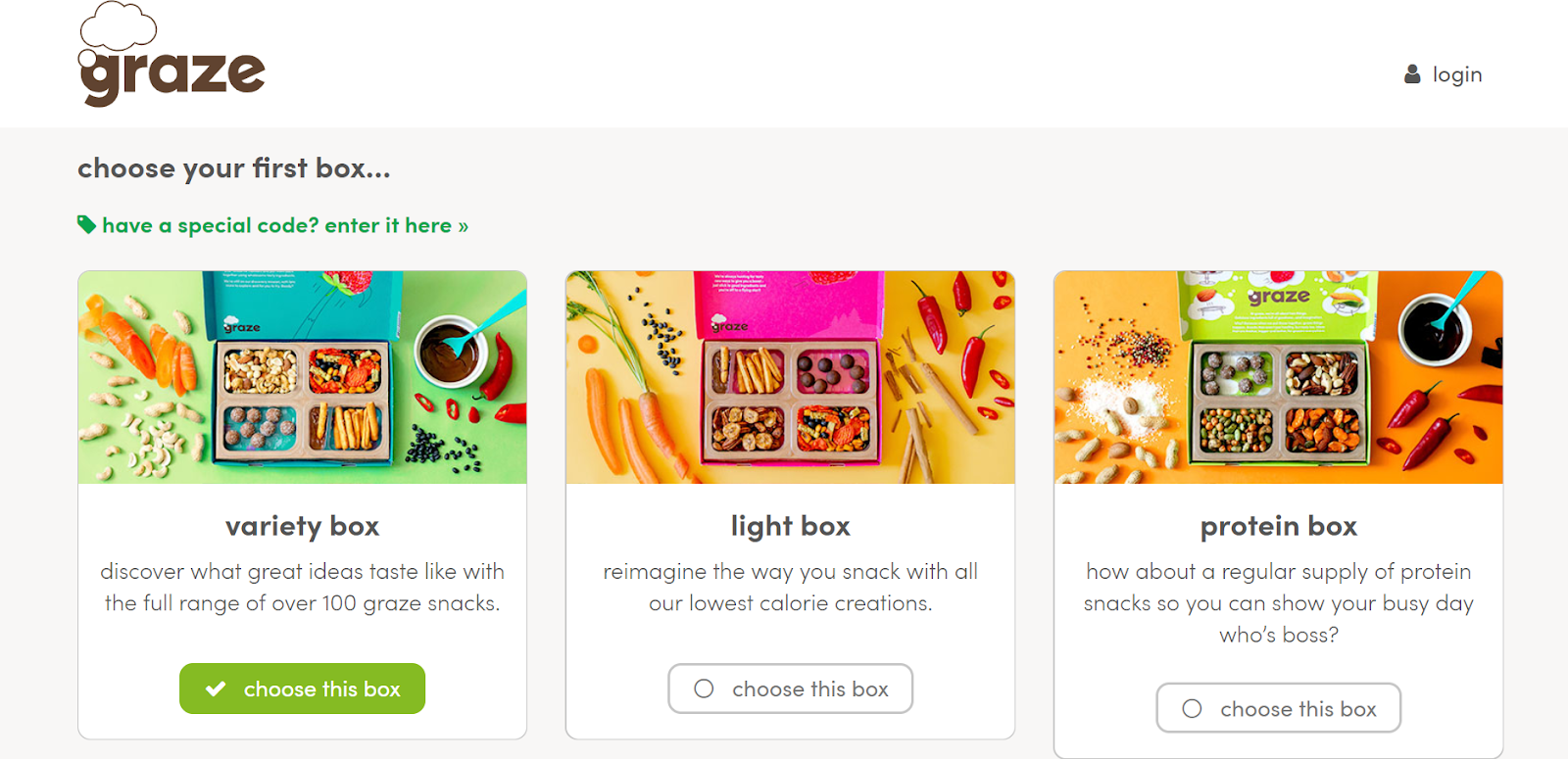
Also, Graze has made an outstanding movement in advancing user experience by offering product options based on the stated selling objectives. The 3 categorized box options have been optimally assorted to allow customers to try various products at once while maintaining the appropriate nutrition proportions.
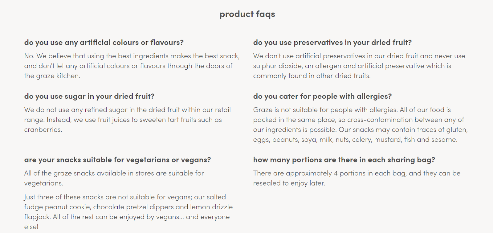
Another noticeable feature of Graze is the detailed product FAQs. Aside from providing a general FAQs section, Graze has cleverly grasped its customer insight by adding a strong product FAQs page that answers all popular queries about the health element which is the core component of the brand’s products.
ASOS
ASOS has proven its position in the digital fashion market with effective investment in designing an organized and user-friendly web store. A brief explanation, eye-catching images with simple yet prominent CTA buttons categorizing men and women’s clothing - these are the main features that draw users’ interest in the store at the very first sight.
However, the most highlighted section that makes the site worth a visit is the optimal product page. One of their distinguishing UX features is the video demonstration to give users a presentation of how the product looks in person, strengthening their confidence to buy.
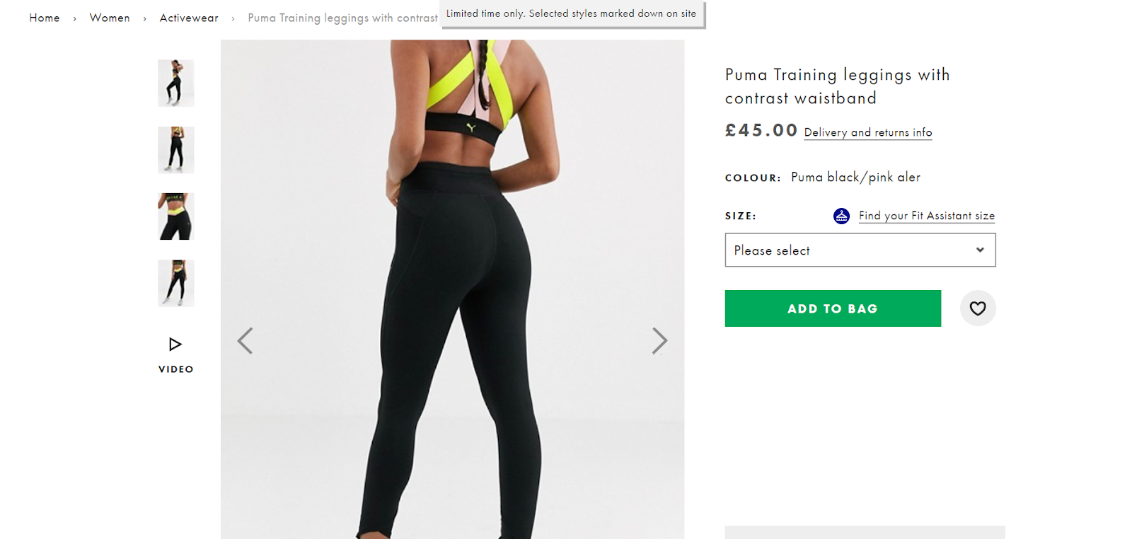
Also, the brand has solved all users’ fitting worries by advancing its assistant size and size chart system. Apart from providing a standardized pop-up size chart of different product categories for various regions, the Fit Assistant size allows users to insert their weight and height for relative measurements to give users a possible suggestion of size. Users no longer have to hesitate to reach out for their long-desired items!
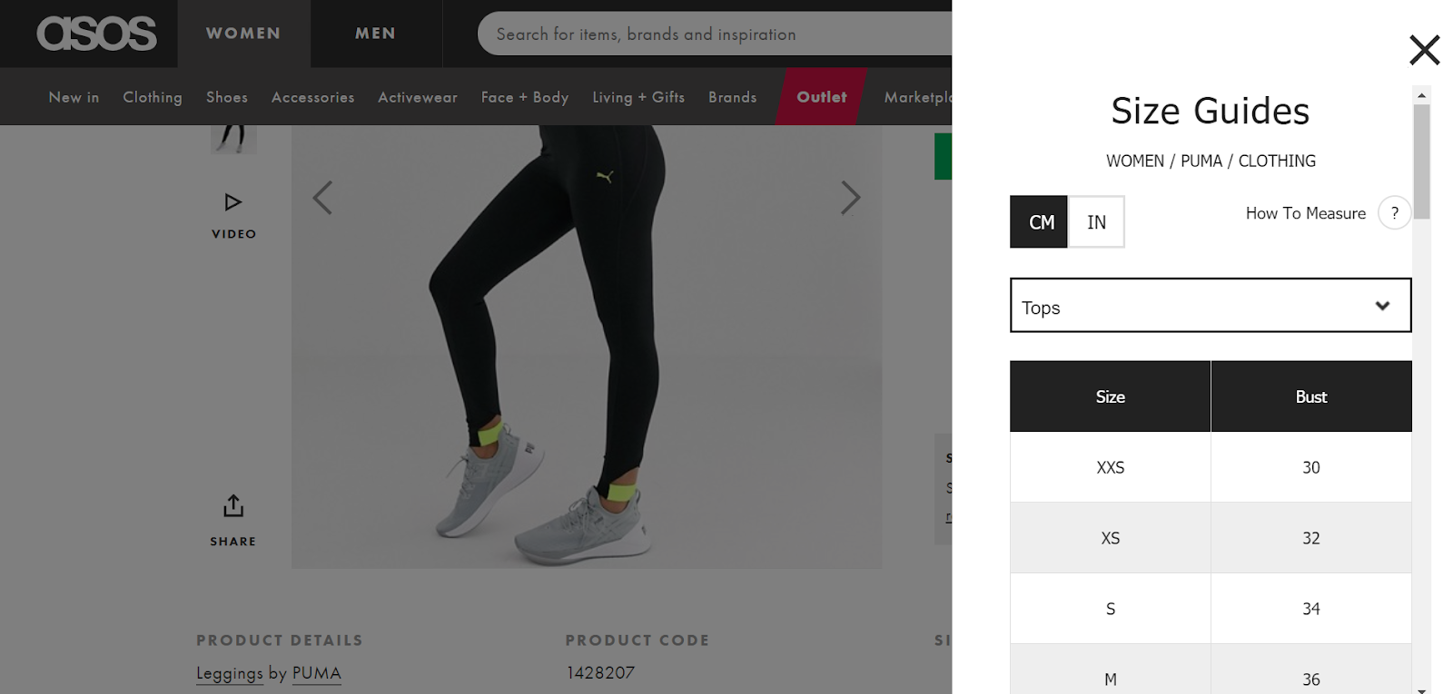
(ASOS’s standardized pop-up size guides)
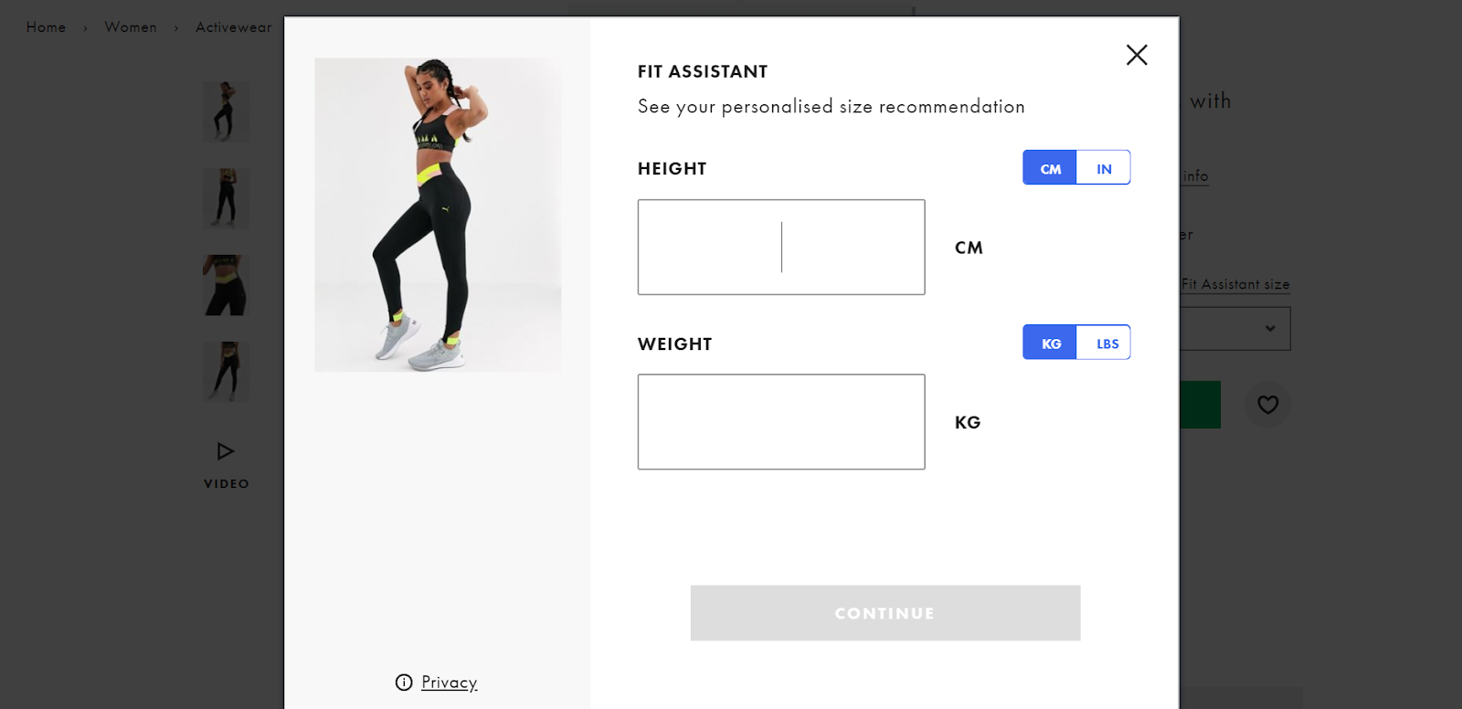
(The Fit Assistant Size aiming to recommend personalized sizing)
Conclusion
In today e-Commerce market where an increase in the overall conversion rates lies in customers’ willingness to buy, it’s important to have a web store design that optimizes users’ shopping experience at every of their visit. Customers’ purchase decision is the key element to keep businesses alive, so make sure not to disappoint them with such unnecessary technical problems that may cancel their on-going customer journey.

