


1 min read
|
03-30-2026
How to make Sidebar sticky in Magento 2
Vinh Jacker | 03-17-2025
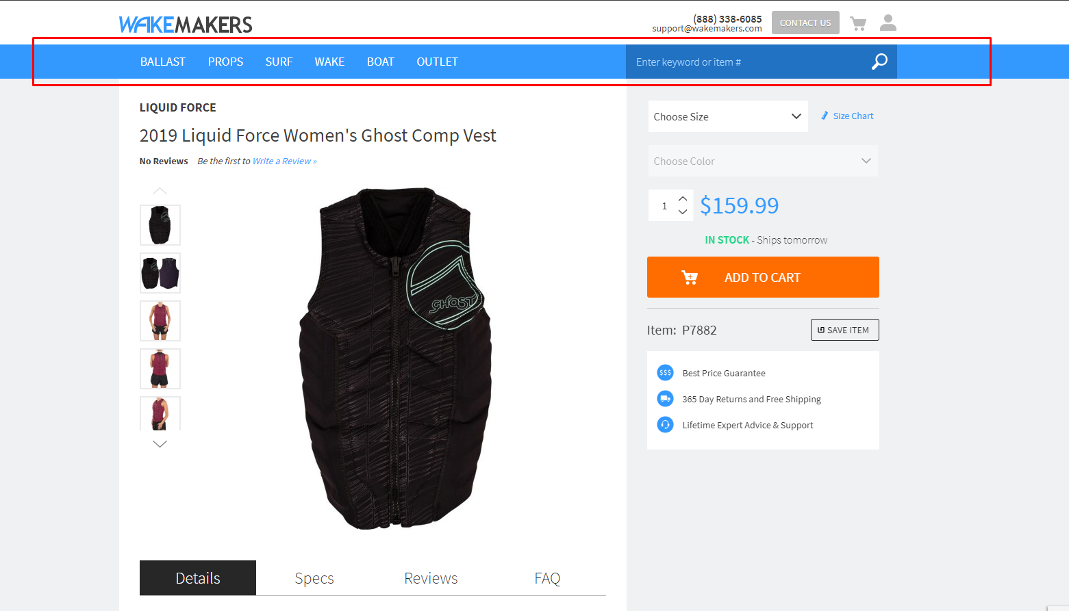
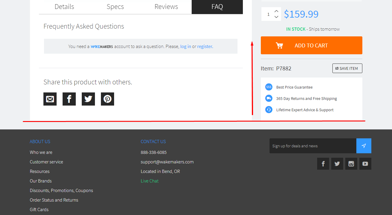
In today’s post, I will talk about how to make Sidebar sticky in Magento 2.
Sticky sidebar, just similar to a sticky header, the sidebar element will always be displayed in the viewport or will be displayed when several conditions are met. This can be considered as an ideal location to move the product options, add to cart button, or element which is important for your product.
As a result, your customer can freely browse all your product’s content, as well as the add to cart button, which is always ready to be clicked on once the purchase decision has been made.
Before making any changes in the code to the activate sticky sidebar, you need to create a custom theme. In here, I named it as Mageplaza/StickySidebar.
5 Steps to make Sidebar sticky in Magento 2:
Step 1: Change LESS code
You can make changes in this code by going to app/design/frontend/Mageplaza/StickySidebar/web/css/source/ and create _extend.less file inside it. Then copy/paste the below code:
.media-width(@extremum, @break) when (@extremum = 'min') and (@break = @screen__m) {
  .box-tocart .action.tocart {
    width: 100%;
    margin-right: 0;
  }

  .sidebar {
    &.fixed {
      position: fixed;
    }
  }
}
To symlink and compile this code, remember to run Grunt commands. On the desktop, the sidebar will be position as a fixed element and the add to cart button is made full width.
Step 2: Change Change XML code
Inside of app/design/frontend/Mageplaza/StickySidebar/Magento_Catalog/layout/, you can create catalog_product_view.xml. Then copy/paste the below snippet:
<page layout="2columns-right" xmlns:xsi="http://www.w3.org/2001/XMLSchema-instance" xsi:noNamespaceSchemaLocation="urn:magento:framework:View/Layout/etc/page_configuration.xsd">
    <referenceBlock remove="true" name="catalog.compare.sidebar" />
    <referenceBlock remove="true" name="wishlist_sidebar" />

    <move element="product.info" destination="sidebar.additional" />

    <referenceContainer name="sidebar.additional">
        <block class="Magento\Framework\View\Element\Template"
               name="sticky.sidebar.wrapper"
               template="Magento_Catalog::sticky-sidebar-js.phtml"
               after="-" />
    </referenceContainer>
</page>
Using the above snippet, you can:
- Change the number of columns in the page layout from one to two which the sidebar on the right side.
- Remove the compare and the wishlist block when the layout of this page is being used.
- Change block’s position which contains product options and adds to cart button to the sidebar
- Add template file which will be used to invoke the AMD component for handling the sticky sidebar logic and calculation
Step 3: Change PHTML code
You can create sticky-sidebar-js.phtml in app/design/frontend/Mageplaza/StickySidebar/Magento_Catalog/templates/. The following snippet need to be copied/pasted:
<script type="text/javascript" data-mage-init='{"stickySidebar":{}}'></script>
Step 4: Change RequireJS code
Inside of app/design/frontend/Mageplaza/StickySidebar/, you can create requirejs-config.js. Then copy/paste the below snippet:
var config = {
    map: {
        "*": {
            stickySidebar: "js/sticky-sidebar",
        }
    }
};
Step 5: Change jQuery code
Inside of ` app/design/frontend/Mageplaza/StickySidebar/web/js/sticky-sidebar.js, you can create sticky-sidebar.js`. Then copy/paste the below snippet:
define(["jquery", "matchMedia", "domReady!"], function ($, mediaCheck) {
    "use strict";

    var sidebar = {};
    var a2c = $(".product-add-form");
    var a2c_mobile_target = $(".product-info-main > .price-box");
    // nodes required to calculate sidebar params: width, left, padding-left
    var page_main = $(".page-main");
    var page_main_w;
    var main = $(".main");
    var main_w;
    // nodes required to calculate sidebar params: top
    var header = $(".page-header");
    var nav = $(".nav-sections");
    var breadcrumbs = $(".breadcrumbs");
    // luma specific css values
    var a2c_mb = parseInt($("#product-addtocart-button").css("margin-bottom"));
    var main_pb = parseInt(main.css("padding-bottom"));
    var tabs_mb = parseInt($(".product.info.detailed").css("margin-bottom"));

    sidebar.el = $(".sidebar");
    sidebar.padding_ratio = parseFloat(sidebar.el.css("padding-left")) / page_main.width();
    sidebar.updateHorizontalParams = function () {
        if (sidebar.el.hasClass("fixed")) {
            page_main_w = parseFloat(page_main.width());
            main_w = parseFloat(main.width());

            sidebar.width = page_main_w - main_w;
            sidebar.left = ($(window).width() - page_main_w) / 2 + main_w;
            sidebar.p_left = parseInt(page_main_w * sidebar.padding_ratio);

            sidebar.el.css({
                "width": sidebar.width + "px",
                "left": sidebar.left + "px",
                "padding-left": sidebar.p_left + "px"
            });
        }
    };
    sidebar.updateVerticalParams = function () {
        sidebar.height = sidebar.el.height();

        var scrolled_from_top = $(window).scrollTop();
        var header_h = header.outerHeight(true) || 0;
        var nav_h = nav.outerHeight(true) || 0;
        var breadcrumbs_h = breadcrumbs.outerHeight(true) || 0;
        var content_h = main.outerHeight(true) || 0;
        var sidebar_limit_top = header_h + nav_h + breadcrumbs_h;
        var sidebar_limit_bottom = sidebar_limit_top + content_h;
        var sidebar_limit_bottom_criteria = scrolled_from_top + sidebar.height + main_pb + a2c_mb - tabs_mb;

        if (sidebar_limit_bottom < sidebar_limit_bottom_criteria) {
            // sidebar should start drifting out of viewport on the top
            sidebar.top = sidebar_limit_bottom - sidebar_limit_bottom_criteria;

            sidebar.el.css({"top": sidebar.top + "px"});
        } else if (scrolled_from_top > sidebar_limit_top) {
            // header and breadcrumbs are now above viewport
            if (!sidebar.el.hasClass("fixed")) {
                sidebar.el.addClass("fixed");
                sidebar.updateHorizontalParams();
            }
            sidebar.top = 0;

            sidebar.el.css({"top": sidebar.top + "px"});
        } else {
            sidebar.el.removeClass("fixed").removeAttr("style");
        }
    };

    var onResize = function () {
        $(window).on("resize", function () {
            sidebar.updateHorizontalParams();
        });
    }, onScroll = function () {
        $(window).on("scroll", function () {
            sidebar.updateVerticalParams();
        });
    }, onInit = function () {
        mediaCheck({
            media: "(min-width: 768px)",
            entry: function () {
                sidebar.el
                    .addClass("fixed")
                    .prepend(a2c.detach());

                sidebar.updateHorizontalParams();
                sidebar.updateVerticalParams();

                onResize();
                onScroll();
            },
            exit: function () {
                a2c.detach().insertAfter(a2c_mobile_target);

                sidebar.el
                    .removeClass("fixed")
                    .removeAttr("style");
            }
        });
    };

    onInit();
Following are some information about this code
- The logic is initialized using the onInit() method
- The product options positions can be change between mobile and desktop layout by utilizing the matchMedia library. Besides, you can also add/remove a CSS class named
fixedusing this matchMedia library. - On the desktop, the values of four CSS properties and load event listeners will be calculated by JS.
- The sidebar display can be divided into three states:
- State 1: The sidebar is positioned relatively as long as breadcrumbs are in visible in the viewport.
- State 2: The sidebar is positioned as a fixed element and will be remained in the viewport when breadcrumbs are scrolled outside of the viewport.
- State 3: The sidebar will slide outside of viewport once the sidebar bottom side is aligned with the content bottom side.
The above code has been optimized in order to work well with Luma theme, therefore some of the code stated here might have to be added or cleaned up.
Conclusion
In conclusion, the sticky sidebar is a useful element which could help improve your conversion rate . I hope through the above information; you will be able to make Sidebar sticky with ease. If you have any questions about this topic or face any issues while following this tutorial, feel free to let me know. Thanks for reading!
x

Jacker is the Chief Technology Officer (CTO) at Mageplaza, bringing over 10 years of experience in Magento, Shopify, and other eCommerce platforms. With deep technical expertise, he has led numerous successful projects, optimizing and scaling online stores for global brands. Beyond his work in eCommerce development, he is passionate about running and swimming.
Related Post


Magento 2.4.9 Beta Release: What's New?
Magento 2.4.9 beta is here. Stay up to date with every release milestone with this regularly updated guide.
11 mins read
|
03-17-2026

Google Analytics Website Traffic: The A–Z Guide for Magento 2 Store Owners
Learn how to analyze website traffic in Google Analytics 4, identify high-quality traffic sources, and grow your Magento 2 store with data-driven insights.
18 mins read
|
03-17-2026

The Complete Guide to UTM Parameters & Google Analytics for Magento website
Master UTM parameters and Google Analytics for Magento. Track traffic sources, measure campaign performance, and practical tips to use it for better business decisions.
10 mins read
|
10-05-2025

How to implement Cookie Consent for GTM & Google Analytics in Magento Under GDPR?
Implement cookie consent for GTM & GA4 in Magento under GDPR. Step-by-step guide using Google Consent Mode v2 to avoid fines and maintain analytics.
15 mins read
|
02-27-2026

Speed vs. Sales: Comparing Hyvä Checkout and Mageplaza One Step Checkout
Learn how Hyvä Checkout and Mageplaza One Step Checkout impact order completion rates and revenue growth.
8 mins read
|
02-25-2026
1 min read
|
03-30-2026
Magento 2.4.9 Beta Release: What's New?
Magento 2.4.9 beta is here. Stay up to date with every release milestone with this regularly updated guide.
11 mins read
|
03-17-2026
Google Analytics Website Traffic: The A–Z Guide for Magento 2 Store Owners
Learn how to analyze website traffic in Google Analytics 4, identify high-quality traffic sources, and grow your Magento 2 store with data-driven insights.
18 mins read
|
03-17-2026
The Complete Guide to UTM Parameters & Google Analytics for Magento website
Master UTM parameters and Google Analytics for Magento. Track traffic sources, measure campaign performance, and practical tips to use it for better business decisions.
10 mins read
|
10-05-2025
How to implement Cookie Consent for GTM & Google Analytics in Magento Under GDPR?
Implement cookie consent for GTM & GA4 in Magento under GDPR. Step-by-step guide using Google Consent Mode v2 to avoid fines and maintain analytics.
15 mins read
|
02-27-2026
Speed vs. Sales: Comparing Hyvä Checkout and Mageplaza One Step Checkout
Learn how Hyvä Checkout and Mageplaza One Step Checkout impact order completion rates and revenue growth.
8 mins read
|
02-25-2026