How To Make Your Shopify Store Look Professional: 8 Tips to Follow
Summer Nguyen | 01-23-2024
A professional and attractive Shopify store is crucial to engaging clients, gaining their trust, and increasing revenue. First impressions count in the cutthroat world of e-commerce, and the appearance of your store has a big influence on sales. In this post, we’ll go over the essential components and offer helpful advice to help you create a polished Shopify store.
Whether you are just starting out or trying to make improvements to your current store, these insights will help you create an online presence that is reliable and aesthetically pleasing to your target audience. Let’s explore the realm of e-commerce design and learn how to make your Shopify store look professional.
Why is Shopify store design important?
The design of your Shopify store is crucial for several key reasons:
- First Impressions: The design of your store is the first thing customers notice. A well-designed store creates an excellent first impression, which has a significant impact on how prospective buyers perceive your products and brand.
- Trust & Credibility: Professionalism and aesthetic appeal in design promote credibility and trust. Consumers are more inclined to purchase from a store that exudes credibility and dependability.
- Brand Identity: The design of your store reflects your brand identity. It enables you to successfully communicate your brand’s message, core principles, and distinctiveness to your target audience.
- User Experience: A well-thought-out design improves the user experience (UX). It makes it easier for customers to navigate your store, find products, and complete their purchases, leading to increased sales.
- Competitive Advantage: A well-designed store can set you apart from competitors in the highly competitive e-commerce landscape. It shows your dedication to providing a high-quality shopping experience.
- SEO Performance: Search engines like Google consider user experience and design as ranking factors. A well-designed store can positively impact your store’s visibility in search engine results.
- Conversion Rates: A professional design can increase conversion rates, as it instills confidence in potential buyers and encourages them to take action, such as making a purchase.
- Repeat Business: A memorable and professional design can lead to customer loyalty, encouraging repeat business and word-of-mouth referrals.
In summary, Shopify store design is essential for making a positive impression, building trust, enhancing the user experience, and ultimately driving success in the competitive world of e-commerce. It’s not just about aesthetics; it’s a strategic investment in your online business.
Why should you make your Shopify store look professional?
Making your Shopify store look professional is essential for several compelling reasons:
- Build Trust: A professional-looking store conveys trustworthiness and reliability. Customers are more likely to purchase from a store that appears well-maintained and established.
- First Impressions Matter: Your store’s design is the first thing visitors notice. A professional appearance creates a positive first impression, which can mean the difference between a potential customer staying and looking around or leaving right away.
- Competitive Advantage: A professional design can set you apart from competitors in the highly competitive industry of e-commerce. It shows your dedication to providing a high-quality shopping experience.
- Enhance Credibility: A professional design lends credibility to your brand. Customers are much more inclined to believe in your products and services if your store appears professional.
- Improve User Experience: Professional design often translates to better user experience. A well-structured, easy-to-navigate store makes it simpler for customers to find what they’re looking for, increasing the chances of making a sale.
- Higher Conversion Rates: Customers who find your store visually appealing and trustworthy are more likely to become paying customers. Sales and revenue may rise as a result of this.
- Better SEO Performance: Search engines like Google consider user experience and design as ranking factors. A professional design can positively impact your store’s visibility in search engine results.
In conclusion, a professional-looking Shopify store is not just about aesthetics; it’s a strategic investment in your brand’s reputation, customer trust, and overall success in the competitive e-commerce landscape.
8 Tips to make your Shopify store look professional
Pay attention to your website design
The design of your Shopify store is the first impression customers have of your brand. A well-crafted design creates a visually appealing and cohesive look, conveying professionalism and trustworthiness. It determines the mood of the entire shopping encounter and shapes the way customers view your brand and merchandise.
- Choose a clean and visually appealing theme: Shopify offers a wide range of themes, including free and paid options. Select a theme that aligns with your brand’s style and the products you sell. Consider factors like color, layout, and the overall aesthetic.
- Consistent color scheme and typography: Stick to a cohesive color palette and typography throughout your website. This consistency contributes to the development of a strong and recognizable brand identity.
- High-quality images and product photography: Invest in professional product photography to showcase your products effectively. High-resolution images and detailed shots can enhance the perceived quality of your products.
- Prominently displayed branding elements: Ensure that your logo and brand name are prominently displayed, typically in the website header or footer. This helps visitors remember and identify your brand.
Example
Allbirds is a brand known for its simplicity and sustainability. Their Shopify store features a clean design with a neutral color palette, reflecting their commitment to eco-friendly products.
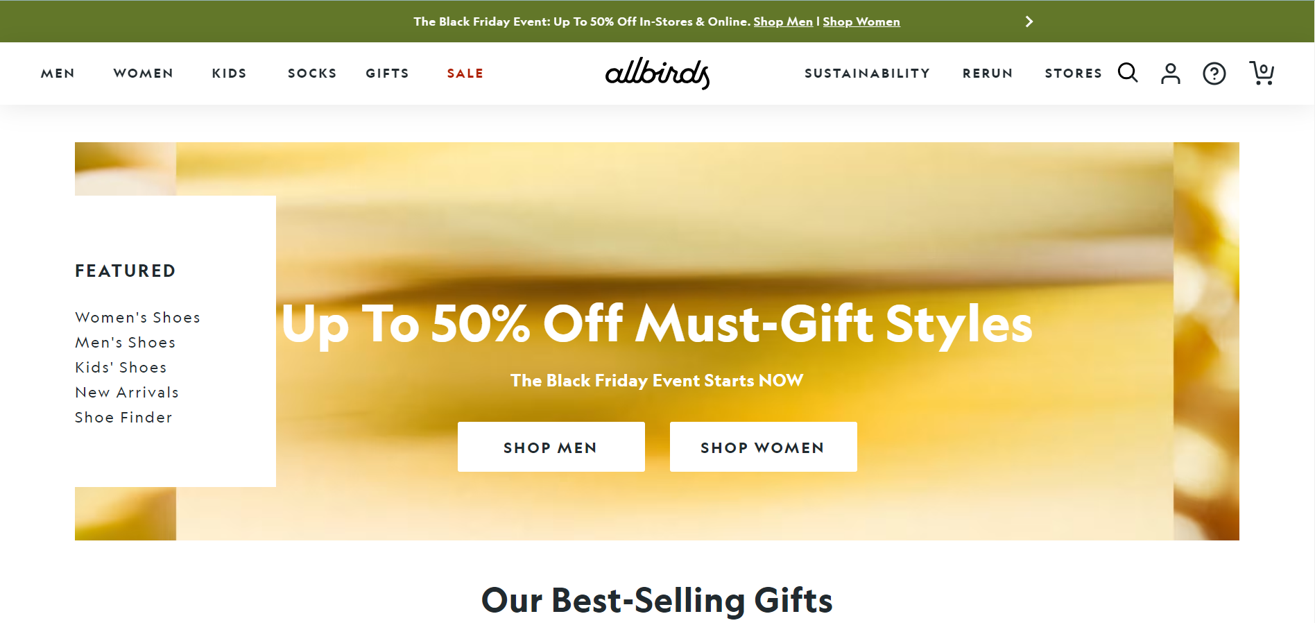
- Implementation: Allbirds maintains a minimalist design with a neutral color palette on their Shopify store. The simplicity extends to their product pages, where high-quality images take center stage. The navigation is intuitive, focusing on showcasing their sustainable footwear.
- Success: By adopting a clean and visually appealing design, Allbirds communicates transparency and simplicity, aligning with their commitment to sustainable and straightforward products. Learn to prioritize the essential elements that reflect your brand ethos.
- Lesson from Allbirds: Allbirds maintains a consistent and minimalist design that aligns with their commitment to sustainability. Learn to prioritize elements in your design that resonate with your brand’s values and messaging. Consistency across your branding reinforces trust and loyalty among your audience.
Improve your store’s accessibility
Making sure your store is accessible to all customers, irrespective of their abilities or disabilities, is the hallmark of accessibility. By making your Shopify store accessible, you expand your potential customer base, improve the user experience for all visitors, and demonstrate a commitment to inclusivity. This inclusivity contributes to a positive brand image.
- Accessibility for all users: Make your website accessible to all, including those with disabilities. Follow web accessibility standards (WCAG) to make sure that your content can be understood and utilized by everyone. Use alt text for images, provide video transcripts, and create accessible forms and buttons.
- Readable fonts and contrast: Choose fonts that are easy to read, and maintain a good contrast ratio between text and background. This is important for users with visual impairments.
Example
Warby Parker is dedicated to inclusivity. Their website includes alt text for images, making it accessible to users with visual impairments, aligning with their brand’s commitment to accessibility.

- Implementation: Warby Parker ensures accessibility by providing alt text for images on their website. The fonts are easy to read, catering to users with different visual abilities. The brand also offers a virtual try-on feature, enhancing the shopping experience for all users.
- Success: Warby Parker demonstrates the importance of making your Shopify store accessible to a diverse audience. Incorporating features like alt text and providing inclusive tools can enhance the overall user experience.
- Lesson from Warby Parker: Warby Parker demonstrates the importance of inclusivity by incorporating features like alt text and a virtual try-on. Recognize the diverse needs of your audience and implement accessible features to ensure a positive experience for all users.
Make your website more usable
Usability is crucial for providing a seamless and efficient browsing and shopping experience. A well-designed and user-friendly interface reduces friction in the customer journey, making it easy for visitors to find products, navigate through your store, and complete transactions. Usability directly impacts customer satisfaction and conversion rates.
- Clear navigation: Develop a user-friendly menu structure that allows customers to easily find what they’re looking for. Use logical categories and subcategories, and consider implementing a search feature.
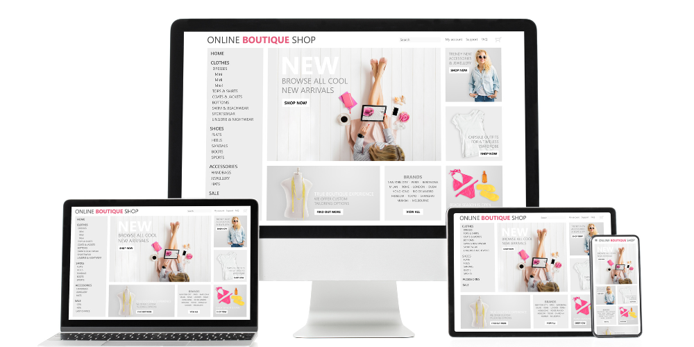
- Responsive design: Make certain that your website is mobile-friendly, meaning it can adjust to various screen sizes and devices. In a time when a lot of people shop on mobile devices, this is essential.
- Optimize page load times: Slow-loading pages can deter users. Compress images, use content delivery networks (CDNs), and choose a reliable hosting service to minimize load times.
Example
Zara prioritizes user-friendly design. Their Shopify store features intuitive navigation, a responsive layout, and clear product categorization, creating a seamless shopping experience.
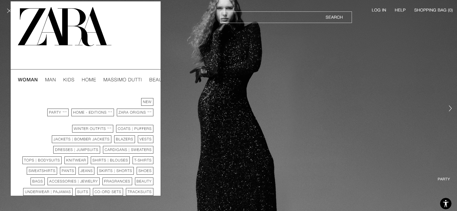
- Implementation: Zara’s Shopify store is incredibly user-friendly, with simple navigation. Clear product categorization makes it simple for customers to locate what they’re searching for. A smooth experience on a variety of devices is guaranteed by the responsive design.
- Success: Zara’s emphasis on usability highlights the significance of user-friendly navigation. Prioritize simplicity, clarity, and responsiveness to enhance the ease with which customers navigate through your store.
- Lesson from Zara: Zara’s emphasis on intuitive navigation and a responsive design enhances the overall user experience. Prioritize user-friendly design, ensuring that visitors can easily find and explore your products. Simplify the navigation structure and optimize for various devices to cater to a broad audience.
Drive high-quality content
The foundation of a Shopify store that looks professional is high-quality content. Your products’ benefits and distinctive selling points can be better communicated with the aid of interesting and educational product descriptions and eye-catching images. High-quality content builds your brand’s authority and credibility in addition to drawing in and keeping customers.
- Informative product descriptions: Create detailed, informative product descriptions that highlight key features and benefits. This not only assists customers in making informed purchasing decisions, but it also improves the professionalism of your store.
- Compelling product images: Invest in high-quality product images that showcase your offerings from various angles. Consider lifestyle photos that illustrate how the product is used.
- Blogging: Maintain a blog or news section that provides valuable information related to your industry or products. This can position your brand as an authority and keep visitors engaged.
Example
Apple is a master of content presentation. Their Shopify store provides detailed product descriptions, high-resolution images, and a clean layout, reinforcing the premium quality of their products.
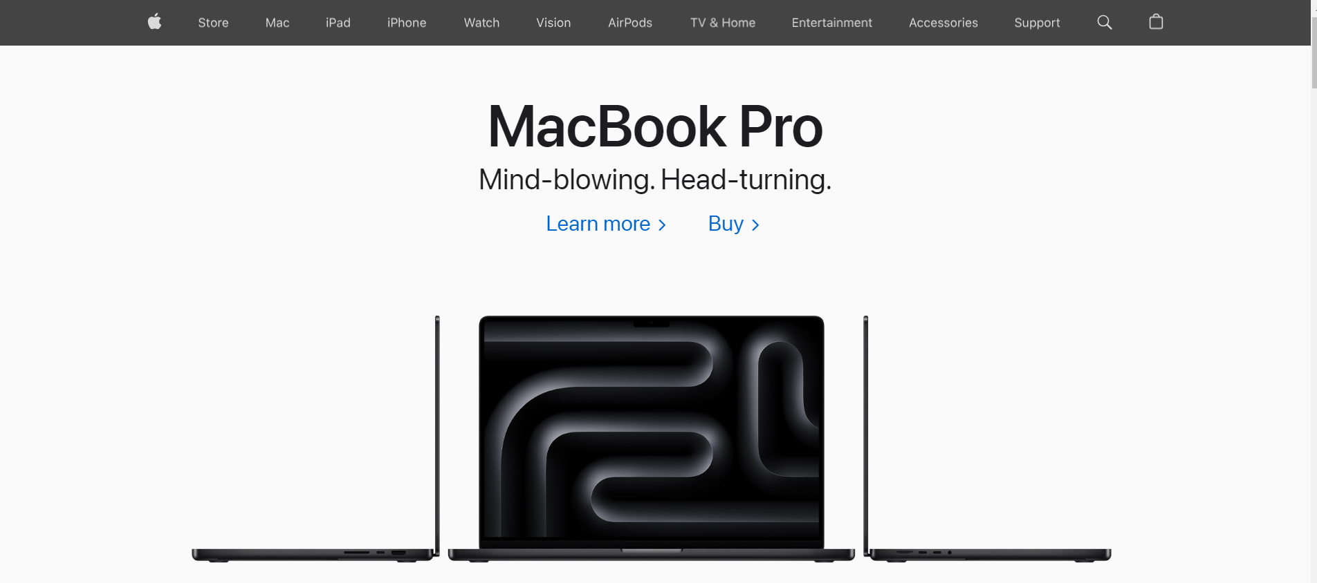
- Implementation: Apple’s Shopify store provides detailed product descriptions, high-resolution images, and a clean layout. The emphasis is on showcasing the premium quality of their products through engaging content.
- Success: Apple’s approach underscores the impact of high-quality content. Invest time and resources in creating compelling product descriptions and visually appealing images to communicate the value and uniqueness of your offerings.
- Lesson from Apple: Apple invests in high-quality content, showcasing detailed product descriptions and engaging visuals. Recognize the power of compelling content in conveying the value and uniqueness of your products. Invest in professional photography, descriptive copy, and multimedia elements that tell a compelling brand story.
Having effective links
The functionality and integrity of links are essential for a smooth and frustration-free user experience. Broken links or confusing navigation can erode trust and lead to customer abandonment. Clear and functional links, along with strategically placed calls-to-action, guide visitors through your store, encouraging them to explore and make purchases.
- Functional links: Regularly check that all links on your website work as intended. Broken links can frustrate users and diminish your store’s credibility.
- Clear CTAs: Implement clear and effective call-to-action (CTA) buttons that guide users toward desired actions, such as “Add to Cart,” “Buy Now,” or “Subscribe.” CTAs should stand out visually and be strategically placed on product pages.
- Internal linking: Use internal links to guide users to related products, categories, or informative content. This can improve navigation and encourage users to explore more of your store.
Example
Nike effectively uses CTAs on its Shopify store. Buttons like “Shop Now” are strategically placed, guiding users seamlessly through the shopping journey.
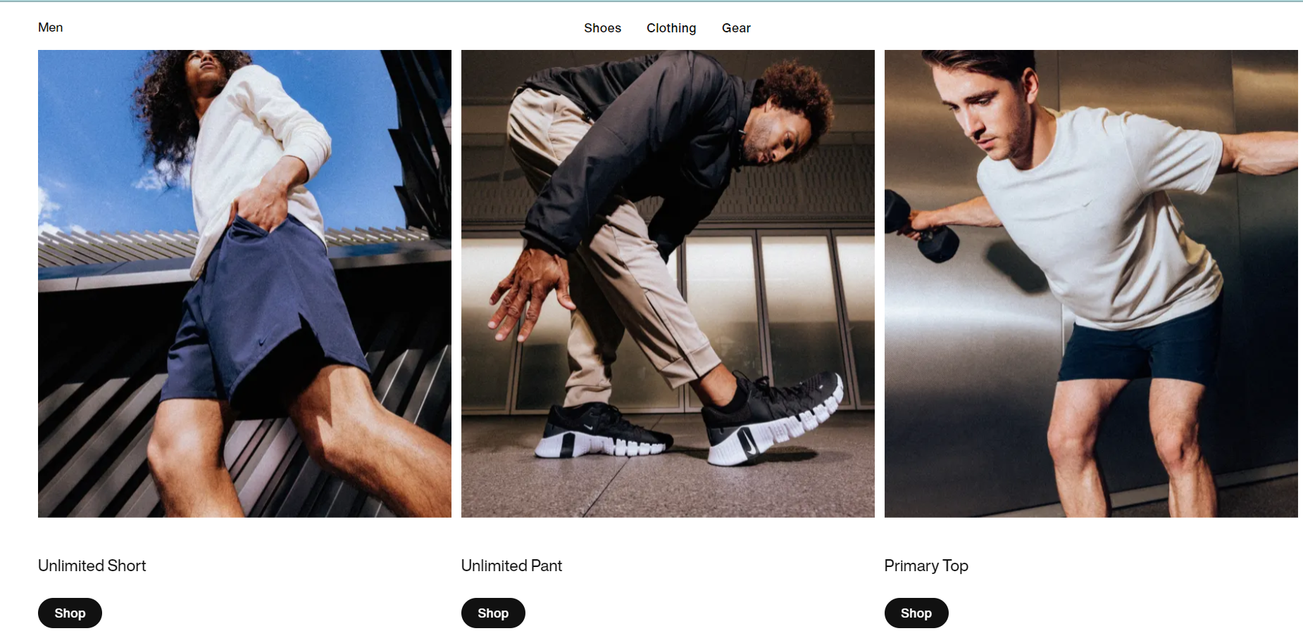
- Implementation: Nike strategically places clear call-to-action buttons, such as “Shop Now,” throughout their Shopify store. These buttons guide users seamlessly through the shopping journey, prompting them to take desired actions.
- Success: Nike’s effective use of CTAs demonstrates the importance of guiding users toward specific actions. Implement clear and strategically placed buttons to enhance the user experience and drive conversions.
- Lesson from Nike: Nike strategically places clear CTAs throughout its Shopify store, guiding users toward specific actions. Understand the customer journey and strategically position CTAs to prompt desired actions, such as making a purchase or signing up for newsletters. Use compelling language that encourages engagement.
Incorporating these detailed tips into your Shopify store can help you create a more professional and customer-friendly online shopping experience, which will lead to increased trust, engagement, and sales. Review and update your website on a regular basis to stay competitive and meet the changing needs of your customers.
Ensure consistent branding
Branding consistency is critical for developing a strong, recognizable identity for your Shopify store. It is critical for establishing trust, leaving a lasting impression, and connecting with your target audience. Customers are more likely to engage with your products or services when they encounter a consistent brand across multiple touchpoints.
- Unified Visual Elements: Ensure that your logo, color palette, and visual elements remain consistent across all pages of your Shopify store. This includes product pages, category pages, and checkout.
- Consistent Messaging: Use a consistent tone and messaging style in your product descriptions, blog posts, and any written content. The language you use should reflect your brand personality and resonate with your target audience.
- Branded Imagery: Use a consistent style for product images and other visuals. This includes photography style, image editing, and the overall aesthetic. A cohesive visual presentation contributes to a polished and professional appearance.
- Uniform Social Media Presence: Extend your consistent branding to your social media profiles, ensuring that your brand’s visual identity is maintained across platforms. This reinforces brand recognition for customers who follow you on various channels.
Example
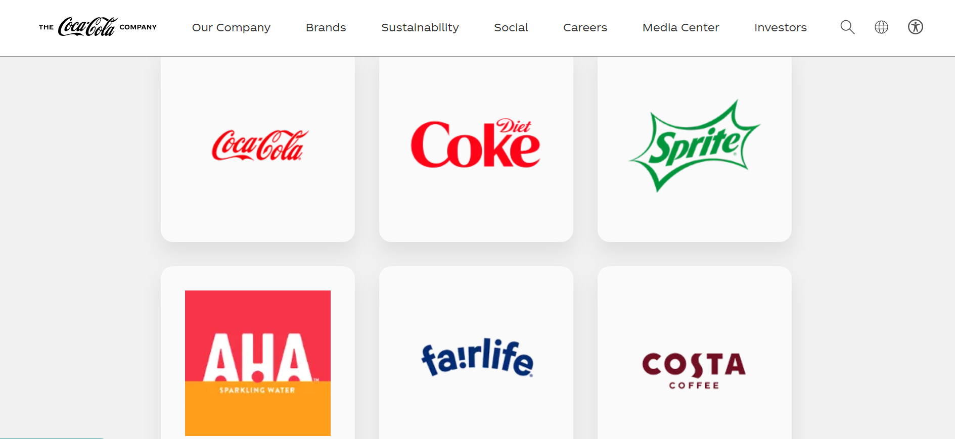
Coca-Cola maintains consistent branding with its iconic red color, distinctive logo, and cohesive messaging. Implementing a similar approach ensures that your brand is easily recognizable and professional.
- Implementation: Coca-Cola is a global brand known for its unwavering commitment to consistent branding. The company uses a distinctive logo featuring its iconic cursive script and red color palette consistently across various touchpoints. From its product packaging to marketing materials, advertisements, and online presence, the visual identity remains remarkably unified.
- Success: The success of Coca-Cola’s consistent branding is evident in its global recognition and iconic status. The brand’s logo and colors are instantly associated with the refreshing beverage, creating a strong and enduring connection with consumers. This recognition translates into brand loyalty and repeat business.
- Lesson from Coca-Cola: Develop visually distinctive elements for your brand, such as a memorable logo and color palette, that can be consistently applied across all platforms. Consistently use language and messaging that align with your brand values. Coca-Cola’s messaging often revolves around joy, happiness, and refreshment, reinforcing its brand identity.
In summary, Coca-Cola’s success with consistent branding showcases the enduring power of a unified visual identity and messaging strategy. By implementing these lessons, businesses can build a brand that resonates with customers, fosters trust, and becomes synonymous with the values and products it represents.
Have a well-optimized mobile design
Mobile optimization is a critical aspect of ensuring a seamless and user-friendly experience for visitors accessing your Shopify store on smartphones and tablets.
Since the utilization of mobile devices for shopping on the internet grows, failing to optimize for mobile can result in lost potential customers, higher bounce rates, and a negative impact on your search engine rankings. A well-optimized mobile experience improves accessibility and user engagement and contributes to higher conversion rates.
- Responsive Design: Choose a Shopify theme that modifies the design and content to fit the device’s screen size. This ensures the experience is consistent and visually appealing across all mobile devices.
- Mobile-Friendly Navigation: Simplify navigation for mobile users. Use clear and concise menus, prioritize essential content, and implement touch-friendly buttons to enhance usability on smaller screens.
- Optimized Images & Media: Compress and optimize images to reduce load times on mobile devices. Consider using lazy loading for images to ensure a faster initial page load. Limit the use of large media files that can slow down the browsing experience.
- Streamlined Checkout Process: Optimize the checkout process specifically for mobile users. Minimize the number of steps, use a mobile-friendly input method for forms, and enable guest checkout options to simplify the purchase process.
- Mobile-Specific Features: Leverage mobile-specific features, such as touch gestures, swiping, and mobile-friendly sliders, to enhance the overall mobile user experience. Ensure that interactive elements are designed with touchscreens in mind.
Example
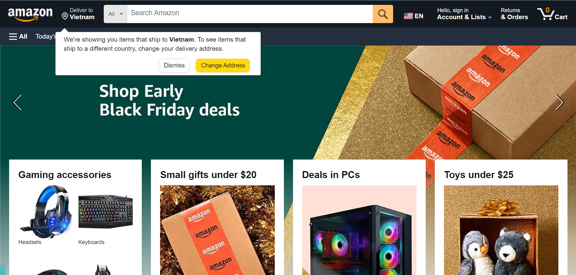
Amazon’s mobile app and website are great examples of mobile optimization. The responsive design ensures that the site functions correctly on a variety of devices. Mobile users’ navigation is simplified, and the checkout process is streamlined, making it simple for customers to complete purchases on their mobile devices.
- Implementation: Amazon has prioritized mobile optimization to meet the needs of its diverse customer base. The company utilizes a responsive design that seamlessly adapts to various screen sizes, ensuring a consistent and user-friendly experience on both smartphones and tablets. The mobile site features simplified navigation, touch-friendly buttons, and an efficient search functionality to streamline the browsing and shopping process for mobile users.
- Success: Amazon’s success in mobile optimization is evident in its dominant position in the e-commerce industry. The mobile app and mobile website contribute significantly to the company’s overall sales. By prioritizing mobile user experience, Amazon has expanded its reach and accessibility, catering to the growing number of users who prefer to shop on their mobile devices.
- Lesson from Amazon: Implement a responsive design for your Shopify store to ensure a seamless experience across different devices. This flexibility allows your website to adapt to varying screen sizes, providing a consistent and visually appealing interface. Simplify navigation for mobile users by prioritizing essential elements and using clear menus. Amazon’s mobile site features straightforward navigation, enabling users to explore categories and find products easily.
Amazon’s success with mobile optimization highlights the importance of adapting to changing consumer preferences. By prioritizing a user-friendly mobile experience, businesses can broaden their customer reach, increase engagement, and ultimately drive sales in the mobile commerce landscape.
Display trust badges & security features on your store
Displaying trust badges and security features on your Shopify store can significantly boost your company’s credibility and perceived reliability.
Because users enter sensitive information during the checkout process, ensuring data security is critical. Customers are reassured by trust badges and security features, which contribute to a positive perception of your brand.

- SSL Certificate: Ensure your Shopify store has an SSL (Secure Socket Layer) certificate, which encrypts data transmitted between the user’s browser and your website. To protect customer information, a secure connection, denoted by “https://” in the URL, is required.
- Payment Security Badges: Display trust badges from reputable payment providers, such as Visa, Mastercard, or PayPal, on your checkout page. These badges signify secure payment processing and help build trust with customers who recognize and trust these payment platforms.
- Security Seals: Incorporate security seals and certificates from recognized security providers. Examples include McAfee, Norton Secured, or TrustArc. These seals indicate that your website is regularly scanned for security vulnerabilities and adheres to industry security standards.
- Guarantee Badges: If your store offers guarantees, warranty, or return policies, display corresponding badges or icons. This communicates transparency and builds trust by assuring customers that their purchases are protected.
- Customer Testimonials & Reviews: While not a traditional trust badge, showcasing customer testimonials and reviews contributes to the overall trustworthiness of your store. Display positive feedback prominently to reinforce the reliability of your products and services.
Example
Shopify itself incorporates trust badges and security features on its checkout page. The use of SSL encryption is evident in the “https://” URL, and the payment options display familiar logos, such as Visa, Mastercard, and PayPal. These elements reassure users that their payment information is secure and handled by trusted payment providers.
- Implementation: Shopify understands the critical importance of trust and security in online transactions as a leading e-commerce platform. On its checkout pages, Shopify prominently displays trust badges and security features to reassure customers about the safety of their personal and payment information. These include SSL encryption indicators, secure payment provider logos (e.g., Visa, Mastercard, PayPal), and additional security certifications that reflect the platform’s commitment to protecting user data.
- Success: Shopify’s implementation of trust badges and security features contributes to the platform’s widespread adoption by businesses of all sizes. By instilling confidence in both merchants and customers, Shopify has become a trusted e-commerce solution. The visible display of security measures on its checkout pages reinforces the reliability of the platform, encouraging businesses to entrust their online operations to Shopify.
- Lesson from Shopify: Ensure that your Shopify store is equipped with SSL encryption, and visibly display indicators such as “https://” in the URL. This signals a secure connection, assuring customers that their data is encrypted during transmission.
In summary, Shopify’s success in implementing trust badges and security features demonstrates that transparency and a commitment to data security are fundamental for building trust in the e-commerce industry. By adopting similar practices, businesses can create a secure online environment that fosters customer confidence and loyalty.
Why should you use Mageplaza’s Shopify development service?
Here are some potential reasons to consider our services if you want to make your Shopify store look professional:
- Expertise: Mageplaza is well-known for its e-commerce development expertise. If we have extended our services to Shopify, You can use our experience and knowledge to develop custom solutions that are tailored to your specific requirements.
- Customization: Custom development services can help you create a unique and highly tailored Shopify store. Mageplaza’s expertise may enable them to build features and functionalities that go beyond what’s possible with off-the-shelf themes and apps.
- Integration: If you have specific requirements for integrating third-party tools, payment gateways, or other systems with your Shopify store, a custom development service can help you achieve seamless integrations.
- Performance Optimization: Custom development can be used to optimize the performance of your Shopify store, ensuring it loads quickly, functions smoothly, and provides an excellent user experience.
- Scalability: As your business grows, a custom solution can be designed to scale with your needs, adapting to increased traffic and evolving requirements.
- Support & Maintenance: Many custom development services provide ongoing support and maintenance to ensure that your store runs smoothly and efficiently.
- Unique Design: You can work with Mageplaza to develop a one-of-a-kind design that reflects your brand identity and sets you apart from competitors.
Moreover, Mageplaza also offers FREE 1:1 consultation & FREE 30-day all-app trial. Try using our service to make your Shopify store look more professional.
Conclusion
We’ve explored the key elements and provided valuable tips to help you achieve a professional-looking Shopify store. From design and accessibility to usability, content, and links, each of these components contributes to the overall user experience and impression your store leaves on visitors.
Remember that a professional store design builds trust, shapes your brand’s perception, and enhances the value customers associate with your products. It also influences how customers interact with your store, impacting conversion rates and repeat business.
You can create an online shopping destination that not only looks professional but also engages and satisfies customers, ultimately driving success in the world of online retail by implementing the tips and strategies discussed in this article. Your Shopify store can stand out in a crowded marketplace and leave a lasting positive impression on every visitor if you are committed to quality and have a keen eye for design.


