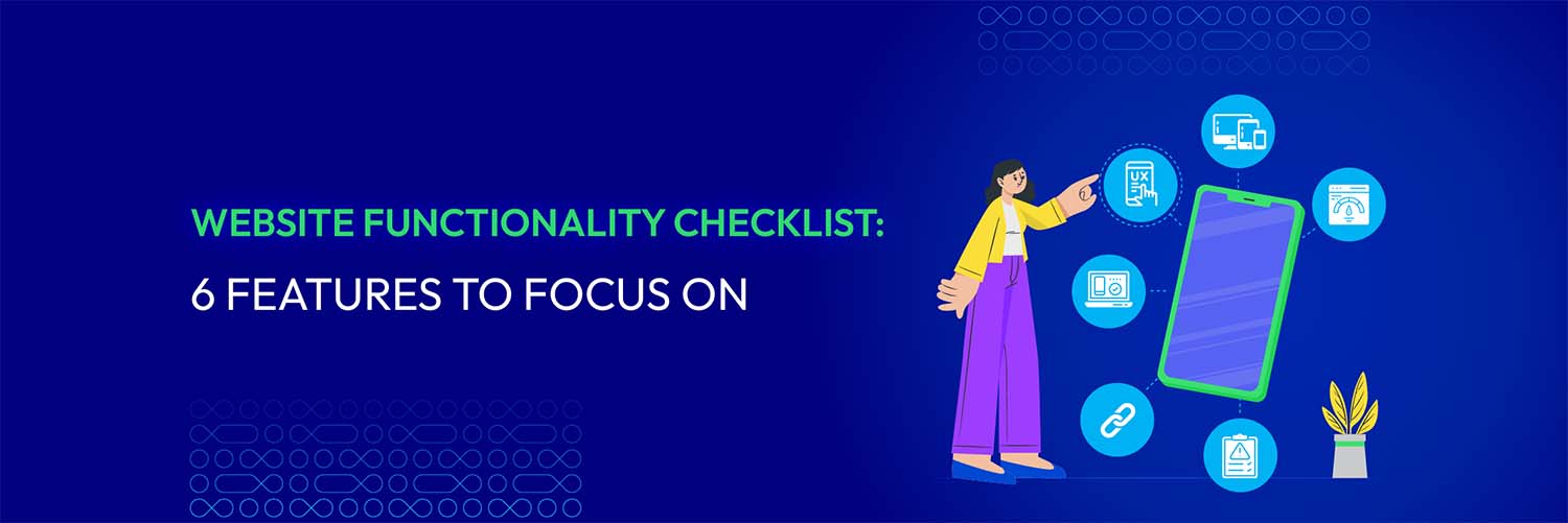
Website Functionality Checklist: 6 Features to Focus on
Vinh Jacker | 07-26-2023
What makes an excellent website?
How to build a website that is not only aesthetically pleasing but also fully functional?
Or what website functionality checklist do you need to upgrade your online platform to a higher level?
If you’ve had these questions on your mind, you are not alone. Many website owners and developers also struggle to maintain the seamless functionality of their websites.
In this article, we will take you through a comprehensive website functionality checklist that covers all the essential features and aspects your website should have.
So, let’s dive in and make sure your website checks all the right boxes!
E-commerce Solution Provider
Over 119,000 global clients have achieved their goals with Mageplaza's help. It's your opportunity to do the same now!
Get StartedImportance of website functioning

Any business or organization is required to have a functional website to ensure that its website is running smoothly and providing an optimal user experience. Hence, it’s important to conduct regular checks and assessments of its functionality.
Here are a few key points highlighting the significance of website functionality:
-
A well-functioning website leads to higher engagement and customer satisfaction.
-
Website functionality increases conversion rates by making it easier for users to complete desired actions.
-
A website with strong functionality enhances brand credibility and trust.
-
Website functionality affects Search Engine Optimization (SEO) rankings and user experience.
-
Businesses can improve functionality to create a positive user experience.
In summary, website functionality is essential for user experience, conversions, brand reputation, SEO rankings, and competitive advantage. Therefore, a website functionality checklist, which we’ll discuss in more detail below, is essential for securing your website.
Read more: 13+ Best Magento SEO Services That Boost Your Organic Traffic and Ranking
6 features for website functionality checklist

1. Responsive design
A user-friendly website starts with a responsive design, which guarantees that your website will easily adjust to various devices and screen sizes. Ensure responsiveness by considering these two factors when designing a website:
Mobile-friendly layout
Websites must adjust to smaller screens and touch-based interactions because of the widespread use of smartphones, and an accessible and readable display of the material on mobile devices is ensured by a mobile-friendly layout.
Here are some pieces of advice that you should take:
-
Optimize website layout and content for mobile devices.
-
Utilize a responsive grid system to create a flexible layout.
-
Use appropriate font sizes and spacing to make the text legible on mobile devices.
-
Create a clear navigation menu to save screen space.
Consistent user experience across devices
In order to ensure that visitors can access and engage with the website regardless of the device they are using, a responsive design seeks to give a uniform experience across devices.
Therefore, when building a website, remember to:
-
Maintain consistent branding to create a cohesive experience.
-
Adapt layouts to fit screen sizes while maintaining the visual hierarchy.
-
Design interactive elements to accommodate touch gestures.
-
Test across multiple devices to ensure a consistent experience.
-
Test the website on different devices to identify issues.
These suggestions will help you build a website with a responsive design that provides a consistent user experience across various devices, improving accessibility and usability for your visitors. If you’re using a platform like the Webflow website builder, maintaining responsive design is even more streamlined, thanks to its visual development tools and built-in flexibility for modern web standards.
2. Navigation and user experience
User experience (UX) and navigation are essential components for a website functionality checklist. Here are three key features that contribute to a good UX:
Intuitive and clear navigation menus
An intuitive and clear navigation menu is essential for users to navigate the website easily, so there are some tips you should consider to make your website the most functional:
-
Avoid using ambiguous or generic terms for navigation menu items.
-
Keep menu items concise and manageable to avoid overloading users.
-
Order menu items logically and categorize related pages/sections.
-
Include search functionality to help users quickly find content.
-
Provide visual cues to indicate user location.
Logical website structure
A logical website structure should be created to group related content together and establish clear relationships between sections or pages, based on how users search for information.
What you need to do is:
-
Organize content logically and hierarchically to create parent-child relationships.
-
Use headings and subheadings to explain content.
-
Help users navigate back to previous pages by using the breadcrumb trail.
-
Allow users to navigate to specific sections or pages with a sitemap.
User-friendly forms and input fields
Websites frequently have forms and input fields, and improving their usability improves the user experience as a whole. Here are some considerations:
-
Keep forms simple and remove unnecessary fields to avoid confusion.
-
Use clear instructions and labels for input fields to provide guidance.
-
Help users correct errors while filling out forms by real-time validation.
-
Break longer forms into smaller steps or sections with progress indicators.
-
Optimize forms for mobile devices by using appropriate input types.
By making it simple for users to browse the website, find information fast, and interact with forms effectively, these elements contribute to a great user experience. The possibility of users attaining their goals on the website increases when the UX is well-designed.
3. Page loading speed
Add loading page speed to your website functionality checklist because it is essential for user experience and website performance. To let slow loading page speed not happen, you should:
-
Optimize and compress images to speed up page loading.
-
Minify and compress code to reduce the size and speed up loading times.
-
Enable browser caching to speed up page loading by storing static files.
-
Prioritize above-the-fold content to allow users to interact.
-
Monitor and analyze website performance to identify areas for improvement.
-
Don’t forget that every website is different, so it’s crucial to test and adjust these improvements to discover the right combination for your particular set of conditions.
4. Cross-browser compatibility
Cross-browser compatibility is essential for consistent user experience across browsers, so keep this in mind when creating your website functionality checklist. There are two key elements that you should concentrate on to ensure your website deliver a consistent experience to users:
Browser testing
Browser testing makes sure that the website works across browsers and versions. Here are what you should do:
-
Test your website on multiple browsers and versions, including common options like Chrome, Firefox, Safari, and Edge.
-
Consider testing on different operating systems as well, such as Windows, macOS, iOS, and Android.
-
Use tools like BrowserStack or Sauce Labs to simplify testing across various browser configurations.
Consistent rendering and functionality
Cross-browser compatibility ensures consistency across browsers. Consequently, you should:
-
Pay attention to CSS, JavaScript, and web standards to ensure compatibility.
-
Identify and resolve issues by regular testing and debugging.
-
Utilize standardized HTML and CSS to achieve cross-browser compatibility.
-
Keep up with web standards and best practices.
By putting these procedures into place, you can greatly enhance cross-browser compatibility and guarantee that your website provides customers with a consistent experience no matter what browser or device they are using.
5. Error Handling and Validation
The functionality of a website must include error handling and validation in order to guarantee a positive user experience and avoid potential problems. Let’s explore each of these features in more detail:
Proper handling of error messages
It is important to give visitors concise, helpful error messages when problems arise when using a website. Here are some best practices for handling error messages effectively:
-
Be clear and concise to explain problems through error messages.
-
Provide contextual information to explain the error cause.
-
Be visually distinct and placed near form fields.
-
Provide actionable guidance to fix errors.
-
Identify issues by logging errors on the server side.
Validation for forms and user inputs
To guarantee the correctness and integrity of the data being submitted, user inputs must be validated. Here are some key points to consider for form and input validation:
-
Ensure the required fields are filled out before submitting the form.
-
Enforce correct formats using regular expressions or libraries by format validation.
-
Validate input values to meet length or range requirements.
-
Validate data consistency between related fields.
-
Implement real-time validation to provide immediate feedback to users.
-
Display error messages to inform users of validation requirements.
Websites can improve user experience, lower user dissatisfaction, increase data integrity, and guarantee system functionality and security by using appropriate error handling and validation procedures.
6. Functioning Links and Buttons
A proper website functionality checklist must involve functional links and buttons. They are interactive elements that are used to offer navigation, start operations, or carry out particular tasks in online and application interfaces. Remember this to make the best use of them:
-
Use specific and meaningful labels to communicate action.
-
Use visual cues to make links and buttons stand out.
-
Provide enough space for users to accurately click on links and buttons.
-
Check for broken links frequently, and fix them right away to improve SEO and user experience.
Related topic: Magento Website Audit Checklist 2023: Don’t Ignore Anything!
Improved-functionality website examples
Mageplaza
Mageplaza is a business that provides strong tools and resources to Magento & Shopify merchants. This business offers customized development services to e-commerce retailers and developers.
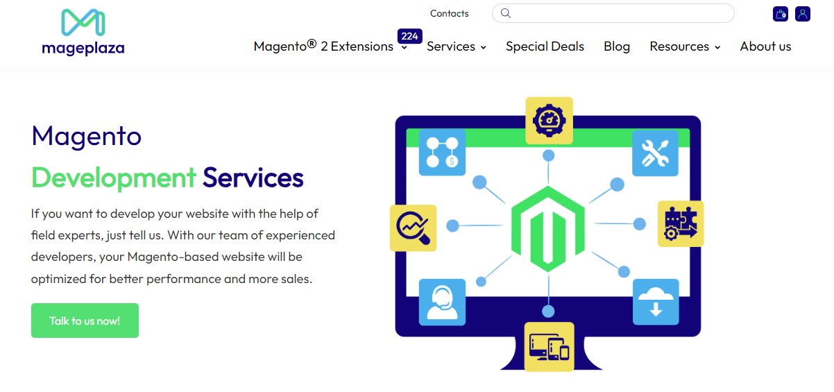
Mageplaza’s website offers two key aspects which are its ease of navigation and the presence of functioning links and buttons.
Firstly, this website ensures a smooth user experience, allowing visitors to effortlessly explore the content and find what they are looking for. Its clear menus and sections help users quickly navigate through pages, reducing frustration.
Additionally, this website’s functioning links and buttons play an important role in driving user engagement. With properly implemented hyperlinks, users can easily move between pages, get to know more about services, and facilitate a seamless flow of information.
These components help to create an all-around satisfying user experience, making the website more effective and enjoyable for its visitors.
Adobe
Adobe is apparently one of the most well-known providers of software for creators. Users search for Adobe for numerous tools such as Photoshop, Illustrator, After Effects, etc.
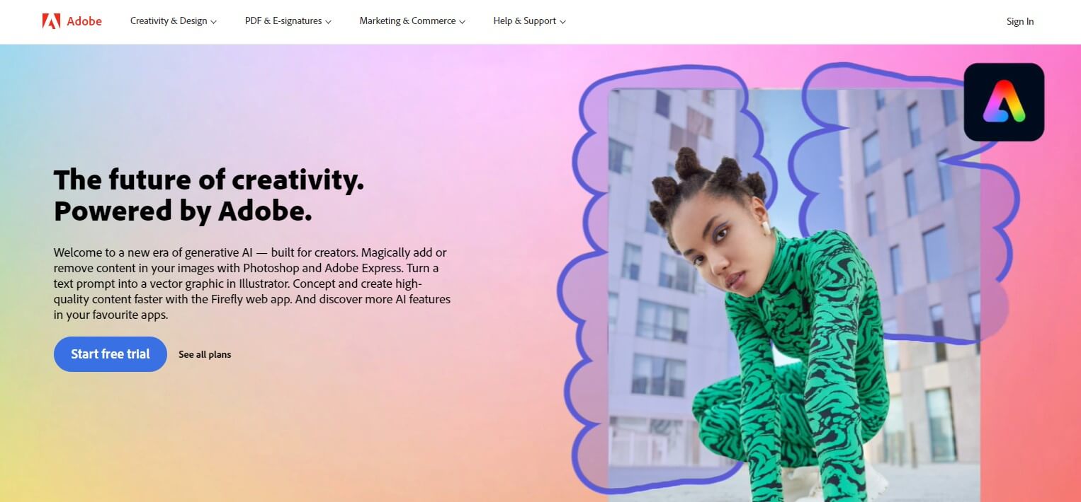
Adobe’s website greets users with a very clean and straightforward layout with a large slider with background animation showing you how you can use Adobe software to create your own interaction.
Additionally, the website is thoughtfully organized, making it easy to navigate. Clear and concise CTA “Join the free beta” is strategically placed throughout the site, guiding visitors to desired destinations and encouraging them to take specific actions.
Overall, this intuitive interface design empowers users to quickly find the information or resources they seek, leading to enhanced productivity and a more enjoyable browsing experience.
Uber
Uber is one of the most popular providers of transportation that allow passengers to hail rides and drivers to charge fares and get paid. Let’s take a look at what Uber is doing well with its website.
This website stands out because of its intuitive navigation with a clear CTA session, which appears right when you enter the website. This allows users can effortlessly find the information they need and are guided toward desired actions, such as booking a ride or exploring available services.
In addition, its responsive design and mobile-friendly layout enable seamless browsing across various devices, ensuring users can access the platform effortlessly whether they are using a smartphone or a laptop.
Moreover, this website prioritizes fast loading speed, optimizing performance, and minimizing wait times. By efficiently delivering content, users can access the necessary information swiftly, leading to a more efficient and satisfying experience.
Final thoughts
In summary, a comprehensive website functionality checklist is essential for every company or organization hoping to succeed in the modern world. Businesses can improve user experience, build credibility, and increase conversions by carefully implementing website functionality.
Implementing a website functionality checklist requires regular review and maintenance to adapt to changing technologies, user expectations, and business needs. It is an ongoing commitment to keep websites up-to-date and functional.
Therefore, embrace the website functionality checklist, continuously assess and improve your website’s functioning, and set yourself up for digital success.


